
Assassin Nation Week: Erica Henderson on the Art, Color, Style and Storytelling of the Series
Assassin Nation Week continues, as today brings a chat with series artist Erica Henderson, who handles not just line art on this book but colors as well. Henderson’s one of my absolute favorite artist in comics, as her work on Unbeatable Squirrel Girl helped elevate that to one of my favorite comics of the past decade, but her work is even better here than we’ve seen before. It has all of the comedic timing we came to know and love Henderson for on Squirrel Girl, but with…well, let’s just say a group of assassins have slightly different solutions to problems than our girl Doreen.
In today’s art feature interview, I talk with Henderson about the development of this series, its cast, how she works, and a whole lot more, before we dive into analysis of a slew of pages from issue #3 to get an inside look at how Henderson brings this world to life. It’s a fun one. Give it a read, and don’t miss tomorrow’s chat, as we talk with Deron Bennett about the lettering of the series.
When you and Kyle first started getting this together, what conversations did you have as far as visual style and the general approach to the book did you have? Or was this a very hands off, “you handle everything on the art side” type of situation?
EH: The art side of it was all me. As you know, Kyle also does the art side on comics and, as you might not know, I usually have a lot of editorial notes or talk with the writer about story beforehand but in this case we both just left the other one alone unless there was a question. We’ve been friends for years and I think this was a case of wanting to see what the other person would produce.
When it comes to a book like Assassin Nation, where everything is completely new and you have – at least early on – a very large cast, what goes into the development of the book? You developed the visual identities of each of the cast members, I’m sure, but what else do you figure out ahead of time to make your life easier as you move throughout the series, both in terms of your line art and colors?
EH: You know. I really should plan things besides characters, but I don’t. As I read the current issue I’ll have a vague floor plan in mind for certain areas but that’s about it.
In the case of Assassin Nation, it’s SO much about the characters that that was my number one focus. Kyle and I both really enjoy an insane ensemble cast but the challenge is making those people all feel distinct from one another. Luckily, A LOT of them die off real quick so that makes my life a lot easier.
For Assassin Nation, what tools are you using to draw and color the book?
EH: This pipeline is the same one I used on Squirrel Girl. So, I do my layouts in a sketchbook. Really small drawings that really only I can decipher. Then the pencils are digital. I use Paint Tool SAI because my computer hates Photoshop. For Squirrel Girl I was doing these on paper, but with Assassin Nation I need to be able to do quick changes because it’s been so much harder to draw. I print out the pages in blue. Ink those. Then I scan them all back in, format them and send them to my flatter, Juan Carlos. He sends those back and they get colored in Photoshop. I know I just said that Photoshop was a nightmare but for me it was line quality, which isn’t as big of a problem when coloring.
In terms of putting an issue together, like #3 as that’s what we’re going to focus on, what’s your process like? Do you and Kyle discuss the issue and the script beforehand, or is there a separation between your roles once you get into the thick of the book?
EH: Issue 3 was pretty easy actually. I don’t think there was much talk about that one. We talked more when we got to some of the later bits because Kyle would have too much story for the pages we had left and I’d tell him which things were unnecessary to the plot and we’d talk about how to finish it out with those things missing.
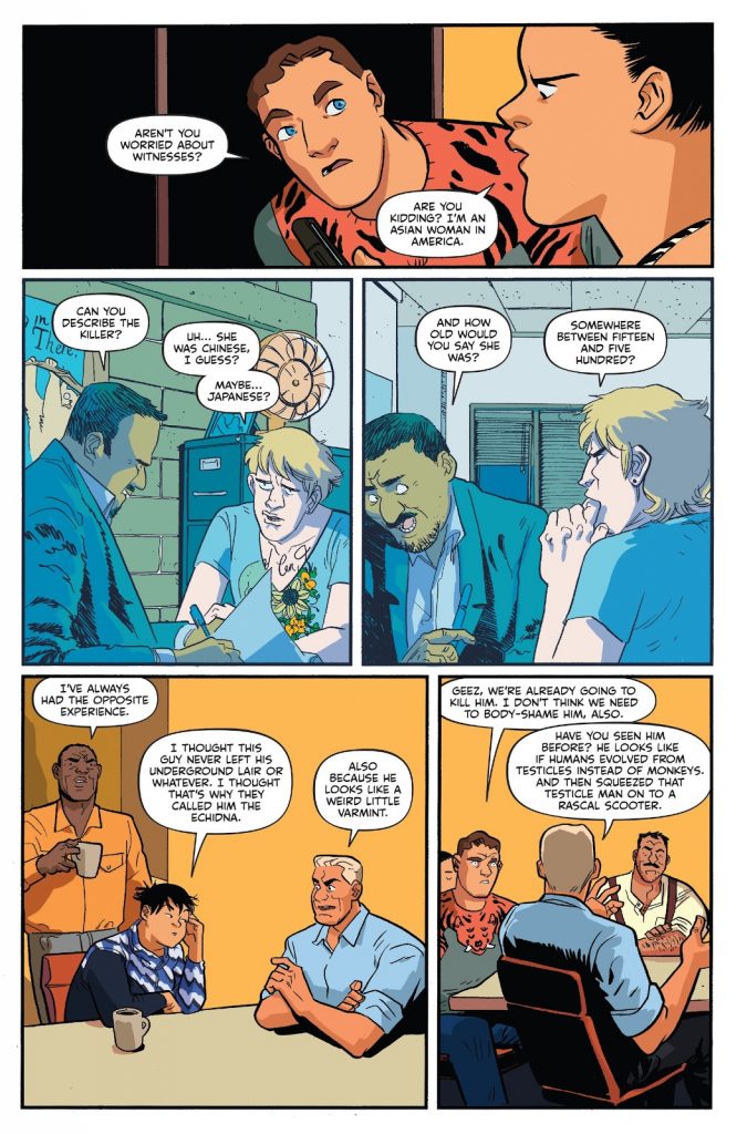
I wanted to ask about the second and third panels here, the flashbacks, and specifically in regards to the colors. There’s a heavy blue tint here, which exists heavily in opposition to the colors throughout the rest of the issue. Is that strictly for contrast with everything else, to delineate that this is taking place elsewhere and at a different time? And here, is your color selection just based on building contrast?
EH: In the second issue, which was front loaded with flashbacks, they each had lighter outlines and a more muted color scheme with one predominant color. Dave’s orange because he was in a desert, Fuck’s was green for the setting again, Wistful Stan’s was pink because the first 1/2 to 3/4 of his was a pleasant memory (I think the background also had this 60s vibe). So in this case it was to visually set it apart from what was happening in the current moment but also that bright blue shadow I think gets across that police station vibe of dingy plus horrible fluorescent lights.
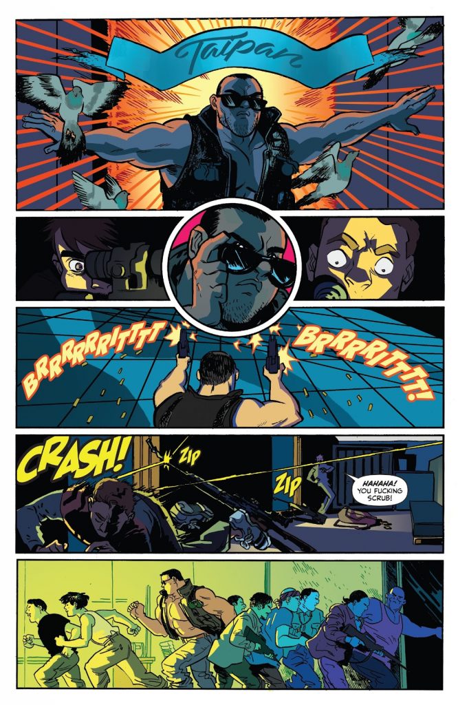
Let’s talk about Taipan’s introduction. Obviously this book is touching on a lot of action movie tropes, so birds flying out as he first appears is very on point. When it came to depicting his first appearance, what were you going for, and what made elements like thee beams of light pouring out from behind him and the banner with his name on it the right solutions?
EH: For me, it was a couple of things, and both of those things revolve around John Woo. When Kyle and I first started, before there was any sort of outline outside of a three sentence trajectory of the story, I told him I wanted to recreate that bit you see so often where it cuts from someone pointing a gun to distant rooftops where the crack of the shot sends a flock of doves flying off. There was never a time where this made sense but I was determined to get in my damn pigeons.
I thought this Taipan intro worked because in my head, even though there’s no way to get this across in one panel, I was seeing it like a Chow Yun Fat moment with birds flying off and a woman singing in Mandarin and in lieu of sound or some sweet slo mo or that John Woo style editing I figured why not add the visual elements of the banner and light? The non diegetic sound and crazy cuts are things that we as viewers of a movie understand to not be truly present in the scene but enhance the way we take in the scene. So, why not add in more stuff that couldn’t actually be present since comics are even more removed from the way we take in the world than movies?
Speaking of Taipan, we’d heard of him before this as an ultimate badass of sorts. What were you going for with his look? It feels very Arnold in Commando to me.
EH: Hah yeah the costuming is definitely John Matrix inspired. I think that outfit already had the grenades too so I didn’t have to add those in. Just added the sunglasses, which is not a nod to Arnold as the Terminator, but just pulling out that classic old chestnut of covering someone’s eyes to deprive them of humanity.
The circular panel in-between the one of Dave and Chad as Taipan locks into them is extremely rad, as it further underlines Taipan’s Terminator like nature. What makes something like that the right answers when you’re laying out a page?
EH: I had not read this question before I answered the previous one. Haha. Okay, so the first panel is letting you know that characters who are about 10 stories away from each other are connecting. Easiest way to do that is to do a closeup. You get into the eyes and you know the eyes are doing something. The hard part is how to really establish the relationship between the three.
Dave and Chad aren’t really close to each other so you can’t do one panel of the two of them and one of Taipan because you’d have to be far away and you need to know that these two accomplished assassins who just murdered some people – who have the high ground and guns trained (on him) – are frightened of this man. Having three equal panels doesn’t work as well either because they’re not equal. So this was the way to put some emphasis on Taipan and show how freaked out the other two are. It’s also a brief moment when Chad and Dave are really on equal ground.
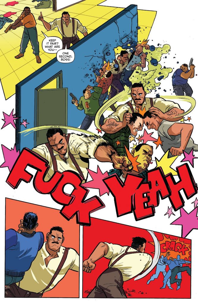
In this sequence, Fuck is actually interacting with his environment as he fights, going through one room to another as he beats up some bad guys. I actually wanted to ask about the usage of the floor in the first kind of “panel” area. Why did you need to establish a floor in the preceding room to make this whole thing work? And how do you generally approach figuring out fight scenes like this in terms of making them flow in a logical sense?
EH: The floor give you a better indication that you’re in a real space. There’s no other instance where a wall acts as a panel divide so I think you need to be more grounded in that space to make it work. Also, for me, panels without gutters or backgrounds work better when you really want to pause on a human moment. In the case of the middle of the page, I sometimes pull away from the background and panels in a fight like this because panel borders are kind of like edits in a movie moving you on to the next bit and I like the feeling that there’s just a bunch of crazy stuff happening in a more or less unknown period of time, like when you’re pumped up on adrenaline. Nothing else matters but THIS.
I love the “FUCK YEAH” here, but what’s its objective here? Is it just fitting the wilding out vibe that’s going on here, or is it more of a SFX stand-in for the rampage Fuck is bringing to the room here?
EH: We’re just having fun.
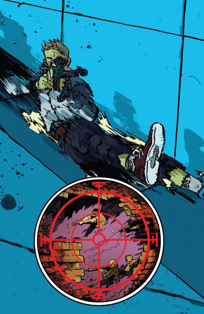
This was a genuinely astonishing page, and I love how you showcased Chad’s energy as he slides down the building. I’m tempted to just ask “How?” but when it comes to accomplishing that energy, what goes into that? Is that special brushes? Relentless effort? Witchcraft? I have no idea how this even happens but I love it.
EH: Those are the same brushes! It’s just… crazy zigzags? You’re trying to capture the way our brain processes motion in a still medium. It’s putting an animation smear at the forefront instead of as a quick in-between.
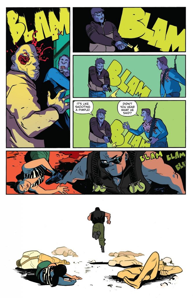
This is a good page to talk about SFX because the BLAMs change sizes and shapes and textures depending on the setting and distance from the shot. I love that. When it comes to SFX, especially comparing the BLAMs in the first, second and fifth panels, what drives your decision making for how to shape those and size those? Is it all about the quality of sound they’re making, or is it something else?
EH: In this case, the first BLAM is a little jagged because it’s unexpected and gross. After that, you’re beating a dead horse so the beats are less extreme. If you were really there it would be just as loud (or maybe not because you’d be going deaf, but I only just thought of that now). The blams get smaller because it’s the same gag 5 times. In the fifth panel it’s implied they’re the same BLAMs so the important thing is to make them small because that’s how Taipan is experiencing them. It’s a moment to moment thing because onomatopoeias don’t exist in real life we can make them mean different things at different times.
Lastly, I wanted to talk about your approach on color inthis issue and book in general, and I wanted to start more broadly. How do you personally like to use color? Are you trying to further underline mood, draw attention with it, a mix of both or is it something else?
EH: Color is often about mood. Comics are so separate from real life that I don’t see a point in trying to copy real life. We don’t have the benefit of sound or motion but by that same regard, we can do more unreal things in comics that might not fly in a movie. Someone would notice a sudden gel light change or to modern audiences it might seem cheesy because for some reason the pinnacle of genre filmmaking right now is “realism” but comics will never be real, so why not embrace that?
Sometimes the color is to note changes in scene. I prefer if different spaces have different colors so that you really feel that movement. I know most people have white walls in their homes but holy crap how boring would that be in a book?
Specifically in regards to the final panel of this issue, you have the contrast between the lighter, more Earth toney colors that Maxwell Bishop is wearing with the blue background and the almost purple that Fingermanand Rankin are covered in. I’m curious about those specific color choices. When you’re picking that palette for this panel, what are you trying to say with that, especially with the flat background and the colors the characters are covered in?
EH: Hah! In this case it’s just that Bishop and that room already happened to be similar colors so making everything else purple/blue was simply a case of choosing a complimentary color. Dipping them into shadow both put emphasis on them but also made them literally shadowy which enhances the fact that they’re figuratively shadowy.
Thanks for reading the second interview from Assassin Nation Week. Come back tomorrow for a conversation with letterer Deron Bennett. Also, if you’re enjoying this content, consider subscribing to SKTCHD to get content like this on the regular!