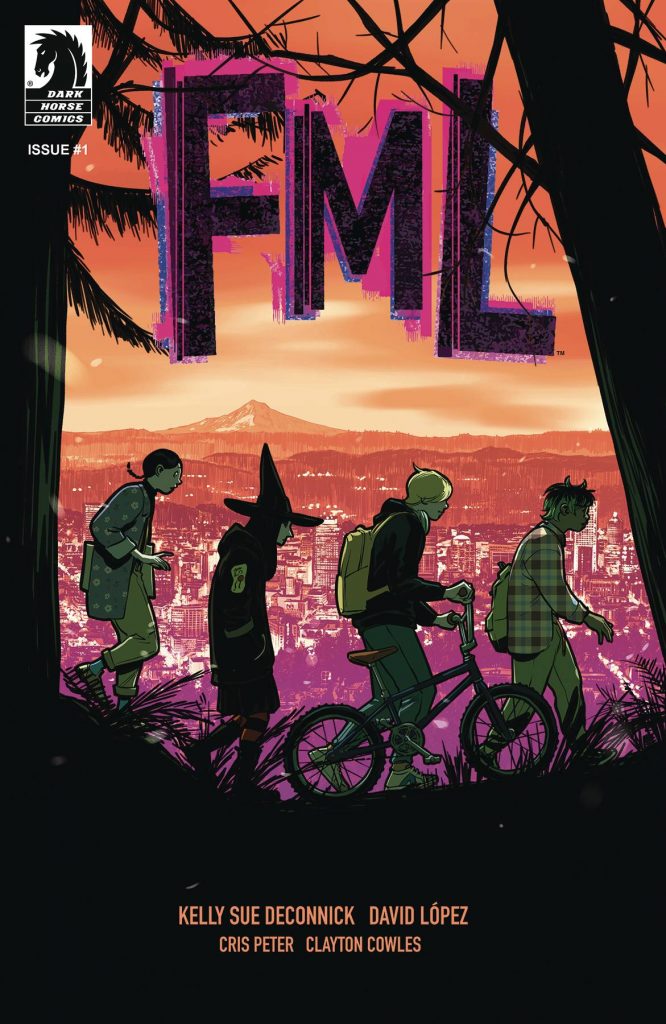
“There Are No Rules”: David López on the Styles and Energy of the Upcoming “FML”
I’ve always known David López was a great artist. He’s proven it time and time again, whether it’s on superhero projects like Captain Marvel and All-New Wolverine or his Panel Syndicate series Blackhand & Ironhead. But when FML — his upcoming Dark Horse Comics series with writer Kelly Sue DeConnick, colorist Cris Peter, and letterer Clayton Cowles — was announced, I had a feeling that it would be the type of project that could prove he wasn’t just a great artist, but one of the best. And you know what?
I was right.
In FML, López delivers something truly special, as his tremendous character acting, inventiveness, and storytelling gifts are on display in each and every panel, page, and issue. López was always great, but his work on FML is astonishing enough that he’s making my 2024 pick for Artist of the Year a fierce battle. 1 This series launches on November 6th, and it’s about “a group of metal kids who face a medley of bizarre foes and encounters in Portland, Oregon during a worldwide pandemic.” But it’s about a lot more than that — it’s really an incredibly fun, energetic, and smart exploration of the emotion expressed in its title — including acting simply as a highlight reel for some of the best comic art of the year, amongst a great many other things.
Having read the first two issues, I knew I wanted to talk to López about his work on this upcoming eight-issue series. So recently through a combination of Google Docs (the first section of the interview) and Zoom (the pages we discuss), López and I did just that. In this art feature interview, we talked about his background as an artist, working with DeConnick, the appeal of this project, and more, before we discuss five pages from FML #1 and what fueled the decisions he made on each. It’s an extended chat with one of the best artists in comics about how he does what he does, and it’s absolutely delightful.
Also, before you ask, there are no spoilers here. The pages that are used are from the preview, so it’s nothing that isn’t already available. But if you’re intrigued by what you see, I highly recommend you pick FML #1 up. It’s an exceptional series, and, again, a great showcase for López’s art. You can find it below. Oh, and this interview has been edited for length and clarity. I hope you dig it.
Let’s start with the basics: Why comics? What made the medium such an appealing one to you both as a reader and as a storyteller?
David López: Comics? Comics are the best!
As a reader it wasn’t a conscious choice, I’ve always been surrounded by comics. I like the stories, and I like the art. There’s admiration in the skill of an artist that always amazes me. It’s magic. I read Asterix, Tintin and lots of classic comic books in the public library. My friend Enric shared his Amazing Spider-Man, but it was Román who got me into New Mutants and later on, X-Men (Art Adams’ Asgardian Wars). Then came Akira and…how can anybody not love comics? That’s the real question!
As a creator, it allows me to try to learn that magic of drawing and create infinite worlds populated by people with my hands. It gives me an illusion of control and lets me tell what’s in my head, release the pressure, makes me feel alive. I tried illustration for a while. I used to visit Luis Royo’s studio when I was 15 (he’s from my hometown) and learned how to use an airbrush and, obviously, I tried that kind of work, but it was too much work. More than a week to make one drawing! Are you crazy? That’s not for me.
I went back to comics and met friends who I made fanzines with. That was the beginning.
You’re from Spain, a country with an incredible history of comic art and comic artists. Did that history and the artists who live and work there play a part in how you figured out your voice as an artist? Or did you take a different path in figuring out the type of artist you wanted to be?
López: There was influence, no doubt. The context of my country when I was growing up was very exciting, there was an urge of opening and a thrill for freedom. We were coming out of a forty-year fascist, ultra catholic regime that had us closed to the world. Society longed for freedom and modernity. At that time, underground culture became mainstream and was everywhere. Many comic creators appeared on TV and the news spoke about them. I learned of Moebius and Hugo Pratt, even (Katsuhiro) Otomo, through the news! Spanish editors published the best comics from all around the globe. We were the first country out of Japan to publish Dragon Ball! I haven’t found the date, but the legend says so.
In my perception, cartoonists were like rock stars and when (Carlos) Pacheco, (Salvador) Larroca and (Pasqual) Ferry started working for the majors in the early 90s, it was an epiphany. If they could make it, so did I.
So, yes, the artists and the ambience of my youth were vital to the artist I am today.
What made you want to work in the American comics market in specific? Was it about how it fit for the type of artist you see yourself as? Was it about opportunities? What was it?
López: I’ve always loved superheroes and the floppy format. The object itself is beautiful. When I was 17, one Spanish publisher, La Cúpula, began publishing the works of Dan Clowes, Los Bros Hernández, Charles Burns, all those crazy cartoonists. It blew my mind. I started doing underground comics. Not anything hardcore, but slice of life in the vibes of Hate. I had my own fanzine, Espiral, and I collaborated in another one with Jesús Saiz, Fernando Blanco, and Javi Pina. We’re all from the same town.
A Spanish agent contacted Jesús Saiz to see if he wanted to work for the US. He said yes and it worked so Fernando, Javi and I tried the same route! Suddenly the chance of drawing X-Men was remote, not impossible. My style then wasn’t what superheroes editors were interested in, but fortunately Bobbie Chase appeared.
A comment here: at that time, I was publishing a story in La Cúpula (the publishers of Peter Bagge). It was a romantic comedy about two girls sharing an apartment in Barcelona. Well, Bobbie Chase was frustrated because she couldn’t find the perfect artist for a project at Marvel. She wanted to publish a story about two girls that share an apartment in New York City. I was perfect for it, so I got hired.
The book didn’t happen, but I was already an artist working for Marvel! I had to adapt my style a bit to fit the taste of American editors but one year after that I was published in Batman: Legends of the Dark Knight and after that, Fallen Angel and…and a career in comics.
You’re working with writer Kelly Sue DeConnick on FML, and she’s someone you’ve worked with before and seemingly have a great relationship with. What is it about Kelly Sue that just fits you and what you want to do in comics?
López: Kelly Sue has a contagious passion. She is very exigent in her work, and you end up doing your best to match that energy. Her comics are not just stories about the villain of the week or a crossover about a crossover. She uses all the possibilities of the genre to speak about whatever she wants. There’s always subtext. That’s something I want in my work. I want to speak about more important things.
And also, she’s the best partner. In the communication context we are in, where the writer is the star and artists are interchangeable, she always fights for her collaborators, she insists that comics are a collaborative medium and, you know, she cares.
Related to that, FML is a project that came together at the end of a long journey of experimentation between you and Kelly Sue. After all that experimentation, what made that the right project for the two of you at this point?
López: I finally managed to trick her into writing me a comic.
At this stage in her career Kelly Sue is into bigger things than comics. Comics are too much work for too little compensation. But we have the poison inside and we need to make comics. The project began because we wanted to do a comic together. Captain Marvel was a great experience, but I wanted a second round, this time with all the freedom we could find. From there we had some conversations, we wanted to speak about teenagehood. We both wanted to have a male lead for once, and with that we started trying things.
We gave fantasy a try, a community college for wizards with useless powers, but that didn’t work. After that Riley appeared, and Portland, and a riot grrrl mom, and the title, FML. The fantasy genre diluted, and we arrived to what was basically FML. But it wasn’t working, probably because it was coming from places that didn’t make sense. We restarted knowing where we wanted to go and suddenly all of it was fresh.
With FML, I’ve gone back to the first comics I was doing. Slice of life with a drop of supernatural while adding the point of view of grown-ups.
Let’s talk about some pages from FML. To start with, I’m curious as to what your process is on this series once you get a script in from Kelly Sue. Where do you start? Is it just layouts? Do you go straight to pencils? What do you do?
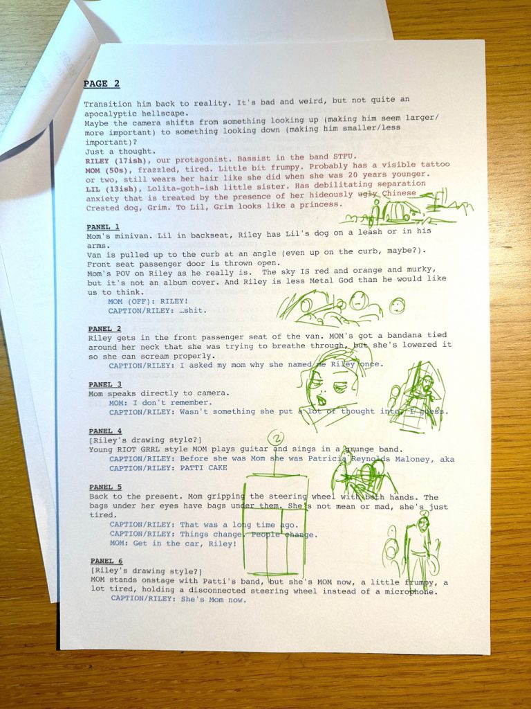
López: No. I do thumbnails from all the script. I print the script and put the dialogue in color so I know where things are, and then I read through it a few times to get the vibe. Fortunately, with Kelly Sue, we can talk about it, so she explains to me what she wants to do. There’s always a little paragraph at the beginning of each scene, and then we talk about it, like, “This is because of this,” etc.. And then I read it all, getting the feeling of what the story is about in that issue. I work on panels first, and then I make a little layout, like some doodles in the script.
And after that, I do the layouts of the whole book. I also put my own lettering in there. Because I am using Clip Studio, you can do that very easily. And for me, it’s impossible to work without the balloons in there. Not knowing where it’s going to be, I don’t know what room I have. And then I make my first doodles for the book and then layouts. With those layouts, Daniel Chabon 2 and Kelly Sue comment on them, and we see if if they like it or not or if they have ideas. And then I just go draw it.
It’s very organic. It’s great because it’s different from making superhero books, because in superheroes you are just one part of a big mechanism. And here, everybody that’s involved with the book…it’s all the mechanism. You have feedback and you know everything that’s involved in there, and then you just do it. It’s much easier.
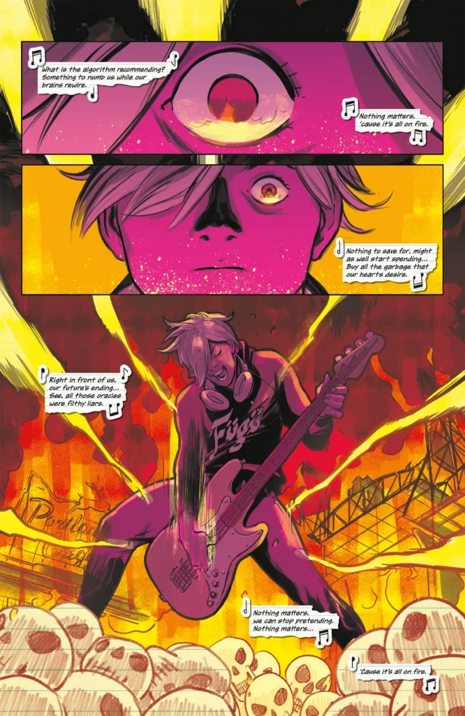
In the beginning, we had Riley playing emotionlessly, looking at the reader while everything was on fire. But it didn’t work. And since I’m an artist, I can see what’s in the script before I draw it, but people that aren’t used to that need to have it drawn. So once Kelly Sue saw what it looked like, she said, “Maybe we should do it different.” We have the chance to do that in the layouts. In the layouts, I also put the spot blacks and some gray work, and then I’ll be in contact with the colorist.
On this page…well, we changed Riley. We had lots of trouble making those skulls in the front because at the beginning, we didn’t clearly know what we wanted for Riley’s art style. One of the hardest things was trying to find a style for a kid that’s 17 years old and likes art, because he has to be proficient enough to do whatever he wants to do with his art but still not mature. And also, he’s a metalhead guy. You have to do lots of work to make it work. And fortunately, it worked, finally.
So, you run the layouts by Kelly Sue and Daniel Chabon before finalizing the pages?
López: We have video meetings where we revise it. Everybody checks it and everybody has their say. There are panels that have changed four or five times because…mostly Kelly Sue. (laughs) She has a clear idea of what she wants in the expressions of the mother. Like, “No, she’s more worried about the kid, but she’s angry.” So, you have to work things out.
I’ve been working in American comics since 2000. And for me, having the chance to do stuff real-time, like, “Hey, look at this. I have changed this,” and “No, I want something more,” and then you just get something live, and the writer and the editor are at the other end of the line and they see it…it’s super helpful. It’s like they were here. It’s great. People didn’t have even email back in the day. (David laughs)
Do you do your thumbnails in the scripts as you go through it?
López: Yeah.
And you do your layouts in Clip Studio. When you’re doing the layouts, are you doing those at a larger size but still rough, just kind of laying out the shapes? Or are you pretty in-depth?
López: No, I am a fast artist. Also, the styling here is very blocky. Cartoonish, if you want. So, I can do it quite fast. It’s very organic. But I must say that I use a very close zoom. The document is the same size, but I look at it very small. If you can make a page work in small size, then you can make it work big.
You mentioned considering lettering placement when you are working on this page. One thing I think is interesting about this page are the colors. There’s the speckled paint in the first two panels, but it’s also just an explosively colorful page. I know Cris Peter did the colors, but do you consider color as you’re going through the pages yourself in the same way that you do lettering?
López: No, because I am bad at color.
(laughs) Sure.
López: That’s one of my weaknesses as an artist, and one of those things that you feel that you have to work more on. I know the vibe that I want to put on the page, but I do not know how to do it. Also, this book is a nightmare for Cris because the sky is red all the time which makes everything red, So, you have a limited color palette to play with. It’s been hard because you run out of color palettes after a few pages, Like, “I can do the sky from purple to orange, but nothing more.” You have to do magic tricks to make it work, and she’s doing it.
What we do is more or less the same as what I do with the writer and the editor. Cris and I check the pages. I tell her the story, like, “I want an accent in here. This part is important. This is going to be important later. I have laid out this to be like this.” But I do not tell her, “Make this yellow, make this pink, make this whatever.” I told her at the beginning that I wanted the colors to be very saturated, and she’s doing very well with that. She also likes that, and I’m quite happy.
But it’s always been that the first time I see the colors, whoever is coloring me, I hate them. It’s always like that. So, I check the colors, close them up, and look again a couple of days later. And then I can appreciate it. I only see the pages in black and white (in my head), so all the possibilities are there. But having to make choices is hard. So, I look at them a couple of days later and I say, “This is looking great.” And the more time that passes after I have seen them for the first time, the more I like them.
I’m looking at this page and thinking, “Cris made it work.”
Not the first day, though. (López laughs)
López: Never. I have worked with lots of great colorists, and with all of them, it’s the same. But they’re professionals. In the American industry, you have the best professionals.
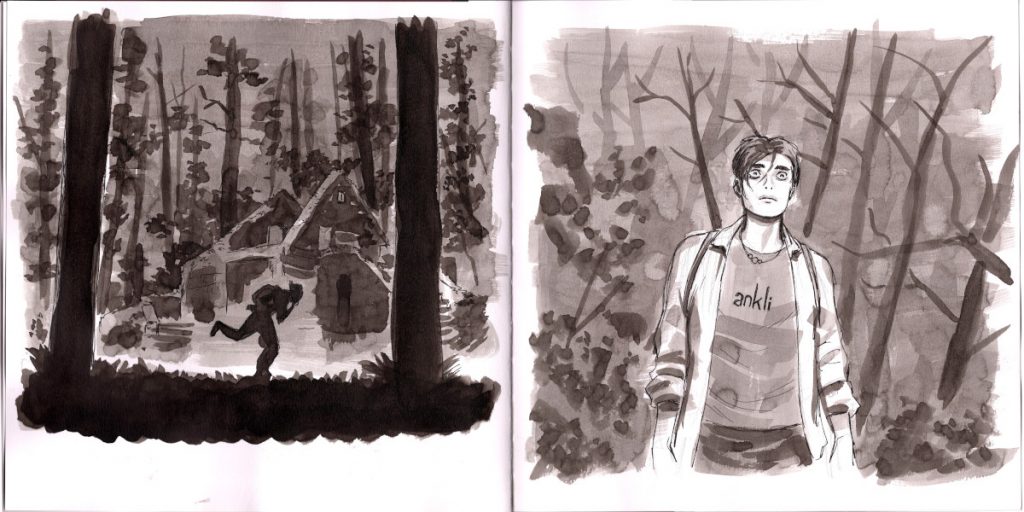
You mentioned Riley’s disposition on this page and how that kind of evolved. He is the first issue’s point-of-view character and the heart of the series from the jump. I know FML went through a lot of development, and you had said that Riley came in in a previous version of this idea. Was this how he always looked? Not this pose, but the hair and structure of him and everything? Or did he evolve as well?
López: He’s always looked more or less the same. But this is where I’m doing all the sketching of this book (López holds up a sketchbook), and this was Riley. If you look at him, he has the hair covering one of the eyes and stuff like that. He’s always been very much like that. He was older, but not that much older, so I gave him a little bit of a mustache. But he changed.
It seems like the only thing that really changed was his hair color.
López: Yeah. In one of the first versions, I said, “Yes, this is mostly it.” But the problem was that the guy inside the body changed. The character has evolved a lot, so I wasn’t happy with it. I was like, “There’s something missing,” until we arrived at the final version of the story and I read the script. And then I said, “Now I know who this character is.” So, the design kind of worked better.
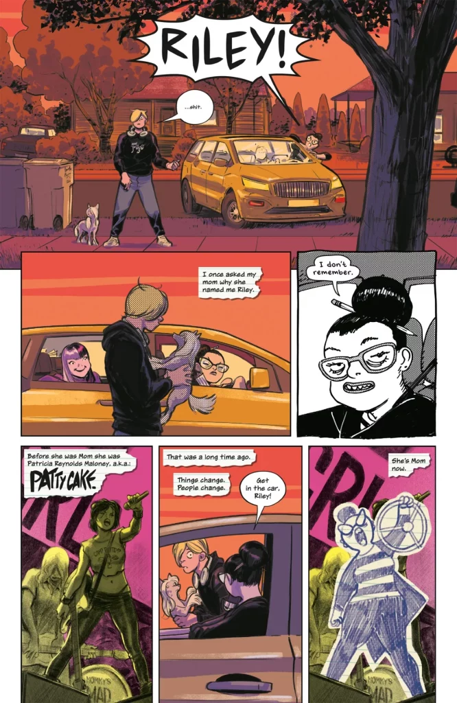
One of the most unique parts about this series are those different styles you talked about earlier. There’s a regular world look, there’s Riley’s notebook art, and there’s Patty’s black and white indie cartoonist style. How did those develop? Did you have a clear vision of what those looks needed to be early on?
López: Absolutely not. In an early version, Mom wasn’t a cartoonist. It was like, yeah, she’s creative, but we said, “It would make sense that she was a professional artist.” So, her and Riley would have that much more in common, and that conversation would be possible. And on this page, we also have the mom’s fanzines look. We have mom’s cartoonist style as it is today in panel three, we have in panel four one of Mom’s fanzines, and in panel six, we have Riley’s style. We also have the objective style, which is the one in color.
For her style, I wanted something with crosshatch at the beginning. But after doing some work, it changed. It’s ‘90s American style. You know like Dan Clowes, Charles Burns, or Lynda Barry. More Barry, but also, I need to be able to do my thing. Barry works very much in the physical…you see the paper, the ink, and everything, and that’s far away from what I was looking for. I was aiming for a Sunday comic strip. In my head, Mom is working at the journal or digital or wherever, and she’s doing her daily or weekly strip. So, I wanted that for her. It was quite fast. It didn’t take that much.
What really took a lot of time was Riley’s style. It was hard. And also trying to find a style for Mom’s fanzines, because I wanted it to be photography on photocopy, and that’s very hard to do, technically. But yeah, it worked. Finally.
Did you actually strip out notebook paper for Riley’s sections?
López: Oh, no.
That’d be impressive commitment to the bit.
López: It wouldn’t be that hard. But the result wouldn’t necessarily be that good. At the end of the day, you have to scan that. So you are going back to digital. So I take the texture of a notebook and I put it there and I cut it with the lasso. In these ones, there’s a bit of a cast shadow from the paper, but you can do that easily. I don’t know if in the final version it was, but we made lots of stuff for this. And also, Clayton made the lined paper effect.
I did want to bring up Clayton. One thing I like on this page is how Clayton lettered “Patty Cake” in the fourth panel. You talked about how you talked with Cris and engaged with everyone on the team. Was there any conversation with Clayton about the best way to mesh your styles? Because the thing about that “Patty Cake” is it feels like your energy. Or is that all him just adapting to you?
López: We talk a lot, Kelly Sue and I, about the third voice. When we are talking about things, I will say, “No, this was your idea,” and she will say, “No, it was yours.” We do not know whose ideas are whose.
It’s everybody’s.
López: Yeah. I don’t know whose idea it is, but we all agree. I haven’t had a creative conversation with Clayton, because I am the one who talks with Cris and Kelly Sue is the one who talks with Clayton. Kelly Sue always wants to give final touches to the lettering. Like, “I want to change this word,” or “I want to change this.” Tiny things that only you can see because it’s very much related to your part. And I do that to poor Cris Peters. I say, “You know this one? Can you change that color just a little bit?” (laughs)
I’m so annoying. I’m so sorry, Cris.
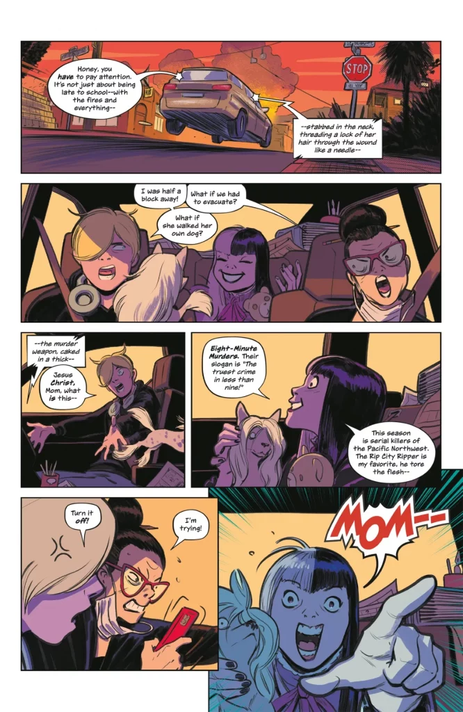
This page is a symphony of amazing faces. (López laughs) This makes sense because your character acting is always on point. Character acting is one thing I love in comic art, and the best who do it well really bring characters to life. You do that really well. What’s your approach to bringing characters to life in a scene like this?
López: We are all cartoonists. We like watching the extras of DVDs to see directors speak about their craft. And I like listening to actors. I have a very actor-like approach to acting. And Kelly Sue gives me the character and she gives me the lines, and I do the acting of the character. So, I have to know who they are inside, how they move, and how they react. That final life you cannot put in a script, that’s what I focus on more. I try to put in all the details.
For instance, in here, you can see that the car is full of mom’s stuff. Kelly Sue said she has a minivan for her family. It’s a very big car for three people. So, I said, “This is the car that she takes to conventions, so she has her prints, she has her comps, she has everything.” And you can see all the details behind Lil that we are not talking about in this scene, but I have talked about with Kelly Sue already. She’s a pro cartoonist. She goes to conventions in her own car and sells things., so her car should be full of that stuff. That is not character acting, but that must be there.
And the characters…Kelly Sue gives them uniqueness and life. I only have to draw that life. I know who they are because they are very solid and they are very humane. Sometimes I think that I go too far, but in other books, when I made X-Men or stuff like that, the editors used to tell me, “Not that cartoony, please.” Here I can do that. Also, I have Kelly Sue to come with me with the details, like, “I have done this. Do you like it?” “Yeah, give me more of that or less of that.”
How do I approach this? I just draw it. It’s not something I do on a conscious level.
It’s very instinctual.
López: Absolutely.
But maybe it’s because the stuff that I like the most is always like that. One of my new obsessions is Guillaume Singelin, a French artist. I’ve always liked his kind of approach. I love the work that Jamie Hewlett did, like in Tank Girl, and this one. He made this one for Dazed & Confused, that magazine. This has always been my inspiration. And I love his black and white work. It’s great.
We were talking about Hirayasumi, Keigo Shinzo’s manga series, before we started recording. You’re not exactly the same as him by any means, but I think one thing that’s interesting about your work and his is, when you look at both of them, maybe that’s not how the emotions look, but it’s how they feel like they look, if that makes sense. You’re conveying the feeling of what that is like.
The fifth panel, the mom getting super mad at her phone…I don’t know if I’ve ever made that exact face, especially while driving through a stop sign at high speeds, but I will say that I’ve felt like that. And it seems like that’s kind of the key to what you do. It’s not about perfectly portraying the emotion. It’s about portraying how that emotion feels, if that makes sense.
López: Oh, thank you. It’s very much like that. I realize that when you are reading a comic book, if the comic is done right, you do not stop to see the art. You see it for a fraction of a second, and you have to get all that and keep on reading. For me, how I read comics, I read everything. It’s reading more than watching. And then after you have read it, you can look at the expressions. But also, you must be able to read a comic without the balloons.
If you take away the balloons, you see a car going fast, the family having an argument, the dog goes away, the kid, she’s a smartass, the mom, she’s looking at the phone while having an argument with the older child, and then the last panel, the kid says, “Hey, look out.” You do not need text for that. So if the writer knows that the artist is going to convey all that emotional stuff, the writer does not need to put that into text. So, the text can be more natural.
Does that make sense?
Yeah.
López: You remember all those Marvel comics from the ’70s? When you read the text, and the image was exactly the same. “Then Magneto took the gem of power and vigorously said, ‘I am the king.’” (David laughs) It doesn’t make sense. There’s a lot of theory lately about the different styles of comic languages. Like…European comics are about world-building. I take you to beautiful places. Superhero comics are about action. I’m going to show you what is happening and you are going to understand it perfectly. And manga is about emotion. I’m going to tell you what the emotions of the characters are. So for that, maybe I’m more of a manga fan. I like the emotion of the characters.
You were talking about how the mom’s convention materials are in the back. When you’re thinking about bringing characters to life, do you think outside of their bodies? As in, how do they affect the world around them?
López: Yeah. I think that there always must be…it does not need to be reality, but it must be plausible. Everything there must be plausible. When I was designing the house (in FML), I asked Kelly Sue, “How wealthy is this family? If they are poor, they are going to live in a small apartment.” So, I need to know about the characters to show that to the reader in subtle ways. Even though we are not talking about that now, I need the reader to know that this woman is a cartoonist and she’s always busy. That’s why she has the pencil in her ponytail.
She always has stuff there because that’s what she does. She’s always busy, so she’s got this dark under the eyes, and her glasses…sometimes she has them here, but those fall and fall and fall. And depending on what I need for the character to do, if she’s very stressed, then the glasses go down, and she’s also trying to have her glasses on.
I want to use everything because I have it there. If I am not using that, I’m leaving stuff on the plate. And I do not want to leave anything on the plate.
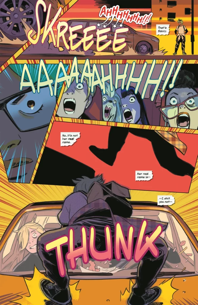
We talked about layouts earlier, but I wanted to talk about them specifically for this page because I love how the first five panels just have these zooms on different things just to show all the reactions and activity over a very short period of time.
The other thing that’s interesting about this is it’s very different from the previous pages. The first one was just three panels stacked downwards, and then the other ones were more traditional grids. But also, I think it’s interesting how the previous page falls into chaos by the end of it and panels are starting to stack on top of each other. What’s your process for laying out a page and an issue? Do you think about layouts in context of the other pages and how they kind of build into each other?
López: Of course. I think most of my pages I have done are superhero books, even though they are not like The Avengers or very superhero-y books. They’ve always been my kind of superheroes. But they are that.
I’ve always felt in those that if they are always on high energy. But if you are always on high energy, you are never on high energy. You need to change the pace. And as artists, we tend to make that mistake a lot, like, “Wow, I am drawing the X-Men. I want to show them looking cool and always in action.” No. You have to save that moment for once or twice in a book, so when you do it, you win that page. You have to work with that energy.
So, it’s something that I did in here. I tried to have a flat energy in the layout. Inside the panels, everything goes to its space, but the shape of the panels also influences. So, like you said, it was horizontal, horizontal, then speed vertical, and then we come here, where, since lots of things are happening at the same moment, I am using 1, 2, 3, 4, 5 panels to show, one car stop-in and one girl jump-in. But that’s action, and I want to convey emotion here. For emotion, it works better in details. The detail of the wheel stopping, then I need to give you something, Like, I use the sound effects. It’s got four tails, the balloon of “AHHH!” That means that the dog is also screaming.
Also, we had the inner dialogue of Riley, and we have that horizontal line we make with the SFX that takes us up, and then we have a tiny Savvy. And then after that tiny Savvy, we can go to the next row, and then we have the eye, and we see that she’s such a badass because she’s cool. She’s not scared. She’s angry. And then we go back inside and we see the reaction of the people that are inside, where panels 1, 3, 4, and 5, you can take them away and you still understand what’s happening, but you don’t understand the rhythm or the emotion.
Then we go inside and we see then that they are screaming. And we see mom. Her glasses have moved because she’s a mess. And then we go to a silent, calm moment of Savvy jumping on the car, and that stops. And then, *thunk*, we see that she’s not hurt and she’s super badass. And now that I see that, I say, “Wow, yeah, this looks awesome,” but I don’t know what my mental process was to get to that. (laughs)
You talked about this a bit already, but the previous page, it’s a horizontal panel, then horizontal, then it’s split horizontally into two vertical panels, and then the next row of them, the panels are on top of each other a little bit. It’s building, building, building into this. It seems like the answer is yes based on what you just said, but do you think a lot about pacing and energy when you’re laying out an issue like this? And how you control those rhythms?
López: I don’t think about it at that moment. I think about it…
As you’re laying it out?
López: Not when I am laying it out. But working in comics, you only have so much time to think about stuff while you are working. I tend to reflect about stuff when I am not doing it. So, when I come to the moment of doing it, I do it unconsciously. That’s how unconscious thinking works, and I think that that’s what works for me. I have thought, “What I think should be done is this.” And then when I get to the situation, I don’t think. I just have it. Also, making comics is an art. And in art, you train a lot to not think when you are doing the things.
You do your problem solving upfront with the thumbnails and layouts, so then when you’re doing it, you’re just doing it.
López: Yeah…but this is not conscious thinking. This is unconscious thinking. To get to that unconscious thinking, you need to read a lot of comics and to analyze, “What did this guy make? What is Hirayasumi? What is this guy doing? How do his tricks work?” So when you have to do a scene, you can think of, “I like it. I want to give this the vibe of Hirayasumi.” I don’t know how that magic works, but I know that I am not conscious when I am problem solving.
I have great conversations with Marcos Martín. When I was doing Blackhand & Ironhead, I had a script tutor. David Muñoz. He’s the writer of The Devil’s Backbone, (Guillermo) Del Toro’s movie. He helped me with the script, and I learned a lot. And I was like, “Wow, once I have fixed the script, then I can do the art, which is something I know how to do.”
And then Marcos told me, “If you want, I can help you with the narrative.” And I was like, “Yeah, I’m going to show it to you, but you are not going to teach me anything. (laughs) I’ve been doing this for 15 years.” And man, those were sessions. (laughs) (Marcos) would be like, “You know, this thing you are doing, it’s all right. You can understand it. But what if…” And I learned a lot doing that book because I had the chance to talk things through with Marcos Martín.
This craft…you learn a lot by talking with friends and understanding how people make their stuff and what their philosophies are. This is why it’s so important to read books about people doing stuff, reading interviews and articles about, how does Kelly Sue write? And you learn by knowing how other people do their work.
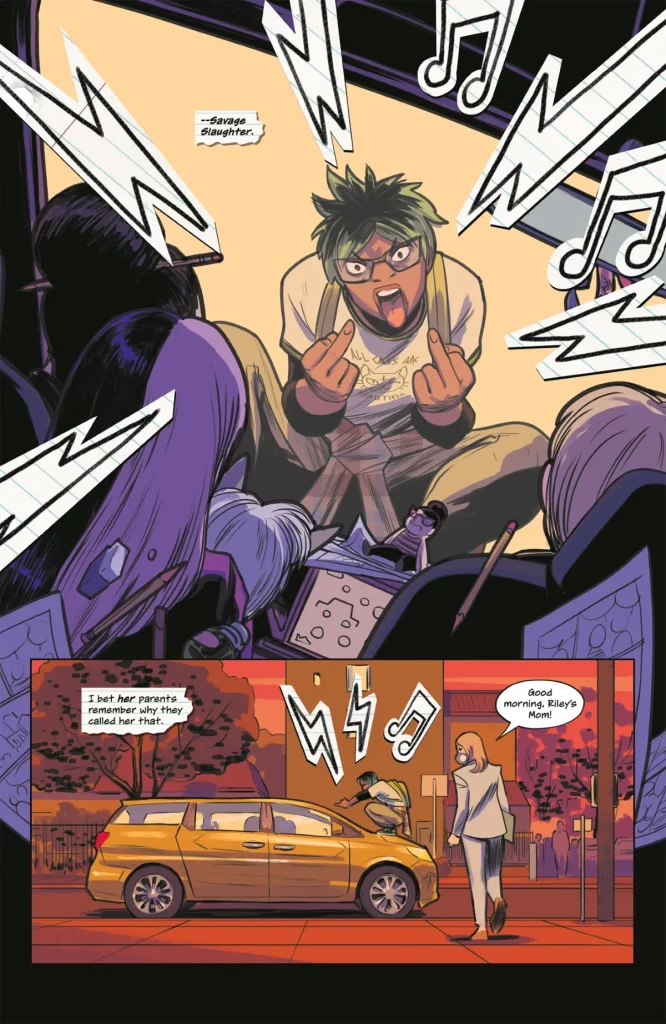
This is the last page. This introduces Savvy, aka Savage Slaughter, and this gives me a chance to bring up the look of the rest of the cast. We talked about Riley earlier and the development of him. What was the development of the design of the cast outside of Riley? Obviously, you and Kelly Sue talked a lot about the different characters, and they evolved a lot over the years. Did you have a clear vision early on about who these other characters were?
López: I remember I read the script, and I sent sketches for Glory (Holgate, another main part of the ensemble), for Savvy, for Lil (the little sister in the back seat of the car), for the mother. For all of them, the first sketch I sent was already final, because if you understand who they are and you understand what world they are moving in, why each character is there like that…I don’t know if you have read Kelly Sue’s scripts.
I have not.
López: Everything is there. It’s not like one of those Greg Rucka scripts, which are paragraphs and paragraphs of stuff. It’s more concise. But she gives you everything that you need. And also, we already had talked about what we wanted to do with the book. So once the characters were there, I was like, “We need one who is very energetic, and she’s also quite dumb if you think about it like that. She’s also the guitarist and singer of the band.” You know what you need of the character, and you know the world she’s moving in. Then it’s super easy. I made Savvy and Glory like that.
Also, Mom and Lil, they were already there from the previous version of the book, and they were very much like that. Also, Mom looks very much like a friend of mine. In the ’90s, she was in the rave scene in France and she’s…You know those punk people that are like, “Now I’ve been living in Italy for six months and then went to Switzerland and then went for one year to live in India?” (David laughs) And then they grow up and they settle? And I said, “Wow, that’s exactly the energy I need for Mom,” because that’s her background. She was a punk rocker that now she’s a mom. And I tend to take the energies from people in real life and put them into characters.
Savvy…she’s very similar to this friend of mine. For instance, her hair, at a certain point, she dyed it green, but she hasn’t done it in a while so the roots are black again. And also, you don’t see anything here, but her glasses are broken, and her backpack is a mess. She’s a mess, physically. All the characters…Kelly Sue and I have talked about them a lot, and we know what we want out of them. So, it’s very easy. I only have to draw it.
I remember I drew one issue of Gotham City Sirens with scripts by Paul Dini, and it was an experience. Like, “Wow, I do not need to make layouts of this.” Everything is in the script. He tells you all that you need. Not all scripts are for the same artists, but Kelly Sue writes perfectly for me. She knows me, she knows what I need, she knows how I like to have the information. And there are different languages, and it takes you some time to understand how a writer writes scripts. Like, “Oh yeah, now I see what he or she is doing.” And Kelly Sue is crystal clear with character building.
I just needed to draw. It was very easy.
Most artists are probably not keen on admitting they play favorites, but I have to ask…Glory Holgate, the witch-like character from the series that is not on this page. Does she speak to you in particular?
López: I know all of them. What I know about her…she steals scenes.
Oh yeah.
López: She’s very graphic. And I remember that one of the few things that was in the description of the character, because we talk about the character and then there’s the written paragraphs or whatever where she tells me, “Well, she’s Glory Holgate and she’s a witch.” And I said, “Well, she’s a witch.” And I drew a witch, just like that. She’s a punk rock witch. I only had to make some patches for the jacket and that’s it. Because she’s a witch with a pointy nose. And at a certain moment, I said, “Well, let’s give her pointy teeth.” And sometimes she has pointy teeth and cat eyes…because she’s a witch. (laughs)
She’s all angles.
López: Yeah. She’s very much like that. And this girl, she’s a punk rock 17-year-old girl with a complicated background. That’s it. She also has one T-shirt with, “All cats are beautiful.”
ACAB.
López: That’s it. The point is, I’m not saying that I’m super smart. I’m saying that if everybody in a book has time and confidence to talk to each other and explain clearly what they want because they have an idea of what they want, things are super easy.
I want to talk about the styles again to close. This page shows how the different styles you use will interact with each other because it’s not just Savvy showing up. It’s Savvy showing up with accents from Riley’s art style. What’s your approach to merging those different styles like you did here? Because that’s something that shows up as a recurring thing. It’s not just that something will be drawn in the mom’s style, it’s that these worlds will crash together. What was your process for that?
López: The process goes back to…I was doing some Blackhand & Ironhead stuff, and I had a really big problem trying to make the bad character. I knew the character, but it wasn’t working. And I talked to David Lafuente…you know who he is?
Yeah. He’s awesome.
López: He’s my friend. I was like, “It’s not working.” I had pages and pages of the character. And he said, “Well, this is super easy. You should make a G out of the mustache and put a crown on him and a cape like he was a king.” And inside of me, I was like, “You cannot do that. It’s forbidden. People don’t dress like that in real life.” (David laughs) And he told me that there are no rules. You can do whatever you want as long as you are consistent. And everything in the world of FML is consistent with…there are no rules. We’re selling one emotion. “Fuck my life.”
And there are things happening which are horrible, and we are laughing at them to try to…It’s the whole philosophy of the (story). The world is a horrible place sometimes, and lately, it’s more horrible than ever. But you have to live with that. We’re putting lots of stuff in there, and I think we are doing it. Just do it. It’s like the Nike commercial. (laughs) In here, you can do it. The comic book police has not come to tell me, “No, you’re arrested. You cannot do that.” (laughs)

