
“That is How We Bring Out the Best in Our Work”: Gurihiru on Art, Collaboration, and Unico: Awakening
I love Gurihiru’s art.
This might not be a surprise to you if you read my Creators of 2021 feature for The SKTCHD AWRDS — or if you’ve read their comics yourself — but it’s true. This Japanese art team comprised of Chifuyu Sasaki and Naoko Kawano brings the best out of both of artists, crafting some of my favorite and the most charming art in comics. It’s an electric pairing, with lively character acting, potent storytelling, and exceptional colors omnipresent in their work. They’ve been making phenomenal art together for nearly two decades, particularly at Marvel, and they just keep getting better and better. Recent efforts like the Eisner Award-winning Superman Smashes the Klan with Gene Luen Yang and Thor & Loki: Double Trouble with Mariko Tamaki found the pair continuing to level up, even if they were already amongst the very best.
While every Gurihiru project is a treasure, their next one is a particular thrill. It’s the currently being Kickstarted Unico: Awakening, a reimagining of a classic Osamu Tezuka (you know, the creator of Astro Boy, amongst other things) story with Gurihiru on art and writer Samuel Sattin collaborating with the team. As noted on the book’s Kickstarter, it’s an effort to reinvent “Tezuka’s beloved character for a new generation of readers.” With Gurihiru onboard, it has a fair chance at doing that, as well as being its best self with that duo bringing it to life.
I was recently pitched on promoting the book in time for the Kickstarter’s launch, and after seeing Gurihiru attached, I quickly countered with an interview with the duo. As a big fan of their work and a believer in shooting your shot, I had to try. And the good news is, we recently made it happen, as I talked with the team about loving Spawn, getting into the Western comics industry, how they work together, tackling a Tezuka creation, and more, before breaking down several pages from this upcoming comic with them to get insight into how they work. The pair answered the questions via email as one, and as an exciting wrinkle, this interview is available both in English and Japanese, with the latter coming directly after the English language version at the bottom. 1
You can find that conversation below. It’s open to non-subscribers.
From what I understand, the first American comic you ever saw was Spawn, something you said had “a big impact” on you in a previous interview. That was not a comic I would have expected for you! What impact did it have on you as artists?
Gurihiru: Spawn was the very first American comic that we saw at a bookstore (Spawn was translated into Japanese and sold well at book stores in Japan for years). It had a dynamic composition and panel layouts that we never saw in Japanese manga. We were blown away, and it influenced us a lot. That influence was not the dark art style, but the ways in which the art was laid out. Also, a full-color, larger sized book was a fresh surprise. And after we knew that it had been drawn with a computer, it gave us the motivation to buy a computer ourselves for drawing.
You made it into American comics after an editor at a Japanese publisher encouraged you to send your portfolio to Marvel, which led to an eight-page Fantastic Four story, an effort that was incredibly the first time you ever drew a comic. I know you both went to art school, but how much of the work of drawing comics did you learn on the job?
Gurihiru: We both went to art school, but what we studied there was centered around packaging design for merchandise and environmental design. But as a hobby, we drew anime and manga fanart and sent it to magazines. We also read a lot of Disney art books. And so from our hobby drawing comics, we learned what we weren’t taught in school. Also, when we tried drawing comics for the first time, we received advice from an editor at Marvel. That advice became fundamental for how we approach comics, and we developed our style from each new project we took on.
I’m interested in how you work together. Do you have a set process for how you work? Or is it fluid, with you switching roles depending on – or even during – the project?
Gurihiru: We basically do not switch roles. Sasaki works on pencils and inks and Kawano works on colors. But on every step of our work, we suggest ideas and share our thoughts. Our strong point in working together is that we can see each other’s work from an objective viewpoint.
You’ve been working together for a while now. You’ve found a lot of success. How do you feel you two, together, bring the best out in each other’s work?
Gurihiru: When we work, we express our thoughts verbally, and when we find the best solution, we praise each other. I think that is how we bring out the best in our work. We never think really think about this when we’re doing it, but we naturally recognize each other’s contributions and always work in a relaxed environment. Of course we argue sometimes and if there is something that we cannot agree on, we talk until we do.
When we do a deep read of a script together, we talk about the reasons why a certain character made a choice or action/behavior. By doing this, the character design becomes a much deeper process, so these conversations are very helpful.
Let’s talk about your currently being Kickstarted project, Unico: Awakening, a 162-page manga that reinvents Osamu Tezuka’s character. Tezuka is obviously a name that comes with a lot of history behind it. What was the appeal of this project, and does taking on a Tezuka character come with any pressure at all on you as artists?
Gurihiru: We were surrounded by and read many Tezuka works when we were children, and they influenced us. We initially felt nervous to work on a Tezuka-sensei creation that we respect so much, so we actually turned down the offer to work on Unico the first time. The reason we decided to work on this is because we were told that we do not need to be constrained by the original work’s style, and we could create freely, using our own style. We also thought that the character of Unico complements our art style.

I wanted to start with this page, specifically the panel of Unico chasing the butterfly. One of the things I enjoy the most about your art is there’s often a joyousness to it, between the colors and the characters. Why is that something that recurs in your work, and what’s the key to bringing that feeling out in your art?
Gurihiru: That is a difficult question. This may not answer it, but we ourselves are not particularly joyous, and we like watching horror movies and other dark and scary stories. But oddly, the things we make do not have venom, and many of our readers say that our work is vibrant and cute. I guess that is one of our strengths, but also one of our weaknesses. We honestly do not know why our art turns out like this. Maybe it’s because we adore joyous and bright things and we want our colors and characters to reflect that joy.
You two are incredible at character acting, as your characters often feel alive in a rare way. What’s the key to bringing characters to life for you, whether it’s a tiny unicorn, a goddess, a mortal, or whomever?
Gurihiru: Influenced by Disney animators, we used to watch people a lot. Whenever I am at a café or on a train, I sketch people; even when I don’t have a pencil and paper, I have a habit of sketching people in my mind. Even from a casual standing pose, you can pick up on a person’s characteristics, so when we draw comics, we heavily weigh in on character acting. Years ago, I used to work for a public stage company, on lights and props, so I may have been influenced by the acting techniques from the actors I observed there.
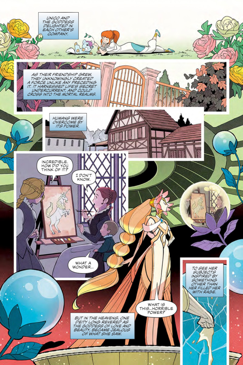
This page features a look into the land of the mortals, in which the colors are a bit muted compared to the land of the gods. When it comes to your colors for a story that takes place in a range of settings and times seemingly, how important is it to visually distinguish each of those?
Gurihiru: Compared to black and white comics, a full color comic has much more information to manage. Choosing the color shade for the page is a very important factor in making the comic easy to read. One of the good things about full color comics is that you can influence a reader’s sense of time, place and emotion.
This page brings two wildly different sets of characters to the page, with mortals from what looks like the 1800s maybe, and the Goddess of Love and Beauty. When it comes to designing characters, what’s your guide? Is it just about understanding the character, or is it more about achieving a feeling in the look?
Gurihiru: If a character is important character to the central story, we try to come up with character silhouette that will be striking and stand out. In the original story, Venus was drawn as beautiful woman with mythical touch, but the concept of “beauty” varies depending on every person. So we thought we should not have beauty equate with appearance in our Unico. Instead, we made Venus’s silhouette differ from a human’s, so that readers can differentiate between mortals and immortals with at a glance.
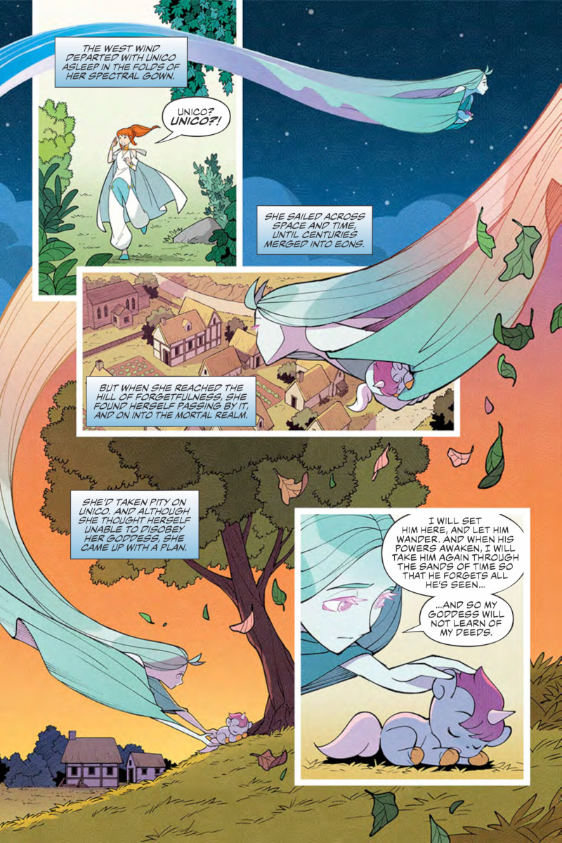
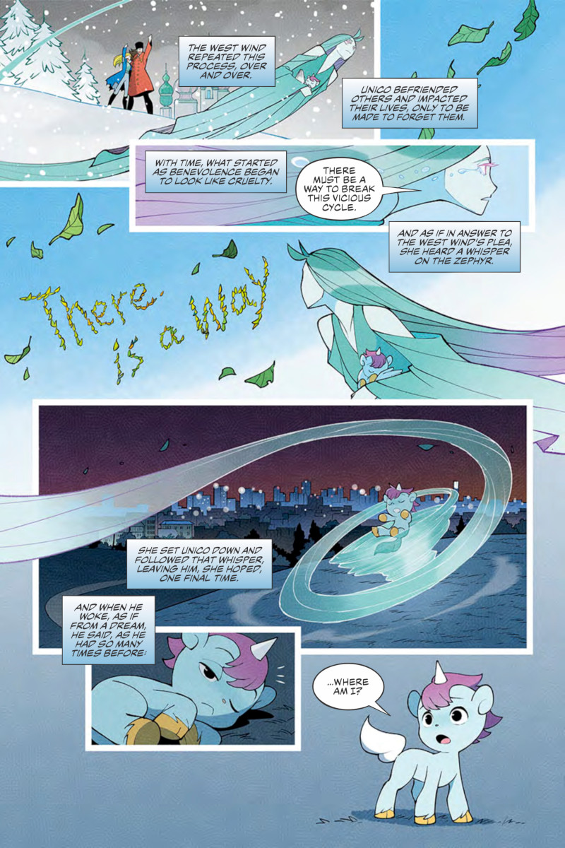
I love this page, with the West Wind almost having free rein to travel the world and the panels as she wants, coming in and out of page that almost acts as a guide to the reader’s eye. What’s your approach to laying out a page? Do you two discuss storytelling elements like page design, or is that something you have a good process for at this point?
Gurihiru: When we draw a comic, we always think about guiding the eye. Here, by making sure the West Wind’s character doesn’t get cut in the middle, we use her to guide the eyes of the reader, and also enforce panel borders. In these prologue pages, the story centers the narration, so we did not use simple panel structures. We wanted to increase the drama, so we drew backgrounds on all the pages to make them resemble a picture book. Sasaki always comes up with the layouts for our comics, and Kawano checks the layouts to see if they are constrained.
You’ve largely worked on all-ages comics, if not entirely. It makes sense, as there’s often a gentleness to your work, even on stories like Superman Smashes the Klan that can be a bit more intense. Is that something you prefer, or is that more a product of what you’re offered?
Gurihiru: We do like working on serious stories and comics with action sequences. We think that if we draw those with our art style, we can make something unseen elsewhere. And one of the comics that was received well this way was Superman Smashes the Klan. But maybe because our art style is specific, we do get many offers for fun and cheerful stories.
Let’s talk about Unico himself. Your version looks like Tezuka’s, except with longer hair and maybe a bit more slender and horse like overall. What made this the right way to update the character?
Gurihiru: We wanted to make our Unico distinct to us and our style, as opposed to directly adapting the original. Tezuka’s Unico sometimes resembles a girl, so we wanted our Unico to be more epicene. But we also did not want to completely change the silhouette and the colors, so we boldened the mane and emphasized the character’s horse element. We do not know if this was the right decision, but we have always respected the sense of charm in Tezuka’s Unico, and hope that we were able to evolve the design for readers encountering it for the first time.
Also, we’re not the only ones. Many other artists have drawn Unico in their own way for our Kickstarter campaign, and we hope everyone enjoys the other Unicos as well.
How much freedom were you given to bring Unico and the rest of the characters that originated in Tezuka’s original to life? Were you largely able to have your own spin on this world, or were there particular guidelines to follow?
Gurihiru: We did not have many limitations. Tezuka Productions has allowed us the ability to work freely. But when we design characters, we respect what our writer Sam has in mind, and build that into the design. For example, the Night Wind’s gender was described as non-binary, so this is how we designed the character.
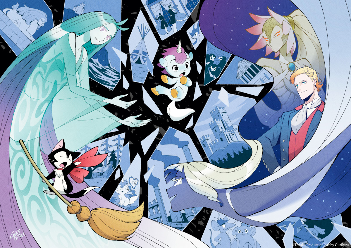
I love this promotional image, as it gives us a tease of crucial elements of the story, from the times and locations of the story to the characters we’ll come to know and love, I’m sure. These types of images are important, but also much different than your typical interior pages. Do you approach this type of thing in the same way as you do your pages? Or do you need to think of it differently because it’s trying to do something else.
Gurihiru: Since this is an illustration, we took a different approach from a comic book page. We composed it so that people would gain an idea of the story and the characters by looking at just one piece of art. The images that are drawn in the shattered shards of glass are the places and people Unico encountered in the original manga. By depicting these images in an unsettling, broken way, we provide insight into his future adventures.
Lastly, your Katy the Kitty Witch in the lower left corner is the absolute best. Compared to the original, this form is far more cat like, and I love it because of that. You’re extremely good at drawing cats, even beyond this. What’s the key to bringing that character to life in such a magical wa
Gurihiru: I love drawing animals, and I’ve loved manga with animal charcters ever since I was a kid. I specifically loved Osamu Tezuka’s manga “Vampires (バンパイヤ)” and doodled a lot, imitating his drawings like crazy. When I draw animals, there is a lot of influence from Tezuka-sensei. And the reason Katy (Chloe in Unico: Awakening) is drawn as she is, has a lot to do with us having cat. I think many elements are taken from that.
Japanese Translation
Q.あるインタビューで、はじめてみたアメリカのコミックスがスポーンで、”大きな衝撃を受けた”と答えています。あなたたちから名前が出るとは思いもしなかった作品名です! アーティストとして、どのような衝撃/影響を受けたのでしょうか?
A.スポーンは私たちが初めて手に取ったアメリカのコミックです。当時読んでいた日本の漫画では見たことのないダイナミックな構図やコマ割りに非常に感動し、とても影響を受けました。ダークな絵柄に影響を受けたわけではく、絵の魅せ方を学びました。大判のフルカラーというのも新鮮な驚きがあり、これらがパソコンで描かれてると知ってから絵を描くためのPCを買うきっかけにもなりました。
Q.日本の出版社の編集者がマーベルへポートフォリオを送ることを勧めたのがきっかけでアメリカのコミックスの仕事を受けるようになったと聴いています。そこから8ページのファンタスティック・フォーのストーリーを担当することになりましたが、そのコミックがはじめ描いたコミックだそうで驚いています。おふたりとも美術系の学校へ行かれたそうですが、そこからコミックを描くことに関連するような学びはあったのでしょうか?
A.二人とも美術系の学校でしたが、そこでは商品のパッケージや環境デザインに関することを学んでいました。ただ趣味でアニメや漫画のファンアートは描いて雑誌に投稿をしたり、ディズニーのアートブックをたくさん読んだりしていました。なので学校ではなく趣味でやっていたことがコミックを描くことへの学びの場になっていた気がします。それと初めてコミックを描くという挑戦をした時マーベルの編集からアドバイスをいくつも貰いました。そのアドバイスが今でもコミックを描く時の基礎になっていますし、仕事をしながら経験を積んで自分達のコミックスタイルを作り上げた感じです。
Q.どのようにおふたりは仕事をされているのかとても興味があります。仕事をする際に決まったプロセスはあるのでしょうか?それとも、企画によって流動的で、その作品によって役割をかえたり、作品の作業中でも途中で役割をかえたりするのでしょうか?
A.基本的には役割は変えません。佐々木がペンシル・とインクで、河野がカラーです。
ただ、どの作業段階でもお互いの意見を言い合って作品を作り上げています。お互いの作業を客観的に見れることが二人でやっていることの強みだと感じています。
Q.もう一緒に仕事をされて長いと思います。成功も納めてきました。おふたりが一緒に仕事をしていて、どのようにお互いの長所を引き出せていると思いますか?
A.作業の中でお互いの考えを言語化し伝え合い、最適な答えを見つけた時に褒め合うことでしょうか。長所を引き出そうと考えたことはありませんが、お互いのことを認め合い、常にリラックスした環境の中で仕事をしています。もちろん言い合いもしますし、譲れない点についてはとことん話し合います。
よく二人で脚本を読み解く時に、何故このキャラクターはこの行動をしたのかをお互いに話し合ったりしてキャラクター性を深められるのも非常に役に立っています。
Q.キックスターターのプロジェクト、手塚治虫のキャラクターを新たに描くこの162ページのマンガ「ユニコ:目覚めのおはなし」についてお聞かせください。
手塚先生はこれまで長くに渡りに多くのことを築き上げてきました。
どのような点がおふたりにとってこの企画が魅力的なものだと感じられたのでしょうか?
またアーティストして、手塚先生のキャラクターを描くということにプレッシャーなどはありますか?
A.子供の頃から多くの手塚作品に触れ、影響も受けてきました。尊敬している手塚先生の作品を自分たちが手がける事にとても抵抗があり、一度はこの企画を引き受けることを断っています。引き受ける事にしたのは、既存のスタイルに捉われず自分たちのスタイルで自由に描いても良いと言われたことと、ユニコというキャラクターが私達の絵柄に親和性があると感じたからです。

Q.このページからお聞きしたいと思います(2ページ)。特にユニコが蝶々を追いかけているこのコマです。あなたのアートで特に私が楽しんでいるところは、 カラーとキャラクターの間に喜びが溢れているところです。どの作品でもその傾向がみられるのはなぜでしょうか、また、あなたたちのアートにその喜びの感覚をもたらすにいたる鍵はなんでしょうか?
A.難しい質問です。答えになっていないかもしれませんが 私達自身はそれほど明るい性格ではなく、ホラー映画や暗く恐い物語を好んで見たりします。ただ不思議なことに自分達が生み出すものには毒がなく、読者からも明るく可愛い作品だとよく言われます。そこが私達の長所であり弱点なのですが、なぜこうなるのか、その鍵は自分達でもわかっていないのが正直なところです。もしかすると明るい雰囲気に憧れのようなものがあり、色合いやキャラクターに明るいものを求めるのかもしれません。
Q.おふたりはキャラクターの演技のつけかた素晴らしいです、あまりみない感じでキャラクターが生き生きとしていることが多いです。あなたたちにとってキャラクターに命を吹き込むときの鍵はなんでしょうか、それが小さなユニコーンだったり、女神だったり、普通の人間だったり、それが誰であったとしても。
A.ディズニーの影響で普段から人の観察をよくしていて、カフェや電車でスケッチしたり、紙やペンがない時は脳内でスケッチしたりする癖がつきました。何気ない立ちポーズでもその人の性格が現れるので、キャラクターの演技はコミックを描く際に特に重要視しています。
以前、照明や大道具として市民劇団に入っていたことがあるのですが、そこで見ていた役者の演技技法からも影響を受けているかもしれません。

Q.このページは人間の世界を覗き込んでいます(ページ3)。神々の世界に比べて色が抑えられています。さまざまな場所や時間を舞台にする場合、ストーリーにカラーをつけるにあたり、視覚的に明確にそれぞれわけることがどのぐらい重要になりますでしょうか?
A.フルカラーコミックは白黒コミックに比べ情報量が多いです。ページの中で色合いを決めることは読みやすくするための非常に重要な手引きだと思っています。色によって時間や場所、感情を読者に伝えられるのがカラーコミックの良さのひとつですね。
Q.このページでは、大きく違うキャラクターたちが登場します(ページ3)。1800年代の一般人に見える人々と、愛と美の女神です。キャラクターをデザインする際、ガイドや方針はありますか? 自分のなかで理解したキャラクター(を描く)ということでしょうか、それとも見た目である種の雰囲気を出すことに注力するのでしょうか?
A.物語に関わる重要なキャラクターの場合、そのシルエットにはこだわりを持って考えます。原作では神話風の美女として描かれていたヴィーナスですが、「美」という概念は人それぞれなので私達のユニコでは見た目で美しさを表現するのはやめようと考えました。それよりも、ひと目で地球人ではないと思わせるシルエットにして一般人との差を明確にしています。
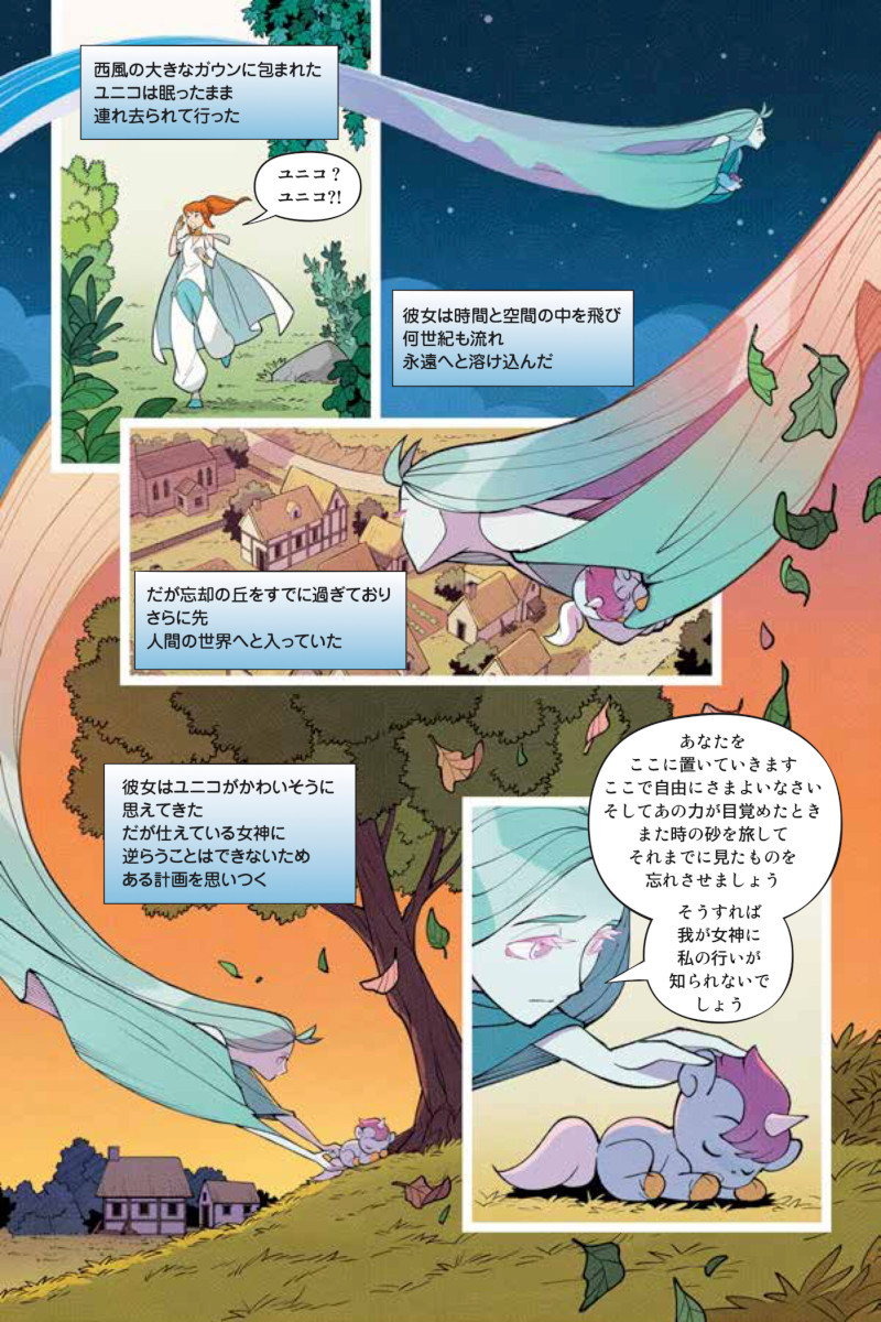
Q. (ページ5)このページがとても好きです。西風がまるで自由に世界中を旅していて、コマの間も自由に動き、どこへでもページのなかで好きに移動していますが、まるで読者の視線を誘導するガイドのようにもなっています。ページのレイアウトをする際、どのようなアプローチをしていますか? おふたりでストーリーテリングの要素について話合うのでしょうか、たとえばページのデザインについて、もしくは、すでに語るうえでの良い過程をお持ちなのでしょうか?
A.コミックを描くときは目線の誘導は常に考えています。今回は西風の体が途切れないというキャラクター性を活かして、目線誘導の他にもコマ割りの役目も果たたすようにしています。このプロローグのコミックはナレーションを主軸に進んでいくので、シンプルにコマ割りされたものにせず、ドラマチックに魅せたいと考え、全ページに背景を入れ絵本風にしました。コミックのレイアウトはいつも佐々木が考えて、その後不自然なところがないか河野が確認してます。
Q.おふたりの作品の多くは全年齢向けの作品だと思います、ほとんどがそうだと言ってもよいかもしれません。おふたりの作品には優しさがあるので、それも理解できます、それが例えもう少し激しい”Superman Smashes the Klan”のような作品の中でも感じます。そのような作品を好んで描かれているのでしょうか、それともオファーを受けた結果なのでしょうか?
A. シリアスな内容やアクション展開のあるコミックを描くのは嫌いじゃないです。それらを私たちの絵柄で描く事によって他にはないものが生み出されると思っていて、それがうまく噛み合ったのがSuperman Smashes the Klanだと思います。ただ、私達のスタイルが明確なのか、明るく楽しい作品のオファーが来ることが多いのは確かです。
Q.ユニコ自身についてお聞かせください。あなたの描いたユニコは手塚先生のユニコに似ていますが、より長い髪で、もしかしたらもう少しスレンダーで、全体的に馬っぽいと思います。このキャラクターをアップデート/現代向けにするあたり、これが正解だと思った点はなんでしょうか?
A.原作には捉われず私達なりのユニコにしたいという思いはありました。手塚ユニコは一見女の子にも見えることがあるので、より中性的にしたいと考えました。ただ大きく変えるのではなくシルエットや色合いは変えずに、立髪を目立たせより馬の要素を強くしてみました。これが正解という自信はありませんが手塚ユニコの持つ魅力をリスペクトしつつ、まだユニコを知らない読者にも親しみやすいデザインに進化させられたかなと思っています。
今回は私たちに限らず多くのアーティストがそれぞれのユニコ像を描いているので、そこも楽しんでいただけると嬉しいです。
Q.手塚のオリジナル・キャラクターに新たな命を吹き込むにあたり、どれほどの自由があったのでしょうか? この世界をご自身で自由にすることができたのでしょうか、それとも従うべき具体的なガイドラインがあったのでしょうか?
A.特にこれといった制約はありませんでした。手塚プロからも自由に描いてほしいと言われています。ただ、キャラクターデザインの時にはライターのサムさんが持つキャラクターのイメージを尊重して描くように心がけています。たとえば、夜風はノンバイナリージェンダーのようにという指示があったのでそれに沿うようにデザインしました。
Q.このプロモーション用のイラストがとても好きです(最初に公開したイメージ・イラスト)。これからの物語に起こる時間や場所や、これから知って好きになるキャラクター達など、この物語の重要な要素を示唆しているからだと思います。このようなイラストは重要ですが、普段のコミックの中のページとはとても違います。このようなイメージ・イラストを描くときと、普段のページは、同じようなアプローチで描かれるのでしょうか? それとも、(普段のページとは)違うことをしているので、別の考え方をしてアプローチするのでしょうか?
A.イメージイラストなので、コミックとは違うアプローチをしています。一枚で物語やキャラクターの持つ個性などを多くの人にわかってもらうよに構成を考えました。ガラスに写っているのは原作でユニコが旅した場所や出会った人々です。不安定なガラスの破片に写す事でこれから待ち受ける冒険を示しています。
Q.最後に、イメージの左下にある猫の魔法使いのケイティ(チャオ/クロエの英語名)が最高です。原作に比べて、この姿はより猫っぽいです、だから私はとても好きになりました。あなたたちは猫を描くのがとても上手です、ここにあるもの以上に。このようなキャラクターを魔法のようにいきいきと描く鍵はなんでしょうか?
A.元々動物を描くことが好きでした。子供の頃から動物が出てくる漫画が大好きで、特に手塚治虫のバンパイヤの模写を狂ったように描いていました。動物の描き方は手塚先生の影響が非常に大きいです。
今回チャオがより猫っぽいのは自分でも猫を飼っているので、その要素が色濃くできているのだと思います。
Shouts to David Hyde and his team at Superfan Promotions for making that (and the whole interview) happen.↩