Jonathan Case Talks the Era and Atmosphere of The New Deal
The phenomenal cartoonist talks his new graphic novel at Dark Horse Comics
As you may have gathered from my review from a couple week’s back, I was a pretty big fan of Jonathan Case’s The New Deal. The recent graphic novel from Dark Horse Comics tells a fun, unexpected story of two Waldorf Astoria employees in the 1930’s who get involved in several mysterious thefts that took place in their hotel, and it’s a very charming read that delivers great characters and phenomenal look at the era. Like I said, I liked this book a whole lot.
Naturally, I had to talk to Case about the book, and over the last couple weeks, we talked about how the book came together, what appeals to him about the era, his art background, how he got into comics, the fashion and look of the 1930’s, and a whole lot more. Case gives some fantastic insight into his work, and as one of the most underrated cartoonists in comics for me, I really enjoyed getting his perspective on his work and art. Enjoy that conversation below.
Oh, and if you haven’t yet, give The New Deal a read. It’s a very enjoyable comic, and one that’s unlike anything else in comics…in a good way.
Let’s start big and broad. What’s your art background? Did go to school for art, and if so, was it specific to sequential art?
JC: I studied acting in college, not sequential art, but I’ve always loved visual art and storytelling. Drawing, sculpture, and performance were big parts of my early years. I just gravitated toward them.
I took a few drawing and illustration classes in college. Color theory, foundation coursework, etc. All of that helped, but I also just spent lots of time off on my own, creating.
When I decided to get into comics after college, I sought out advice and portfolio reviews from professional artists, and that really refined my scattershot approach.
I still like acting, I just act on paper now.
What made you want to work in comics in specific, and as your career has moved along, who and what have been the biggest influences to you developing your artistic voice?
JC: It came about from a personal crisis. I ran my health into the ground trying to do everything well in college. Just after my senior year I was sick in bed for weeks with an infection, and I had to be on antibiotics for 9 months. I figured if I went to New York or LA, I’d just dissolve into a people-pleasing mist. I saw comics as a way to tell the stories I wanted to tell immediately, while staying grounded. That was the hope, anyway! It’s worked out pretty well, but I still have to fight that ambition/please everyone mode.
In terms of influence, I take take it from friends and family and from all kinds of art, mostly stuff I loved as a kid and still do. I can’t rattle off a laundry list of famous names like most cartoonists. I love Bill Watterson and Winsor McCay, but I draw nothing like them. Steve Lieber and Jeff Parker have both been super supportive of my growth as a working cartoonist. I owe them a lot for giving me opportunities and guidance.
You’re both a Portlandian and a Periscopean. It’s a deadly combo. How has working in that environment and in that city helped you become a better artist and storyteller?
JC: I haven’t been into Periscope much lately, having dad duties to juggle with my career, but that group of people gives me so much. It’s hard to know where to start. From learning the business side- everything from how to value my work, how to promote, to tell me when I’m thinking crazy… it’s just easier to develop alongside others who are doing their best work. I owe them a ton.
I have lots of great community in Portland, not just in the art world, but my faith community, my extended family, my neighbors. I feel grounded here, and I have people I love who can challenge me if I’ve spent too much time in my cave, or too much time trying to do everything (still a fatal flaw, probably not going away). I love it.
Let’s talk about The New Deal. It’s a wonderful, original story, and I’m curious how it came together. Was that a time period that always interested you? Beyond that, are more character centric stories more interesting to you as a cartoonist?
JC: I can’t imagine cartooning without characters! I guess there’s political cartoons and the like, but yes, I got into this to tell stories, and without characters, that’s a no go. Maybe you mean the focus on characters vs. fantastic events and epic whathaveyou. I like those too, but maybe my strengths lean toward smaller, intimate stories.
The New Deal came together, at least at first, from my love for Jack Lemmon and Billy Wilder, Alfred Hitchcock and Cary Grant, and maybe some Neil Simon and Tennessee Williams plays, too. I just wanted to do something that felt like a classic New York black and white movie or a Broadway play. The class and racial tension pieces fell into place as I researched the period and followed my interest. It’s more fun to write about the underdog, and there’s few places where the social/economic gaps are larger than luxury hotels.
Every artist works in their own way. Some art all digital. Some are all traditional. Some have a hybrid process of sorts. For The New Deal, what was your process in bringing the book to life – both for the writing and art portions – and what tools did you use to do so?
JC: I try to spend as much time on the script and layout process as the final art. There’s no special process there, just writing and rewriting over a period of months, then adjusting the script to visual format with rough layouts. I get all that done before doing any final artwork.
I used a tablet computer for all my line work so that I could bring in reference easily and concentrate on making the drawings solid, instead of sinking time into drawing the book twice, as you do with traditional pencils and inks. I went from layouts to inks to printouts that I then watercolored and scanned back in so I could keep the project from being all digital. That traditional media grace note served several purposes: one, it was enjoyable to me, two, it gave the work better atmosphere, and three, it helped root the project to the tools that were available in the 1930s, which is always something I consider. If you want to do a project that’s set in a certain period, use tools from that period, right? It felt like a good compromise between technical efficiency and the joy of loose, unpredictable hand-painting.

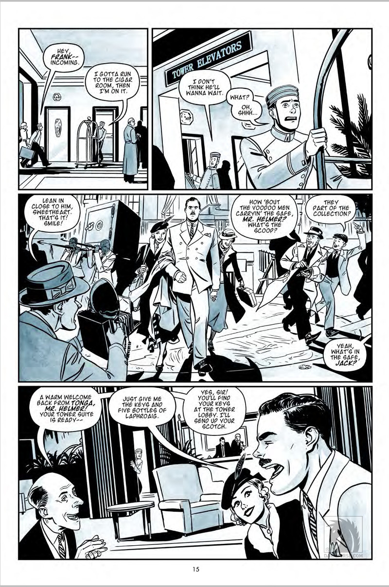
Creating a story is hard enough, but telling one from a time gone by seems like it would add additional difficulties. How much research did you do to make sure the language of characters like Jack Helmer and environments like the Waldorf Astoria were represented in ways that felt reflective of the era?
JC: Quite a bit in terms of environments. There was a lot of reconstruction from old and current photos, but I was never so slavish that I let the environment dictate my story. There’s plenty I chose to modify, and probably more that I missed, but I wanted to have enough visual notes there as a solid foundation.
The language of characters is more intuitive and informed by my love of period plays and movies. I enjoy some stylization when it comes to dialogue, and I try to find natural rhythm. Hopefully it’s not all, “Whaddaya know, whaddaya say, doll?” It’s a balance.

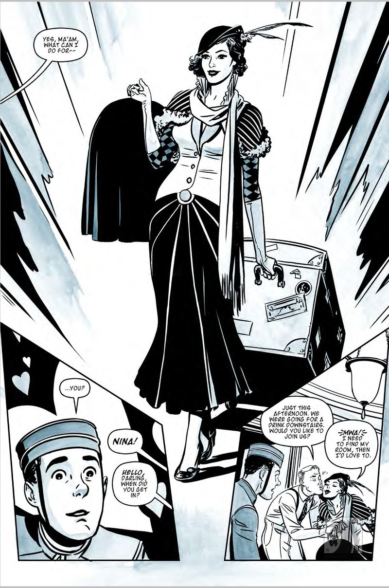
This continues the question above, but I loved this page and how it was both a brilliant introduction to Nina Booth and a great look at how much care you put into the fashion within the book. It seemed like you gave extra attention to put Nina in different outfits and hats throughout. Was getting the style and look of the characters an important thing for you to do? And beyond that, was it fun to dig into the look of these characters?
JC: Oh, yeah, it was lots of fun. I wanted Nina to wear something new for every scene she’s in. I actually got a little criticism for her getups from one journalist who felt her stuff wasn’t a perfect fit for the 30s, but that was intentional. I wanted to have enough pieces reference the period (and a few of her outfits and hats are direct lifts from vintage photos) but give myself freedom to play and push her fashion forward, even in some anachronistic directions. As I see it, anyone who’s really into high fashion doesn’t fit the exact mold of their time. Another balancing act!
In terms of layouts, I liked how this page was set up as primarily a splash but with extra room for reactions to Nina’s first appearance. You said the layout process is a pretty ordinary process for you, but when it comes to laying out a page, what are you focusing on? Is your primary concern clarity, really?
JC: Clarity and flow. The page above is an exception to what I usually do, which is pretty much rectangular panels and a few borderless compositions. When I do an unusual layout like this, I really want it to pop because it looks like none of the other pages in the book. The other thing I think about a lot is something a close friend and collaborator once told me. He said that whenever he saw a crazy layout on a comics page with panels splattered here, there, and everywhere, it just made him think about the artist who drew it, how clever they must have thought they were, and not the story. I pretty much agree. Comics should be easier to read than not, so if the reader’s confused, I failed.

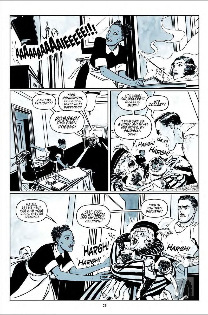
I really enjoyed some of the random humor that makes it into the book, and I found this whole scene funny…but mostly because of the pugs. The combination of the “THIS IS HOW THEY BREATHE!” line with how you depicted them had me laughing. In comics, what do you find to be the key to bringing humor to the page, both through writing and art (and those two elements in conjunction)?
JC: I think to sell ‘funny’, it has to be funny to you, or at least the product of a skillful lie. Pacing and rhythm are important. I think comics humor reads best when there’s a flatness to the illustrations. Get too dynamic and fussy and you dilute the power of the gutter- that magical place between one panel and the next, where readers fill in the gap and anticipate the last beat of your yuk yuk moment. Does that make any sense?
You talked about this briefly already, but I really enjoyed the watercolor washes. As you said, it added a lot to the project. Not to expose myself as a helpless philistine, but how do you decide what gets the wash treatment and what doesn’t? Obviously there are certain things that require that – Theresa’s skin, for one – but it seems you’d use it as adding texture and depth to the background at times, and I was curious as to how you’d feel out that process as you went along.
JC: It’s just from the gut, really. I work too fast at it to have too much to say, but it’s essentially a tool for enhancing foreground/midground/background elements and creating a vignette around focal points. Spotlighting things. Theresa is actually the one tonal element that wasn’t done entirely with wash, but with a local-color digital tone dropped in. I wanted her to look really consistent, and that worked best.

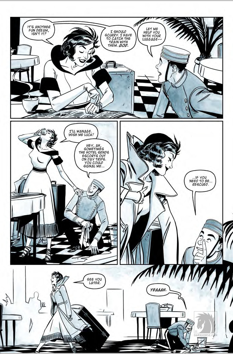
You said you studied acting, but you now act on paper, and that’s evident here. I’m a huge fan of how natural and gestural your characters are, especially with how Frank and Nina use the very era-specific index finger to the side of the nose gesture. Because of your natural affinity for the acting side of art, would you say this is something you pay a bit more attention to when you’re putting a comic together?
JC: I don’t know if I pay more attention to it than other cartoonists, but I do think those nuances are all the fun. I try my best to give every character their own everything. There’s nothing worse than sitting through a book, movie, whatever, where they all talk and act like the most clever version of the writer. Okay, there are a lot of worse things, just not when I’m being told a story.
