“I Find it Fascinating to Have Your Work Live Somewhere New”: Maria Nguyen on the Station Eleven Graphic Novel
Saying I’m a fan of HBO Max’s recent mini-series Station Eleven is to dramatically understate my affinity for it. I eagerly, energetically, enthusiastically enjoyed all ten episodes of the wondrous series created by Patrick Somerville that stars Mackenzie Davis, Himesh Patel, and an astonishing ensemble. Some might have skipped it, if only because it’s a post-apocalyptic story set 20 years after a flu pandemic wiped out the vast majority of humanity. I certainly did not, and couldn’t recommend it more highly, even amidst everything that’s going on
Because for as much weight and sadness it carries within its story, it’s equally hopeful and beautiful, exploring the interconnected nature of life and the healing power of art in a way that’s uplifting rather than depressing. Filled with staggering performances, exemplary filmmaking, and one of the finest scores in recent memory by Dan Romer, it’s the type of show that sticks with you long past its conclusion — in a good way. It’s a must watch, and then, in my experience, a must read. After I finished the show, I quickly devoured Emily St. John Mandel’s similarly excellent novel it was based off of. Basically, I was so impassioned by the show I would engage with anything connected to it.
And I’m apparently not the only one.
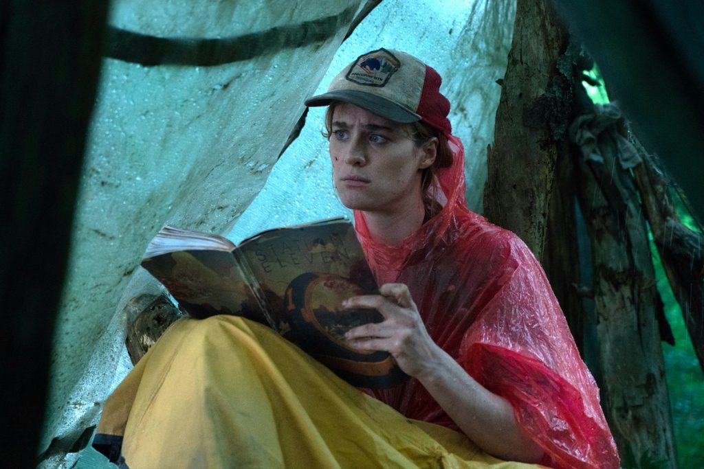
At the heart of the show is a graphic novel, created in-world by a character named Miranda Carroll (played by the exemplary Danielle Deadwyler). Titled Station Eleven, this graphic novel binds key characters together and acts as a crucial through-line in its ten episodes. If you go on Twitter and search through Station Eleven-related keywords, it’s easy to learn that other fans want more from the show as well, including a full release of this graphic novel. They’re practically begging for it, which I get: I want it too!
The tricky thing is, this graphic novel isn’t a completed work. While Somerville did create a full manuscript for it, the artist who worked on this project — the phenomenally talented Toronto-based artist Maria Nguyen — only created pages needed by the show. It’s only partially done. But what was completed forms the believable backbone of the series, as the care and craft Nguyen brings to the pages made this graphic novel not just something that existed in-world, but a book that you believe would be foundational for those who connected with it in the show.
Naturally, as a person who a) runs a comic book website and b) loved the show, I wanted to learn more about how this rather unique comic project came together, as well as the person who brought it to life visually. That’s what happened recently, as Nguyen and I popped on Zoom for a lengthy interview. Nguyen discussed the development of her art, illustration work versus comics, her preferred path as an artist, the origins of this project, and more, before we break down some of the pages she created for this graphic novel, exploring the experience of developing this work that was so crucial to the show and the characters within it. It’s a good one with one heck of an artist.
This interview has been edited for length and clarity. Also, it’s open to non-subscribers. If you enjoy this conversation, consider subscribing to SKTCHD for more, as the efforts I do here are entirely funded by subscribers.
I want to start at the beginning for you. When did you first start drawing, and what made it something that you wanted to do going forward?
Maria Nguyen: I remember the first time I really got into art. I was living with a family friend, I think. She (had) really complicated family circumstances, so my mom and dad took her in. One of the things that she had up on her bedroom wall was this Sailor Moon poster, and I would stare at that Sailor Moon poster forever. “Wow, that looks so cool. I want to draw her bangs.” But I was probably four or something and was never into drawing up to that point.
But that was the first time I was really into art, just staring at the Sailor Moon poster. It wasn’t until fourth grade (when I started to draw). I had just moved to a new school. My siblings and I were the only Asian kids at the school at the time. It was a very predominantly white classroom. I didn’t have friends for a while, but the teacher decided to bring this cartoonist in and the cartoonist was just like, “Okay, this is what we’re going to do. You have a piece of paper in front of you. Follow my steps and you’re going to make this cartoon character.”
What ended up happening was I followed the instructions and some students looked over and they were just like, “Wow, look at Maria’s artwork! Look at how she drew it compared to all of us!” It was just six student tables all grouped together. And the five students that were sitting with me leaned over and were like, “Hey look at Maria’s! Hey, can you draw me?!” And I was “Wow, I need friends. So I’m going to draw these kids.” (laughs) So that was the very first time I was into art. It wasn’t because I liked it really. It was because I was making friends through it, and then I continued doing that. I became known as the girl who drew.
And then after that, I figured (out) I really liked doing it. So I continued taking art classes throughout high school and I still enjoyed it. I really wanted to go to an art program after I graduated high school, but my parents had other plans for me. I was going to be an accountant. So I went to business school for about a year, which, even though I never made it as an accountant, that ended up being really crucial for me as an illustrator, as someone who makes art and does it as a business. And then after that, I ended up making enough money to go to a portfolio class and made a portfolio. And then I went to the illustration program at Sheridan College in Oakville, Ontario, and graduated from there, before trying to make a career out of being an illustrator and I somehow got into the comic space. And then yeah. Here I am.
I find the accountant wrinkle interesting. Why was that so helpful? Did it just teach you principles you needed to follow as an independent businessperson going forward? Was that what you learned from that?
MN: It’s definitely the business stuff. Learning about the expenses, learning about what you can write off for taxes, learning about running a sole proprietorship, that’s what it was. And learning about incorporating a business. It just made going into illustration as a business way less intimidating. And even though we had business classes at Sheridan, while I was going through the business classes, none of it seemed intimidating at all. It just felt like, “Okay, yeah, that makes sense, we’re going to be a business.” So I felt like I had an edge because of that. Even though I don’t like the process of doing it, it just made me feel comfortable while I was learning about that.
And so once I kicked off my career, I started my career in school because I was able to get a couple of jobs while I was in my last year at Sheridan, but it really made the process less intimidating and it really got me into the business mindset before I had a panic attack because that is so far from what we typically do as creatives. (laughs) We just don’t want to think about the business aspect. But that’s such an integral part of the business of making artwork and then trying to make a living out of it.
I’ve talked to artists who are considerably more stressed out about the idea of managing expenses and doing their taxes then they are of basically any project they ever take on. Which is understandable. One is what they do, the other one is something that they have to do.
You do a lot of illustration work and you also have a graphic novel coming in 2024. Do you have a preference for the path your career takes? Would you prefer to do more comics than illustration, or perhaps vice versa? Or is it just about going where the path takes you naturally?
MN: It’s going where the path takes me naturally. Anytime I haven’t been able to do something, I want to do it. So before I made any comics at all, I was just like, “I want to do that.” I want to make comics, but I want to make money doing it. (laughs) I don’t want to make it just to make it. At that time in my life, when I was thinking of making comics, I was just like, “I want to do it, but I want to get paid to do it.” And I think that’s often the opposite from a lot of people who make comics.
A lot of them are more passion driven. I really wanted to make money and survive off of it. The only thing I could think of was how can I do it, but also get paid to do it. And that was luck. At the end of it, it ended up being luck, it ended up communicating with the right person on Twitter or having my art fall into spaces where someone who was in the position to hire me could see it. But at that time that’s what I could think of. But once I actually started creating comics, it was more, “How can I make this the best it could be?”
I really love comics. I grew up reading Manga and everything. And so that inspires a lot of the comic language that I know. So once I actually started making them, I was just like, “oh my God, I care about this so much.” (laughs) I care about how the readers eyes move throughout the pages. I care about the composition of not just one panel, but how that panel fits on the page and how that panel fits in the whole spread of things. So I think honestly, I just fall into things. (laughs) But before I can fall into them, I really want them and I try my best to be in the spaces where I can get those opportunities. But that comes with luck.
Maybe it’s part luck, but it’s also putting yourself out there and being ready for the opportunities when they come. When you’re doing a comic job, does that feel considerably different for you as an artist than illustration work? If you do, say, a magazine cover, does it feel like it’s coming from a different part of your brain than comic work?
MN: I wouldn’t say it’s coming from a different part of my brain, but I would say comic book work is so much more difficult. Just because I realize that I’m not just creating an image, but in a way I’m acting and I’m the set designer and I’m all these things. And it’s difficult because you can’t put a hundred percent of your effort into every single panel, even though every fiber of me wants to. You want to put all these details in, you want to put all these things in, because that’s just what I’m used to in illustration. Because in terms of an illustration, if I make the cover, that’s say one panel on a comic book page. But a comic book page has several panels, so you have to learn how to divide and conquer in a way.
But they all use the same part of the brain. It’s just I have to dig deeper when I make comics because there are just so many more skills required to do that. I’m working on my graphic novel right now and I’m realizing that there are so many more skills that I had to obtain just in terms of drawing to make the book the best that it could be. Because when I do a lot of my illustration work, I don’t have to worry so much about, say, the perspective of things quite as much because I’m more worried about the composition of where everything belongs, where the text is on the page and everything like that.
So a lot of my work, especially for my illustration, it’s very much inspired by Japanese printmaking. It’s very flat. When I do need to do perspective, it’s like something big is in the foreground and something small is in the background or atmosphere color theory. Basically, I use different elements and the principles of design to do space in my illustration. Whereas I have to use more technical skills to do space in comics because it makes more sense in my brain for that to belong in comics. But yeah, it’s definitely much more challenging. But it’s fun to learn because it’s exercising another part of my brain that I don’t usually use.
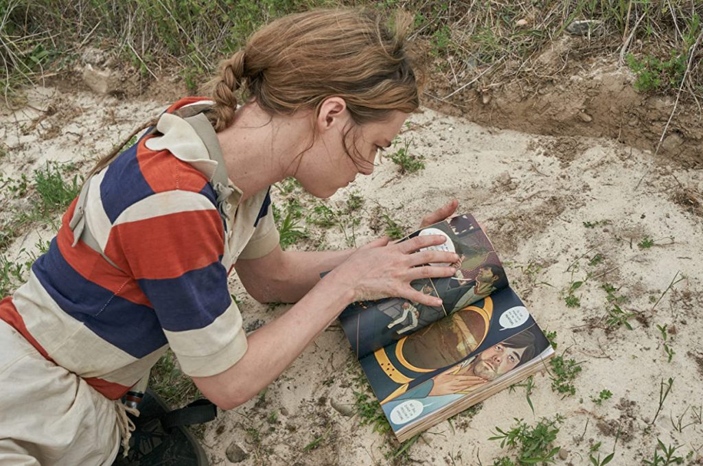
That makes sense. So, we’re going to be talking about Station Eleven, the HBO Max series that you provided illustration work for. I think it’s a fascinating project. It’s kind of like an illustration project that is executed with comic layouts and language. We’re going to get into the specifics on that, but how did that project first come together?
MN: I was very lucky. I worked with a guy named Tze Chun, one of the co-founders of TKO (Studios). I worked with him on the cover for Eve of Extinction. And I think he said somewhere that he discovered me off the Visible Woman hashtag on Twitter, so there’s one bit of luck. He discovered me a year before he hired me for that gig. And then I did more work with him, and I think a (Station Eleven) producer by the name of Nate Matteson had been talking to Tze and I guess Tze recommended me. And so, once he put in my name, they reached out to me. I believe it was (Matteson), Hiro Murai, the director who they got on board, and Patrick Somerville, the showrunner.
I guess those people in the TV space saw my artwork and they said that they wanted to work with me. So it was kind of crazy. This was before the pandemic. But they had me in mind because they saw my illustration and they really liked how I drew water, which was crazy because a huge inspiration for how I drew water was Japanese printmaking. And so, they said for a big portion of what was important in the comic was water. They really wanted someone who can draw water and draw it well. So they hired me, and the rest is history. (laughs)
What appealed to you about it as a project? Was there something that spoke to you as an artist?
MN: To be quite honest with you, it was more of the type of project it was at first. At that time, I didn’t really have any material to work with. When they first reached out to me, I hadn’t read the book Station Eleven. I didn’t know what the source material was. But for me, it was exciting to have my work be in a space on TV where it was just the image itself, and in a way, it played a key part in the story. After that, Patrick Somerville was able to write a whole manuscript for the comic, 1 which was unbelievable honestly. But I read it and I was just like, “Wow, I cannot believe these folks saw my portfolio and were like, you know what Maria can do is sci-fi.” (laughs)
And so I was just like, “That’s so cool that someone thinks that I could do sci-fi, so let’s roll with this.” I have to believe that I can do this too. And it’s not that I’ve always wanted to do sci-fi. But if I haven’t done something, I want to do it. And I really wanted to challenge myself to do it. And so Ruth (Ammon, the show’s production designer) sent me a bunch of images that were inspiring them. Doctor Eleven also appears in the show, but they had (their own) inspiration for how he was going to be. And so their main message to me was, “Do it how you want to do it. Draw how you want to draw. If we give you an image, you can get inspiration from that, but we don’t want to give you any directions. We want you to read this and just do whatever the heck you think is right.”
Because in the book, Miranda is not someone who is interested in drawing cape heroes in a very American way. They were like, “Doctor Eleven is not Superman, he’s not Batman. He’s someone else. He’s from this woman who’s very creative and leans towards more of a free spirit, fine artist maybe. And also just not very traditional in terms of comic book making. So we want you to do basically whatever you want with the script.” And that was very appealing to me. (laughs)
The freedom was just crazy.
It’s unusual for any project. In my head, though, something like this would typically be a lot more rigid than that. So it’s amazing that you had so much freedom.
MN: It was really crazy too, because I’m someone who wants a lot of guidelines. I find the challenge in working within a lot of guidelines. So in terms of doing illustrations, you look at the client, you look at the message they want to communicate and all that. It’s very specific. You can’t just draw anything you want. You have to think of the wider audience and in this you do too, but if I’m doing a business magazine, I can’t just draw anything I want. So this was really cool. I would be like, “How do you want me to draw this? Are you sure? Is it like this?” And the most specific thing was the spaceship itself because when I first read it on paper, I was just like, “What are the physics behind this spaceship that they are on?”
That didn’t make sense to me. But everything else they were just like, “We don’t want to poison your mind with our ideas. We want you to do what you want.” And for me as someone who hadn’t done sci-fi, who hadn’t explored sci-fi in depth before, this was such a challenge in terms of visually creating something. I just didn’t know where to start. But at the same time it was very freeing. It was really great to be able to work like that. Most of my ideas just went through because they were just like, “This looks great. Let’s go with this.” And I was just like, “Are you sure I can’t make anything?” (laughs) It was crazy to me.
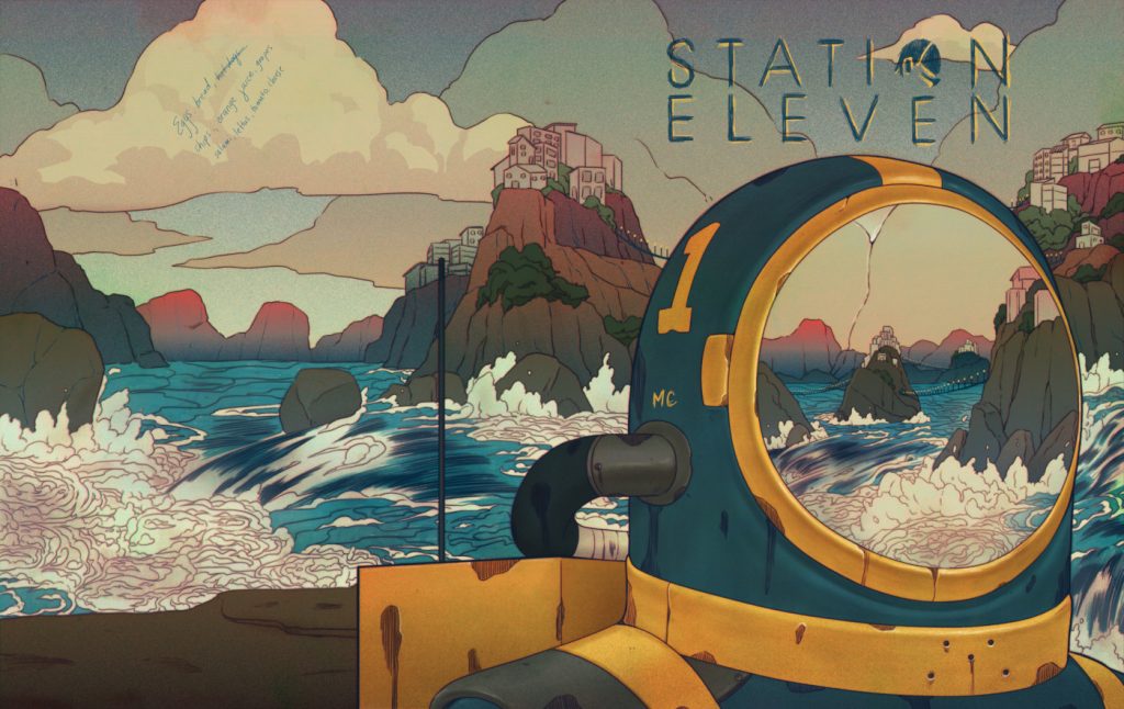
Well, let’s bring up one of the pages. It’s the cover for Station Eleven, the graphic novel. This graphic novel that you were putting together parts of was very much a personal project from a character in the story. I have to imagine that was part of the reason they wanted to give you so much freedom. It probably had to feel like a personal project for you for it to feel like a personal project for that character. Did it feel strange at all that you were creating this graphic novel that would never be completed and doing so as a proxy of a cartoonist who did it this as an extremely personal project? Or was that just outside your brain?
MN: That for me was a little outside my brain. And I think that was because they were so insistent that I basically followed my heart on how I needed to create this. But I take everything I draw personally and that could be to my detriment, but this one was really special because it was hard. It was really, really hard to draw this one and make it look how it did at the end, because I wanted it to look good so bad. And I was in my brain about it. I was really struggling with the colors and everything. And at the end of the day, I figured this is probably what Miranda went through when she was making her work too. (laughs) She kept remaking it and redoing it because something always was off. But that was what it was like creating this. I’m pretty sure I restarted the coloring process several times. So it’s funny because without me trying to be in her headspace, I was already in her a headspace.
Yeah. It’s the space of an artist.
MN: Yeah. This was the very first image I made for them and it was really important for me to set the tone. The reason why this one looked a bit different from the rest of the pages is because I brought up the whole point of how in a lot of comics in the traditional realm, the covers are different from the interior art. So I was just like, “Hey, let’s do that. Let that be the one thing that we take from the floppy comic book world.” So I did that. That’s why this image was (different). I really wanted to amp up this image. It felt important to me to make this one right. And luckily I didn’t have to change very much on it. I was also really surprised that they wanted my handwriting on there. So you see her grocery list on there and that’s my handwriting. That’s just crazy.
I was going to bring that up because while they gave you a lot of freedom, I imagine there were requirements. Like the grocery list or the MC on Doctor Eleven’s helmet. Were there elements that you knew that you had to incorporate, but the rest was just play within that sandbox as long as those things were there?
MN: Those were requested of me, but they didn’t tell me where or anything like that. I ended up doing those. I had freedom of design for this one, for sure. I even got the freedom to do the layout and everything because this was a wraparound cover. But yeah, they wanted the grocery list on there and they didn’t tell me what to write. (laughs) They just wanted me to write a list because they were just like, “We want the audience to know that this isn’t too precious to Miranda. At the end of the day, if she wanted to burn this as well, she will.”
What were you going for with this piece? Was it more just about coming up with a representative cover for this theoretical graphic novel? Or was it more about coming up with a striking image, knowing that it was going to show up on the show the most of anything you came up with?
MN: For me, I think having a striking image is the most important thing, especially for a cover. And if you could do that with the concept as well, then that’s a bonus. That’s just how I think. But for this one, it was more of, how can I showcase as much water as possible because that’s something that was really important to them. But also this was definitely one of those things where they were like, “Okay, we want him to stand and look at water.” And so I was just like, “Okay, so how do I do that?” And the whole concept of having these little islands all over the place where the sea people would go from island to island, I got inspiration from Hạ Long Bay, which is in Vietnam. They’re these small islands scattered all around bodies of water. So that was really cool to be able to find inspiration from that. And when I spoke about that, they got really excited and they’re just like, “Yeah, let’s go for that. Let’s make that be something that is in the comic.”
I love that. Did you do the logo?
MN: So, they had a logo, and they were just like, “Put this logo on.” I told them, “I’m going to sketch out the logo that you gave me.” So in a way it is mine, but in a way it’s not. They already had a logo that they wanted on there. I just didn’t use that image.
The “O” is different, isn’t it?
MN: A little bit, but this was the logo that they gave me. I just didn’t think it would look right if I put their logo on there. So I just sketched it out. And it works! (laughs)
One other thing I wanted to mention. Doctor Eleven did appear in the first episode. Did you know what Doctor Eleven was going to look like?
MN: Not when I first had the meeting with them. But down the line, they had already started filming before I started on the book. So, they sent me some reference images. But they also sent me images of…I believe it would’ve been inspiration for the costume designers. I’m not exactly sure, but they did send me inspirational images as well. And so I just went with my own thing and hoped that it worked. And luckily they approved of those images.
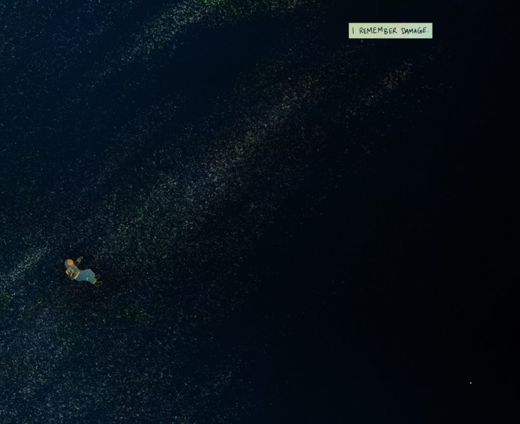
The next page I’m going to bring up is the “I Remember Damage.” page. I love it. It’s such a striking page. It’s simple and stands out because of it. It did make me wonder, though: did you work on this project traditionally or digitally?
MN: Both. I do the line work digitally and then I print it out and scan it back in. It gives me a certain effect that I really like. The cover I did traditionally as well. I did the textures traditionally for the most part, though. I would say it’s 90% digital and the rest is traditional.
It was mostly the stars that made me wonder that because it feels like some speckling of paint or something. That said, I know there are all kinds of brushes you can use to do that kind of thing.
MN: My whole thing is trying to have people believe that my digital work can be traditional. That’s my whole vibe. (laughs)
You said that Patrick (Somerville, Station Eleven’s showrunner) had put together a manuscript for this. What was the process in putting pages like this together? Did it basically come down to you need a double page spread like this that focuses on the line “I remember damage” because that was a shot that they’re going to show? Were the pages you created reflective of the shots that they needed in the show?
MN: This page was already in the manuscript of how they wanted it to be. But in my head, this is how it looked. It was just he’s where there are stars and then it fades to darkness. So that’s how I saw it in my head when I did it. So most of the pages on there were actually spreads, which was really fun for me personally, because then you can really play with how to really mix in the traditional paneling with how I do illustration. So what was really fun about making these pages was figuring out creative ways to panel that weren’t traditional paneling. Just because of how Miranda was, she was not very traditional at all and I just figured she would do whatever the fuck she wanted.
A lot of how these spreads came to be…it just felt right. It’s a weird thing to say, because obviously there’s a lot of technical stuff to it. There were certain pages where it was really technical. There was one page where he’s looking at a spaceship, and that was very technical because it was supposed to fade into an airplane from what I was told. So there were certain pages that were technical. But the rest of it, luckily I was able to just draw it out, and while I was creating the pages, they would shoot it not too long afterwards. So there were pages that were digitally placed in, but there were pages where I had already created the pages and then they filmed not too long after.
You said that they had an idea as to what the spread would look like. But were you mostly given broad concepts rather than page layouts, with how the page is laid out being up to you?
MN: Most of it was, well, there were some where there were very specific panels paneling already, but they also were very open to me changing things up for it to make sense as well. For the most part though, it was very broad.
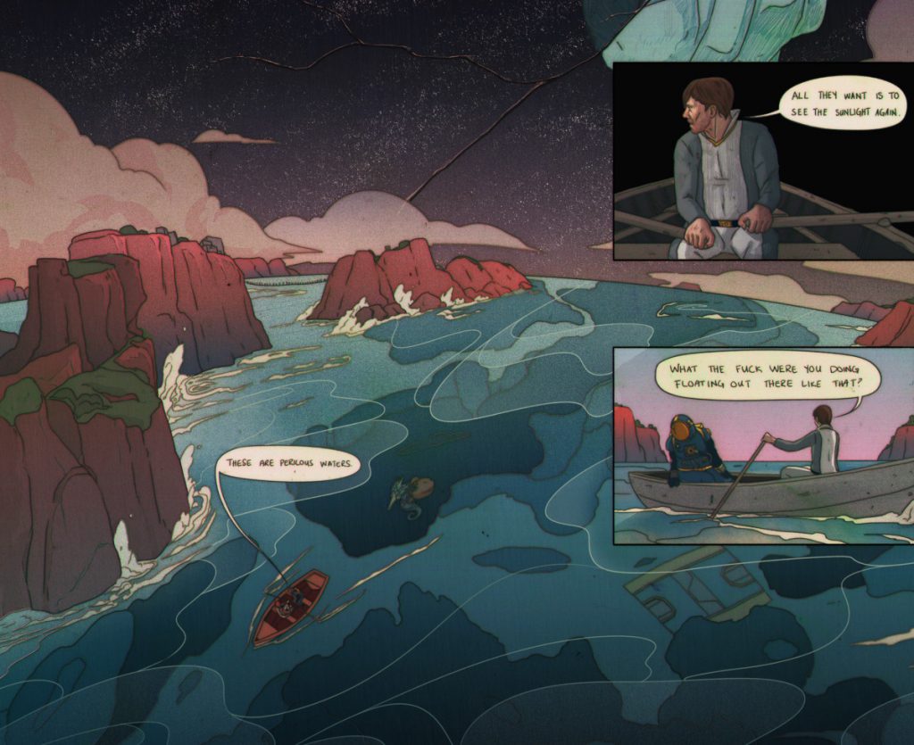
So next page I want to bring up was one you described on Twitter as being very hard to do. I just want to say, though, that this is a great page. Both the depiction of the environment and the layout feels so unique and inviting. You mentioned this before, but someone like Miranda probably would not have followed traditional comic structures. She just was making a comic because it’s what she wanted to do, not because she was obsessed with the medium. And this layout, I don’t know if I’ve ever seen it in a comic before, but it works really well. What made this one such a challenge for you?
MN: Because I was supposed to draw, like, a globe thing. (laughs) And I’m not good at perspectives. I was like, “What am I doing here?” There were so many things that I felt like I had to work with. This was not on the list of pages to draw at first because the pages would come sporadically. I didn’t have a definite list, and when I did, it changed or more were added. And this one, they were just like, “Hey, we want the iceberg to be in the glass above, but we also want you to do the ocean, but we also want them to be rowing on a boat. We also want there to be this deep underwater thing and there’s a portal that goes underneath.” It was just a lot.
I was just like, “Wow, I don’t know, man.” I don’t even remember how I did this one. (laughs) It was such a whirlwind of how to do it, but I’m glad I did it and I’m glad I know that I can do it. But it’s funny because when I do pages like this, my head is in such a frenzy. It’s almost like I’m in a survival mode because I really wanted to get it done and I really wanted it to be good. And while I was working on it, I was so scared that it wasn’t good. I was so scared that it didn’t turn out how they would’ve envisioned the page. But then I look at it now and it seems foreign to me…but I got it done.
It seemed like there was a lot of pressure, but it also seems like responding to challenges is a thing that drives you as an artist.
MN: Oh yeah, for sure. And the bigger challenge too is just this is going to be on TV, people are going to see this…you better freaking do this right. (laughs) I don’t want people to look at it and be like, “What does this have to do with the story? How does this make sense in the show?” I wanted it to make sense, and part of it making sense is to do it well.
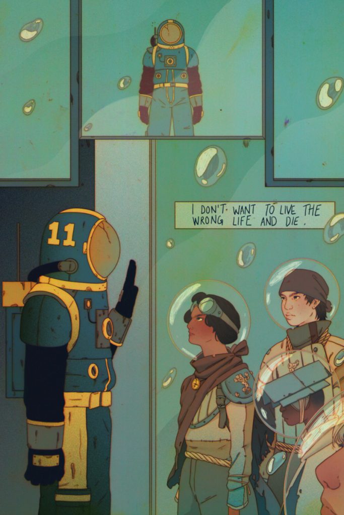
This page is the Undersea and Doctor Eleven meeting. When you do a design for these characters like the Undersea and Doctor Eleven, is this something that the production team was particular about? Or is this another thing where it’s just you do what your version of the Undersea would look like based off what you know about them?
MN: Yeah, that was it. Do what you want to do. And I was just like, “What? Are you sure?” They were like, “Just so you know, what you design, we’re taking inspiration from for the show.”
Oh my God.
MN: Basically, the only thing that I had for the Undersea…I drew them as adults at first. And then later on, (the Station Eleven team) said they preferred that they would be children and they would be taking scraps from shipwrecks and that was what would make up their clothes. Those were the only things that I had to make them up, and this is what I came up with. (laughs)
I love that you were simultaneously drawing the graphic novel that showed up in the show and almost a designer on it because the comic you did inspired it in some ways.
MN: Yeah. That was told to me when we had a Zoom meeting, they were just like, “Hey, just so you know, this comic is going to translate into the show a lot.” And I was just like, “Well shit, I can’t do a bad job.” It’s weird because those pressures never reached me while I was making them. All I wanted to do was a good job anyways. Those pressures just never reached me as I was making it. It’s not until right now we’re speaking of it that I remembered that that was the case. (laughs)
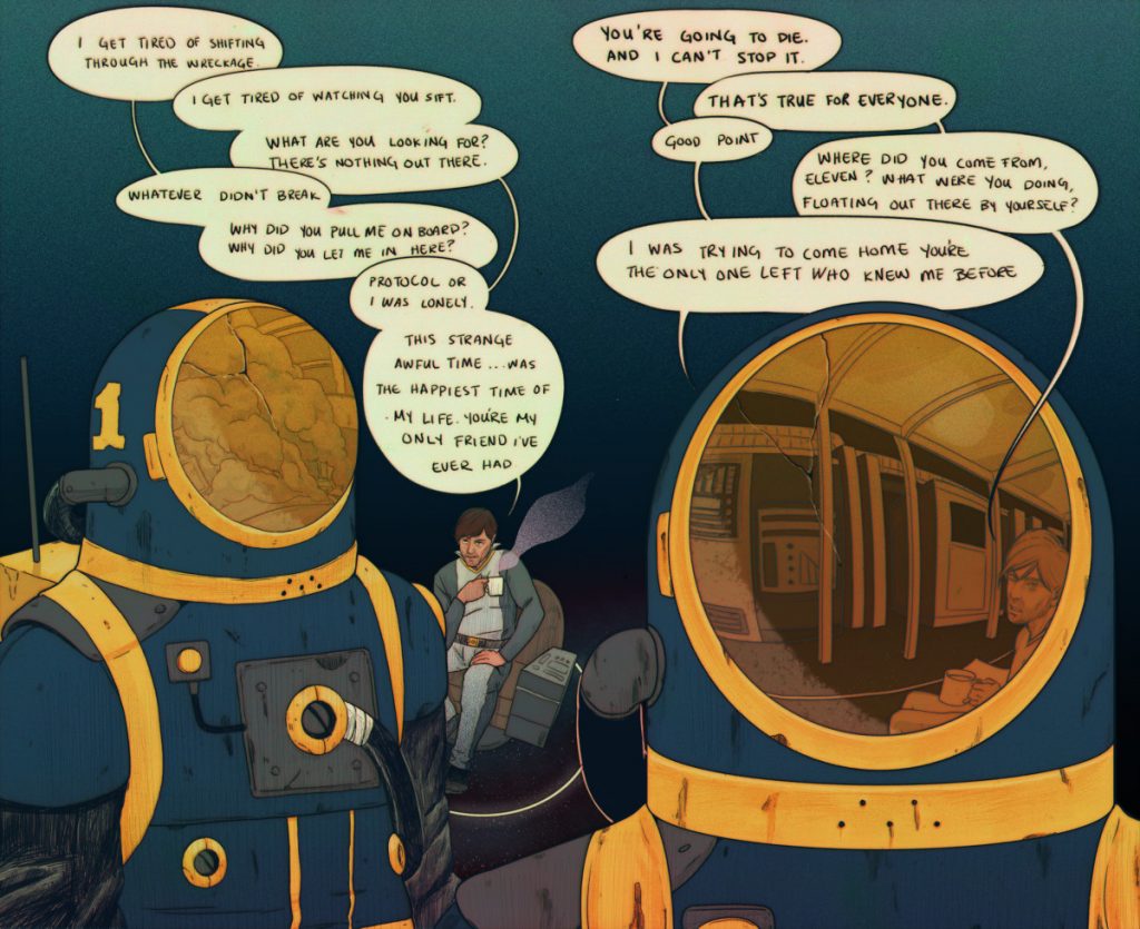
This page I really like for several reasons, but I want to start with the lettering. As I mentioned earlier, there’s a meta element of a sort here because the comic you bring to life is, in the story, an extremely personal graphic novel by Miranda, in which she expresses her feelings about life, her memories, and her relationship with one person in particular. When it comes to the lettering, you could have gone on Blambot and found a comic font to use, and I don’t know if it would have necessarily jived in the same way. Like with the logo, if you just used their set logo, it may have felt incongruous with the personal nature of this. Did you want to go for a more hand lettered look to make it feel more personal and authentic?
MN: I don’t know if I did it to make it feel more (congruous). At this point, I did have the character in my head. When I was doing the lettering, I was just like, “Nah, she’s not typing it out.”
Did you hand letter this?
MN: Yeah. (laughs)
Wow.
MN: Oh my God. There were so many spelling errors. (laughs) Oh man, I had to go back. There were a couple of spelling errors on these. They’d be like, “Hey, just so you know, you’re missing the ‘E’ in ‘where'” or something like that. I don’t write with my hands very often. So that was really interesting. But I really felt like, because she’s doing this and she wants to do it over and over, I felt like she would’ve been so dedicated to making it as personal as possible for her. And I don’t see her being someone who would be like, “I need this to be perfect.” It’s more of, “I need to get this out of my system.” It didn’t feel right for her as a character to do traditional lettering, like using a font. I felt like if she was creating it, she would just do it by hand.
You brought up perspective earlier, and I thought this page was an interesting challenge because fundamentally, both sides of the spread are doing the same thing. Given that this would be two pages, I feel like you almost have to approach the second page in a different way. And I love your solution of using Doctor Eleven’s mask as a reflection that allows you to have that same conversation taking place in a different way. When you’re working on two pages like this, is it important for you to come up with a different way to frame it visually so that you’re giving a new look to the conversation on each side?
MN: For sure. I think it’s really important to just make imagery not boring. That for me is really big. But also in the manuscript itself, Captain was reflected in his helmet and I was just like, “How the hell am I going to do that?” And I don’t know how I did it, but I did it. (laughs) It’s weird because it just spilled out. Even how I did the speech bubbles on here, I’m surprised at how I did that. And I think a lot of it is like I said before, it’s a fight or flight mode because I really want to do a good job and I don’t even pay attention to how I’m doing it. I think a lot of it is problem solving. And so somehow I was able to problem solve this page. I’m not going to lie, when I did have him speak in his mask and then have the speech bubble come from it, at first it was going to be two panels. Then I was just like, “No, what’s the point?”
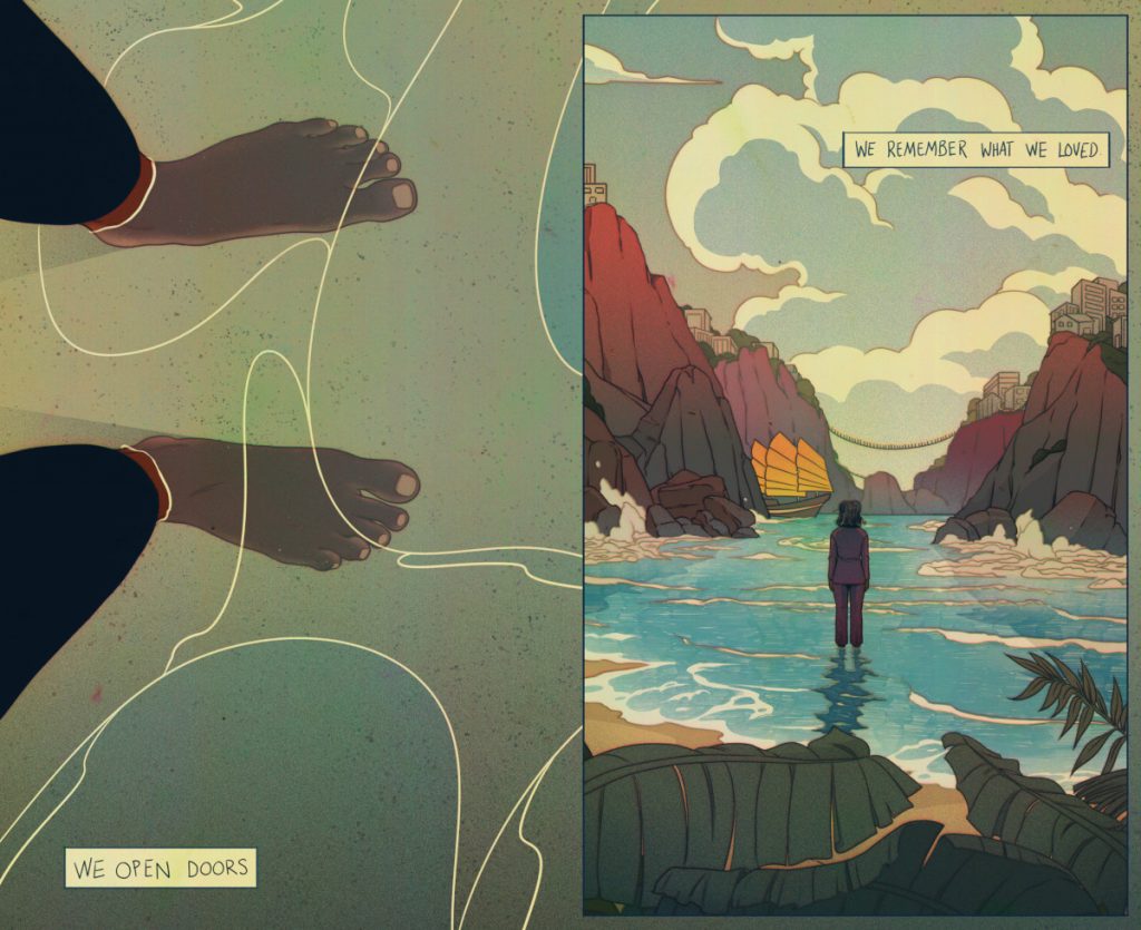
The last page I want to bring up is what I believe would’ve been the actual final pages of the graphic novel. It’s this last page of Miranda Carroll. I love it. It’s very much a signature for Miranda’s life project, this moment where she’s inserted into this work. Was that why it was important to only give shots from a first-person view and then third person directly behind her? That way we get to experience everything from her perspective?
MN: Honestly on this page, Patrick was very specific about having her standing and looking out. And I think it had something to do with the shot at the time. I’m not sure, but I adore this page as well because everything else with Doctor Eleven is so dark and gritty and this one is so bright and hopeful. But other than that, in terms of the perspective parts of it, that was all Patrick. That was all his genius ideas for the show. I can’t take credit for that at all. (laughs)
Well, you did a hell of a job bringing it to life.
MN: Thank you.
This is a random question, but there are certain pages where it’s shorter bits of text that are bigger messages within the show, as in, I think they’re ones that a character says themselves. I think the art visually reinforces what is said in the show. Did you have a slightly different approach to the lettering on pages with big messages like this? Because they feel much clearer than the conversational ones. Or is that more of a product just having a lot more to write on the dialogue pages?
MN: I think it was coincidental that these ended up being in the show because I didn’t know if they’d be in the show at all. And if I did, then I don’t remember. But it’s fifty fifty. Part of it was because when the characters are speaking, I had so many words to work with and fit onto the page. And also my writing for some reason is just huge. And I know I can scale it. But once it’s out onto the page, it just felt right. It just felt right to have these be bigger. I didn’t know that these were going to be important, but they felt like important words or phrases to me.
I don’t remember if that text showed up in specific, but the “I remember damage” page did. There are ones that act as visual reinforcement for what happens in the show.
I mentioned this before we started recording, but it’s been fascinating to look on Twitter and see how many people desperately want the graphic novel to be made. People connected with the show, but they also connected with your work. They see it and think, “I want more of this. I want this graphic novel to be real.” How did you feel about the response to this? Did it feel special to see your work showcased at such a scale?
MN: For sure. Like I was saying at the beginning, one of the reasons why I took this opportunity is because I didn’t think I would get another opportunity to have my work displayed and presented in such a way. Because my work is usually printed on something or on covers and all that, and I find it fascinating to have your work live somewhere new. This was a new place that my work can live. And I was really surprised at how it resonated with people. I was told that it would play a huge part in the show, but I didn’t think other people would receive it as being a huge part of the show because, like I said, I didn’t know much about it.
And I actually kept myself from consuming any Station Eleven content while I was making the work, just to make sure that I wasn’t being influenced by other folks or other ideas, or even by the book itself. I just created the images off of the manuscript, because the manuscript in reality is not real. So I just based my imagery off of that. So once it went out for me, it was just cool. My work gets to live in this way, it gets to be displayed in this way, but I didn’t think other people would really pick up on it or have it (mean) anything to them at all. I just didn’t think that, I just thought they would look at it and be like, “That’s cool. At least the comic is nice.” (laughs) I was hoping that they thought it was nice. The comic looked good. But I didn’t think anyone would take interest in me as the illustrator of it.
Thanks for reading this conversation with Maria Nguyen. If you enjoyed it, please consider subscribing to SKTCHD for more pieces like this, and to support the work I do on the site.
Editor’s Note: I want to read this manuscript!↩
