
Talking the Art and Process of Jupiter’s Circle with Wilfredo Torres
Think about the artists that work with Mark Millar. Really think about it. It’s kind of insane the talent and names who work with him. People like Sean Murphy, Frank Quitely, Rafael Albuquerque and Goran Parlov collaborate with Millar, which means regardless of what you think of Millar’s writing, you’ll find a ton to love in Millarworld books because of the art. But it’s not just huge names, as Jupiter’s Circle (the prequel of Jupiter’s Legacy, his book with Quitely) introduced me to the classic stylings and exceptional storytelling work of artist Wilfredo Torres. While he’s not new to comics by any means, he was new to me, and in the book’s two volumes, he’s put together some of my favorite work of anyone in the industry.
And today, I talked with Torres about his work on the book, how he first got into comics, the creators who inspired him, what it was like following Quitely in that universe, his process, what tools he uses, ink washes, the story behind some gaps on the book for him, and much more. He’s a phenomenal artist, and it’s great to get perspective into the work he’s doing on the book.
Let’s start at the beginning. For you, what made you want to draw comics for a living, and what were the biggest influences – doesn’t have to just be other artists, can be other mediums or even art school – on how your art has developed?
WT: I’ve loved comics since I was a kid and I mean probably 5 or 6 years old but I think I was about 13 the first time that I really noticed the Credits on a Comic. Marv Wolfman & George Perez’ run on THE NEW TEEN TITANS was where I became a ‘collector’ and really started to think about what went into making a Comic Book and that’s when I said to myself, ‘this is someone’s job! I want to do this!’.
George Perez, Curt Swan, Jose Luis Garcia Lopez, John Byrne, Neal Adams, Bill Sienkiewicz, Alan Davis, David Mazzucchelli, Steve Rude are all early favorites/influences but that list could go on and on. Ironically most of the Artists that I get compared to are names that I didn’t really become familiar with until much later.
Jupiter’s Circle is your big project right now, and as a continuation/prequel to Jupiter’s Legacy, that means you had a big name to follow: Frank Quitely. As an artist, does that type of thing enter your mind at all when you’re considering a project or working on one? Or do you keep yourself pretty focused on the project as a standalone?
WT: I had a bit of a freak out when Mark approached me about working on Jupiter’s Circle. I was very intimidated by not just having to follow an Art Monster like Frank Quitely but also looking at the other huge names that Mark has collaborated with, I didn’t think I belonged on that list. Once I sat down and put pencil to paper though, I got swept up in the excitement of what I was working on and I stopped worrying about it.
Jupiter’s Circle is definitely a more Golden Age look at superheroics, although with a certainly more real look at what life would have been like for heroes that would have lived during that time. For you, what appealed to you about that project, and how has the experience working with Mark been?
WT: I started drawing comics because I wanted to draw superheroes and this was the first opportunity that I had to do exactly that. Mark’s pitch for the book was very appealing as it was meant to be a sophisticated character study so it wouldn’t be all clenched fists and gritted teeth. Working with Mark has been fantastic! I love seeing how genuinely enthusiastic he is about making Comics, that kind of excitement is infectious.
Everyone has a different process in how they work. What’s your process on Jupiter’s Circle from scripts to sending your art on for coloring, and do you create your art digitally, traditionally or using some combination of both?
WT: I work traditionally so it’s all pretty basic stuff. I usually read the script on my first pass on my laptop and then print it out, read it over again and jot ideas down in the margins before sitting down to actually work up actual thumbnails. I usually work on period specific material so I’ll gather up whatever reference I need.
I work out my rough pencils on a sheet of 11”x17” printer paper and once I’m happy with it I scan it in and convert it to blueline in Photoshop. I print out the bluelined page on an 11”x17” sheet of Bristol so that I can Ink it without having to worry about erasing.
Specifically on Jupiter’s Circle I’ve employed a wide range of techniques as far as inking the final line art. I do the majority of my Inking with a Pentel Aquash Brush Pen and Dr. Martin’s Bombay Black India Ink. I’ve also used Copic Markers and Gray Wash for added tones as well as China Marker and zip-a-tone. Once the page is completely Inked I scan it in and format it in PS before loading it up for the Colorist.
One thing I really enjoy about this book is how of the era it feels, and that starts and finishes with your art really. From The Utopian’s Ronald Reagan esque look to the hairstyles and fashion, it feels very of the time. When it came to realizing this period, did you dig into the look of the era pretty heavily? Or is this just your natural interpretation?
WT: I’ve heard the Reagan comparison before and that was definitely unintentional.
I didn’t really do too much digging in as far as the costumed look, having grown up on Silver Age Comics it was all pretty clear in my head. I definitely dug up reference for civilian clothing, vehicles and architecture to try and get that to feel right.
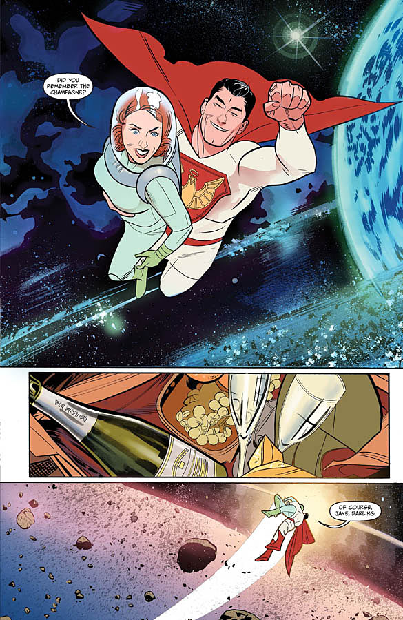
I’m always curious about the delineation of duties in bringing the art of a book to life. For example, I really enjoy the look of space here and its cluttered, colorful nature. Some parts are obviously you and some are obviously colorist Ive Svorcina, but when it comes to realizing the rings of the planet in the top panel and some of the smaller splatter effects in the bottom panel, what’s you and what’s Ive?
WT: I had very specific ideas about what I wanted the space scenes to look like and I may have gotten a little carried away in parts. I used inks, wash, white opaque, Copic markers and whatever else I could think to throw at it to try and achieve the sort of painterly look I’d imagined. I don’t know how successful I was but it definitely wasn’t for lack of trying.
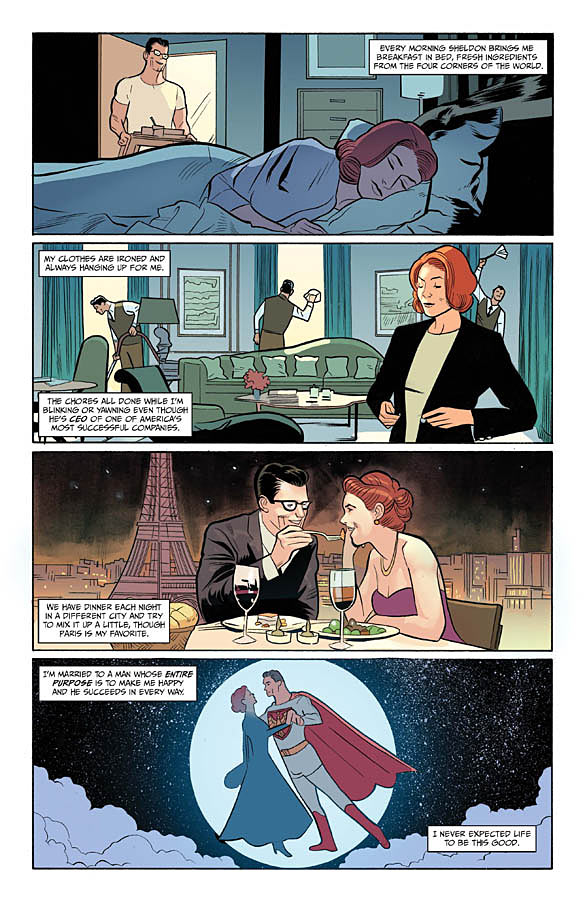
Similarly to the last question, elements like the lights of Paris feel more like an ink wash rather than typical coloring effects. Having looked at some of your Inktober works and beyond, I know you use ink washes quite well. For you, what do you use that tool for? Is it accent moods or give depth and texture a page or panel or something else?
WT: Thank you, that Paris panel is wash – For me the wash definitely allows me to try and add in a warmth, depth and transition that I can’t always achieve with just line art or spotted blacks. Ive Svorcina has handled that type of stuff so well and I was very happy with the end results.
This page is a pretty straightforward layout of four wide panels running top to bottom – a pretty cinematic layout. But looking through the book, it stands out that the book overall never gets too insane with its layouts, keeping things in simple grids or classic structures. Was that a choice to fit the era of the book, a personal preference type thing or just the way things played out?
WT: Mark gives me full scripts and I stick to them closely unless I think the storytelling could be improved by changing it a bit. Personally I never want to be too slavish to any one approach but in my own work I am partial to a traditional grid which I’m sure was part of the reason that Mark asked me to work on this book.
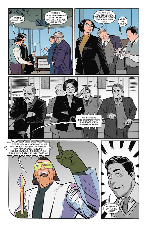
I love Professor Prism. He’s completely absurd in a Batman ’66 sort of way…like he’s a guy who watched one too many TV shows and thought, “man, I could make an awesome criminal.” For characters like that, is that pretty much just you having fun? Or are elements like that something Mark’s scripts are pretty tight on?
WT: Professor Prism was a lot of fun. Mark was pretty open about what he wanted aside from the scepter so he was kind of developed on the fly. He originally looked a bit different and then Mark asked me to push it further and we finally landed on this absurd looking goofball. I would’ve loved to have drawn him more but I imagine his criminal career was a very short one.
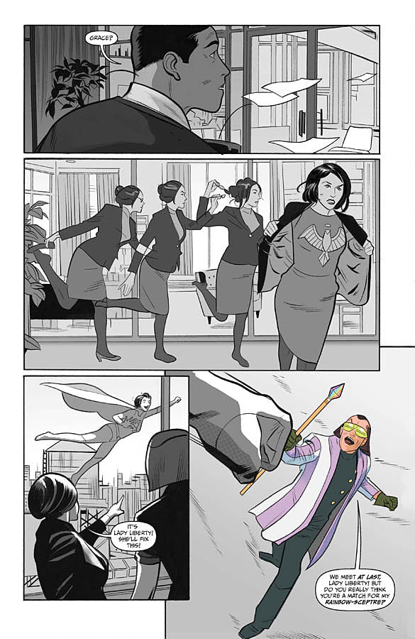
One thing I really enjoy about the book is the clear lines drawn between some of the characters in their hero personas vs. who they are in real life. Like, Grace is an angry, unfulfilled person, while Lady Liberty often looks like she does in the bottom left panel – like a woman of the people who is happy to be there. For you as an artist, is that interesting ground? Getting to dig into how the character acting differs depending on the context? I know it’s interesting to read!
WT: For Grace in particular that’s a big story element, in her secret identity she’s a powerful, independent, modern woman living in a time when she still has to hide and acquiesce to living in what is still very much a ‘Man’s world’ but as Lady Liberty she’s free of those restraints. I absolutely love to read and work on books that have strong character elements, making them ‘act’ is my favorite part of the job.
In the second issue of the series, you actually only worked on part of the issue and in issue #3 and #4, Chris Sprouse is credited as the artist. You took a two issue break in the first volume too. Is this just a question of scheduling or is it more of a tag team effort depending on what’s happening in the book?
WT: While I was working on Volume 1 Issue 3, I lost my Wife to Breast Cancer which essentially blew my life up. Mark and our Editor Nicole Boose worked with me to try and get things figured out as best as we could, we were all committed to try and keep the book on schedule and Mark to his credit, was also committed to keeping me on the book as much as possible and I couldn’t be more grateful.
Davide Gianfelice and Francesco Mortarino stepped in to pinch hit for me so that I could take some time to grieve and have a more relaxed schedule. Mark’s plan always included Chris Sprouse stepping in to give me a break on Volume 2 though. I think with monthly Comics, even under the best of circumstances it takes a village. I was fortunate enough to be working with a truly wonderful group of people.
Like what you see? Think about digging into his work on Jupiter’s Circle. It’s a great series that you can read independent of having dug into the comic it spun out of.