“There is only one you”: Max Sarin on Breathing Life into the Cast of “Giant Days”
To read Giant Days is to love Giant Days. This BOOM! Studios series from comics genius/Eurovision maven John Allison and the brilliant Max Sarin follows three young British women – Esther, Susan and Daisy – as they navigate the wild and formative years of college together, and it’s a wondrous series. It’s one of the very best comics around, which is probably why it’s nominated for Best Continuing Series at the Eisner Awards this year.
I’ve talked to John several times on Off Panel, but I had never interviewed the art side of the duo. That’s not because I don’t love Sarin’s work: I do! They’re one of the best artists in the business at character acting, and the humor and lovable nature of the cast comes through gloriously thanks to the work they do in each and every issue. So with that love in mind and the conclusion of the series coming soon with issue #55, I reached out to Sarin for an art feature discussion about their work, roots as an artist and storyteller, process, character acting, hair, the magic of details, and a whole lot more as we go through pages from Giant Days #33 to #36. 1
We’re going to get into your art and everything here in a minute, but I wanted to start with where you’re from. You’re an artist from Finland, which, to my knowledge, makes you relatively rare in the comic industry in terms of your point of origin. What comics and art did you grow up on in Finland, and do you feel like living there impacted the types of stories you wanted to tell in comics?
Mas Sarin: There are quite a few of us doing comics (Stay Still, Stay Silent, Transfusions and Plague Dogs for example can be found online) but when I was growing up I never saw these people. The Finnish comic scene was mostly black and white, more or less realistically drawn fantasy. We had many translated comics from Belgium, France and Italy, not to mention all the action comics from the U.S.. Donald Duck was carried to our mailboxes every week.
My grandmother had huge piles of comics for my brother, who was five years older than me. So when I went to visit her, I read through them over and over again. They were mainly old Tarzan and Phantom comics, but there was also (very politically aware at the time) Bamse and Alice in Wonderland.
I think a lot of my comic upbringing was influenced by my older brother. He got himself Amazing Spider-Man’s, and G.I.Joe‘s, and some naughty comics that were geared towards adults. Of course I read through all of them and then some more.
I think living in Finland has impacted me as much as it has impacted other Finnish artists. There is this sort of dark yet silly humor that binds us together. There is also the nature. If I could do any comics I wanted, I would be doing stories about spirits in the woods and such. You know: old folk ghost stories with a modern twist.
What’s your art background, and what made telling stories in comics the thing you wanted to do with your art?
MS: I was a basic geeky kid: Not many friends, but the ones I had were the best one can get. The games we played were the inspiration for my early drawings. I also wrote a lot, which gave me a need to draw out the characters and so forth. It was later on when I learn I wanted to make comics. It was Persepolis that made me realize comics can be about anything. That book was a game changer for me. Blankets came along after it and it just blew my mind. I applied to University of Lapland to become a graphic designer, but I soon realized it was a bad move. I wanted to do comics. I was absolutely horrible at graphic design.
So I went to Glyndwr University in Wales to study comics. I quit that uni too. At this point there is a very long story about mental breakdown, studying more and less, working in retail and abandoning my hopes of being an artist. Skipping ahead few years, I decided to give one last chance for art. All of this lead to the small moment in Kanneljärven Opisto (an art course, which was fantastic) when I was sitting in front of watercolor paper and realized this is what I need to do with my life: draw. Tell stories. It is hard to describe how suddenly the world was full of colors again.
Pictures tell us stories. I found that I need to illustrate narratives in order to find my place in the world. Writing was all fun and dandy, but drawing out the scenes, the emotions and the action was what made me want to wake up in the morning.
Everyone has a different process in terms of how they work. When it comes to an average issue of Giant Days, what’s your process? Are you traditional, digital, a bit of both? How do you work?
MS: I am 100% digital with Giant Days, if you don’t count a random doodle here or there. This is mostly because the pace I need to do these comics would be impossible to keep up with if I was to use traditional medium. I am slow as it is when it comes to art, but digital drawing equipment saves me tens of hours and therefore enables me to do what I love.
I do pencils as digital sketches and after getting them approved by the team, I ink them over, with the basic brush that comes in Clip Studio Paint.
Lissa Treiman was the original artist on Giant Days, but since then, you’ve made it your own thing, defining the characters for many of the fans. What appealed to you about Giant Days as a project, and was there any learning curve to following another artist on a book like this? Did it take you a bit to figure out how you wanted to approach the characters and the stories, or was it easy to jump right into?
MS: I was still studying in University when I was contacted about Giant Days. It was like I was pulled into a flying steam train: thrilling and also scary, because this was something I had never done before. What appealed (and still appeals) to me about Giant Days is that it is so well grounded. It is funny and familiar. It is like a friend one would love to have. John’s writing made me a fan from the start.
It took me few issues to get to know the characters better, but from the start John told me to make it my own so I didn’t have to try and draw like Lissa. (Which would have been impossible, because she is fantastic). As I was free to do my own thing I went and gave it my all. It took me a very long time to relax enough to get my lines less stiff and sterile (It is still a work in progress).
I got tremendous amounts of help from John, Jasmine Amiri (who was my editor at the time) and Dan Berry: They guided me to make my work better and also easier.
That all said, I want to point out I was intimidated by Lissa’s work, naturally. She has such a huge amount of raw talent it is insane. Knowing I could not fill her boots, I pulled on my own sneakers from the start thinking: ”There is only one Lissa and there is only one you”. You can admire someone a lot, but at the end of the day you can not steal anyone’s drawing powers. Trust me. I looked it up.
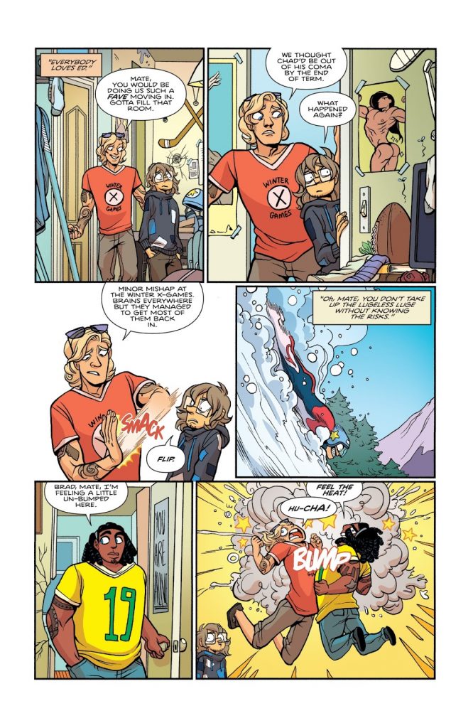
Let’s start with this page from issue #33. While it doesn’t feature any of the three leads, what it does feature is a constant in the book, and that’s brief moments of cartoon-like energy that acts as a counter-balance to the relatively not explosive nature of the book. The last panel featuring the sports bros chest bumping is perfect. When it comes to bringing moments like that to life, how do you figure a beat like that out, and do you think there’s a line you can cross where it goes from “just right” to “outlandishly cartoonish?” Or are you looking to reach that level?
MS: When it comes to John’s writing, it is very clear where those kind of beats can appear. Exaggerating things on the other hand was taught to me in one of the art schools I was at (Kanneljärven Opisto) by one of the life drawing teachers. He told me to blow everything out of proportion and then wind back to a suitable level. It is usually a gut feeling when it comes to these situations. I ask myself “Is it too much or is it too little?” Depending on the answer I try my best to adjust the characters (to the) correct level of cartoon silliness.
How flexible are John’s scripts for you to play around and find the right answers for these kinds of things, and have you found that they’ve loosened up the more and more the two of you have worked together?
MS: John is very flexible. Some issues ago I hurt my hand and he helped me out by doing the pencils. I made some changes to his pencils knowing he would not mind, because he trusts me the way I trust him. That is at least how I feel. I think our way of working together has loosened up a lot as I have become better at drawing. He is kind to ask, “Hey Max, can I write about Daisy getting a drivers license? There will be cars in many panels.” But I believe he also trusts that whatever he may throw my way, I am happy to draw. He also inserts things I love to draw. He knows my love for weird and horror and lets me play around with those aspects here and there.
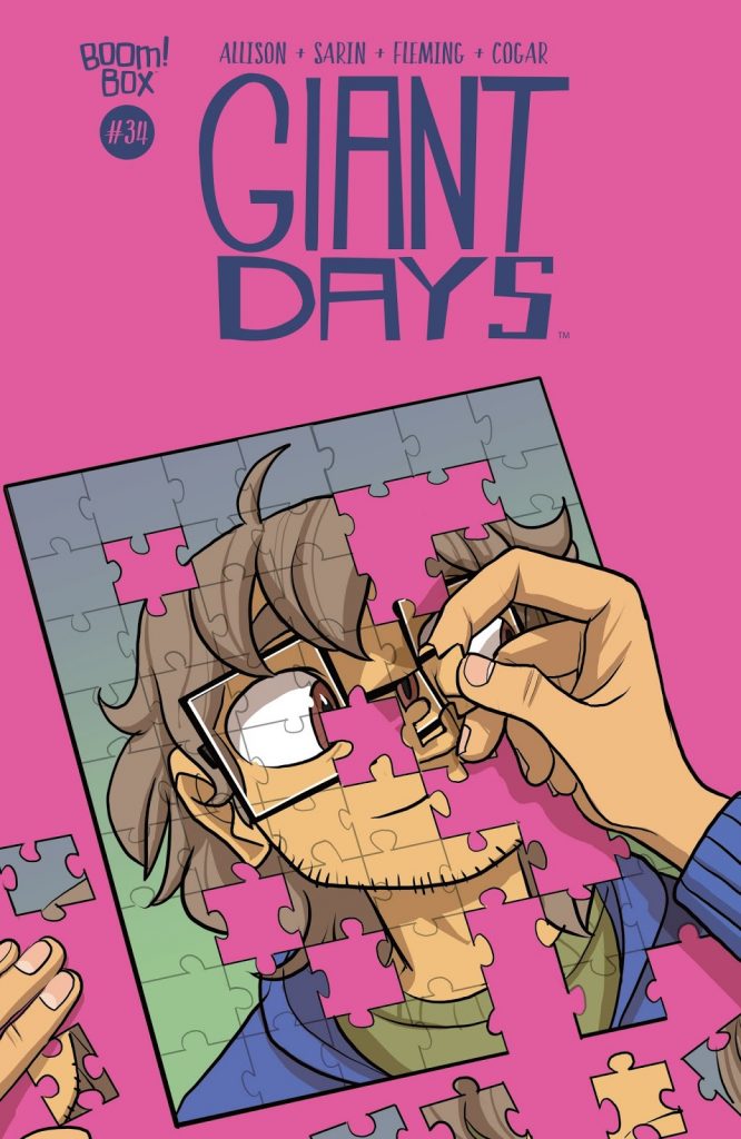
I love this cover you did for issue #34, as it’s a great representation of our guy Ed and how he’s always figuring himself out. When it comes to covers for the series, what’s your objective? Do you have a specific idea as to what you think a cover should be trying to accomplish, or is it just about creating a compelling piece of art?
MS: I usually get a very brief synopsis of the issue, which tells me what is going to happen. At least more or less, as things can change as we approach the said issue. I do follow on Lissa’s footprints on the covers most of the time: Character with a simple color background. I want people to get the feeling of what the issue is all about.
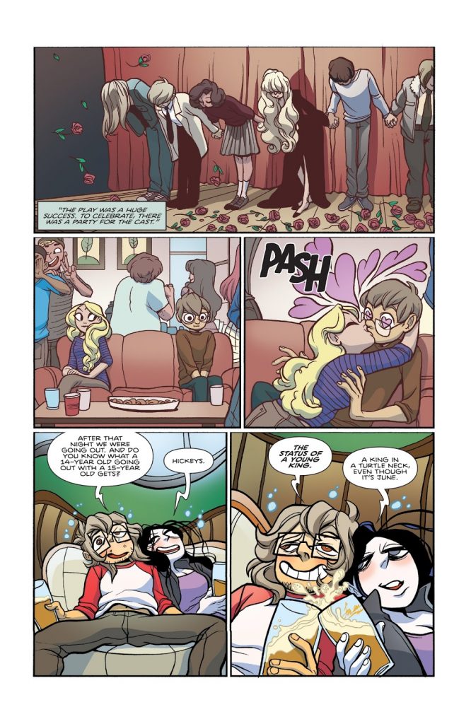
Your character acting is amongst the best in comics in my business, and this page shows off the spectrum you can hit. You have the absolutely drunken joy of Ester and Ed at the bottom, with those feelings easily fitting memories of my own nights out. In the second row of panels, you have the intense bashfulness of Ed contrasted with the glance and then pounce by Callie Higson. For you, what’s the key to best bringing these characters to life? Do you have a specific approach, or is it very feel based?
MS: I am very much one of those people who make faces while drawing expressions to know what they feel like, but it also has to do with actual acting. When I was teenager I was part of a theatre group in my hometown and what I learnt on the stage was translated on my pages. Body language is something that moves beyond language barriers and is the main focus I have while drawing the characters on paper.
I have to quickly compliment you: you’re excellent at drawing flowing locks. Both Callie and Ed’s hair are quite nice here. That’s not a skill every artist has, and this book gives you a lot of characters to have fun with, hair wise. Is that something you focus on, or is it just part of the larger whole of bringing these characters to life?
MS: Very much thank you! When it comes to hair, I can happily admit I had the biggest crush on Eris from Sinbad. That hair. <3
Eris wasn’t the only one. I have always been fascinated about how people draw hair. It started when I was little and there was this older girl who drew the best damn side hair anyone could wish for. Naturally I copied the living heck out of it. Elfquest and various animated movies also had an impact on me. I had this dream that one day I would be competent at drawing hair so this compliment was extremely nice to read. Thank you!
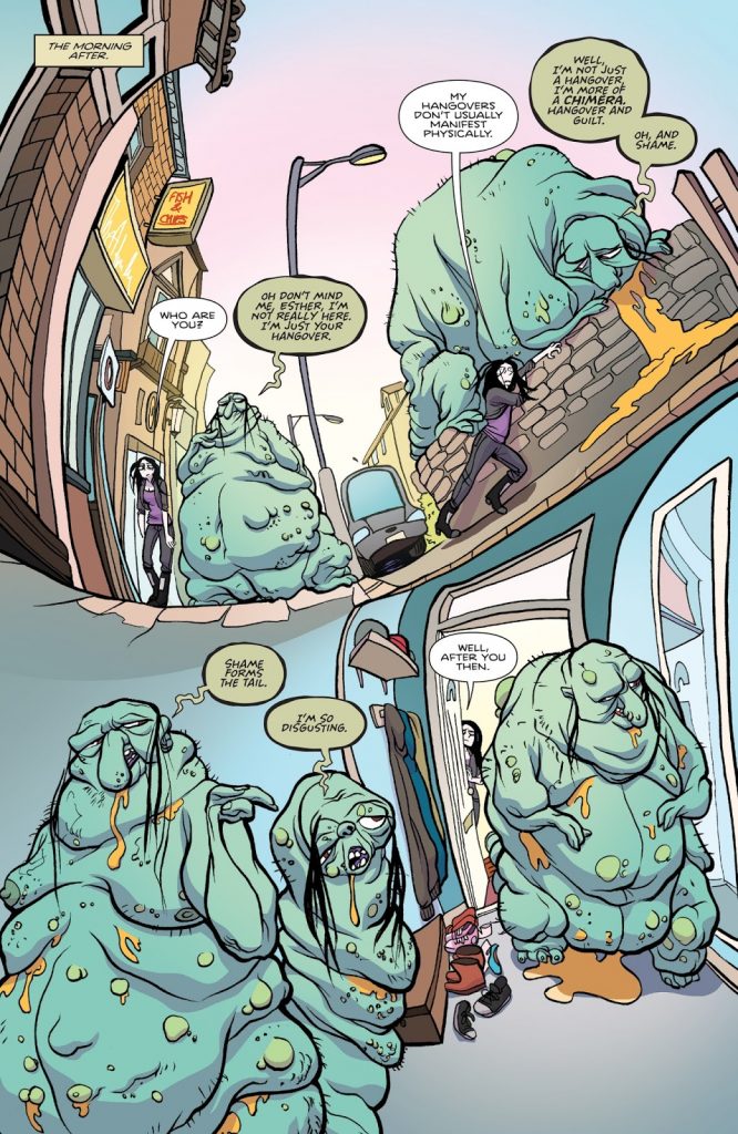
This page is incredible for a number of reasons, but it continues something you did in issue #34 where you warped the panels, splits in the page and environment to represent what it feels like to be incredibly drunk and then painfully hungover. The environment is the part that really interested me, as it has an almost fish eye camera feel to it. How did you come up with that solution, and did that present any difficulties in terms of how you brought Esther’s environment to life?
MS: If you look at my early Giant Days work you can easily see I was rubbish at drawing backgrounds. Straight lines were not my friends. And I am still not in best of terms with them. Therefore, I LOVE when I can play with the background to give it a flow. It started from the first Night World issue: I asked if I could just do whatever I wanted with the paneling and I was given a green light. I decided whenever there is a dream scene or some kind of drunken state or hallucination I hop off the edge with an absolute glee. My only problem is that I didn’t dare enough on those early times, but that is what learning is. Can’t learn if you don’t facepalm while looking back every now and then.
I have to talk about the monster that represents hangovers, guilt and shame. I have to imagine you came up with several permutations of what that looked like for Esther. What made this particularly lovely beast the right look for that manifestation of how Esther was feeling?
MS: This creature was a result of empathy and sympathy: again with the feelings. When you feel like absolute worst, you feel the weight on your shoulders, weakness in your arms. It slows you down and every step feels like walking in swamp. This along with John’s dialogue helped determine what the creature should look like. It couldn’t be thin and clingy like some hangovers can be, but very big, with a “personal space”-invading mass.
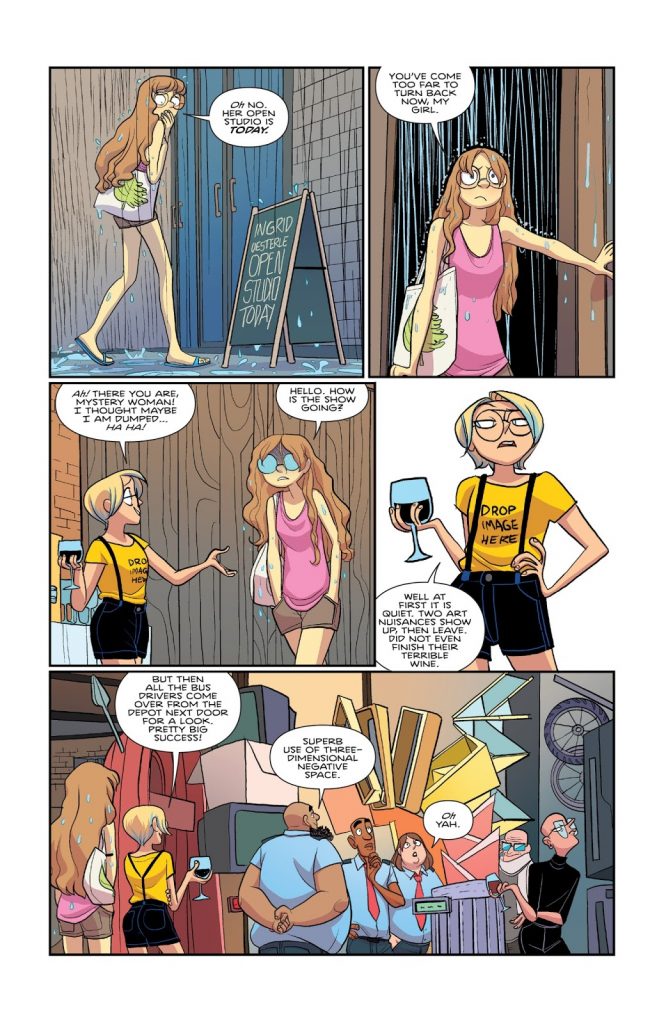
This is a great page for a lot of reasons, but it also is within issue #36, which is notable for a big reason for you: it’s the issue where you started inking yourself for good on the book. How did inking yourself change your approach on the book, and what made this the right time to do that?
MS: Liz had been doing amazing job with the inking, but had decided to continue with other projects. I was asked if I wanted to ink myself now that I wasn’t in university anymore and I was happy to get back on the saddle.
This isn’t even a technical question, I’m just curious: who was your inspiration for Ingrid’s art? Or was that a purely Max creation?
MS: I believe John just told me to do something with rubbish and I went with it. I just figured out what things I could bile up and clue together.
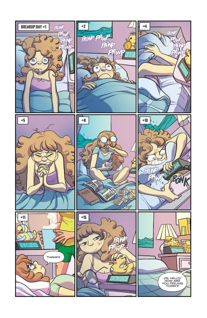
The last thing I want to ask about is this page of Daisy, post breakup with Ingrid, as we get to see her tour of emotions in the 15 days that come after. It’s pages like this that, to me, make me really feel like I understand and appreciate the cast of this book as if they were real. There’s a lot I could ask about here, but I want to ask about one specific detail: Daisy’s alarm clock. It says a lot about who Daisy is. Where did that detail come from? Was that something John scripted or you added in? And for you as an artist, how important is it to bake in details like that which reveal a lot about a character without being in your face about it?
MS: For me, the alarm clock was just something Daisy would have. I couldn’t think her having a plain box type on her bedside table. Having known her as a character for quite some time by then I knew she liked nature, and she liked birds. I think seeing that duck clock was irresistible to her. That or she got it as a gift. Not sure. Either way, I just thought it would suit her.
I love adding small details, because I also love seeing them in other comics and illustrations. Unfortunately, I rarely have the time to add those details in Giant Days so it ends up being small, but continuous things like that alarm clock. Or Susan’s “No” shirt which we haven’t seen in a while because I felt she doesn’t want to wear that shirt that much anymore.
If I could have my way and all the time in the world there would be approximately 87% increase of details in comics. It is many times “useless” to add them because the majority of readers flip through the panels, but as a creator they are fun as heck to draw and as a reader they are always so enjoyable to spot. This mindset is heavily influenced by Don Rosa’s Duck stories: They are so fun to read again and again because there is always something you have missed the last time.
Thanks to Sarin for the chat, and if you’re enjoying this content from SKTCHD, continue subscribing to the site before it goes behind a paywall next week!
I picked those issues because I read Giant Days in trade, and those are the last four issues that have been released in trade. I’m sorry!↩
