
“When You’re a Kid, Everything Seems Huge:” Jared Cullum on the Heart and Heroes of Kodi
Sometimes, a new favorite comic can come from nowhere. It’s like the old rope-a-dope move Muhammad Ali would use: you’re expecting one thing and another thing altogether knocks you out. That’s the story of Jared Cullum’s Kodi, a Top Shelf graphic novel release I first discovered in 2016 when it was but a cover reveal, before randomly just a little while back, I came across it on the new release shelf of graphic novels in my local shop. I picked it up, and it immediately became one of my favorite comics of the year.
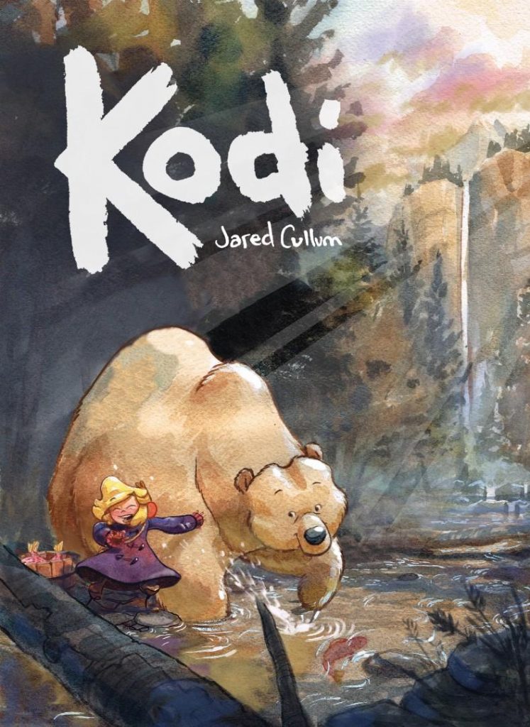
It’s a simple story. It’s an all-ages story about a little girl named Katya who lives in Alaska with her Meema, with few things to do in my home state and even fewer friends. Her life changes when she finds an injured bear in the woods, whom she names Kodi, and the friendship she forms with the bear changes her life. The story flips eventually, as Katya moves to Seattle, but it then becomes a story of how they attempt to be reunited, and how friendship can unite people (or bears!) no matter the distance. Told with restraint and gorgeous watercolor art, Cullum crafted a comic that’s a perfect palm for the 2020-ness of this year, delivering a story with so much heart and beauty it can be overwhelmingly delightful.
Naturally, I wanted to talk with Cullum about his work on the book and beyond, and the good news is, we had spoken before when I opened my email. It was around the cover announcement in 2016, so all I had to do was start that conversation again. This is the result of that chat, as we discussed his origins, falling back in love with comics, how he works, storytelling, playing with sizes, the importance of eating in comics, and more. Give it a read, and if you enjoy what you see, check out Kodi! It’s extremely good!
What came first for you: loving comics or art? And what made you decide to want to combine the two of them into what you do for a living?
Jared Cullum: I think, for me, I fell in love with drawing. At least, that is what came first. When I was a kid I loved to draw. I never had any interest in Art with a capital A, or painting or becoming any sort of artist. I was never talented but I did love it. When I started drawing again in my mid-20’s a friend of mine gave me a copy of the book, “Blankets.” I’m sure it’s a common story but I fell absolutely head over heels in love with drawing and wanted to make comics and tell stories. So I started rigorously drawing and studying comics. I made my own webcomic, which a lot of people were doing at the time, to give myself a steady deadline.
Eventually I stumbled across some beautiful french comics that were colored with watercolor. Specifically Lewis Trondheim and my all-time hero Cyril Pedrosa. Pedrosa work was on a level I could not begin to imagine so I sort of left the webcomic and set out on a quest to improve my drafting and I wanted to color stuff with watercolor like those guys did. I wanted to dip my toe into watercolor but it basically consumed my artistic life and became my waking pursuit. I loved the medium and, though I’ve been studying masters for years – I feel like I’ve just started with it. You could spend lifetimes exploring each medium of painting and drawing.
You said elsewhere that, Kodi “ended up being a story about finding something you love, losing it, and then the arduous journey to find it again,” with Katya’s loss being Kodi, while yours was rediscovering everything you loved about drawing and painting when you were a kid. I’m curious what happened there. What happened that made you fall out of love with art, and what helped you rediscover it?
JC: A couple of things went into that decision. Stability and a fair amount of laziness. I was never talented at drawing, though I did love it. I needed to learn how to harness working hard at the medium, setting goals and improving. When I was about 16 I was very discouraged. I had a number of teachers pull me in for private meetings and, with the best intention, tell me I should quit drawing. At least with the intent of pursuing any kind of career. It’s not an uncommon story but the truth was I did not have what it would take and they were trying to help.
The same thing happened. I didn’t have very thick skin or resolve so I gave up. I felt like there was no future in it and went on to do other things. When I came back to it I resolved to work hard and learn to draw. I drew about 3 to 6 hours every day with no break for years to develop my first comic which was an absolute flop. I took it to a local comics shop in Richmond and the owner told me it was terrible. He actually walked me to the shelf and put it next to green lantern and DC stuff and asked if I thought it looked like I should be doing this. He suggested I learn to write and let someone else draw.
I was angry about that for years and used it as fuel to increase the amount of work I did with the express intent of being there when I got something on the shelf. It’s not a satisfying story as I did go back when I got a book on the shelf but the owner had passed away a year earlier. I understand where he was coming from and those teachers. You can’t know how hard someone is going to work and what they’re willing to give up or if they truly love something. I don’t agree with derailing people but I don’t fault them.
Now my artistic life is comfortably split. I know a lot of people who burned out and quit because of making art their livelihood. It happens. I also have this open playground of outdoor painting to pursue that gives me freedom and joy and coal to bring back to the fire. I think it’s important to have heroes and equally important to have personal projects or goals where you don’t owe anyone anything and you can explore completely free to bring back something new and interesting to your stable art-making life.
As an Alaskan, I feel like I’m uniquely suited to connecting with Kodi because, well, Alaska is rarely a setting in comics. That does make me wonder, how exactly did this unlikely story of a bear becoming friends with a girl with a Russian name in Alaska come together? What’s Kodi – the book’s – origin story? There’s a lot of unique elements to it, and there’s no obvious connection to yourself there, so I find it very fascinating!
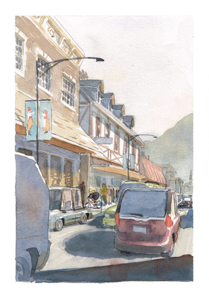
JC: The story came about from two to three different ideas that I threaded together. The original idea was woman in her 20’s. A bear lost in Seattle. And the story of Joshua, the fisherman. I had very specific visuals in my head for each story but no specific story with a beginning, middle and end. I’ve always wanted to go painting on location in Alaska, as it looks so beautiful. I typically write by thinking of every idea I can possibly think of and cutting down from there. I had thought about the story being in Juneau and when I discussed it with my writing mentor/friend, she told me she had traveled to Sitka and had lots of reference photos.
The initial design for the character Katya I stumbled on reminded me of a girl I knew in high school named Katya so I just named her that. I liked the idea that Sitka was a small town and had an interesting history of Russian influence so I thought that connection was interesting.
The character Joshua was based on the spirit of a friend from Richmond who unfortunately passed away recently.
After I had an idea for the theme – which was belonging I threaded the three different ideas together centered around the idea of finding belonging in the world and friendship. I felt like 9 to 11 was a better age for the lead character because that age is so difficult and hard to find belonging and friendship.
I am a big fan of watercolor. That is a big part of this book. But obviously, it isn’t the only part of it, and I know it was a long process based off when I first emailed with you about the book. What was the process of taking Kodi – the idea – and turning it into Kodi, the graphic novel from a creative standpoint? Do you script for yourself, or is it all figuring it out on the page and going nuts with watercolors from there?
JC: As process goes I have a very difficult time writing actual words down. I’m not very articulate or intelligent or well read, so I struggle to sit down and write words out that sound better than a fifth grader. I can, however, see images in my head very clearly. So my process tends to be, “storyboard-driven” to borrow a term from animation. I can see a scene in my head and sketch the pacing out in the form of storyboards.
I typically try to build a timeline. Either by notes or by writing various plot points and then I will storyboard the story out to feel out the timing and pacing. That is usually how I get the dialogue worked out as well.
From there I convert it to a thumbnail-layout version. Once that is approved by an editor I draw the pencils for the pages and essentially make a hundred-something page coloring book.
After that I paint and use ink only on the elements that are important to the scene in a hopes the less important objects will fall away. I try to dissolve away from the object of interest. It is an optical effect I stole from the impressionist painters like Mary Cassatt, Berthe Morisot and others like Sargent and Sorolla.
Last question before the pages: this is an all-ages comic. Does it change how you approach the story at all knowing it could be for anyone, from an 8 year old who is reading their first comic to me, a 36 year old in Anchorage, Alaska who has been reading comics all your life? Or is it just about trying to find something universal in the story that connects with anyone?
JC: I try – above all – to make the story concise and clear. That is all that matters to me.
I don’t see myself as being capable of writing anything extremely complex. My goal is to, at the very least, be good, clear and concise. Is there a clear hero or set of heroes and journey?
The world-building elements don’t matter as much as the story could take place in space, Alaska or the wild west. If the story is good and concise and clear I think most every age will appreciate the connection with it. The main considerations I had for age was the elements of the story I pushed forward or pulled back. There are elements of the backstories I left to be resolved by the reader through context clues in the background.
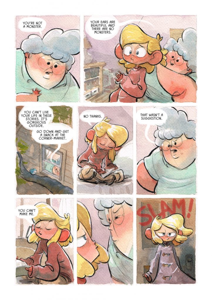
I wanted to start with Katya’s look. This page is a good showcase, because we get a whole lot of ear action. Her ears are huge and a very charming characteristic. When it came to designing Katya and her Meema – both of whom have very distinct and different looks – what were you going for, and what made their looks the right ones for each character?
JC: I do a lot of my character building based on basic shapes because I feel like people connect with them emotionally. The shapes have specific psychological meaning. Circles, being round and more friendly, for example. So the design of Meema is based largely on circles because I want her shape design to reflect her personality. So that you know her without hearing any dialogue. To me, Katya is a character who has been through something and is in the age of transition and unsurity. Her structure is based on circles with the juxtaposition and variety of the triangle based jacket and often sitting in a position creating a triangle with her body. It is meant to reflect her journey into not being well-adjusted.
The other consideration is exaggeration. In building the world (ie: cars, adults) I tried to remember what it felt like when you’re a kid. Cars are subtle and adults tend to feel towering in personality and shape. That is why a lot of ears are and elements are squashed and stretched.
While it’s not always the case, the book feels like it’s primarily three rows of panels, and even when it isn’t, it often feels like it’s using pretty similar heights for where panels start and stop in other layouts. Was that deliberate? If so – or if not, even! – what does that kind of thing do? Is it about aiding story flow and making it an easier read?
JC: Yes. So back to clarity and design. I think it helps to have the object (comic) built on a sort of grid. Kind of like how magazines are structured. It helps to give a consistent heart beat to the story. This is the metronome of the timing. From there I can expand and contract to increase speed or slow the reader down. The grid gives a sense of unity that I can add variety to as I go.
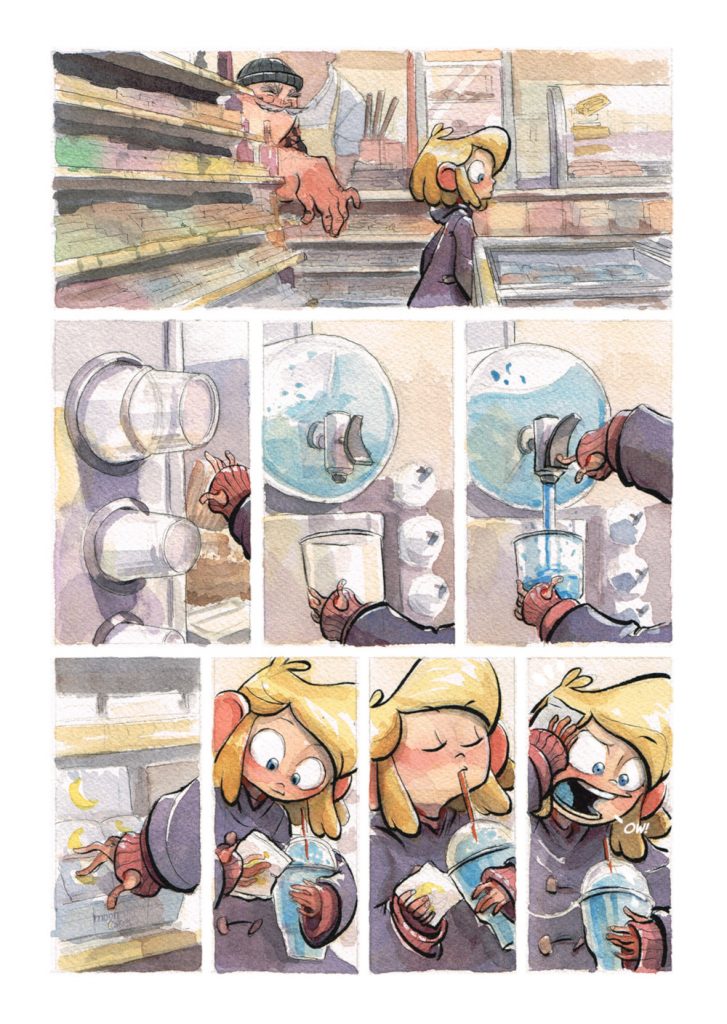
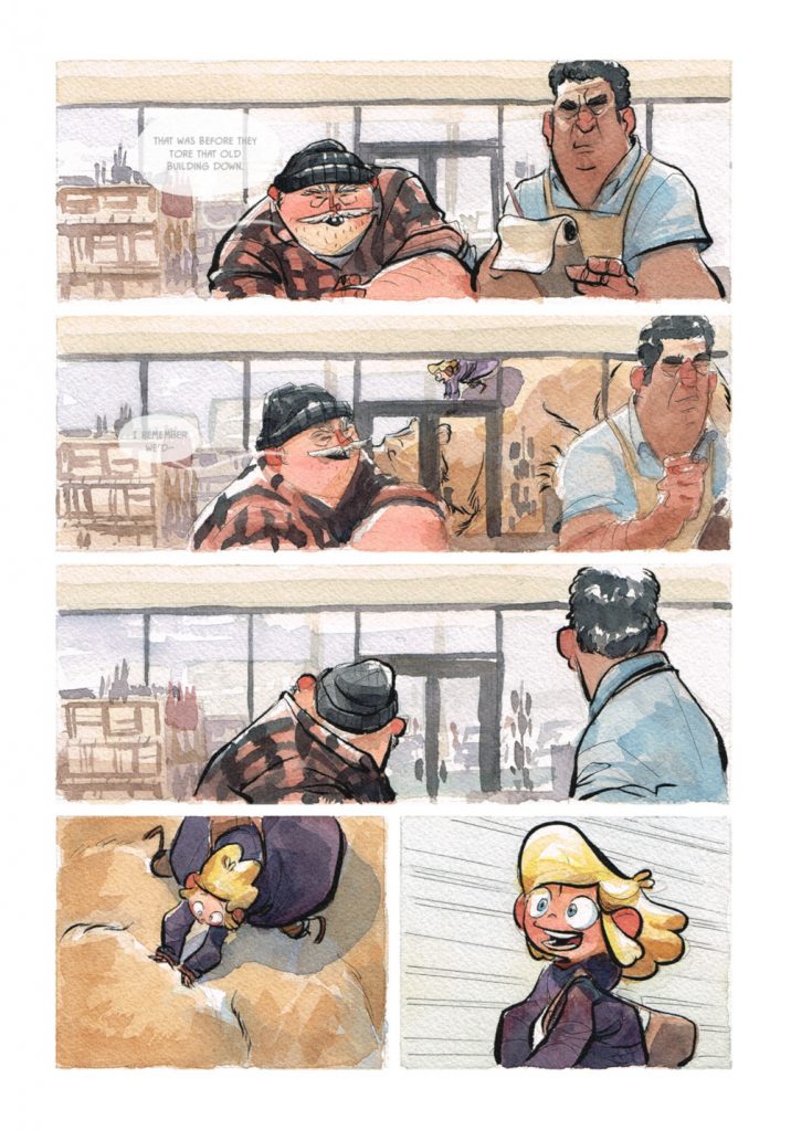
I. Love. The last three panels. Katya’s reaction to brainfreeze is utter perfection. When it comes to character acting and cartooning, what’s the key to making a beat like that work? I love that you included all three steps, for one, because it shows cause and effect in beautifully hilarious fashion.
JC: I think the key is to act it out yourself. This is my favorite type of comics panel to do, which is the moment to moment beat of a scene. I love zeroing in on the key actions that piece a moment together.
Including the process shots in the middle of Katya loading up a slurpee was remarkably charming. But for you as a cartoonist, why was that important to include? What makes beats like that necessary?
JC: It’s a story lesson I learned from animation Master Miyazaki. You ever watch one of his films and feel remarkably hungry for the food? It’s always beautifully and realistically rendered, but more importantly, in a film like My Neighbor Totoro or Ponyo they take the time to eat, which has nothing to do with the story. It’s a human thing. It’s a human experience we all connect with and is something that brings the character to life.
Kodi seems like a conundrum to a degree, because he’s a) a bear and b) unable to speak. But you do a remarkable job of animating him without making him not feel like a bear anymore. Did you have any ground rules for that character in specific? Things to help you bring him to life without losing the crucial, essential bear-ness of him?
JC: I think I had a specific character and bear in mind. It was important to me he ate and did things that made him feel real as well as had fears. Fear is another human experience people can relate to and connect with a character. I think the acting was so important to me for the character it didn’t really occur to me until people pointed it out that he didn’t say any words. I rarely think of words. I like my comics to be able to be read even if the dialogue isn’t there. That is something I learned from Master Cyril Pedrosa. I collected his work before it was translated here so it was all French. I never needed to translate anything because you could connect with the characters and read through their acting.
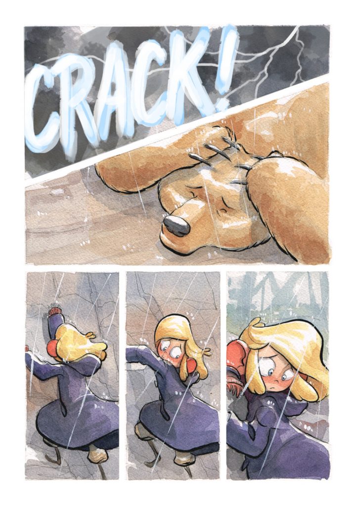
This book lives or dies on Kodi and Katya’s relationship connecting with readers. There are a ton of little things in here that make it work – namely her leaving her coat on the giant bear to protect him from rain just a couple pages later – but when it comes to a purely art standpoint, how do you visually build that relationship? Is it important to include extra beats like those last two that shows the care Katya has for this bear?
JC: In terms of a visual relationship the eye is often drawn to color harmony in opposing colors. So I specifically designed them so that whatever scene they were in together it would be strong purple and yellow next to one another.
I think the root of the story is an idealization of what I hope to share with the world in that what is important to me is that the heroes impulse is to love and help. Katya, Kodi and Joshua act first out of love and hope instead of fear regardless of their history.
The song is reference to Katya’s past which is why she cried when singing it. The jacket was meant as one of those “save the cat” moments (to borrow from screenwriting) where the hero does something specifically nice and good hearted that makes the reader care about them and root for them.
I love this page both because it’s beautiful but also because it feels like a pace changer, using a full page with details for us to drink in after the relatively consistent layout for a bit. There are very few of these full page splashes in the book. What do you like to use them for?
JC: I like the idea that is hopefully stops the reader for a moment. To borrow again from the Master Miyazaki, he peppers his stories with quiet moments that let the pacing breathe. The close-up of the frog in Totoro, or the open landscapes peppered throughout Porco Rosso. The intent is to slow the pacing and give the view something to get lost in for a minute that isn’t story specific but expands the world for them. It says to the reader that this world is bigger than the story, there is traffic, people and sun/rain.
I love watercolors. It gives everything in this such a charming, lively feel. But what made them the right fit for this story in your mind? What do they allow you to do that other coloring techniques don’t?
JC: I like that they are direct and the medium focuses on luminescence. Lighting a scene is extremely important to me as a story telling factor. The sunset at the end. The rain in times of trouble. Watercolor also falls a part really easily and it’s just a medium that I deeply love and am passionate about.
I love the lettering choice you made here, with the two folks in the store having their conversation, but it’s only lightly visible as Katya and Kodi blow by the store. It’s a small thing, but it really works. That’s obviously a very deliberate choice. What made it the right one, and what kind of impact do you think it has?
JC: The intent there was the typical white noise of a nearby conversation. The conversation isn’t as important as setting the stage of white noise in a convenience store interrupted by this thunderous visual of a bear and girl flying by the window. It provides a visual noise that is interrupted both in actual conversation but in their acting as well. I think it’s important to provide a comedic break from time to time to keep the reader interested and also to thread scenes together and expand the world for the reader.
One of the most crucial visual elements in the story, to me at least, is the size difference between Katya and Kodi. She’s so small, and he’s so big. You use it both for adorability factor but also humor. Obviously a human child and a bear are going to be much different sizes, but it feels like you dialed it up a bit here. What does that allow you to do as a storyteller?
JC: This goes back to that idea I mentioned previously. When I designed Kodi, I did so with the intention of designing a child’s idea of Kodi. When you’re a kid, everything seems so huge. The world is built on a squash and stretch of a child’s perspective of things and I liked the idea of a large imposing character being kind hearted. That not everything huge is imposing. It’s part of the “coming of age” lesson she’s working through in the story.