Nailed It: Comic Artists on the Page, Panel, Cover, or Detail That Was Just Right
After doing hundreds – and hundreds, and hundreds – of interviews over the years, there are a few themes that pop up a lot in my conversations with creators. Things that seem to be consistent across the board, save for a few outliers. Sometimes they’re hyper specific, like “artists aren’t fond of drawing cars or bikes or crowd scenes.” Other times they’re broad. But there are the ones that come up on the regular.
Of all of them, one of the most consistent is the idea that, generally speaking, a lot of artists don’t enjoy looking back on their work. It’s not that the previous version of them that crafted a page or panel or cover was bad at the job, per se. It’s just that you can’t help but be critical of your own work, or that the deadline crunch ensures a certain speed is necessary, so eventually, you have to just wrap it up. It results in a situation where artists can’t help but notice perceived mistakes on the page when they look back. I don’t notice them, of course. It’s all magic to me. But that preference to not look back comes up a lot on Off Panel in particular.
This always made me wonder, though. If this is a consistent theme amongst artists, are there works they knew they nailed upon completion? Efforts that turned out to be just like was in their heads when they started – or even better! – resulting in a highly satisfying piece for both today and tomorrow? At Emerald City Comic Con this year (and, in two other cases, on video chat recently), I endeavored to find out, talking to a gaggle of great talents about a work of theirs that they remember feeling was on point when they finished it. Today, you can read the results of those chats, as artists share the pages, panels, covers, or details they remember feeling great about, as well as why those efforts just worked.
This is open to non-subscribers, so if you enjoy this piece, maybe consider subscribing to SKTCHD for features like this. In the coming weeks, I have more interviews in this vein with creators from the convention, diving into standout moments from their lives in (and around) comics. It’ll be a lot of fun.
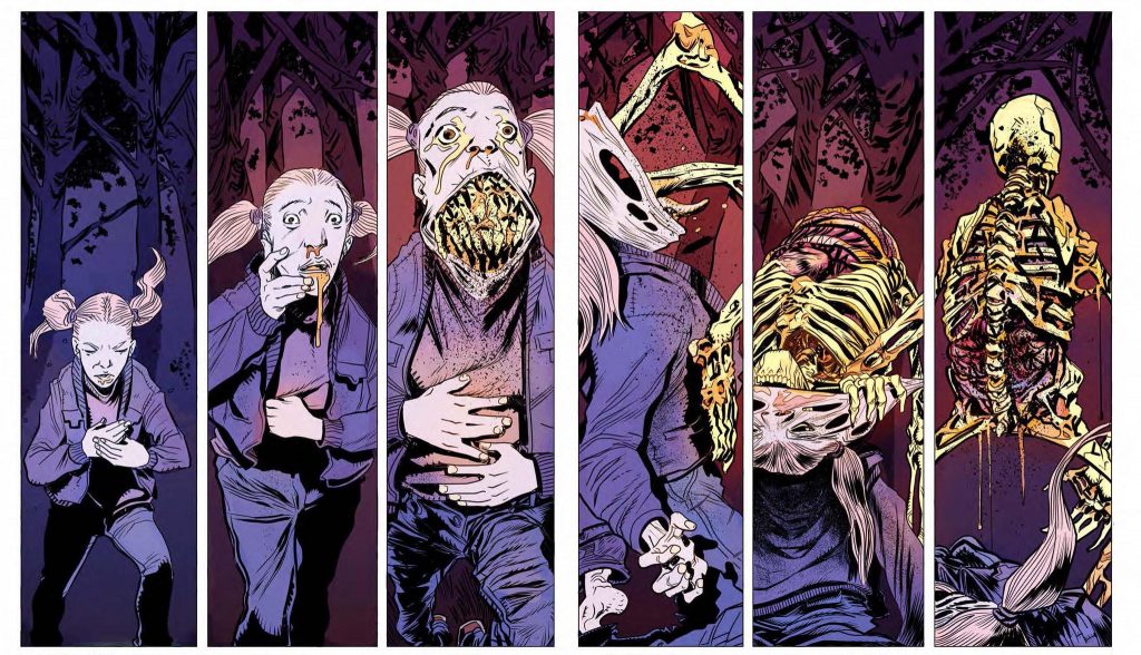
John Bivens (Spread, Cult Classic Creature Feature): Cult Classic Creature Feature actually has a spread that I still say is my favorite spread that I ever illustrated. And that is of a teenage girl throwing up her skeleton backwards. It’s my favorite because in storytelling terms, it came out just exactly how I wanted.
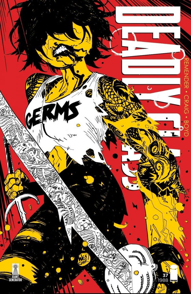
Wes Craig (Deadly Class, Kaya): There’s one cover of Deadly Class 1 with Saya, and it’s just so punk rock. She’s wearing a ripped white Germs shirt and leather pants, and she’s holding her sword really close to the camera. She has a red dot for an eye. It’s on a red background, she’s yellow, which makes it red/yellow, my favorite color combination. In Kaya, there’s a ton of red and yellow. It’s just really bold and it looks like a punk rock poster.
I hated selling that original art. I made prints of that and I’m going to make more prints of that because everybody really likes that image. That’s the one where I nailed the spirit of that comic. It’s not my favorite piece of art I’ve ever done, but the one where I was like, “That’s what the series should look like.”
I drew it slow but I inked it so fast that there’s energy on the page, it felt like a punk kind of thing, like I was strumming the guitar really fast.
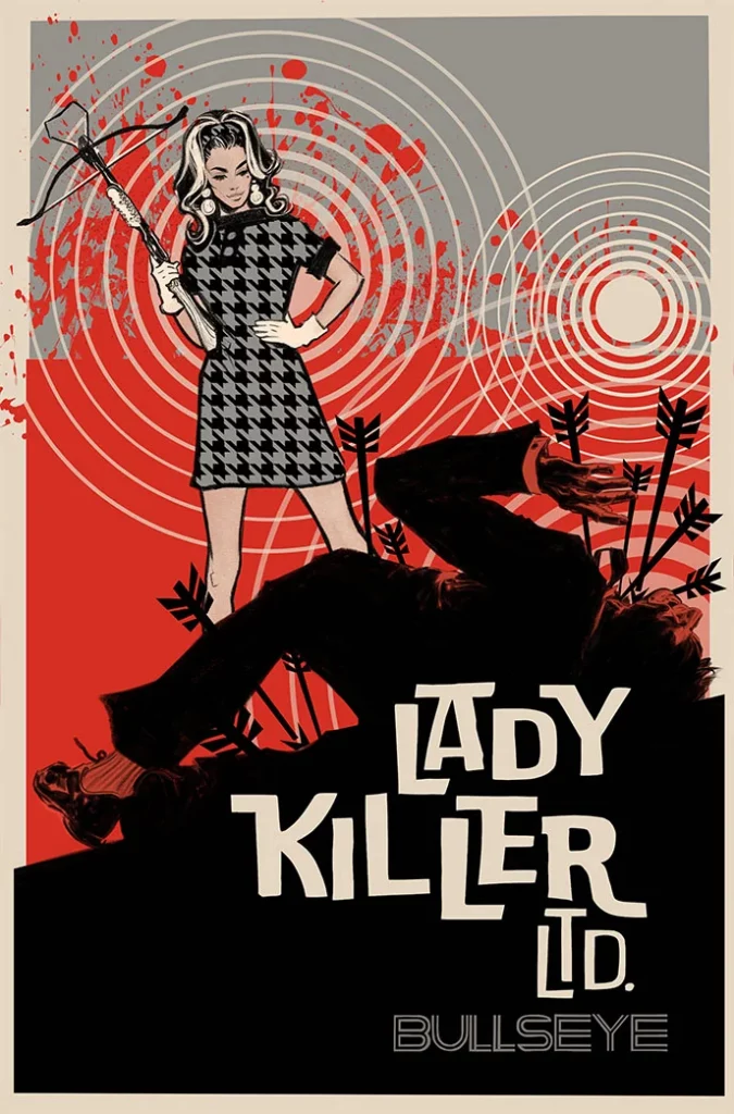
Joelle Jones (Lady Killer, Catwoman, Wonder Girl): I think there are individual components that I can get behind. I did this print of Lady Killer that’s very recent. I really dig her hair. It just swoops in the right direction. Do you know what I really love about it? It’s not because it’s good, but because it was two pen strokes and done. And it worked. The spontaneity of doing it right…that is incredibly satisfying. There is something really satisfying beyond the art itself, that your eye can see that it’s right and not to meddle with it. “I did this right in the first line stroke, walk away.” There’s a (satisfaction) that you don’t get in any other part of life.
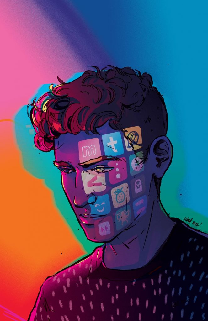
Liana Kangas (Trve Kvlt, She Said Destroy): I would say either of the last covers that I did. (My cover for) Mindset #1 was executed exactly how I saw it in my head, which rarely ever happens. Either it’s way better than I thought or it doesn’t quite hit the mark, but it’s just different. I’m not upset with it, but it definitely doesn’t match up with my expectations. But Mindset and then the Star Wars cover that I did were probably the ones where I was like, “Oh hell yeah.”
I wouldn’t say it matched with my expectations, but I think it’s more like, “Oh, holy shit, I did that.” I was really happy about it. I keep forgetting my own skill and talent and then I look at it and I’m like, “Oh yeah, I wasn’t just mindlessly going at it.” There was an art to it.
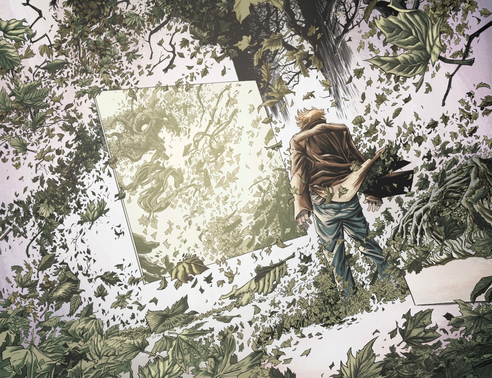
Declan Shalvey (Old Dog, Moon Knight, Injection): I’m actually fairly lucky. It’s happened a good few times, and sometimes, it comes out better than you could have expected it would. I think that spread in Injection 2 where Robin Morel’s in front of that window pane. That was what was in my head and it came out just the way I wanted. And maybe Injection #1’s cover and even the Moon Knight #1 cover.
I’m not trying to sound like an egotistical bastard or something, but I think in general, stuff comes out the way I wanted it to. I would say maybe my expectations are low, but just from the way I do layouts, it’s always an attempt to get as close to that as possible. And I kind of do. I would say 40% of the time, something comes out the way I wanted to. I would say 20% turns out better and then another 40%, not quite. But I think that’s pretty good. That’s a pretty good balance.
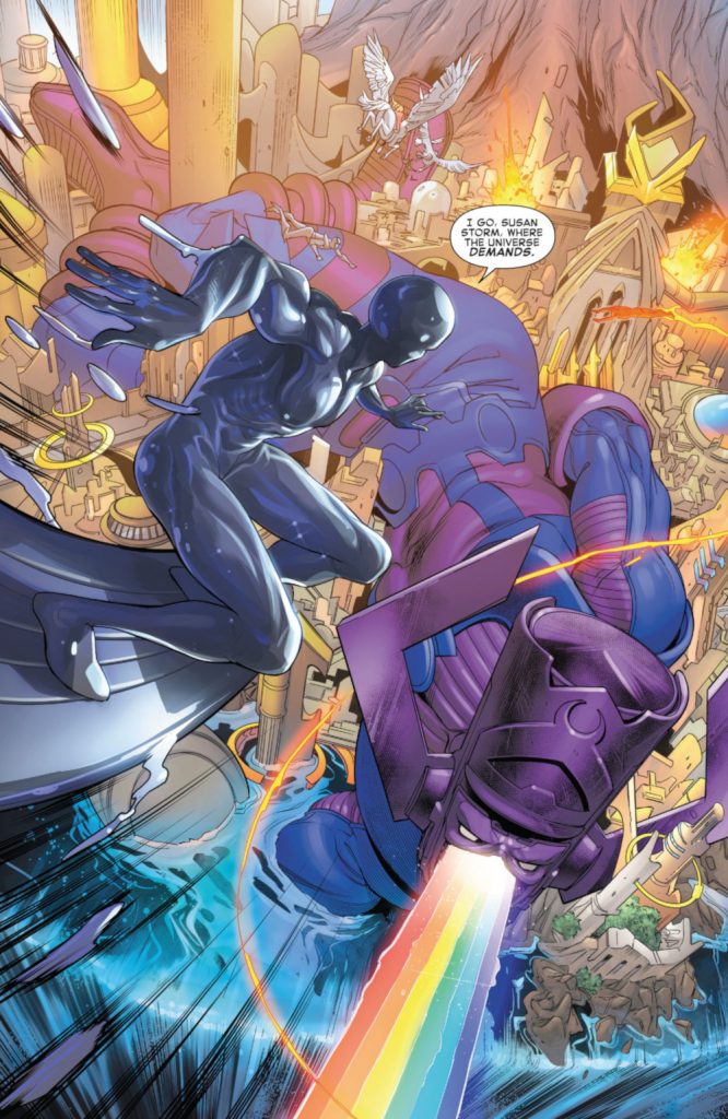
Rachael Stott (Fantastic Four): There was in one of my first issues of Fantastic Four. 3 It’s the Silver Surfer swooping down to Asgard where there’s the empty husk of Galactus lying across it. And when I read that, I was like, “Oh my God, this is a nightmare to draw.” And then when I looked at the finished thing, the guy that did the colors, Jesus Aburtov, made it look incredible. I was so chuffed with the way it turned out. The composition turned out really good. And also I get really obsessed with having depth in my artwork, because I don’t think I’m very good at it. So at times when I do get it, I’m like, “Ah, thank God.” So I thought the depth worked really well.
I thought that Galactus looked cool. You want him to look big, as well, because you don’t want to draw Galactus in (a way where) it just throws the whole perspective of the page off. But that one time it worked out, just once.
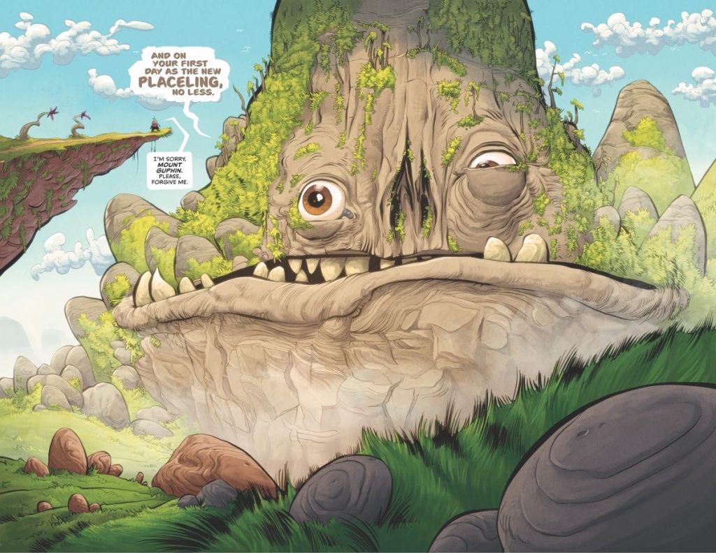
Kyle Strahm (Twig, Spread): I feel like that happens more often with panels than it does with pages. But from Twig #1, the two page spread with the mountain, when you first see the mountain right at the beginning, I feel really good about that page. And then when I got the color back from Jean(-Francois Beaulieu), I felt even better about them because he did such a good job. I tried to put a lot of depth in it, so there’s a bunch of stuff in the foreground and as you move back in space, there are all these different levels of depth. And at that time we had no deadline, so I could take as long as I wanted. That part of it was really successful for me. And so the scope, the scale of this massive thing was clear because there was so much space for it to exist in.
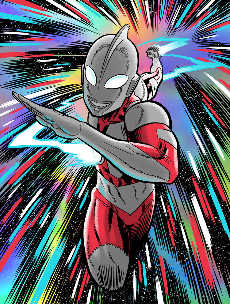
Robert Wilson IV (Barbaric, Heartthrob): The things that I tend to look back and be proud of are things where I had some kind of a leveling up or artistic breakthrough. There are a few screen prints that I did that I feel proud of. Even if I’m not as excited by the drawing itself, I’m proud of what it meant for my artistic progression. And that’s how I’ve been trying to look at my career. It’s not static.
I feel like we tend to look at things, our own lives especially, in a bit of an ahistorical view. “I am the culmination of everything and this is the end. This is where we are.” And obviously, it’s not really how things work, and the present moment isn’t the be all, end all. Things keep going. I try to think of my work in terms of a continuity. And I love when there is a clear delineation in an artist’s career. Like pre Ziggy Stardust and post Ziggy Stardust.
Bowie is so interesting to me because he has three or four of these big shifts. And so the things I’m most proud of are the things where I can see those shifts in my own work. (But) I don’t feel like I’ve had (my Ziggy Stardust moment) yet. I might be drawing it now.
