The Long Batober: Let’s Celebrate Batman & Robin: Year One by Power Ranking Chris Samnee’s 12 Best Panels from the Series
It feels only right that Batman & Robin: Year One, the 12-issue maxi-series from Chris Samnee, Mark Waid, Mat Lopes, and Clayton Cowles, is ending this week. While it fell back a couple weeks from its originally scheduled release date of October 15th, it still managed to conclude within the confines of the same month. That was important, and something people might even describe as a Batober miracle.
“Wait, what’s Batober?” you might be wondering. For long-time fans of Samnee’s work, it’s the reason Batman & Robin: Year One felt like a comic of destiny. The artist had long spent his Octobers participating in a one-person Gotham themed art month, Batober. Delivering a different piece of art featuring varying members of Batman’s cast every day during October was something the artist had become quite famous for. 5 It was an anticipated event, and one where art fans basked in the glory of his work. Each piece was so good that the only downside to Batober was is it made everyone sad Samnee had never actually drawn a series starring The Dark Knight. We all knew that he would crush it, which meant he simply had to take on a Batman book at some point, even if that came at the cost of Batober itself in the end.
That’s what this project did, but boy oh boy, was it worth it. Batman & Robin: Year One is a tour de force, and a human highlight reel for the gifts of Samnee and colorist Mat Lopes in particular. It also revealed that if any character is Samnee’s muse, it’s Dick Grayson, not Batman himself, as the original Robin is someone the artist really made magic with in the series — as opposed to the rest of the magnificently drawn characters and scenes you’ll find throughout. Its 12th and final issue arrives today, and it’s sure to be filled with majestic pieces of art, as the entire series has been. But with it ending right as Batober would typically close, I thought it’d be a good time to look back on the series and highlight the very best things that Samnee has drawn within its pages, almost like it was one long Batober but with me curating the selections.
That’s what we’ll be doing today, as I power rank my 12 favorite drawings and sequences from the series, as well as sharing a bonus in the form of my favorite cover from the run. We may not have gotten Batober, but this book is filled from an even richer collection of treats, ones that find Samnee taking everything he’d do during that beloved theme month a little bit further. It’s worth noting for trade waiters, though, that my selections do not include anything from issue #12 nor does it feature anything that could be considered a meaningful spoiler. This isn’t about plot. It’s just about great drawings.

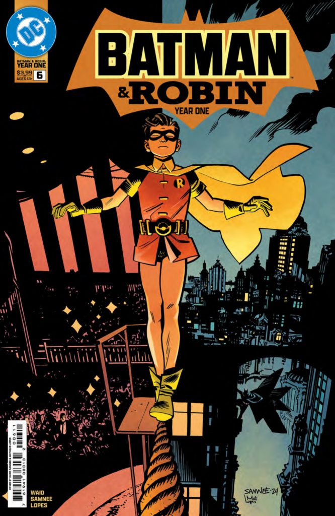
Best Cover: Robin walks a tightrope in issue #6
Why It Takes the Spot: There are plenty of different routes an artist can take to making a great comic book cover. Sometimes it’s just an iconic image, a singular look at a character that represents everything we love about them. Other times it might come from an atypical path to making the visual pop, whether that’s through bold color choices or a highly graphic approach. There are few wrong answers, at least in concept. One of my favorites, though, is when a story is told on the cover. That’s what the cover to #6 — which, it needs to be noted, is drawn by Samnee and colored by Lopes as well — does. It’s a remarkable work, showcasing Dick Grayson walking a tightrope between his two lives, as he closes his eyes and exists in two different times at once. The life of the literal circus, and the life of the circus that comes from being Batman’s sidekick.
Take a long look at this and then close your own eyes. You might find yourself transported into the moment yourself. Grayson taking a deep breath as he steps forward onto the rope. The roar of the crowd and the din of Gotham City, enveloping him as he moves onwards. Existence being split in his mind and the moment. A good cover stands out. A great one you can feel. This one does that, and does so incredibly well.

12. The General gets his close up in issue #4
Why It Takes the Spot: The primary antagonist of the series early on, as well as the main new character within its pages, The General is someone who needs to be taken seriously by readers and the Dynamic Duo alike. There are a number of ways you can get there. Plot works, of course. The General moving in to take over Gotham or being cruel and unusual to his father, delivers that effectively. We know he is one bad dude through those actions, and one who won’t stop until he gets what he wants. But we need to buy into him visually, as well.
That’s why I love a moment like this. It’s almost as much about what we don’t see as what we do see. Samnee depicts The General with nearly half of his face in the shadows, only a dead serious eye standing out within the darkness, as his visible face and posture reveal a calculating man contemplating the mistakes he’s made. It’s a picture that says a thousand words, especially with Lopes’ moody colors perfectly complementing the panel. It’s not a showy moment. It’s just a guy’s face! But because of its simplicity, it resonates deeply while reinforcing why this character is a threat worth paying attention to.

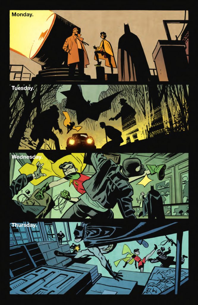
11. We get a danged montage in issue #7!
Why It Takes the Spot: This sequence is for those who were missing Batober and how rich scenes were depicted in singular images. Each day in this page’s montage feels like a Batober piece, as Samnee gets to conceptualize the different crime-fighting activities Batman and Robin are up to throughout the week. It’s a great way to deliver story, and to deliver a feeling for certain readers, even if Year One is a far richer exercise than simply being an elevated Batober.
My favorite of the four, though, is Monday. Oddly, I sometimes love Samnee the most when he pulls the camera back and simplifies his character work even more. I love how he depicts Gordon and Robin there, as they’re boiled down to their key details but it’s still so obvious that it’s the two of them. One other thing I love is the choice to show the fronts of Gordon and Robin but the back of Batman. Sure, that’s just positioning, and a product of this type of conversation. But it also is storytelling. It speaks to how open those two are and how closed off The Dark Knight is. It’s brilliant work.
subscribers only.
Learn more about what you get with a subscription
Amongst other things, of course.↩
Amongst other things, of course.↩
Quick aside: I love Mark Waid’s script there, as he translates Grayson’s message to ham speak.↩
Important note: This is in issue #6, the one that had my favorite cover that depicted Dick Grayson’s split lives.↩
Amongst other things, of course.↩
