Ten Very Specific Things from Comics I’ve Loved This Year
I’m off in New York this week, both at NYCC and beyond, so there’s no time to write. But there was the week before, and I had 12 hours of flights to contend with to get from Alaska to New York. With there being no way to predict the news, I’ve decided to mix things up in this week’s ten things column and write it on the endless flights I have to contend with.
This week is all about very specific things I’ve loved from my varying comic reads this year, with the focus being on creative decisions that have elevated my love of varying comics. This is not the same thing as my favorite comics of the year — that’ll come later this year, though I suspect you’ll see some of these comics reappearing there — but a random assortment of elements from varying comics I really, really loved. Let’s get to it.

1. I.N.J. Culbard, Strobing (Wild’s End #2)
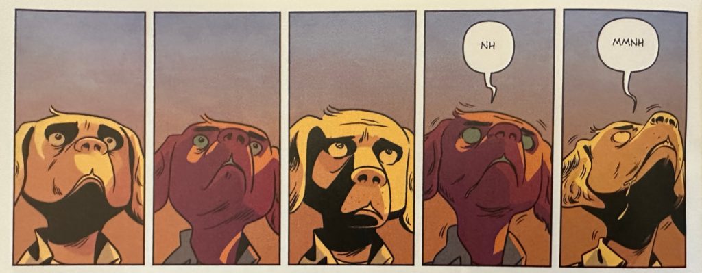
This sequence comes on the top of a page in Wild’s End #2, and it finds artist I.N.J. Culbard unleashing the total package in an incredibly effective yet not terribly showy way. It comes at a time Eddie, the character in the panels, and his grandpa come across aliens that look frighteningly close to old timey light poles. These aliens have developed a form of mind control and the way they take hold of you is by strobing the light that’s at their head. If you look into them as they do it, you’re taken into their grasp, doing what they want no matter what — even if it kills you. That’s a problem for Eddie, a young dog person born with epilepsy, which we learn of in that moment. Of course, strobe effects are famously bad for sufferers of that illness, as we see play out here.
This presents an interesting creative conundrum. How does one showcase the strobe effect from the alien while also revealing the unique impact it has on Eddie? Those are two different possible focuses for one scene. There are a lot of options here. The most likely solution though is showing the cause and effect by sequencing the alien and then Eddie, visualizing the action and the reaction across the panels and pages. That would work, but it’s missing some storytelling spice.
Culbard came up with a better solution: Why not just zoom on Eddie’s face and show the terrible effect the strobe has on him across a quintet of panels, using color alone to deliver the on/off rotation of the light? That, my friends, is good comic booking. The lighting leading to the rapid degradation of Eddie’s health, all emphasized by utterances that come from the youth and the motion lines that begin to form when the seizure takes hold in panel four, is an extraordinary choice.
This is an oddly good encapsulation of what makes Wild’s End special. It isn’t a showy, in your face kind of book, instead using tight, thoughtful storytelling to raise tension and invest us in the characters. In moments where others might go big, Culbard and writer Dan Abnett choose to go small. It’s what helps make Wild’s End one of the finest comics on the stands today.

2. Brothers and Dragotta, Setting Up (Go Back, in Newburn #10)
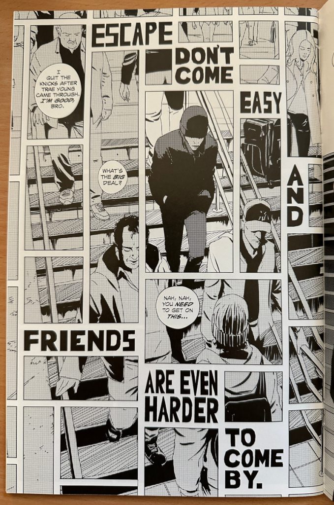
While Newburn itself is a great comic, one that writer Chip Zdarsky and artist Jacob Phillips should be proud of, I’d argue its latest exceptional arc has been highlighted by its backup rather than the superlative story that comes in front of it. That one is from writer David Brothers and artist Nick Dragotta. It’s called Go Back, and it finds a young man running from the law in New York City after he pickpockets and tussles with the wrong person — an off-duty police officer. Every aspect of it has been appealing, but instead of talking about some of the meatier bits that actually get into the story, I wanted to highlight the first page of its second installment.
It finds its lead character making his way down to the subway, looking to escape this predicament he finds himself in. The thing I love about is how well it sets both the stage and the tone for the entry to come. Whether it’s the idle talk from surrounding people of Trae Young cooking the Knicks or the light colored clothing and lively feel to every individual besides our lead, it helps you quickly understand that this is a person who is trying to not be found in New York City. You get that even if you hadn’t read the first installment. If it was just that, a page of all these people going up and down a staircase, we’d know that. But Dragotta chooses to step it up that much more.
The choice to break everything into panels with the titling of the chapter weaved into it makes the energy feel even rawer and more present. I love how the only panel that shows a complete person is the one that is on the lead character, with its details just a little brighter, emphasizing how he’s in the sights of everyone right now. The integrated words of the title add even more, acting as both a promise of what’s to come and a push down the page, ramping up the energy and adding to the tension in the process. Plus: It just looks cool as hell.
It’s fantastic seeing a duo work as well together as Brothers and Dragotta are. They’re achieving a singular feeling vision together while maximizing the space they have in each entry of Go Back. 6 That’s part of a big year for the pair, as their ShortBox Comics Fair entry Fight Like Hell was a fierce and fun read that stood out amidst a whole lot of competition. I hope we see much more from them, because they’ve been accomplishing great things in small spaces.

3. John Allison, Exemplifying Comic Timing (Steeple: The Silvery Moon)
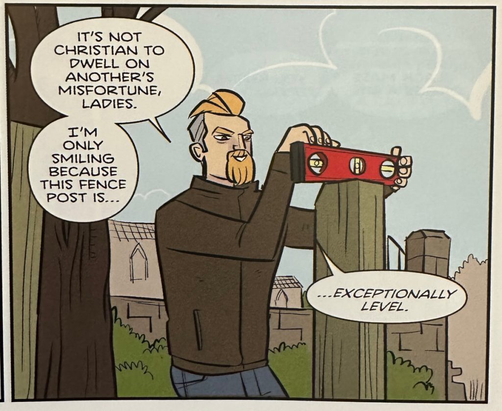
This comic is not from this year. It’s my one cheat. I did read it this year, though, which is why I’m allowing it. Plus, it’s extremely difficult for me to not tout cartoonist John Allison whenever I can, certainly not in a beat that so perfectly showcases what makes the guy one-of-a-kind.
It’s pretty simple, in the way that single panels often are. It’s unexceptional, as images of bearded men using a level can be. But built into its simplicity and its plain as day nature is some genius comedic timing. This finds Reverend Penrose — reverend by day, sort of, bane of monsters and mermen at night — reacting to the women in his life reveling in the satanic church leader’s tough times, as he tries to be a good, godly man by not reacting to his opposite number’s misfortunes. He can’t help but enjoy it, even if he tries to mask it by claiming his smile is connected to just how level the fence post he’s checking happens to be.
Here’s where the brilliance lies: choosing to split “…exceptionally level” from the rest of his dialogue, italicizing it in the process. It’s a case of a small decision paying massive dividends, as it forces us to read about Penrose’s smile, look at his smile, and then read the poor excuse he’s trotting out there. It makes it to hit with maximum possible impact, acting as a microcosm for how Allison blends words and pictures to deliver humor in a way few can. It’s smart as heck cartooning and funny as hell.
It’s also just a breathtakingly bad excuse. I’m sure Penrose loves a nice and level fence post, but we all know the truth.
subscribers only.
Learn more about what you get with a subscription
With the caveat that my shop has still not gotten undamaged copies of Newburn #11 yet, so I cannot speak to that.↩
With the caveat that my shop has still not gotten undamaged copies of Newburn #11 yet, so I cannot speak to that.↩
Coming soon! Sensastional She-Hulk! Their second volume together!↩
OR IS HE DEAD??? This issue suggests…maybe not? As does Daredevil #1, available at comic stores shortly after the end of this run!↩
Forgive me.↩
With the caveat that my shop has still not gotten undamaged copies of Newburn #11 yet, so I cannot speak to that.↩
