
The SKTCHD AWRDS: The Comics of 2019
This week, I revealed my comics of the year in the SKTCHD AWRDS over a series of five posts. It was a lot – it ended up being over 10,000 words over the 25 write ups – but it was a good year, and I wanted to tout its goodness in full. But I also wanted to make it easier to read in the end by compiling all of it in one ungodly monster of end of the year content, collecting all 25 comics into one super post. That’s what you’re getting today: all 25 in one place.
We’ll be going in alphabetical order based off title, and as per usual, if you think I missed something, consider jumping into the comments and sharing it! I for one am more than happy to read comics that were great that I might have missed on, so let’s discuss our favorites there! Also, this post is open for all readers, so please enjoy these write ups, and hey, if you haven’t read any of these titles yet, it goes without saying that I recommend them.

The Infernal Affairs Award: Assassin Nation
Written by Kyle Starks
Art by Erica Henderson
Letters by Deron Bennett
Sometimes, you just want a comic you’re going to enjoy. And for me, Assassin Nation was the comic I enjoyed the most this year, as Kyle Starks and Erica Henderson made an action comic that was equal parts hilarious, engaging and thrilling. While the premise was quite simple and made the whole thing seem like it was going to be intentionally ludicrous in a very specific way – it was about a crime boss hiring 19 of the 20 best assassins to protect himself from assassination – it ended up being something more, even if it was also ludicrous.
That’s because I was expecting something more Hard Boiled like, and it ended up arguably being more like Infernal Affairs, or The Departed, if you prefer. Sure, it was violent and had big, wild characters with names like Fuck Tarkington 1 and Desert Regal, it was also a conversation driven mystery that kept you guessing, even if by the end you were like, “Oh, yeah, that should have been obvious.”
But hey, also gun fights! And hilarious jokes! And cutaway gags! And arguably the greatest character creation in 2019 in the form of Taipan, an assassin designed off of Arnold’s Commando character, John Matrix! 2 It’s both a lot more than the simple action comedy it seemed to be, but also exactly that at the same time. Sometimes that’s all you need when you’re reading a comic: a couple pals trying hard to entertain each other, and in the process, succeeding at just that with you, the reader. Assassin Nation was the best in the business at that this year.
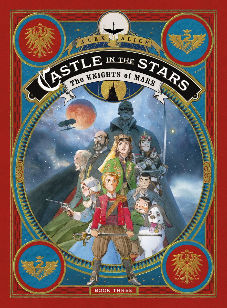
The Final Fantasy Award: Castle in the Stars: The Knights of Mars
Written and drawn by Alex Alice
If I could pick one comic that’s most specifically designed for me – even if it’s unintentionally so, obviously – it’d be Castle in the Stars, an ongoing graphic novel series from French cartoonist Alex Alice that is published by First Second. I describe it as “What if Hayao Miyazaki made a Final Fantasy comic?” which is very much exactly my jam, especially with its regular usage of airships. Its production value is out of this world, with a gorgeous, impeccably made hardcover on each volume. Oh, and the art is maybe my favorite in comics, with uniquely busy but still sublimely readable page layouts paired with sumptuous watercolor art.
It’s my kind of comic, and honestly, its gravy train hasn’t slowed whatsoever as the story moves onwards. This year’s third volume – The Knights of Mars – finds the story being told at its most whirlwind pace, but it doesn’t lack any of the inventiveness or artfulness that was delivered our way in the previous editions. Its speed is mostly due to its need to get to the stars, as the squad faces a long journey to the red planet to get some answers to their questions. This leads to some delightful character moments and interesting new(ish) foils being packed along with to add to the tension, and it leads to an energetic, thrilling read.
Plus: THE VISUALS. My god! The fact that everyone on the comics internet isn’t always talking about how Alice is an art god bewilders me. Everything he does is brilliant and beautiful and all kinds of other highly complimentary adjectives that start with “B.” He might be my favorite artist in comics right now, which is really saying something. So yeah, big fan of this volume, and I highly recommend that series as a whole. It’s an all-ages read, but it really does suit anyone, especially if your idea of a good time is a Super Nintendo Final Fantasy game or The Castle of Cagliostro. If that’s true, you owe it to yourself to read these books.

The Metronome Award: Criminal
Written by Ed Brubaker
Line art and letters by Sean Phillips
Colors by Jacob Phillips
A phrase I’ve long carried with me when I talk about comics is “metronome books.” Those are comics that are sometimes slept on and not discussed perhaps as much as they should be, and that’s primarily because they’re so consistently good people just kind of get tired of it. There’s only so many ways you can say things like “Fiona Staples sure is good at art!” or “Al Ewing! That guy can really write a Hulk comic!” I feel like it’s part of the reason you see reviews decline as titles age, as a lot of people just sort of work through their chief commentary early on in a run.
Ed Brubaker and Sean Phillips’ Criminal is a great example of that, as they’ve spent more than a decade telling stories in this world, and doing so in exemplary fashion. While they consistently find ways to surprise – the Archie-infused The Last of the Innocent arc is a good example – even then, it’s still a variation on, “Those dudes Ed and Sean make good comics!” It can be more fun to slay something that utterly failed or rave about something unexpected, and so minds wander, eyes turn elsewhere.
But more than a decade later, Brubaker and Phillips are as good as ever, and this series had a marvelous year, one with all of the grim and gritty characters and situations we all love, but with some notable narrative variations to keep things spicy.
Take The Summer of ’88, the current storyline, for example. It’s a lengthy one for the duo, and that’s partially because of how the pair has been changing up their approach. Each issue has a different point-of-view character, giving us insight into the world and the situation from a wide mix of characters and showing us the area of effect one femme fatale can have on an array of figures while even giving us her perspective on the situation. It’s a clever way to do it, taking us inside the heads of those involved, showing how everyone has their own motivations and how there are costs to every action, even if they aren’t obvious.
That arc isn’t even the seeming highlight for the year for the pair – the comic artist-centric one, Bad Weekend, quickly was released in hardcover after the story ended and earned raves for what they delivered – but it’s the one where I was reminded by just how special this series is and how clever these storytellers are. Sure, their comics are always good, making them metronome books on the surface. But this famed partnership never rests on their laurels and never takes plays off, giving us a story that is far more than just the same ol’, same ol’, but something fresh and exciting more than a decade into the title’s existence. It was yet another impressive year for one of the finest titles out there.
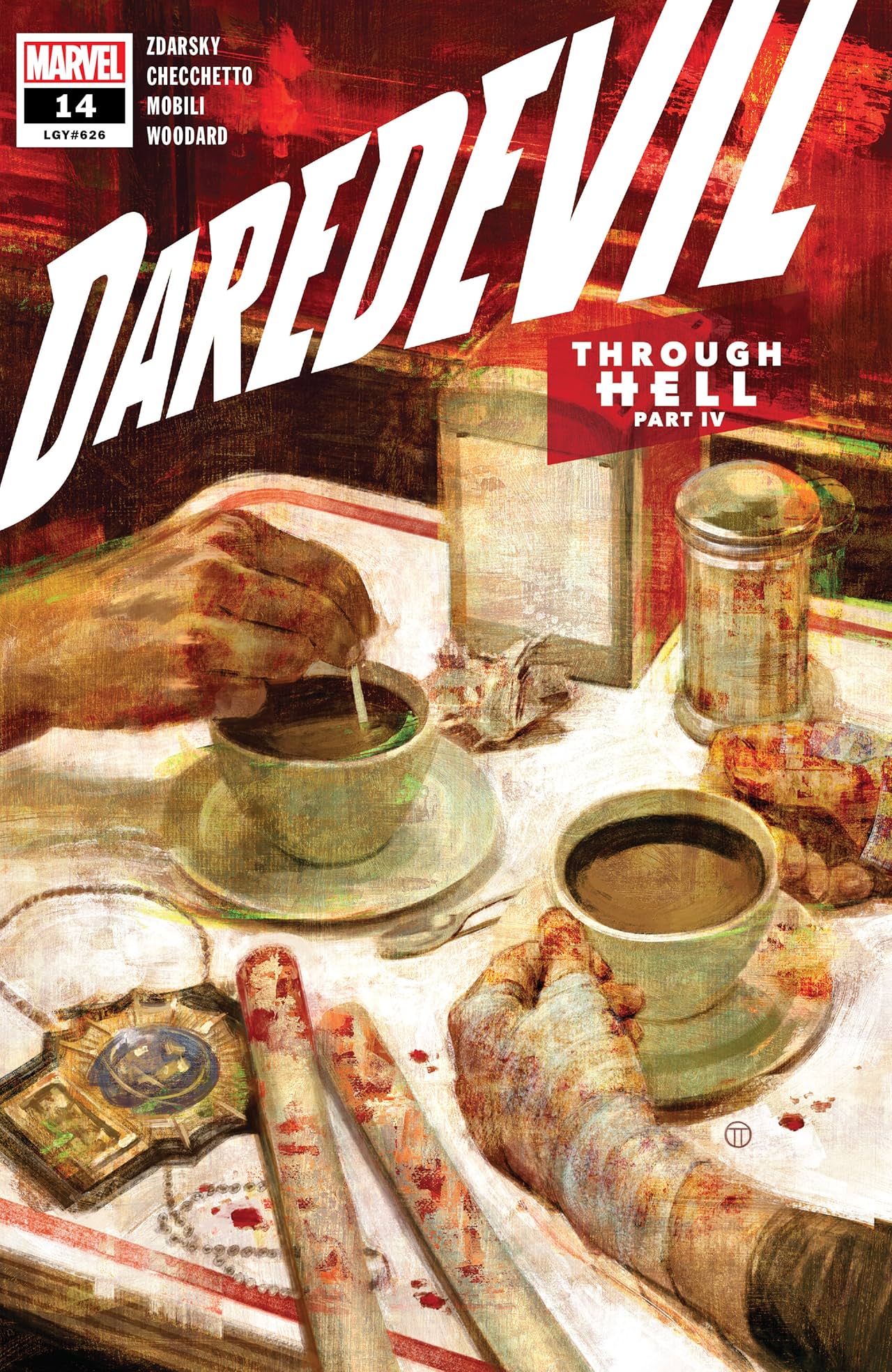
The Degree of Difficulty Award: Daredevil
Written by Chip Zdarsky
Pencils by Marco Checchetto, Jorge Fornes and Lalit Kumar Sharma
Inks by Marco Checchetto, Jorge Fornes and Jay Leisten
Colors by Nolan Woodard, Sunny Gho, Jordie Bellaire and Javier Tartaglia
Letters by Clayton Cowles
Covers by Julian Totino Tedesco
I imagine the fight or flight response kicking in with comic creators when they are offered a run on Daredevil. It feels like your immediate response would be a fascinating blend of excitement and fear, because it’s a character with a rich and beloved history. That makes it easier to find strings to pull and situations to manipulate, but it also means that subconsciously, you can’t help but compare what you’re reading to what you’ve read before. The degree of difficulty that comes with that, alongside the pressure that’s certainly there too, must be immense.
Yet Chip Zdarsky, Marco Checchetto, Julian Totino Tedesco and friends delivered completely in their first year, giving us a story that’s engaging, effective and fitting of the character. That’s basically all you can ask for from them, but that they did it while introducing new characters, new ideas and chaos thanks to the power vacuum that happens when Daredevil retires (again) and Wilson Fisk goes legit (ish? he does extremely murder someone in the book). That leads to an intriguing read, and one that is greatly appealing to me as a longtime fan of the character and much of the creative team.
I will say this, though. Its greatest weakness is how it suffers from Marvel’s relentless release schedule. It debuted in early February of this year, and by the close of the year, 15 issues will have been released with a 16th dropping on January 1st. That’s a dizzying schedule for the writer and an untenable one for the art teams, and because of that, the middle arc this year suffered because of an incongruous fit in Lalit Kumar Sharma. He’s a capable artist, but next to an ascendant effort from Checchetto, the book diminishes greatly. Jorge Fornes stepped in on the last issue of the arc Sharma works on presumably because he was a far better fit, and it was immediately a vast increase in quality.
Overall, it’s an extremely strong title, and one that I love at its high points. But its one that I wish had a bit more breathing room, as it could be a classic run if given the time to be. I adore it all the same, even with a bit of a sag in the middle, as the work of the core team is truly exceptional. Even when facing the legacy of the character, they compare favorably, delivering a worthwhile addition to Daredevil’s story.
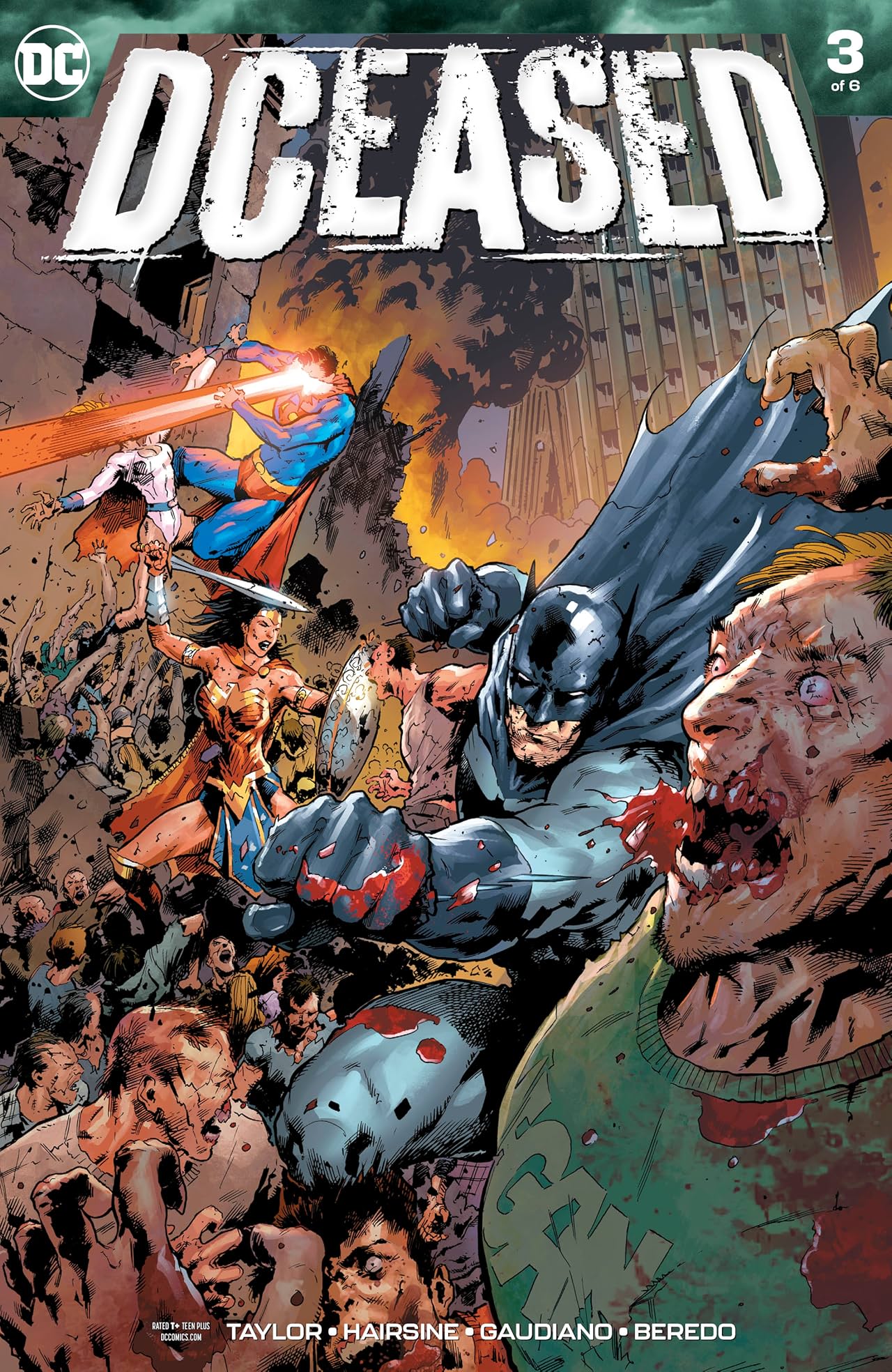
The Dude Disguised as Another Dude Award: DCeased
Written by Tom Taylor
Pencils by Trevor Hairsine, James Harren and Neil Edwards
Inks by Stefano Gaudiano and James Harren
Colors by Rain Beredo
Letters by Saida Temonfonte
DCeased had no right to be as good of a comic as it was.
I facetiously and lovingly called it DC’s Marvel Zombies, because that’s what it was. It was a six issue mini-series that was about the Anti-Life Equation being channeled through people’s devices, meaning if you use your phone, you turn into a bloodthirsty monster, effectively. 3 It was a big, bonkers and maybe even arguably silly Elseworlds tale on the surface. It had all of the markings of a cynical cash grab of a comic.
And yet, it was very good, a highly entertaining and even surprisingly emotional tour of what happens to the DC Universe when evil wins. What do heroes do when they’re stuck in a zero sum game in which there’s no chance to win? What unfolds is a fascinating study of hope and the relentlessness of heroism, as well as, you know, some good ol’ fashion ultra-violent hijinks that arise from the marriage of superpowers and a variation on the idea of zombies. [foontote]I didn’t want it to seem like it was too serious, because it really is a pretty brutal blockbuster most of the time.[/footnote]
Tom Taylor’s one of the best writers in the business, and his ability to turn an idea that feels like it should be unbearably morose into something emotional and character-driven is endlessly impressive. He’s one of the few that can do that in the often grimdark DC universe, and he showcases that here over and over. It helps that he has highly effective artistic partners working with him, including the underrated Trevor Hairsine, whose work is equal parts brutal and beautifully nuanced throughout. Pairing him with Stefano Gaudiano – a seasoned vet of the zombie arts on The Walking Dead – was an inspired choice, as was deploying the genius that is James Harren 4 in the Apokolips portion of the first issue.
This in some ways is the ideal event comic, of a sort. It’s one that has a real cost to it. It has an absurdly big idea, but one delivered with execution and respect from a fantastic creative team. It feels like a true final crisis, and the kind of comic I want to read from DC.
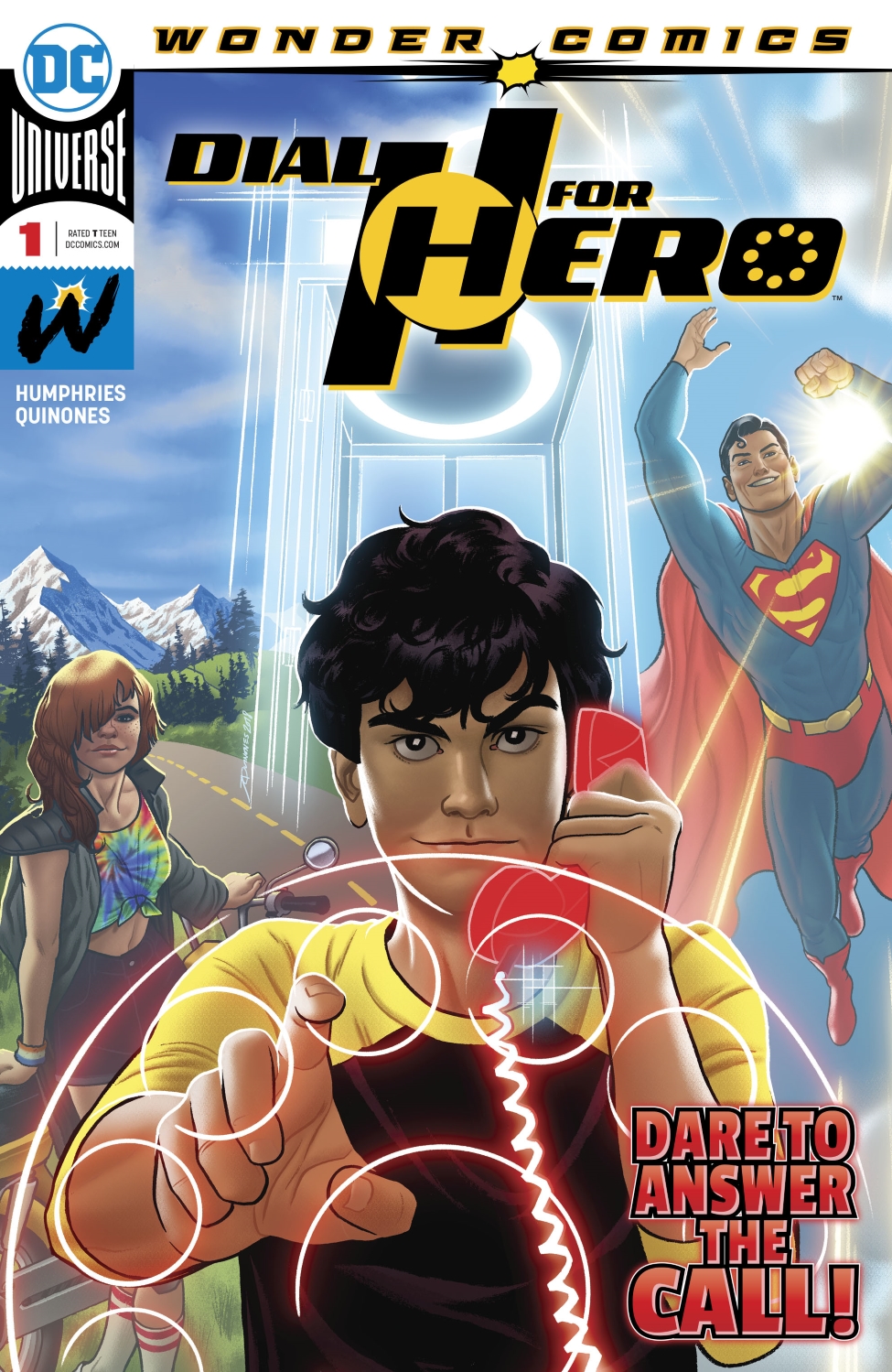
The Under the Influence Award: Dial H for Hero
Written by Sam Humphries
Line art by Joe Quinones, Paulina Ganucheau, Colleen Doran, Erica Henderson, Michael Avon Oeming and Stacey Lee
Colors by Jordan Gibson
Letters by Dave Sharpe
There’s a big part of all of us that is heavily influenced by the stories we enjoyed as we were growing up. Whether you’re someone who makes comics, movies, TV shows, or books, or perhaps you just engage with them, what you enjoyed when you were younger plays a big part in what comes next for you. Usually when that manifests itself, it’s a feel based thing. The emotions are evoked, even if it’s not exactly what came before.
Don’t tell Sam Humphries and Joe Quinones that, as that pair took Dial H for Hero, a title that long struggled to connect with audiences and fused its core premise – the idea that a ring of the H Dial turns you into a different hero each time – with their own personal comic book history to make something special. Dial H for Hero is a tour through their own experiences with and loves from the medium. A little of everything is present here, as we see not just your DC influences, but early Image, Moebius, Frank Miller, Jamie Hewlett, Mike Allred, and on and on and on. Humphries, Quinones, colorist Jordan Gibson and the rest of the team swing in and out of the stylings of those influences, and it’s always a thrill to see what they come up with.
It’s not just style, of course. They’ve created a remarkably winning pair in series leads Miguel and Summer, and their adventure together is endlessly entertaining. They’re building a new Dial H mythology, and it’s one that somehow expands the idea while also making it more personal. It’s built for a tight, 12 issue story, and one that accomplishes a lot yet entertains in a thoroughly small and delightful ways. This is my favorite part of the rather underrated Wonder Comics imprint Brian Michael Bendis put together at DC, and a wonderful example of what happens when you empower creators to look inwards and find the right story for them. You get a killer Dial H comic! Who saw that coming? I certainly didn’t!
I talked with Humphries about this book on Off Panel, but I’ll be honest, a lot of it was “THAT JOE QUINONES GUY SURE IS GOOD!” Sam, you’re rad too!
The Classic Misdirection Award: Farmhand
Written and drawn by Rob Guillory
Colors by Taylor Wells
Letters by Kody Chamberlain
I went deeeeeep on what makes this comic so good a little while back, so I don’t want to play back those hits so much here. The short version is Rob Guillory managed to build off of a promising start while flipping what we thought this title might be in exciting ways.
The longer version is much more, but here’s a quick version of that even. The impressive thing about this book is sure it’s good and sure it’s surprisingly frightening and impressively dark while still being entertaining. But perhaps the greatest strength of this year for Farmhand was how Guillory played our expectations against us. We thought this title was going to be one thing, and yes, it has a lot of the trademarks we’ve come to expect from the cartoonist. Heart and comedy, through and through. But it also took those beats and twisted them, revealing this book to be more of a family horror comedy than the quirky book it appeared to be at first.
That made it far more interesting, as the horrors from this world don’t have to just come from creepy science experiments gone right – and then super wrong! – but also from the history we all share. Our relationships can we what strengthen us, but they can also tear down families, destroy partnerships, and create scary situations for those around us. Guillory managed to throw us off that scent at first, but by the time we had reached the end of the second arc, Farmhand revealed itself to us as a much more multi-faceted and far more unexpected story. It’s a much better book in having that, and I’ve been endlessly impressed by how Guillory handled that.

The Good Times Award: Giant Days
Written by John Allison
Line art by Max Sarin
Colors by Whitney Cogar
Letters by Jim Campbell
Full disclosure: I am a trade waiter on Giant Days. I love the series, but I came onboard late and the sequencing of trades resulted in me never catching up in single issues. 5 But I love the series all the same, as the adventures of Daisy, Esther and Susan is the most perfect piece of entertainment in comics for this reader, pairing a situation that’s highly relatable for many readers – college! youth! bad decisions! – with John Allison’s highly amusing and aspirationally authentic writing and Max Sarin’s exceptional character acting and visual storytelling.
That’s one underrated part of this book. It’s strange to say, but I feel like Allison and Sarin’s gifts are almost underrated because of the humorous nature of this series. But this is a world-class duo of comic creators. Allison is unparalleled in his character work, and so is Sarin. There’s a reason everyone loves the cast of this book: no one builds characters like these two do. Everyone feels alive, but also like if they were apex sitcom versions of real people, without the downside. It’s like the Judd Apatow series Undeclared, but filtered through Allison’s brilliant mind and Sarin’s exceptional visuals.
So yeah, needless to say I love it. It’s the best time in comics, even if it’s over. But it’s still going for me! Huzzah to the perks of being a trade waiter! Giant Days keeps going for me while it’s still going for everyone else! Yeahhhh!!!!

The Peak of Their Powers Award: Harley Quinn: Breaking Glass
Written by Mariko Tamaki
Art by Steve Pugh
Letters by Carlos M. Mangual
Outside of Batman: The Animated Series, Harley Quinn has been a struggle for me as a character. She’s someone who has always felt like her renditions are at odds with each other, with a distance between who the creators think she is versus who she’s actually supposed to be. That’s not to say there aren’t good comics featuring the character, but most Harley comics felt like an impression of Harley rather than the real deal.
That’s part of the reason I enjoyed Harley Quinn: Breaking Glass so much. Mariko Tamaki and Steve Pugh clearly had a fierce idea as to who Harley Quinn was in their mind, and it’s a version that felt reflective of not just who she is – someone with good in her, even if she is 100% an agent of chaos – but also of the world we live in today. That made this comic not just a good one, but a relevant one, and that’s something altogether more interesting.
But let’s not bury the lede here: this is a remarkably crafted book. You have two creators at the absolute peak of their powers here, as Tamaki’s had a banner year and Pugh’s found his perfect muse in Harley Quinn. Tamaki’s blending of modern issues like gentrification with old school ideas like villains in The Joker vein lead to an exciting and atypical approach to a familiar world. Pugh’s character work is pristine and his blend of desaturated colors and explosions of vibrant hues deliver a unique, engaging read. Pair the two together and you’re left with something that’s as dynamic and one-of-a-kind as the titular character within the pages of this book. It’s an outstanding fusion of two phenomenal talents, and a showcase of what happens when creation and creators unite to form something greater than the sum of their parts.
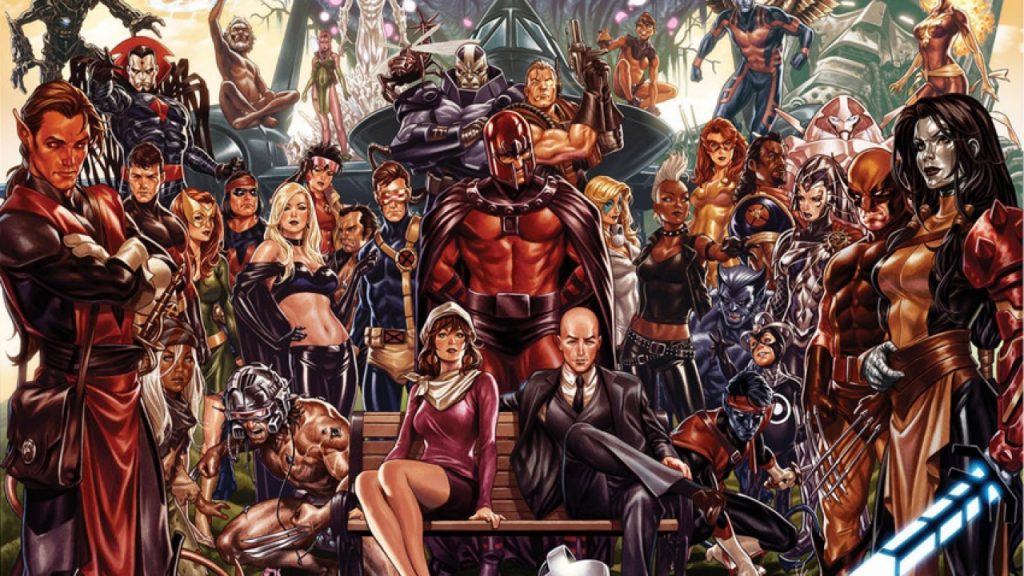
The Comic of the Year Award: House of X + Powers of X
Written by Jonathan Hickman
Pencils by Pepe Larraz and RB Silva
Inks by Pepe Larraz, RB Silva and Adriano Di Benedetto
Colors by Marte Gracia
Letters by Clayton Cowles
Design by Tom Muller
What can be said about these comics that hasn’t been said already, perhaps especially by me because I refuse to stop talking about it? House of X and Powers of X were two comics that were one, and because of that entangled, synchronized nature – and because of their extremely high levels of quality – they became something much more. They were the event comic that lived up to the name, a status quo changing effort that made us rethink what we know and love about the X-Men.
Were they perfect comics? Maybe not. But they delivered exceptional art, unique approaches to the way Marvel tells stories, challenging turns for characters and the X-Men as a whole, revised takes on characters we’ve long thought we knew, 6 and the rare water cooler experience for comics. This was the Game of Thrones experience for comics: the story that had everyone talking every time a new issue was released. I can’t recall the last time a comic did that on the merits of what it was rather than something notable about how it was being released. It might be the first title to truly accomplish that in the social media era, unless you count the New 52, which I’d argue was mostly because of the shocking nature of what it represented.
It was both something new and something great. It was Jonathan Hickman at the peak of his powers and with a stunning amount of freedom orchestrating something new and wonderful. It was Pepe Larraz and RB Silva, getting their headliner moments and nailing every beat. It was Marte Gracia, showcasing how a colorist can unite disparate visions in a way many might not have expected. It was Clayton Cowles, bringing his A game, as per usual. It was Tom Muller, working with Hickman to reinvigorate what a Marvel comic could look like. More than that, like with the mutants, it was a team showing how united is better than separate, and how every member of your squad – whether it’s on the specific creative team or part of a writers retreat or part of the X-Men writers room – can make an impact, if given the chance.
It was the perfect comic for 2019, and something that represents hope for both the X-Men and how Marvel comics could maintain relevance throughout the next decade, culturally, creatively, commercially. These were, without a doubt, the comic of the year.
Oh, and if you’re into this sort of thing, I talked with Jonathan Hickman about how all of this came together, and Tom Muller about how he made that design magic happen. They’re good follow ups to reading those titles.

The Quiet Giant Award: Immortal Hulk
Written by Al Ewing
Line art by Joe Bennett, German Garcia, etc.
Inks by Ruy Jose, German Garcia, etc.
Colors by Paul Mounts, Chris O’Halloran, etc.
Letters by Cory Petit
Immortal Hulk is a fascinating book because it’s a Hulk title that’s heavily defined by the quiet moments. Whether you’re talking the eerie, end of the universe story in issue #25 or the beats where the Hulk isn’t smashing but something far more frightening – plotting – this title elevates at moments that are often secondary in comics starring the Jade Giant. It’s because like Banner, Al Ewing knows the devil is in the details, and it’s something that separates this book from others before and makes it more akin to Peter David’s beloved run.
Fascinatingly, this has come as Ewing has dramatically increased the scope and scale of this title to previously unthought of levels for the character, connecting the Hulk to other dimensions, immense spans of time, and to a level of smashing we had yet to believe possible. As they say, as above, so below, and it turns out a Hulk is a Hulk no matter where he goes. That leads to wonder and terror in equal measures, and to a truly unique read.
Of course, it’s not just Ewing, and it’s not just quiet moments in space. Joe Bennett has done career-defining work on this title, and this year featured him going off on the monster realm, particularly with the new wave Abomination character, both when Rick Jones resided within and General Fortean. The latter is a deeply fascinating character in this run – albeit a no longer living one – if only because he’s one that shows how the Hulk doesn’t destroy things physically, but emotionally, mentally, and, perhaps crucially, competitively. Fortean wanted to prove himself, and Bennett proved himself a horrifying monster in painstaking detail. It was a remarkable creation, and one that was elevated by the veteran artist’s mind and delivery. He’s the exact right artist for this run, as he can deliver moments both big and small while giving us ample measures of whatever emotion we’re supposed to be feeling with few words from Ewing in conjunction.
Special shout out to German Garcia, too. It was a one-stop appearance in Immortal Hulk #25, but my god, what doozy of a visit from the veteran artist and his collaborator in colorist Chris O’Halloran. We needed someone who could deliver wonder and horror while making those known things completely alien to us, and Garcia crushes it.
I don’t need to tell you this comic is good. It is known. But I appreciate it for the little things. We’re used to big with the character. Doing something a bit different, a bit more nuanced, a bit wilder has helped this comic become a modern classic. It’s been a thrill to read.

The Deep Impact Award: Kaijumax
Written and drawn by Zander Cannon
Color assists by Jason Fischer
It was a light year in releases for Kaijumax, but considering each issue of Zander Cannon’s “monsters in a supermax prison” comic basically contains enough emotion and reader experience in one issue as three plus issues of a typical comic – at least from a feel standpoint, it’s a regular length comic – it hardly felt like that. That’s one of the many things I love about Kaijumax. It’s a comic where every decision is measured, every character is considered, and every detail is respected, meaning that this will never be a comic you read and are like “that was fine” afterwards before you move onto another comic.
Each issue of this will carry with you long after the read, living with you as you think of the state of Electrogor’s family, the current gang situation, the shocking turn in Xian and Go Go Space Baby’s relationship, and, perhaps most of all, the GOAT goat Daniel, who must be eternally protected because he is a precious little baby former devil monster turned current goat. It’s a title that endlessly resonates with you, making you not just think but feel, whether that means about how hilarious or clever something was but also the sadness Cannon can deliver within this seemingly cartoonish facade.
It was a great year for the series. Sure, the rate of release has slowed in its penultimate season, but Cannon’s mostly a one-man show. If he needs time to make a comic that has as deep of an impact as this one does, then he deserves that time. I’m fully onboard, no matter how much this book hurts to read sometimes. That’s just Cannon doing what he does; telling a story that pulls no punches but is always better for it.
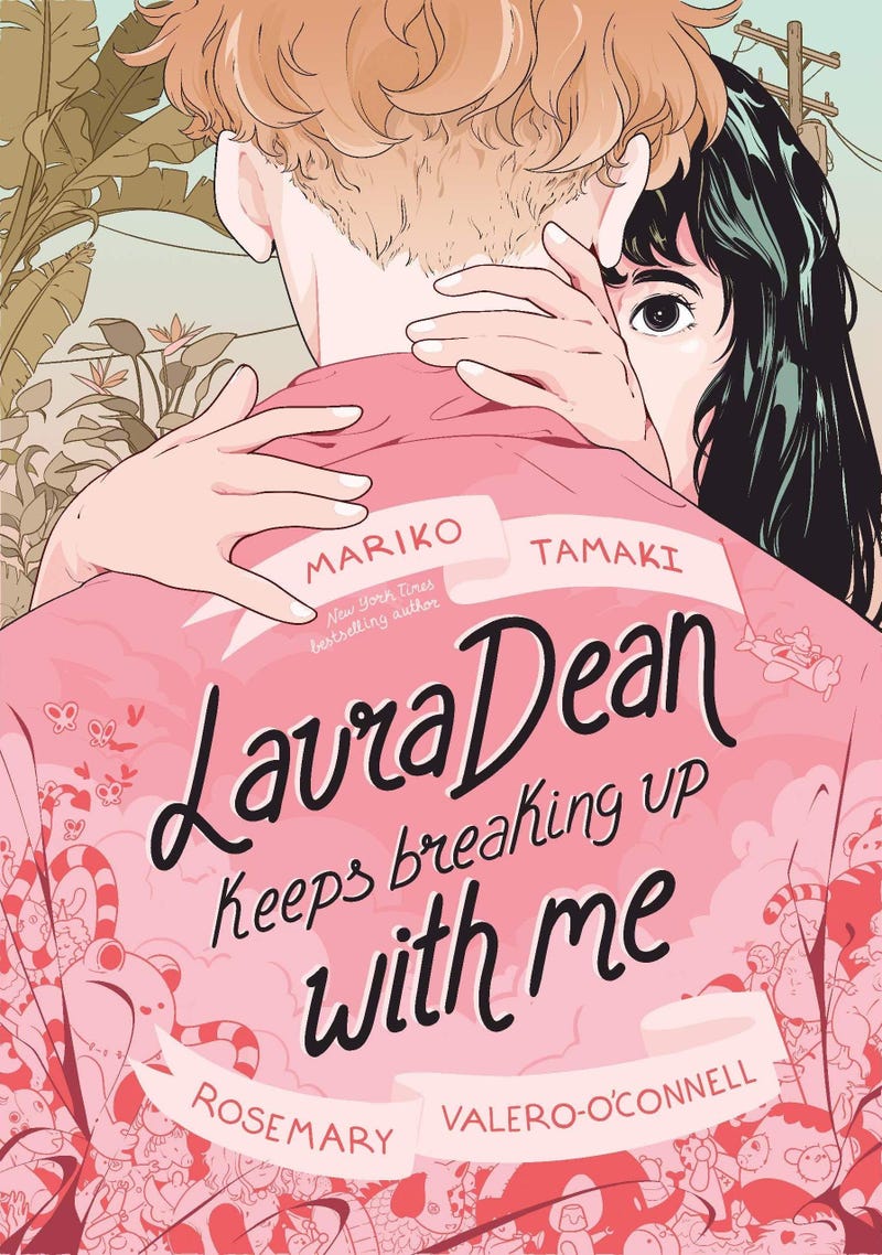
The Mirror Award: Laura Dean Keeps Breaking Up With Me
Written by Mariko Tamaki
Art by Rosemary Valero O’Connell
Sometimes comics are escapism. Sometimes they’re a place we go to see the Hulk punch planets or kaiju use crazy slang in prison or any number of other bonkers concepts. But sometimes, they’re a wonderful medium for delivering stories about what it means to be young, the complicated emotions that come in relationships, meditations on how our actions affect each other, and how inescapable feelings really can be. Mariko Tamaki and Rosemary Valero O’Connell’s future Eisner-winning graphic novel Laura Dean Keeps Breaking Up With Me is an excellent example of that, as this tour de force showcased the depths and humanity that can be delivered in this art form, if you so desire.
That’s not to say anything they did hadn’t been done before. But it’s a remarkable reminder of the potency that can come from comics. Case in point: when I first read this book, there was a large part of me that was genuinely upset with the title’s lead Freddy. I hated how she treated her friends, hated how she ignored her best friend Doodle, and hated how she just couldn’t leave Laura Dean alone, as she had too much good in her life to waste her time in a broken relationship. But then I realized as I was rereading it that my frustration stemmed from the fact that at points in my life, I had been Freddy, and really, who hasn’t been at some point in our life? There’s nothing more destructive to a person than a bad relationship, and this was an incredible showcase for it.
That is the brilliance of Tamaki and Valero O’Connell, as this pair delivered a story with such authenticity and heart that we’re given a story that doesn’t just feel true, but like a mirror to our own lives. And every little bit of decision making they make within this work emphasizes that, from camera decisions or choices to fade characters out (whether you’re talking details or in total) by Valero O’Connell or little looks at how we engage with our private lives or insights into where we foster relationships Tamaki chooses to include. This has a lot of big emotions in it, but much of it stems from the small choices this deadly duo makes throughout.
This was the graphic novel of the year for me, and that’s without even saying anything about Doodle, the non-goat character 7 who I’d fight the hardest to protect. Doodle was a remarkable, fully realized creation, and to steal an overly dramatic Twitter line, I’d give my life for Doodle. That kind of investment is hard to find in a comic, but Tamaki and Valero O’Connell nailed it here.
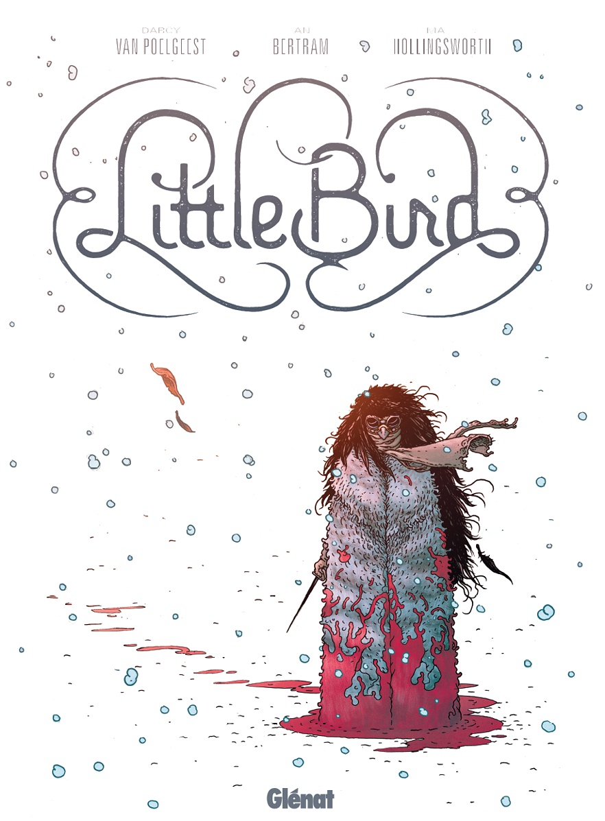
The One That Waited Award: Little Bird
Written by Darcy Van Polgeest
Line art by Ian Bertram
Colors by Matt Hollingsworth
Letters by Aditya Bidikar
Design by Ben Didier
This was a title that was endlessly recommended to me, yet I kept saying I was going to wait for trade. And then the wait for trade route took longer than expected, as Image and the Little Bird team inexplicably decided to go to hardcover first, which delayed its arrival into my hot little hands and created a much more expensive release. I waited. And waited. And waited.
But then I bought the hardcover upon its release and was like, “Oh, so that was actually really good!” There was a part of me that rued my perhaps overly patient ways, as I could have been hyping up this title long before. But it was a title that worked very well in collected form, especially considering the very high quality of the hardcover release. That was a beauty, and something that wonderfully emphasized the work everyone put in. And while it was a great idea with top notch execution by writer Darcy Van Polgeest, I’d be lying if I said it was anything but the art that really, really sold me on this.
Ian Bertram’s work on this is astonishing, with a style that evokes Frank Quitely yet an execution that’s often reminiscent to Hayao Miyazaki. 8 The power of the story is amplified by Bertram’s art throughout, and when paired with colorist Matt Hollingsworth, you have two visual masters working in lockstep. Letterer Aditya Bidikar perfectly matches Bertram’s line, adding weight to the storytelling and jiving nicely with everything else in the book. By the time you work in Ben Didier’s design, you realize that this very well may have been one of the best looking comics of the year, top to bottom.
It’s a very strong book overall, but those visuals are just killer, and every bit worth the wait even if I was slow on the uptake.

The Sleeper Award: Meet the Skrulls
Written by Robbie Thompson
Art by Niko Henrichon
Color assists by Laurent Grossant
Letters by Travis Lanham
While there were smaller titles on this list, is there anything more singularly unexpected than a five-issue Marvel mini-series about the family life of Earth-bound Skrulls that was believed to be a cynical tie-in to the Captain Marvel movie being…something wonderful? Maybe, maybe not, but either way, this one really snuck up on me. It even got to a point where at the end of the year I wondered to myself whether or not I was overrating it. It had been a bit. Was it just the surprising nature of this title that had me advocating for it so much?
Then I went back through the series, and nope! This title was a poignant, potent and, yes, surprising read, as it uses the fluid nature of the Skrull race to explore the classic nuclear family. It touches on many of the same beats as Tom King and Gabriel Hernandez Walta’s The Vision, but it’s very much its own thing, introducing a family of characters – the Warners – that we can’t help but get invested in them.
It also asks questions about identity, as these characters – most notably the teens from the Skrull family – struggle with who their parents want to be, whether that means a fierce warrior or even just someone who prefers their Skrull form over the human one. Within it, writer Robbie Thompson handles it with grace and a deft touch, artist Niko Henrichon provides exemplary character work loaded with subtleties and heart, while letterer Travis Lanham continues to make his case as the most underrated letterer. 9 This came from nowhere to be a top 20 comic on the year for me, which makes it a true sleeper, and one I adored.

The Map to My Heart Award: Minotaar
Written and drawn by Lissa Treiman
Every time I talk about this comic, I talk about the foldout map within its pages.
That’s not to diminish anything else within it, but it’s rare that I read a comic where I genuinely haven’t seen something in it before, especially when it’s a map in a mini-comic, not a graphic novel. The production questions related to that astonish me, but shouts to Lissa Treiman and Zainab Akhtar or whoever else came up with that solution, because I love a good map in any story, let alone a comic.
But to only talk about the map is to betray its true strength, and that’s Treiman’s ability to deliver a heartfelt story of the complicated nature of friendship in a Theseus in the Labyrinth-like tale set in what is effectively Ikea. It’s an absurd idea, but her exploration of what binds us and the things that actively work to drive us away is revelatory, even as she’s blowing our minds with unique page layouts in which pals Dena and Mel engage with their increasingly maddening environments.
The pages and world shudders and struggles as they fall apart, but like a good Malm or Ektorp from the Swedish furniture giant, Treiman showcases that a good friendship is sturdy if you build it right. A good map in a read is worth a whole lot in my book, but if you deliver a relatable tale of friendship in a delightfully drawn and inventively laid out comic, I’ll love your work even more. Lissa Treiman gave us both in Minotaar, and it made for a singularly unexpected and tremendously well-done read.
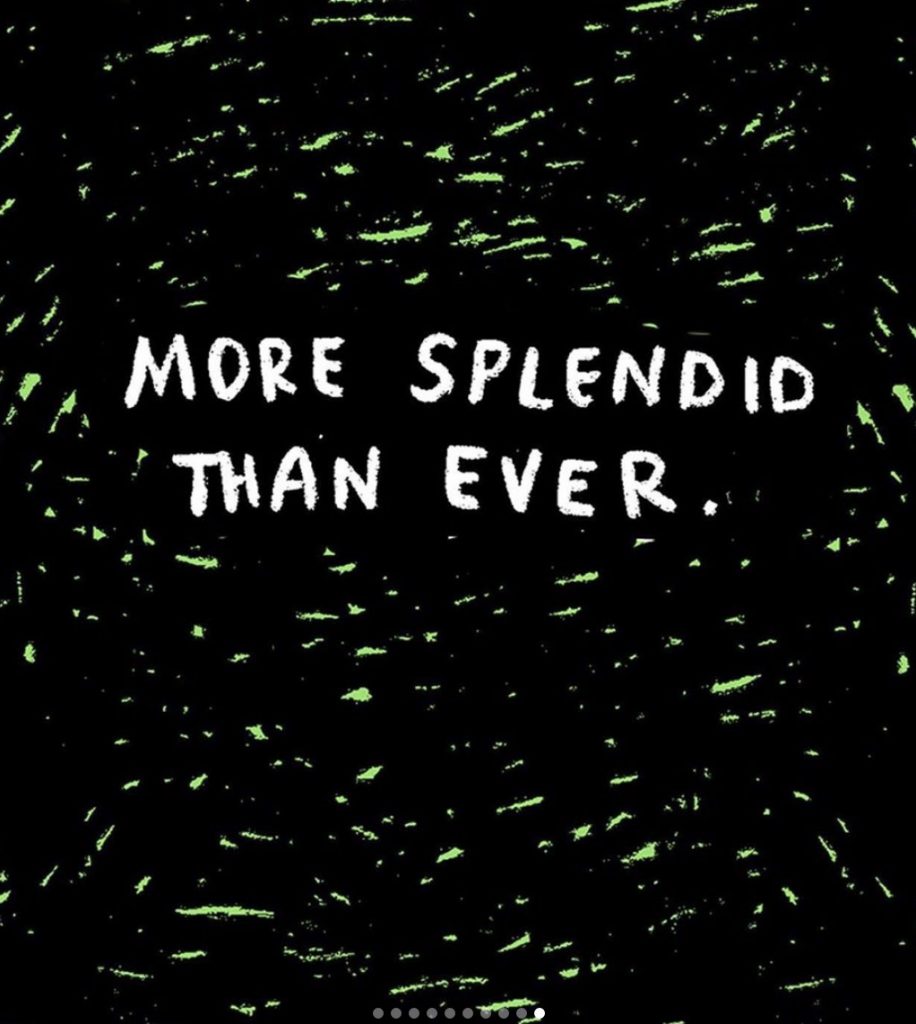
The Heartbreaking Delight Award: Linney (but mostly More Splendid Than Ever)
Written and drawn by Lucy Knisley
As I type this, my cat Kubo is laying on my lap sleeping. I’ll be honest: it’s inconvenient as all get out. Laptops are reliant on having an available lap, so instead of typing this like a normal person, my computer is propped up on the back of a couch with my legs fully stretched out and my body twisted to make it work. An ergonomics expert would lose their mind if they saw what I was doing, as this is definitely not the right way to do things.
But we do a lot for our pets, and for those that love cats, it’s sometimes a mysterious thing for outsiders as they tend to be moody, unpredictable animals, 10 with curious, complicated personalities. Few cartoonists have ever showcased that better than Lucy Knisley, as her Linney comics on Instagram and Twitter were a constant delight this year, highlighting the internal life of her truly remarkable cat Linney. It was a hilarious tour through Linney’s unforgettably on-point yet shockingly literate perspective on life, and it was arguably the main reason I got onto Instagram whenever I did. 11
But my adoration of Knisley’s Linney comics – and even arguably her abilities as a cartoonist – was elevated by the remarkable concluding chapter to Linney’s story, as the cat passed away this year. Linney’s final moments were commemorated in a strip called “More Splendid Than Ever,” as Knisley faces the need to put this wonder cat to sleep in face of waning health. We as readers have come to know Knisley through her work over the years, as it’s mostly autobiographical in nature, which leads us to having some level of kinship with her. Yet, of all of the stories she’s told from her own life – her wedding story, her experience of having her first child, 12 her relationship with food, etc. etc. – there’s nothing I’ve connected with more than Linney’s final chapter.
It’s a ten screen strip on Instagram, and something that showcases the potent capabilities of social media based comics. It doesn’t pull any punches, whether you’re talking about Linney’s signature sassiness or the raw emotion Knisley bakes into it as she takes readers behind the scenes of her life, and it’s all the better for it. I’ll be honest: I shed tears reading this comic. It’s such a universal story, that of human and pet, and it’s something that is unexplainably deep. The honesty and beauty of how Knisley handled Linney’s grand finale showcased a cat and a cartoonist as just what she called it: more splendid than ever, and something worth touting and remembering what it brought to us in those ten screens and beyond.
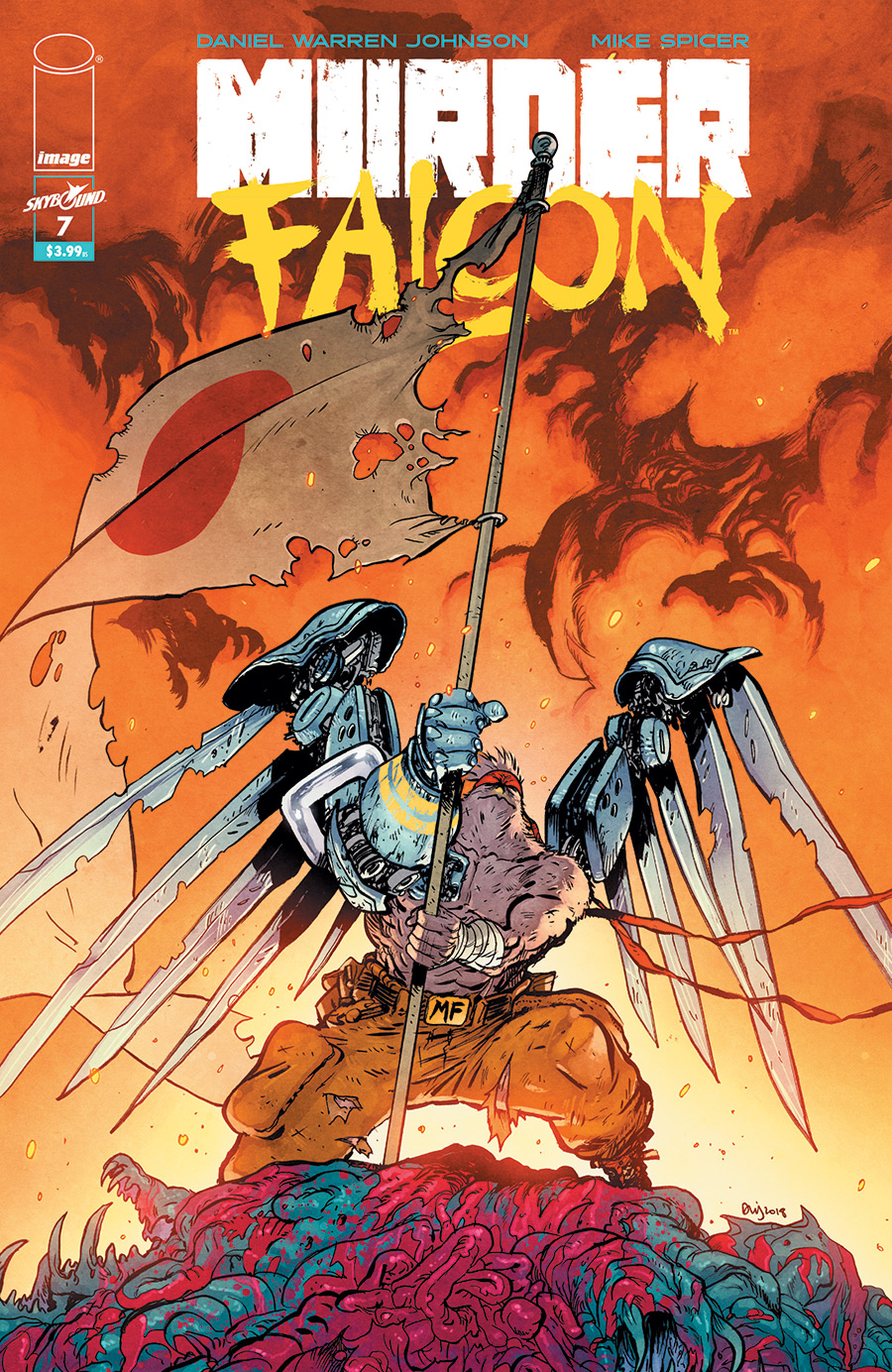
The Secret Depths Award: Murder Falcon
Written and drawn by Daniel Warren Johnson
Colors by Mike Spicer
On one hand, this is a simple comic. It’s a comic about a dude who is good at guitar that’s fighting kaiju by empowering a metal fueled literal murder falcon, while he reunites his band to help save the world. Murder Falcon absolutely works like that. Daniel Warren Johnson is a cartoonist who can bring big monsters appropriate levels of explosive energy, and as someone who clearly loves kaiju and metal, this is tailor made for his abilities as a storyteller. 13
On the other hand, this is a title with secret depths to it, as all of that fun insanity obfuscates the big, bold heart at the center of the book. Deep down, it’s a story about how we – whether we are a metal band, a family, old friends, or all three – are better and stronger together, and how hardships aren’t moments that should separate us but embolden our connection. Series lead Jake learns a lot during this story, and while the big monster fights are killer, they’re also something more. By the end of the series, a big lesson is learned, and it’s a shockingly poignant, heartbreaking finale that feels earned and special in an unexpected way.
Daniel Warren Johnson is two things at once: one of the most brilliant cartoonists in comics today and someone who can deliver real emotion without falling into any traps that can come with. There’s no cliches here. It’s all pure, whether we’re talking the monster fights or the tragedy. It’s a balancing act, but one DWJ nails, as per usual.

The Big Finish Award: Paper Girls
Written by Brian K. Vaughan
Line art by Cliff Chiang
Colors by Matt Wilson
Letters by Jared K. Fletcher
Ending a story is one of the hardest things to do. That’s not just because the act of tying everything up and giving characters satisfying finishes is difficult. It’s also due to the expectations of readers. You may end a story exactly how you always envisioned, but if there is a significant delta between what readers want and what readers get, it can lead to disappointment or ignominy. It’s a tough spot.
That’s why Team Paper Girls – Brian K. Vaughan, Cliff Chiang, Matt Wilson and Jared K. Fletcher – deserve double credit, as they didn’t just wrap up their broader story, 14 – but they gave us a final issue showing us what happened next to the titular Paper Girls, and in the process, they threaded the needle of a satisfying end for them and for readers. Perhaps especially this one.
That should come as no surprise, maybe. BKV is an A+ series finisher, as both Y the Last Man and Ex Machina have classic finales. Chiang, Wilson and Fletcher are at the top of their respective fields, and they were certain to deliver the best version of whatever idea they all came up with. This was meant to be. But still, it’s tough to finish a 30 issue run with your strongest year yet, and yet, they managed to do just that. That’s a remarkable thing, and it was the type of goodbye that leaves a wonderful memory in our heads, giving warm feelings to readers as they look back on a story well-executed and a quartet of characters that were given fitting goodbyes.

The Can’t Hardly Wait Award: Pumpkinheads
Written by Rainbow Rowell
Art by Faith Erin Hicks
When Rainbow Rowell and Faith Erin Hicks came on Off Panel, I called Pumpkinheads “Can’t Hardly Wait in a pumpkin patch.” I 100% stand by that suggestion, because that’s sort of exactly what it is? This First Second graphic novel finds best friends Deja and Josiah (or, at least best friends while they work at the pumpkin patch that employs them) on a mission on their last night at the pumpkin patch, as Deja wants Josiah to talk to the girl he’s been into the whole time they’ve worked together.
It leads to a road trip book set on the massive plot of land they work at, touring the wide world of culinary arts and rides their employer has to offer in pursuit of this dream girl. As a lifelong resident of Alaska, this is like reading about life on Coruscant for me, as a land that houses succotash huts and pumpkin bombs 15 is foreign territory for me. But the passion Rowell has for this world is evident, and it’s a thrill to see the detail she brings to it and the love Hicks displays in her artistic ode to this foreign land.
But at the heart of this story is its heart, as the power of friendship is often stronger than the power of our dreams. Through Rowell’s exceptional writing and Hicks’ endlessly impressive character work, we are clued into where the book is going throughout, but even with that in mind, our path to the end result is something pure, beautiful and heartwarming. This is at its core a good natured comic, and these two creators are simpatico in their tremendously complementary skill sets. When their powers combine, its good nature becomes something magnificent, and we’re given a comic that is somehow more than the sum of its parts. Pumpkinheads is just an absolute delight, and a title I couldn’t recommend more highly.
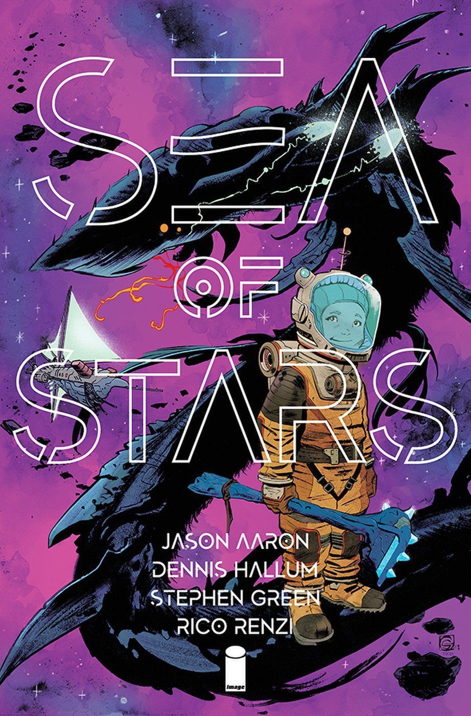
The Team Supreme Award: Sea of Stars
Written by Jason Aaron and Dennis Hallum
Line art by Stephen Green
Colors by Rico Renzi
Lettering and design by Jared K. Fletcher
While creator-owned titles are likely more certain to have cohesive creative teams than for-hire ones, as the latter can often seem like arranged marriages between poorly matching creatives, that doesn’t mean they’re without risk. You never know how something is going to jive until you read the comic. Take Sea of Stars, for example. On the surface, Jason Aaron co-writing with basically any human seems appealing, but with Dennis Hallum 16 onboard it should be even better right? And Stephen Green’s great already, but when you pair him with Rico Renzi, it should cook, seemingly. Jared K. Fletcher can make any situation work, so yeah, this title should be great on paper.
On paper.
Not every title meets the heights built up by its creators because while comics are printed on paper, it takes more than talent to make a series pop. You need complementary skills, flexibility and assuredly many other things. Those are important too, and seemingly, they’re attributes Team Sea of Stars doesn’t lack in, as this title is greater than the sum of its parts. Aaron and Hallum cooked up a heartfelt adventure story about a young boy discovering the wonder of space and the pros and cons of superpowers, while his father attempts to find and rescue him after the demise of his wife and the destruction of the ship he shared with his son. It’s at its core a rescue comic – it’s like Toy Story 2, but set in space, featuring aliens, and mythological beings that aren’t too kind to those around them, so I guess not really like Toy Story 2 at all – but one that speaks to the complications that come with family and feelings of responsibility
While the premise is top notch and the execution on that side is exemplary, it truly is the art that drives this book. Green’s art is a revelation each and every issue, whether we’re talking the life he brings to the cast of the book – while he excels throughout, his handling of the son character Kadyn and his space alien pals, Monkey and Dolphin, is astonishing, with an animation-like vitality to their mannerisms and behavior – or the imagination he shows in realizing the worlds they visit and the flora and fauna they find. The scale is staggering at times, but Green never fails to ground it. That makes it stand out all the more.
And Renzi, as per usual, delivers impressive work. I’ve spent so long complimenting the guy for his work on Squirrel Girl that it feels weird writing about him for another title, but Sea of Stars is a perfect marriage of colorist and story. The blues and purples Renzi gives to deep space give the world a vibrancy and light warmth (at least on the purples side) that makes the adventure feel a little more on the inviting side, turning what could be something scary into wonder. Renzi’s a pro at controlling our emotions with color, and when paired with the demonstrative character work of Green, we have a title that could make us feel the high highs and low lows of the story without any words.
Work in Fletcher – his design work is endlessly underrated, and I love the titling on the book’s covers and the choices he made throughout – and you have one of the best looking comics around, full stop. Fuse it with Aaron and Hallum’s writing and we’re elevated even higher. This is on my shortlist for best Image titles going right now, and it’s because this isn’t just a murderer’s row of creators, but a true team, with complementary skill sets that elevate each other’s work in a real way.

The Me Award: Sentient
Written by Jeff Lemire
Art by Gabriel Hernandez Walta
Lettering by Steve Wands
While the subject matter of another title featured during this exercise – Alex Alice’s Castle in the Stars – might match the subject matter I enjoy the most, 17 no comic this year matched my sensibilities as a reader more than Jeff Lemire, Gabriel Hernandez Walta and Steve Wands’ TKO series Sentient. It does so in inexplicable ways, as there’s nothing obvious I can point to like I can with Castle in the Stars. It’s a feel thing rather than pure subject matter.
But it’s incredibly reflective of me anyways, as its story of an artificial intelligence thrust into an uncomfortable position of being an unexpected matriarch to a cadre of children and of the kids forced into roles that are far outside what is normally asked of them just speaks to me. Both are, in some ways, positions I have experience with, 18 and to see how Lemire and Walta realize it in the story was heartening and heartbreaking. There’s a real care to the storytelling here, as both writer and artist respect the situation and the characters and deliver something that feels more real because of it.
Beyond that, it’s just a breathtaking story, as I flipped through the pages of this book with a shocking fervor, desperate to see how the crew in this story makes it through unscathed. While it is in some ways reflective of many stories that preceded it, Lemire and Walta’s efforts give it a heart many of its peers lack and an inventive angle that makes it a singular read. Sure, it leans into some of the things we know these creators for already – Lemire loves his atypical parent/child relationships, while Walta famously has excelled in the past with precocious youngsters in The Vision – but it’s the very best version of what we know them for, as the pair touches on similar territory without retracing their steps.
Sentient had a high probability of success with me, as I’m quite fond of the work of everyone involved. What I found was something more than I even expected, as it was a title that was on my shortlist of my very favorite titles of the year.

The Audacity Award: Spider-Man: Full Circle
Written by Jonathan Hickman, Chip Zdarsky, Jason Aaron, Al Ewing, Kelly Thompson, Gerry Duggan and Nick Spencer
Line art by Mark Bagley, Chris Sprouse, Karl Story, Greg Smallwood, Michael Allred, Valerio Schiti, Cameron Stewart, Chris Bachalo, Tim Townsend, Al Vey, John Dell, Rachael Stott
Colors by Triona Farrell, Dave McCaig, Laura Allred, Frank D’Armata, Nathan Fairbairn, Chris Bachalo, Greg Smallwood, Mattia Iacono
Lettering by Joe Caramagna
This comic was insane.
The best analog I can think of for it is it’s a $9.99, graphic novella length Spider-Man comic from Marvel featuring the 1927 Yankees of 2019 Marvel creators that’s a manifestation of my favorite Andy Dwyer line from the End of the World episode from Parks & Recreation: no thinking, only stupid. Except it clearly took a lot of thinking, but just in service of doing something big, ridiculous and highly entertaining.
It’s a jam comic, as the first creative team – Jonathan Hickman and Chris Bachalo – started the whole thing off, and then every creative team from there had to figure out the next steps for the story. Because each creative team was leaving their followers in progressively more ridiculous positions, it led to a story that started with Spider-Man teaming up with Nick Fury in space and finished with an insane mix of werewolfism, time travel, assassin mascots, and a whole lot more. That might sound silly to you, but there was perhaps no comic from this year that better exemplified the insane capabilities of the comic book medium than this one. It didn’t try to fulfill corporate goals or match continuity; it just was, and it was better for it.
Plus, when you have comic aces like Hickman, Aaron, Zdarsky and beyond writing and art gods like Bachalo and Smallwood drawing it, you’re going to have something that has a high level of competence behind it at the very least. It might be nonsense, but at least it’d be competent nonsense, which is always preferred to the alternative. Mercifully, this was far better than that, leading to a comic that wasn’t just bonkers in a good way, but one filled with some virtuoso work as well (shouts to Greg Smallwood, who somehow was clearly the standout on the art side despite the fierce competition he was up against).
And hey, as a little bonus, I loved how the end of the issue took us behind the curtain of the writing of this book. They included what supposedly were the emails between each of the creators as they figured out how to end the story together, and it was fascinating to see how each writer’s strength took the lead, most notably Al Ewing’s mind for sorting out rather complicated narratives. In my head canon, it would have been Ewing solving those problems in the end anyways, but seeing an actual demonstration of how each writer helped make this book work was a huge bit of added value for this fan.
When this title was first bandied about, there was a part of me that was grossed out by it. It felt like Marvel at its worst and most money hungry, as a $9.99 comic with 800 million creators on it seems like a hot mess, not something I would be writing about in my own person awards show. But that’s why it’s important to not always judge a comic by its cover – whether you’re talking the actual cover or the price on it – because what you could find in it might be one of the most audacious Big Two reads in recent history.
The Absolutely Nuts Award: The Unbeatable Squirrel Girl
Written by Ryan North
Line art by Derek Charm, Erica Henderson, etc.
Colors by Rico Renzi
Lettering by Travis Lanham
This was the end for The Unbeatable Squirrel Girl, but it ended doing what I always loved it for: its own thing. The Unbeatable Squirrel Girl always marched to the beat of its own drummer, and so when it concluded with an arc about the power of friendship and its counter-balance and an issue featuring both a conversation on the moon with Galactus and a trailer for how great Squirrel Girl is set to her own theme song, it didn’t strike me as odd. Instead, it just seemed right, which is an important attribute in a finale.
Its finale also acted as meta commentary on the fundamental nature of comics, as North confronted the cyclical nature of superhero narratives and how change is a foundational element of them via Doreen’s conversation with Galactus. It was something that easily could have felt heavy handed if done wrong, but thanks to the gifts of North, Derek Charm, Rico Renzi, Travis Lanham and friends, it was something that proved both fitting for the book but also apt for the core theme of friendship. Just like comic characters with tails and giant world devouring beings, we as people change, and if friendship carries on throughout our own personal continuity, then it’s a real superpower. It was a lovely sentiment, and a fitting idea to touch on as the story came to an end.
Overall, it was a strong year, and not just because of the finale. It was just one more step in helping make The Unbeatable Squirrel Girl one of – if not the – defining Marvel series for me this decade, which is an idea that was absolutely nuts to me when I first considered reading the series.
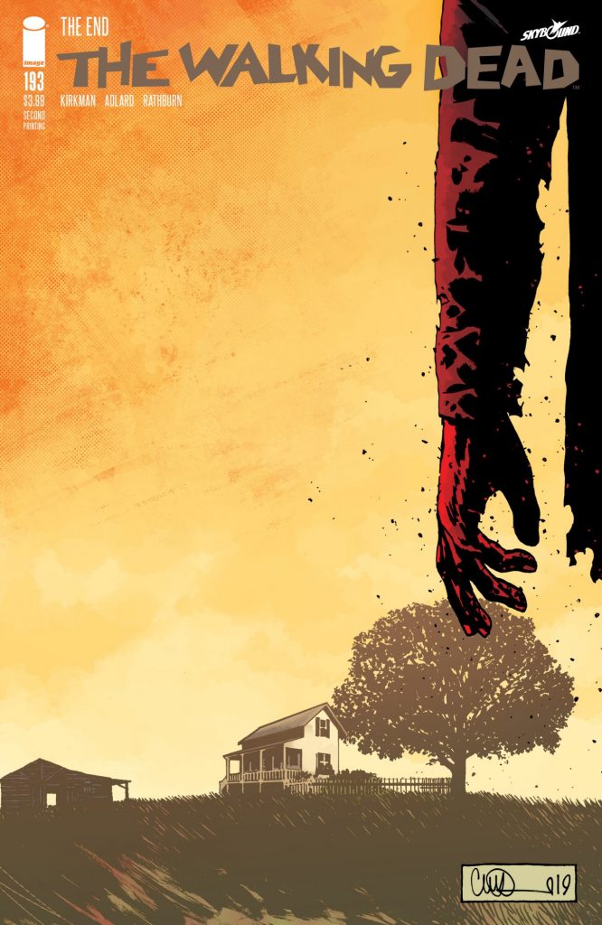
The Long Time Coming Award: The Walking Dead #193
Written by Robert Kirkman
Art by Charlie Adlard
Lettering by Rus Wooton
In a year of many notable endings, nothing was more surprising than The Walking Dead’s concluding chapter. And for once, it wasn’t because of the shocking deaths of several key characters or some massive sea change in the story. No, it was because it was ending at all, as series writer Robert Kirkman long suggested that this was a title that could go on to issue #300. Even more than that, the title had solicited out issues following this one, so they were attempting to misdirect readers in a very real way. And you know what? It worked, which was the perfect way to end the series, as it was a title that long had been fundamentally built off surprising moments just like that one.
Hilariously, though, the issue itself was one of status quo, as it takes place well into the future of the world, as society really began to take hold, Carl Grimes is now an adult with a child, and life began to feel normal again…or at least as normal as it could. For most titles, that’d sound boring, perhaps, but for The Walking Dead, it was a wild change of pace, and something that delighted and impressed me as this massive, nearly graphic novel length final issue gave us a coda that showed that life wins out, someway.
It was a lovely issue, and one that Kirkman wrote the hell out of and artist Charlie Adlard nailed completely. Adlard’s been a beast throughout the series, and he saved his best for last as he inked himself for the first time in forever, 19 leading to major gains for his art. It felt like everything the pair had left to say in this world, and like something that was a long time coming for both. This wasn’t the way I expected the series to end, but it ended up being the only right way for it to do so. Bravo to this pair and the rest of Team Walking Dead, as they didn’t just stick the landing, they found the perfect way to satisfy long time readers while delivering a story that was worth telling. It was a heck of a thing, and a classic misdirection if I’ve ever seen one.
Thanks for reading this week’s comic-centric SKTCHD AWRDS for 2019. Come back next week for the final run of SKTCHD AWRDS, as I’ll be sharing my award winners not just for the year, but for the decade in comics. It’s a lot. You might dig it.
Who was built off cartoonist Chris Schweizer!↩
But with John Woo’s style emulated in the process. Or at least pigeons fly out behind Taipan, unlike Woo, who uses doves.↩
You might already be one if you’re a heavy Twitter user, but this was far more literal.↩
JAMES HARREN!↩
As a follow up to what I said in the year in review episode of Off Panel, it appears I am about 11 months out from completing the series at the current rate of trade releases. I can’t confirm because the final trade isn’t even currently scheduled, seemingly.↩
I’m not sure who got the biggest glow up, Moira or Goldballs.↩
Shouts to my guy Daniel from Kaijumax!↩
Particularly when Little Bird runs. That’s Peak Ghibli right there.↩
That’s a heck of a claim, as most every letterer is underrated.↩
As I typed that sentence, my other cat Kai decided to also sit on my lap. He made it work, further proving the idea of “if it fits, it sits.”↩
I also go on to like the posts my wife makes on the Instagram of our cats. Like I said…big fan of cats!↩
Which also arrived this year in the form of the graphic novel Kid Gloves, which was similarly incredible!↩
Which makes sense, as he made it. Of course he tailor made it to his abilities!↩
Before its concluding chapter, even!↩
A food invented for the book that puts ice cream between two pieces of pumpkin pie before chocolate is poured over the whole thing.↩
This veteran writer might be better known to you as Dennis Hopeless.↩
Mostly because it has airships, if I’m being honest.↩
This is not a reveal that I am artificial intelligence, by the way.↩
Cliff Rathburn still contributed gray tones on the art, which were exemplary as per usual.↩