The Design of Absolute DC: Nick Dragotta on Building a Bigger (and Maybe Better) Batman
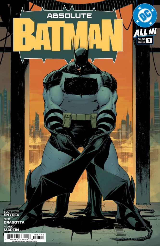
DC is launching its new Absolute Universe this October, and a trio of titles in Absolute Batman, Absolute Wonder Woman, and Absolute Superman are leading the way. Each is an intriguing reimagining of those characters from strong creative teams, and a lot of digital ink has already been spilled about how these projects came together and why they’re something the publisher is doing. But the most exciting part about each, at least to me, is the art and artists. Nick Dragotta, Hayden Sherman, and Rafa Sandoval have been tasked with creating a new look for some of the most iconic characters the world has ever seen — and each seems to have nailed the job. That kind of work deserves a spotlight.
So, to do that, I’ll be writing a series of features about everything they did to bring the new iterations of these characters to life with insight from the artists themselves. And with it being Absolute Batman #1’s final order cutoff today, 1 it seemed like the right time to kick things off with a deep dive look at the art and design of that series from the perspective of Dragotta. Sherman and Sandoval will come later, but we’re starting with the title that’s launching the entire endeavor on October 9th.
This feature is open to non-subscribers, but if you enjoy what you read, consider subscribing to SKTCHD for more like it. The site is funded entirely by subscriptions, so your support helps me publish more articles like this.
About a year back, Nick Dragotta received an unexpected phone call.
It was from writer Scott Snyder, and he was looking to pitch the artist on something big. He wanted Dragotta to draw a new comic, one that would take “a stab at Batman if his origin was to happen today.” According to the artist, Snyder shared “the flavor of what would be happening” at DC around this series, meaning the All In initiative and the Absolute universe, and how exactly this new Batman title would fit within it. It was a lot for a relatively out of the blue phone call.
And yet, the idea immediately appealed to the artist. That was for several reasons, but a key one was his affinity for the character. Dragotta said Batman is “probably my favorite superhero,” with some of the only superhero comics he regularly revisits being classics like The Dark Knight Returns, Batman: Year One, and Batman/Judge Dredd. 2
“There’s just a wealth of incredible, inspiring art,” Dragotta said of Batman’s history.
But there was also a part of him that wondered, “Why did Scott Snyder call me?” Dragotta’s a remarkable talent, but he’s mostly known for the electric art and inventive ideas he brings to creator-owned projects like East of West, Ghost Cage, and his collaborations with writer David Brothers like Go Back and Fight Like Hell. Save for the for-hire work he’s done at DC and (mostly) Marvel, 3 that’s the space he typically operates in, especially of late. So, the “Why me?” of it all makes sense. But it was precisely that background that appealed to Snyder.
“Scott read Ghost Cage and was like, ‘I really like this energy. I like your storytelling, and I would like to bring this to show that this (Absolute) line is different,’” Dragotta said.
The more Snyder walked him through the idea, the more Dragotta knew he had to do it. It was a “no-brainer” in his eyes, mostly because he “thought the idea was so cool.” While he admitted that the pitch was a “daunting, scary thing,” he also knew that “it was just too good to turn down creatively.”
There was only one caveat, though. At first, the idea was Dragotta would work with someone else entirely. Snyder was the title’s initial architect but not necessarily its writer. But the artist told Snyder, “I will do it if you write it.” He wavered a bit, but then asked Dragotta a question in return.
“The Batman idea…you really like it?” Dragotta recalls Snyder asking.
“I was like, ‘Dude, it’s incredible,” he said.
And like that, they were off to the races on Absolute Batman.
The pair talked more at last year’s New York Comic Con, and then in November, the artist met with folks from DC. Much of it was the Snyder and Dragotta show, though. The pair meshed well from the jump, and the genesis of the character’s look, feel, and vibe came from conversations between the two. That was made easier by the fact that they quickly realized they lived close to one another. That ensured they had plenty of in-person brainstorming time.
“We just started meeting up and chatting on the phone almost every day since that initial call,” Dragotta said. “Just about what this book could be and who the characters are.”
While much of the development of the series and its overall look happened collaboratively, the artist remembers Snyder had a specific request about how the character might look early on.
“He wanted (Batman) big,” Dragotta recalled. “That was first and foremost. I remember I initially drew him as one of the bigger Batmans you would see, and Scott’s reaction was, ‘Nick…bigger.’
“I remember drawing that and being like, ‘Scott, we’re getting into Hulk proportions now.’”
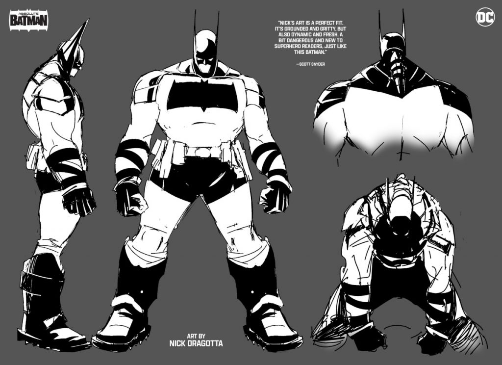
The size of the character — Dragotta estimated that this Batman is 6’6” and 275 pounds, so even larger than the measurements shown on the character sheets revealed at San Diego Comic Con — “posed a whole new set of challenges” in the artist’s mind.
“How does he kneel down on a gargoyle? How does he look over a city when he’s so big? How does he move?” he wondered.
Those questions ended up being ones he enjoyed answering. The artist had to figure out how this enormous character could move like Batman “in a believable way.” Dragotta found it fascinating “how much we changed the character by changing his size,” as that fundamentally affected how the character typically operates. Even though the artist was initially uncertain, they found what they were looking for with that size.
There was only one problem, though.
“Going back to my initial design, when I drew him like a bigger Batman, he was still very much Batman,” Dragotta said. “And (Absolute Batman editor) Katie Kubert clarified it for me. She said, ‘We have a Batman. We need a new Batman.’
“That was when it sunk in. ‘It’s Batman, but it has to be different than the normal DCU Batman.’”
To determine the direction he wanted to go, Dragotta had to decide what he wanted to keep from the character’s typical look. While he knew he had to keep the bat ears 4 and the cape, there was something he knew was even more important.
“As an artist, you can’t lose that silhouette. I think readers would reject it,” he said. “So, I was beholden to that.”
If he was going to keep core visual characteristics like the ears, cape, and silhouette, though, he had to find something that created the distinction Kubert wanted. So, the artist shifted his thinking, one that emphasized that “this won’t be a new Batman in design, but a new Batman in function.” The character is larger, and he won’t just have a utility belt, but “a utility cowl, cape, and suit” as well.
“Every part of him is a utility, very much like Bruce Wayne,” Dragotta said. “This is a new Bruce Wayne. He’s not the billionaire playboy. He’s a do-it-yourself-er, engineer, city worker. Every aspect plays into the themes that we’re playing with with the character of Bruce, and you feel it through the costume.”
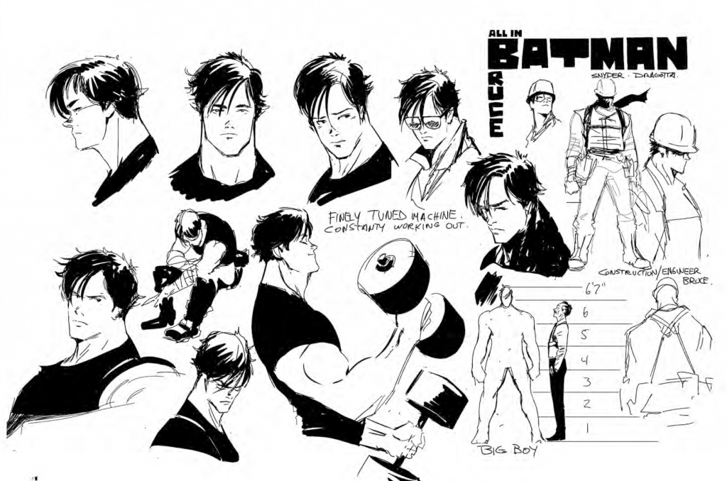
The Bruce of it all is crucial to everything they’re building in this series. The artist describes the character as “a mystery” and “a man of few words.” Much of who he is will be discovered within the pages of the actual series, but Dragotta wants you to understand the character through how he’s drawn. His goal is for readers to “feel for the trauma that (Bruce has) gone through in his life,” and to wonder “does he have it all together?”
More than that, he wants them to understand that “there’s a soul behind these eyes” and “there’s a fire inside this kid’s belly.” There are simmering depths to Absolute Batman’s Bruce Wayne, and that’s showcased both through how he’s written and how he’s drawn. The artist said Frank Miller and David Mazzucchelli’s Batman: Year One was a ”big influence” on them as they turned their series into a “very personal read.”
Of course, amidst all that emotional complexity is a massive human being. 5 Some fans have openly wondered how a character that’s this big can have a secret identity at all. There’s only so much hiding a man of this size can do, right? Dragotta disagrees. In his mind, “6’6” isn’t that abnormal,” and more importantly, he emphasized that “when you see how Bruce Wayne moves in our book, you’ll be like, ‘Yeah, no one would suspect that.’” We shall see! 6
But that’s only half of the character’s identity, and not the one that’s in the title of the series. Much of the creative team’s discussions oriented on Batman himself. And there was something both Dragotta and Snyder knew they wanted for the character visually. They agreed that they had to get “back to him being an imposing, scary figure.” This Batman needed to be the type that if you saw him — whether you’re good or bad — you immediately think, “I need to stay out of that person’s way.”
One visual element that helps with this are the spikes that show up situationally on the character’s shoulders. Dragotta said these serve multiple purposes. One is they’re “how he ramps up the scare factor when he wants people to think twice about crossing him,” something that’s demonstrated in the first issue to magnificent, nightmarish effect. That’s a good pair of words for what Dragotta does in this series. There’s a spectacular intensity to it, something that comes from the fusing of Snyder’s “horror background” — which Dragotta intentionally leaned into — and the sci-fi and manga flavors the artist brings to the table.
That’s not a surprise for anyone who knows Dragotta’s work. As the artist said, “We are a product of our influences and what shaped us,” and he’s inspired by “everything from European comics to Japanese and American.” 7 If you’re a fan of the artist, you’ll see the hallmarks of everything you already love about his art within this series.
Influences only go so far, though. Once they dug into the series, “it then becomes our own,” as he put it. And this one certainly did. Their Absolute Batman has some incredible, singular design elements to him, ones that quickly proved quite polarizing — even if they, more importantly, got people talking.
One example of that is the rather sizable logo found across Batman’s chest. 8 There’s a real reason for it being the size it is. One was to, quite simply, “protect his vitals.” That logo is entirely armor. In fact, if it was up to Dragotta, “I would have made it cover his whole upper torso.” It also doubles as a detachable axe, offering the character even more costume-based utility and the artist a visual element that, as he said, “separates our Batman from the normal DCU Batman.”
Some artists might bristle at how fans have responded to elements like that logo. Not Dragotta. He said that “as an artist, you want people to respond to your work, good or bad.” He loves seeing the passion, especially when it’s easy to “justify the decisions I made.” Given the character’s size and utilitarian nature, it was the only real answer in Dragotta’s mind, as the logo and the axe it becomes “had to match the weight of the character.” More than that, he suspects that when people “read the book, we won’t even remember this conversation.” The reason for that is “story dictates everything” in Absolute Batman, according to Dragotta, with the artist emphasizing that “none of these (creative) decisions were made superfluously.”
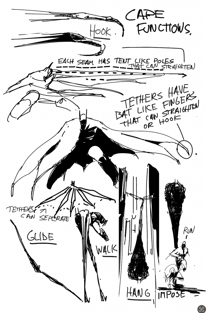
Another aspect that’s different in the character’s design is the cape, both in size and function. While its overall look is rooted in the “classic” silhouette and shape of Batman, its utility stems from the character’s namesake.
“Scott and I were like, ‘Let’s go back and look at bats.’ And if you look at bats, they have these hooky little thumbs. Their wings are connected from their front arms to their back hind legs, so they can walk with their wings, they can fly, and they can pick things up,” Dragotta said. “That was the impetus of the design.”
The cape is used in a lot of new ways, including as stilts the character moves around with and as hooks he grabs things with. And this variation on Batman’s cape is important for several reasons. One of those is, quite simply, it looks cool as hell. You can’t help but be wowed by how the artist uses it on the page. It brings real juice to the action. While a lot of that comes from Dragotta’s manga influences, he shared that 90s superhero comics were a big one as well. He came up as a reader during that time, a period “where the visuals ruled and comics were the coolest things in the world.” He wanted to bring that type of energy to the book, and the cape is a good example. But he still wanted it to make sense.
“It has to be believable,” Dragotta said about the cape. “Which sounds ridiculous because you’ve seen the pages where he’s using his cape hooks and throwing people through windows. But if we believe Superman can fly, we can believe that this Bruce can engineer a cape that could slingshot people across the street.”
It was important for Dragotta to ground the visuals in some semblance of reality. That’s why there are pages in the series where he visually “explains how the cape works,” something that hopefully will help readers better understand the logic behind it. His belief is that this version of Bruce Wayne could figure out how to make something like this work. And he suspects that before long, others will too.
“Mark my words. We’re going to go into a show and see a dude walking 12 feet in the air on stilted capes,” Dragotta said. “There’s no doubt in my mind. These cosplayers will figure it out.”
Dragotta is eager to see others bring his Absolute Batman design to life. And that’s something he’s already experiencing. The artist shared that he’s “never seen this much fan art from pros and up-and-comers on anything I’ve created.” That’s been a hallmark of the response to the announcements of the first three Absolute titles, but Dragotta’s Batman might be leading the pack on the fan art front. That has meant a lot to him, and it’s the type of thing that “inspires” him to “keep ramping it up.”
“That’s one of the things Scott and I are constantly talking about,” Dragotta said. “The new things we can do with this suit and new predicaments to put him in.”
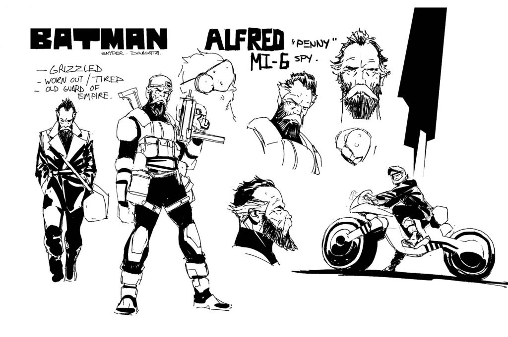
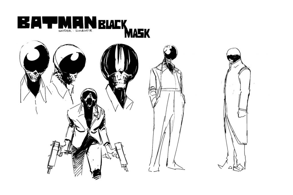
Dragotta’s design sense extends beyond its lead character, of course. Whether it’s allies like Alfred or villains like Black Mask, there’s an “aesthetic” the artist is trying to create within this series. He wants it all to “be believable and have nothing that doesn’t fit.” The goal is that this version of the character and his world will connect visually. That, of course, means Dragotta “wants the villains to be horrific.” A scary Batman deserves scary adversaries. Those characters are something he’s proud of in particular.
“Wait until you meet Batman’s rogues gallery. It’s not going to be what you’re expecting,” he said. “It’s pretty awesome.”
That’s the general energy Dragotta is bringing to the project, though. He just seems pumped about it, and his enthusiasm for Absolute Batman radiated throughout our conversation. It’s a big change of pace for him, but he emphasized that he feels “incredibly lucky” to be doing this “with Scott on such a big stage.” While he admitted he’s still “learning” on the job, it’s clear he’s making the most out of the opportunity while he has it.
But the design is just the amuse-bouche to the meal he and Snyder are cooking up. The main event is the comic itself. While Dragotta excels at a great many things, he’s a storyteller first, and he’s excited for people to see this character in action. That’s not to say he isn’t proud of the design. He is. But after he discovered I hadn’t read the first issue when we chatted a couple weeks back, he repeatedly emphasized how much he wanted to hear my thoughts on the comic, 9 simply because of his belief in it. The creative team worked hard to refine the storytelling and deliver a clear, “easy read,” and it’s something Dragotta can’t wait to share with the world.
“I’m really proud of the way the words and pictures work in this book, so I can’t wait for you to read it.”
Thanks for reading this feature about Nick Dragotta’s art and design on Absolute Batman. If you enjoyed what you read, consider subscribing to SKTCHD for more like it.
Get your orders into your preferred comic shop today if you haven’t already!↩
The latter specifically for Simon Bisley’s work, per Dragotta.↩
Including drawing my favorite single issue ever in FF #23.↩
Although those contain a special surprise, as the first issue reveals.↩
An “Absolute” unit, if you will.↩
Two notes on Bruce, though. The model sheet that was revealed at San Diego Comic Con showed the character with closely shaved blonde hair and a French bulldog. Neither made the cut in the end. Bruce has “beautiful, wavy hair” and the dog was deemed “too cute,” according to Dragotta.↩
For example, he saw my collection of Naoki Urasawa manga during the chat and emphasized that what Urasawa accomplishes is pretty much what he is going for in this series from a storytelling standpoint.↩
One that initially had fewer spikes on it, but Snyder requested adding a couple more to its design.↩
To Nick: The first issue was incredible, and it’s stunning how it fuses the new with the old while turning so many core ideas of the character on their head and yet making it all work together in a way that’s both familiar and fresh. Big fan.↩

