Names as Symbols: On the Importance of Artist Signatures, and the Story Behind Some of Them
The signatures you often see on a comic artist’s work are a funny thing. That’s because the importance of these curiosities to those who see them runs the gamut. For some readers, they aren’t important at all, a secondary aspect that just happens to be there — if they notice it at all. But for others, it can be a much bigger deal. Whether it’s on a cover, commission, or even occasionally a notable interior page, a signature can feel as tethered to an artist’s identity as the art itself. 15 Many readers who came up during the 1990s feel that way, as that may have been the apex for artist signatures as singular works unto themselves.
And Ryan Stegman was one of those readers.
“I grew up in the era of Todd McFarlane and Rob Liefeld having their big scroll (signatures), and there was nothing cooler than that,” Stegman said. “I remember if you used to look at Pitt’s letters pages, (Dale Keown) would have people send in art. People would spend five minutes on the drawing and two hours on their signature with their burnt-out parchment and everything.”
Whether you’re a reader who has immediate recall of your favorite signatures or someone who barely even notices them, these aspects are near constants for the artists who craft our favorite comics. They aren’t just something a creator puts on the work haphazardly. They’re a facet of the art itself, an identifying factor that is thoughtfully layered in.
Thoughtfully layered in, but not always thoughtfully conceived. Amongst the artists who shared the stories behind their signatures, about a third sort of just went with the flow when they were coming up with them.
“I don’t know if it was too much of a thinking process,” Jacoby Salcedo admitted.
“Honestly, I didn’t put much thought into it,” Rob Guillory added. “This was just a natural outgrowth of my signature, maybe sort of how Walt Disney’s signature was just a natural thing that in time became a brand and eventually became iconic.”
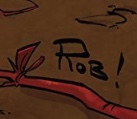
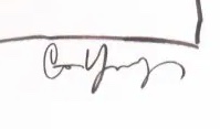
Writer/artist Caitlin Yarsky was an interesting variation on this idea. While she works in comics, she was more interested in fine art and animation coming up. Between having a different set of influences and the fact that she “didn’t even know you were allowed to sign covers” when she first started working in comics, crafting the right signature was never important to her. Maybe that’s why her signatures are a little all over the place — sometimes they’re her legal signature, other times it’s an art-centric one — with the artist leaning into “what feels right in the moment.”
So, not everyone puts a ton of thought into it. 16 But plenty did. For some, it was a long journey of trial and error that helped them find the right signature to complement their work.
Take Chris Samnee as an example. The artist admitted it took him “years” to figure his out. Granted, these are mostly his pre-professional years, but he said he “had a bunch of different signatures growing up.” Everything was on the table. His full name of Christopher Samnee, in an effort to “take up as much room as possible.” Other variations of his name. “Skippy,” which was a nickname he had in high school. No matter what he tried, “it just didn’t feel right.”
“I wanted it to be something you can see from afar and know who it was,” Samnee said, which is part of the reason he ended up with a signature that simply says “Samnee” in all caps.
Liam Sharp wasn’t too different. He’s rotated through options during his career. Touring his earliest work, you can see signatures come and go, with Sharp saying he even briefly signed his work “McSharp” during Spawn: The Dark Ages. These days, he’s using a very graphic “Liam” in all caps that connects into a single line, something he created when he was 19 that has eventually seemed to stick. 17
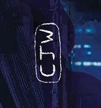
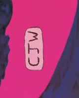
Some of you might be wondering why artists put all that effort into something that could be considered a secondary aspect. There are plenty of reasons for that. One is obvious. There’s undeniably a branding aspect to it. Christian Ward comes from an illustration background, and “as an illustrator, you have to sell yourself as a brand.” Having a signature was part of that. But he doesn’t see himself “as a traditional draftsman,” so he doesn’t sign it in the same way others do. Instead, it’s a file he drops onto his work — it says “CJW” — because as he said, “the artwork is a thing that I offer, and it’s under the brand of CJ Ward.”
Branding can be something artists don’t want to discuss. As Stegman said, “it’s gross to talk about that sometimes.” But it’s important on covers because the artist can get lost amidst the publisher’s name, titling, and art. They are, in a lot of ways, a business card for an artist. Helping people remember who did the work is essential to the value of these signatures.
“If you can get a distinctive enough signature that people see it and remember you, I think that’s important,” Stegman said. “You want people to know the work you do.”
That’s one of the core values of art signatures, which probably seems obvious. Of course you want anyone who sees your work to look at it and say with confidence, “I know who did this.” So, why don’t they just use a simplified version of their name as a signature? That’s easy. These are artists known for their style. Creating a singular signature that matches who they are can help people connect with your art, and that has value that goes beyond that work.
For Liana Kangas, whose signature is their first name in capital letters done in their typical line and style, that approach ensures that people recognize that “it’s actually my signature.” 18 And that recognition is crucial, because easy readability allows people — whether it’s readers, editors, writers, or whomever — to track it back and see, “Oh, this is the artist that did it,” as Salcedo pointed out. That’s the aforementioned business card element. It’s a way for one work to create new work, whether that’s covers, commissions, or whatever.
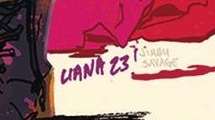
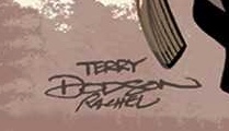
Sometimes that signature becomes so synonymous with the artist that it carries into other aspects of their public presence. Terry Dodson said his signature is “first and foremost an identifier that I drew the artwork,” but it goes beyond that. He actually uses it at the top of his convention banners these days instead of a font.
“That’s because it’s clear that it’s my name, and it’s the recognizable symbol of my name,” Dodson said. “My name is now a symbol.”
Not everyone wanted to use the “B” word, though. While branding can be important, it isn’t always about that. Kangas said they never even “thought about a proposed value on it.” It’s there because it needs to be, not because of any grander plans. Declan Shalvey agreed, saying that his signature and its uses have never stemmed from a “conscious decision of it being my brand,” with it instead being “an aesthetic I want to keep in my work.” Or, as Sharp put it, “It’s more than a brand or a watermark. It’s personal!”
subscribers only.
Learn more about what you get with a subscription
Key point: When I say signature, I’m talking about the signatures people do on their original art to identify themselves as the person who did the work. We’re not talking about what you get when they’re signing a comic at a convention, comic shop, CGC event, or something of that sort.↩
Although as you’ll learn later, even those who said they didn’t sort of did.↩
Someone came up to Sharp at a convention and mentioned how clever his signature was. Confused, the artist asked what the person meant. They pointed out that if you turn Sharp’s signature sideways, it’s a “S” shape. That was not intentional! Sharp said, “I wish I had actually been that clever!”↩
They also like to put the date on there for a little extra recognition.↩
Dodson noted that the “very designed signatures” of the 1990s are coming back, with Stegman’s leading the way. It pairs nicely with some having very 1990s influenced art, he noted.↩
He’s also the only “Shalvey,” but the artist admitted, “I like the look of my first name more than my second name” at least in terms of how he writes it out.↩
Samnee admitted that he treats his signature like his art, in that he’s “always chipping away and trying to make sure there’s as few lines as necessary.”↩
Shalvey uses his art signature for signing comics as well.↩
One was “Dodson squared,” presumably with the squared “2” in the corner. The artist felt that shortchanged his wife, though.↩
Hand-drawn might seem like strange phrasing, but I noticed artists would often say they would “draw” their signature rather than write it. That’s an interesting distinction!↩
Key point: When I say signature, I’m talking about the signatures people do on their original art to identify themselves as the person who did the work. We’re not talking about what you get when they’re signing a comic at a convention, comic shop, CGC event, or something of that sort.↩
Although as you’ll learn later, even those who said they didn’t sort of did.↩
Someone came up to Sharp at a convention and mentioned how clever his signature was. Confused, the artist asked what the person meant. They pointed out that if you turn Sharp’s signature sideways, it’s a “S” shape. That was not intentional! Sharp said, “I wish I had actually been that clever!”↩
They also like to put the date on there for a little extra recognition.↩
