
Building a Better (Looking) Future: Examining the Increased Focus on Design in Comics
Perhaps more than any aspect of a comic, the look is what sells it. While readers buy comics for a lot of different reasons, the basest motive for a comic fan to buy a title they never have before is the book is visually appealing. It stands out. It jumps off the racks at you as you walk by. This comic speaks to you.
Often, this is built on art. You walk by a comic with a cover drawn by Mike del Mundo, for example, and you’re moved by it. “This is something I need to look into.” There’s magnetism there. It’s valuable.
Despite that, one of the strangest things about the majority of comics is, for the most part, they look eerily similar to each other and the comics of other generations. If you take an average comic from the past – say, Captain America #1 – and pair it up with a new one – the new Sam Wilson, Captain America #1, for example – they don’t look exactly the same, both on the cover and inside. But they aren’t that different either.
Comics have an accepted look in the minds of readers, publishers and creators. That’s been the case for a while. And for some that isn’t a good thing.
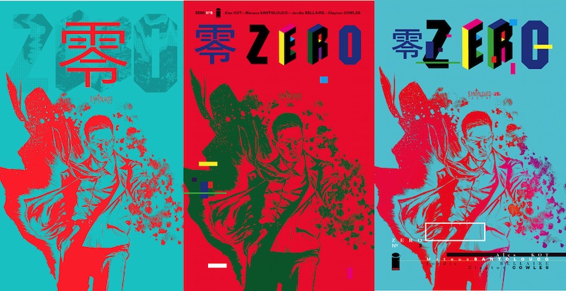
“I’ve been speaking about how the way comics look are stuck in that same loop for a while now,” said Tom Muller, the designer of Zero, Drifter and more. “It’s not a case of ‘If it ain’t broke, don’t fix it,’ but about evolving.”
“Why should design be almost an afterthought in comics, when it’s front and center – even seen as a selling point – in so many other areas of entertainment and publishing?”
While designers like Rian Hughes and Chip Kidd have made their mark on comics in exciting ways, much of what we’ve seen is limited to refining logos and adjusting layouts. Wholesale change in the design of comics wasn’t happening, for reasons unknown.
“It’s one thing to acknowledge and appreciate the design heritage of comics – and it is an amazingly rich one – but I don’t see the point of endlessly repeating the same approach and aesthetic,” said Muller. “Is it because publishers don’t care? In my experience I’ve often found publishers do care. So are they afraid that too much change alienates readers? Are comic readers too caught up in tradition, whilst happily consuming other forms of media that utilize contemporary design? I don’t have an answer for that – yet.”
“But the whole idea of reinforcing the status quo whatever it takes only helps to stifle creativity.”
The good news is the status quo is under siege, and it has been for years now. Good design that impacts comics in a holistic way is taking the leap, and we’re not only feeling it on the covers, but throughout the comic book experience. Comics could and should be a unified experience, and it’s thanks to the work of designers like Muller, Fonografiks and Hannah Donovan that this is happening. Today, we will examine the value of the work they’re doing, and how comics are being impacted in a positive way.
Functional, not a Flourish
There’s one important question to answer before moving on: what do comic designers do, exactly?
“I see the role of the designer in comics the same as I see the role of a designer in any other industry: there to design the message and communicate an idea, and package everything up in something that stands out, sells the product and speaks to the imagination of the readers,” shared Muller. “In Dutch the word ‘graphic designer’ doesn’t exist, we call the profession ‘graphic form giver’ translated literally — and I think that captures it perfectly: a designer’s job is to assemble and give form.”
That’s the ten thousand foot view on comic design, and a rough idea of what a designer’s role should be on any project they take on. Beyond that, an important way to view design is this: it’s not about making something splashy or over the top, but delivering an appealing package that fits and enhances the product it is part of.
Take Jonathan Hickman, for example. Today he’s one of the most popular writers in comics, but he once followed a different path. His college degree is in architecture and before he worked in comics, he was an art director at an advertising agency. His background can be seen throughout his oeuvre in the transition pages and infographic like aspects he’s known for. They aren’t there because they look cool. They serve a storytelling purpose.
“I just hate ads. After that, I hate unintentional dead space. And sometimes, I think a story needs a hard beat, or a chapter break,” said Hickman. “I’m going to be doing all of that in a cool new way in my upcoming work, but the purpose will be the same: controlling the flow of information, or the story.”
“So I guess I’m saying that it’s functional, not a flourish.”
That’s an idea other designers echo, including Hilary Thompson, a graphic designer at Oni Press. Her job is handling logo, cover and interior design for Oni books like Letter 44, Rick and Morty and Junior Braves of the Apocalypse. Her thoughts mirror what Hickman said.
“I think as a designer it’s very important to balance aesthetic with function,” said Thompson. “In essence, designers should be problem solvers with style, so how your audience receives your work – if it’s appropriate, digestible and functional for the demographic – is just as important as how it looks or feels when coming to the right solution for what is needed.”
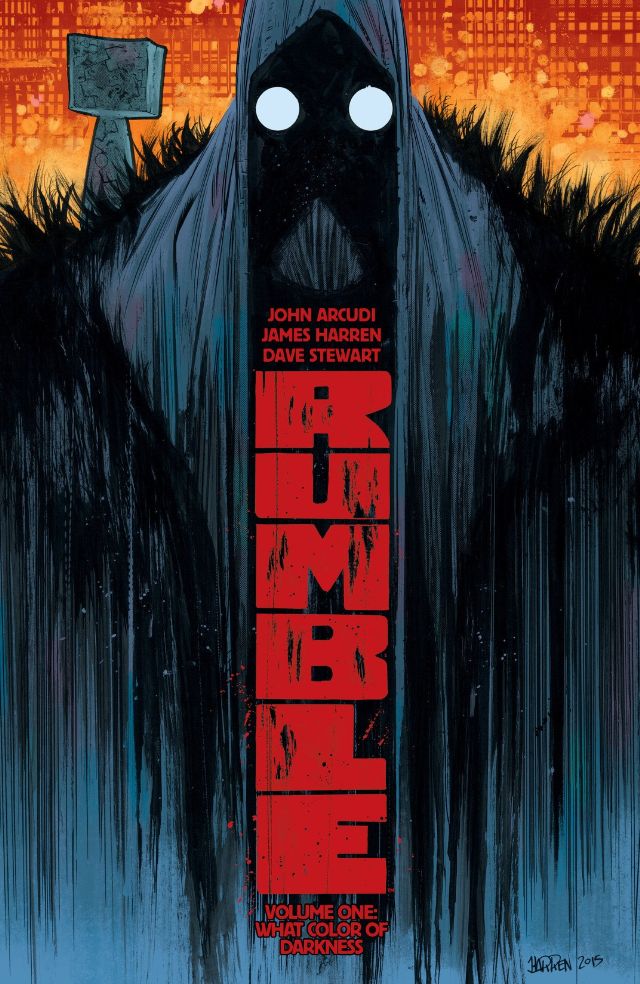
That’s something Vincent Kukua, a production artist at Image Comics Central who works on books like Copperhead, Orc Stain and Rumble, fights with on the regular. He likes to think outside the box for design, but to make it work, he has to rein himself in at times.
“I personally have a design preference that veers toward the experimental and often can be unreadable,” he admitted. “I like to play with type a lot. But, a lot of times that doesn’t quite work in comics, especially when you’re dealing with very basic information that needs to come across efficiently. I’ve learned in my years here to tone that down a bit and not overthink the style.”
It’s a delicate balance, and one we’re seeing accomplished increasingly often in comics. Both creators and publishers are realizing quality design impacts the reading experience in more expansive ways than we used to believe. The work of designers isn’t just making readers pick up a book; it’s enhancing the experience and helping convince them to keep buying the title past that initial issue.
“You need to grab people’s attention, first and foremost, and you’re competing with hundreds of other books on the shelves — so I’m always looking for ways to design something that stands out, while still relating to a comics buying public,” shared Muller. “The second element, which I think is incredibly important, is to design a full experience for readers that starts on the front cover and runs consistently through the issue right to the back cover.”
“Design is a big factor alongside art that pulls in the readers, and it needs to be a subtle constant throughout.”
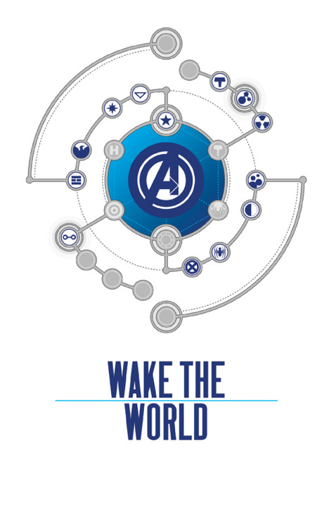
On books like Ivan Brandon and Nic Klein’s Drifter, Muller has helped build a unified look. It creates an immersive atmosphere. You hardly read the book; you live in it. Muller’s approach to comic design is built on stepping outside of the accepted norm for comics, and in a way that lives comfortably within it. There’s a reason Hickman touted Muller’s work out of the blue in our interview, saying, “Want someone to pick up your book? Want some good advice on creating a visual identity? Hire Tom. Then go to bed.”
Creating a visual identity is part of Muller’s everyday life, even outside comics. He comes from a long line of artists, and he lives and breathes design. Beyond that, his work in developing and maintaining brand identities at digital agency Code and Theory – “where you usually solve design problems with unified design systems…(and) a global brand language for a client that runs throughout all aspects” – can be seen in his comic work, and he used Drifter as an example.
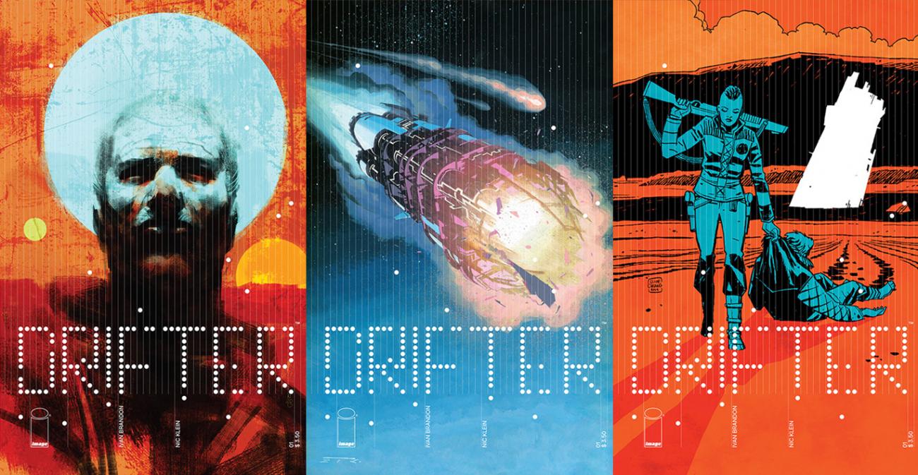
“In the case of Drifter, once we had settled on a logo and visual direction in terms of design, I developed a modular system from which I could design a custom typeface, and extrapolate all the different elements that make up the design of Drifter,” he said. “The system is flexible enough so I can adapt it as the series progresses: whereas the design for the first arc was very much about showing and breaking the grid lines, the second arc design is more about the spatial relations between the geometric shapes.”
If this sounds cool, that’s because it is. But again, it’s not just cool; it’s storytelling.
And while comic design is seen to a greater degree in creator-owned comics like Drifter, publishers like Valiant and Boom! Studios are making big strides on their respective lines as well. In fact, Boom! houses one of my favorite designers in the gifted Kara Leopard.
She’s a production designer there, working on titles ranging from Giant Days and Over the Garden Wall to Tyson Hesse’s Diesel and Peanuts. She creates logos, designs ads and develops credit pages for books. In particular, her work on Wild’s End has impressed, and Dan Abnett and INJ Culbard’s title has been one of the finest in comics since its launch thanks to the keen visual eye of Culbard and Leopard.
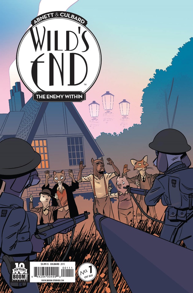
For one, the logo – which Leopard and her manager Scott Newman collaborated on – is a favorite. It’s design at the epicenter of aesthetic and functionality, and the covers are a phenomenal fit for the era and sensibility of the title. And fit is important to Leopard, who has to realign her mindset depending on the project she’s working on.
“I wouldn’t be able to do the same designs I did for (John Allison’s) Giant Days with Wild’s End and get the same product,” she said. “Giant Days is about a group of girls going to University together, so I used my own handwriting and doodles for the design work because I was one of those students who doodled on everything and it fit the overall theme of the book.”
“With Wild’s End, I was able to use interior art for the credits page and use colors from each issue to reflect the time of day in the story. It unified each issue by using pieces of the book itself,” Leopard added. “We want all of our books to be unique, as they are all special in very different ways, and so we try to think of something new for each one.”
Whether its creator-owned comics where designers are essential parts of the creative team or projects like Leopard’s, design has become increasingly important in comics. You can see it across the board. Its value is accelerating.
And there are plenty of reasons for that.
Why Design Has Moved to the Forefront
While its importance has taken a leap in recent years, it should be noted once again that design’s value in comics is hardly a new thing, as Hickman shared. It was just less prominent because of how much of the industry is structured.
“I think that cartoonists like, say, Jim Rugg for example, have been doing this for a very long time. Those artists are presenting a singular aesthetic and, for the most part, it’s always been that way. The design is cooked in. It’s just a piece of art,” Hickman said. “So the lack of cartoonists producing work for Marvel, DC, and frankly most of the companies, is a big part of the problem. There’s too much assembly line.”
“Now, there are very good reasons for this, but it’s still a problem of alignment. It’s just hard to get four to six people on the same page so that what comes out the other side is a beautiful, cohesive thing.”
That’s why creator-owned is the most significant driver of thoughtful, atypical design in comics. As Muller shares in a podcast we’ll run tomorrow, the largest publishers are like oil tankers. They take a lot longer to make turns – for good reason – and that means change is more of a struggle for them. Altering the look of a Marvel or DC title means convincing many stakeholders that it’s the right move. It’s a process.
Creator-owned comics, on the other hand, are more like zippy speedboats. They can change directions quickly, and you only need to decide with your collaborators that bringing on a designer is a good idea. We’re seeing that more often in creator-owned thanks to how the money is split, according to Hickman.
“A lot of the reason is that the market is becoming a little more fair. Creators are keeping more of their money and as a result are able to invest in themselves and the things they own,” he said. “Part of that is going into designing their books.”
For people like Muller, creator-owned means being factored in from the start. That can change everything for a comic.
“When I’m working on creator-owned books I’m closely involved — I am part of the creative team in that sense — when it comes to shaping the look and feel of the series,” he said. “Generally speaking its a close-knit collaboration with primarily the writer and artist to conceive an appropriate design language for the series from a content/context point of view, and then working out how that can work with the art. It’s been like this with all the Image books I’m working on.”
Compare that to his for-hire gigs – which he describes as “more linear affair(s)” – and you have design impacting comics in hugely different ways. His work for major publishers has been significant, having done cover work for Valiant (who also hired Rian Hughes to redesign their logo upon their relaunch) and logo work for DC/Vertigo. But it isn’t as total as what he’s done on creator-owned projects.
That’s not to say it’s impossible to create change on for-hire projects. Arguably no creator has made greater changes to the look of Marvel comics in recent years than Hickman. He made it to the House of Ideas and brought his design aesthetic along with him.
“There you’re just one stop on the assembly line of the great machine. Marvel has to produce so many books every month that, come Friday, the editors are just trying to get comics to press,” he said. “Saying to them, ‘the design of this book sucks,’ or ‘the logo is beating the shit out of the cover’ isn’t helpful. It’s just bitching. It’s just creating more work for the overworked.”
“The thing I did was offer solutions. If I didn’t like the way something looked, then I wouldn’t just complain, I’d offer solutions. ‘Here are some mockups for how the cover design can work for 30 to 60 issues. Here’s what the title page should be. Here’s what the recap page should accomplish and how. Here’s the fonts we should use,’” he added.
Part of his desire to do that was because Hickman uses design to control the flow of his stories, as he said. But it was also because of something few creators incorporate into the look of their comics: branding.
“I also was very conscious of keeping all of the design in the same family because, again, Marvel is a very big company with lots of competing objectives,” he said. “It was very important to me that when someone picked up a book that the visual clues didn’t just scream ‘Avengers.’ It needed to be instantly recognizable as Hickman’s Avengers or Hickman’s FF.”
And they are. One of best things about a Hickman comic is if you removed the credits and words from the book, you could still figure out who made it. The story transitions and breaks in his comics are signatures that also aid his storytelling.
Not that everyone could get away with that, but as Hickman said, he presented Marvel with solutions, and even the biggest comic publisher in the United States rolled with it. The oil tankers can move pretty fast if need be, it seems.
Another thing to consider is how the readership itself is changing. With new readers of all varieties picking up comics in greater numbers, not everyone wants or expects comics to always look the same. Even beyond that, many are used to reading comics online or digitally through ComiXology, which is a much different reading experience. Comic readers are arguably more accepting of the “new” now than any time before, and that has sped up the transition.
Well, mostly, as Hickman shared when I asked him about his predilection towards circles.
“When Secret Wars got announced I had a ticketed signing at a convention booth, and this guy was so mad about Secret Wars that he got his ticket and waited in line just so he could bitch at me for ‘destroying the Marvel Universe,” he said. “So he waits his turn, then comes to where I’m sitting and slaps the ticket down on the table, and, flustered and not able to properly verbalize his anger, just says, ‘Congratulations on Secret Wars. Good job. Congratulations on THAT! And your CIRCLES!’”
“I guess I just kind of like circles.”
His branding is so pervasive even his most ardent of adversaries know Hickman for his usage of a shape. That’s impressive.
It’s always important to remember nothing moves the needle in comics (or really any industry) like money. That’s a factor in Leopard’s mind.
“I think comics are becoming more aware of how design can help sell a book, and how it can also be used to expand the world of the book,” she said. “It’s important to make your book stand out on the shelf, especially with so many amazing comics out there.”
For Kukua, he seconded the earlier thought about technology having an impact – “we’ve seen a lot of physical media get a bit of a jolt” – on comics utilizing thoughtful design more than ever.
“Comics have always been about visual presentation, but I think digital comics coming into its own in the last five years or so has really allowed publishers like Image and others to start experimenting with design, not just on their covers, but inside as well,” he said. “The whole package is becoming really important now and we are looking at taking advantage of every possible space the reader’s eye will come across in order to grab and keep their attention.”
The Future of Comic Design
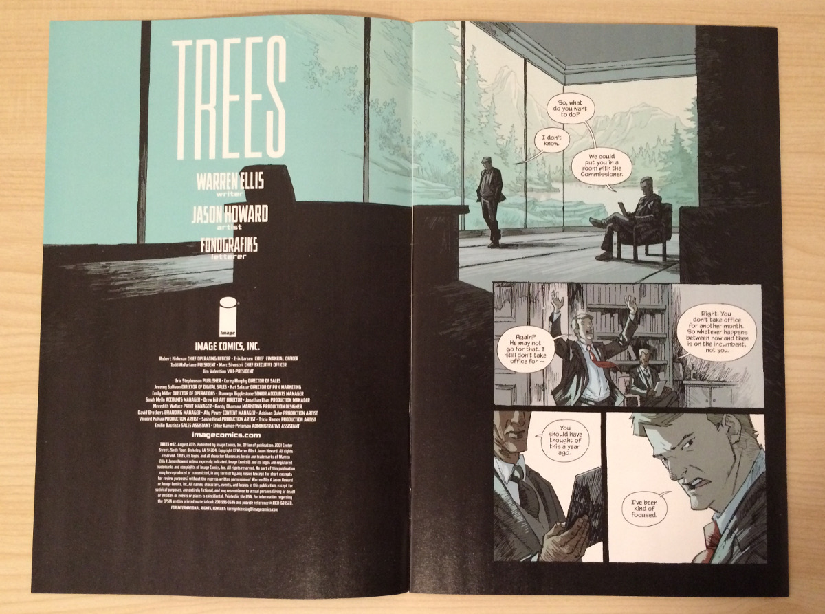
Beyond the people featured here, the comic industry is lousy with exceptional designers these days. Hannah Donovan – who is a product designer by day – has made The Wicked + The Divine a better looking book both in comic form and in trades with what she brings to the table. John Roshell of Comicraft fame has helped make The Autumnlands an even more beautiful book. Eric Trautmann’s design work for Lazarus’ backmatter makes him maybe the most underrated contributor to any comic today. Steven Finch (aka Fonografiks) might be the best designer in comics. His transitions to each issue of Trees help give it the finest open of any book on the stands.
Beyond those four, the folks who commented on this article cited all kinds of names and publishers for who they’re impressed by. They ranged from Jared K. Fletcher (Southern Bastards, Paper Girls) and David Carson (Ray Gun magazine) to Nobrow Press and multiple mentions of Fantagraphics. That’s just scratching the surface. There are an awful lot of gorgeous comics out there, and it’s getting better. For a designer like Thompson, this direction is exciting.
“I can’t stress enough how important it is to practice good design and production techniques for something as intimate as a comic or book. Transporting someone to another world through reading is an honorable task and shouldn’t be interrupted by poor quality or mistakes that were carelessly overlooked,” she said. “I’m happy that comics and other publications are catching on to the value of great visual presentation not just in the art itself, but in every aspect to create a beautiful piece begging to be put on display.”
For Hickman, it’s about creating something beautiful, and he’s pushing his upcoming work to achieve that in an even greater sense than before.
“I think everything should be well-designed. It never will be, but I think, at the very least, it’s important to try,” he said. “There’s an old interview with (Steve) Jobs where he talks about what’s wrong with Microsoft’s products that kind of sums up why, and it basically boils down to this: make beautiful things because they matter.”
“And I wish I could say that I did that all the time, but I don’t. I fail a lot. Some of that is because I’ve been doing so much wholesale the past couple of years, and some of it is because I’m simply not as good as I want to be,” he added. “But I do know the difference, and I think it’s important to try.”
“Anyway, I’m pretty excited for the work I have coming up next year at Image. I think those are going to be special books.”
Muller is seeing more job offers than ever in comics thanks to the increased focus on design and his own higher profile. That isn’t stopping him from continuing to push his work as well.
“It’s all about giving the reader what I like to call and end-to-end experience, where every single aspect of the comic immerses you in the story — and that story can be told in many ways,” he said. “I think it’s vital to keep exploring and evolving the medium of comics in order to stay relevant and engaging; just as everything else evolves.”
Thompson agrees with the idea.
“I think it’s also interesting to see how lately a lot of comics and graphic novels are taking on more of an art book style, with cool cover treatments and things that push the envelope for what we all normally think a ‘comic book’ should look like,” Thompson said. She sees that type of development as necessary for achieving progress in the form.
That’s what is important, really. To keep moving forward and not accept the way things are simply because that’s the way things have always been done. Comics have gotten better the more they’ve released themselves from the shackles of the past. Not that what came before should be abandoned. They both should be embraced – together.
“Tradition and invention should be able to occupy the same room,” Muller shared. “Comics are such a rich medium and there’s (enough) variety going on that it shouldn’t all look the same.”
Innovation doesn’t preclude continuity, and it doesn’t hamstring quality. When it gets down to it, comics are better off with design not being a step in the process, but an aspect considered from the beginning. Thankfully, we’re seeing the fruits of the labor of people like Muller, Hickman, Thompson, Kukua and Leopard pay off in a big way. That’s greasing the wheels of change.
Better design can lead to better comics. We’re only scratching the surface as to what that could mean. That’s a good thing for comic fans everywhere.
Thanks to Jonathan Hickman, Vincent Kukua, Kara Leopard, Tom Muller and Hilary Thompson for the insight they shared for this article. It – along with their superb design work – is much appreciated. Header image provided by Muller.
Stay tuned for this week’s podcast, which is a discussion with Muller about design. It’s a good one. It arrives tomorrow morning.