
The Design of Absolute DC: Hayden Sherman on Designing the Hellish New Wonder Woman
DC is launching its new Absolute Universe this October, and a trio of titles in Absolute Batman, Absolute Wonder Woman, and Absolute Superman are leading the way. Each is an intriguing reimagining of those characters from strong creative teams, and a lot of digital ink has already been spilled about how these projects came together and why they’re something the publisher is doing. But the most exciting part about each, at least to me, is the art and artists. Nick Dragotta, Hayden Sherman, and Rafa Sandoval have been tasked with creating a new look for some of the most iconic characters the world has ever seen — and each seems to have nailed the job. That kind of work deserves a spotlight.
So, to do that, I’ll be writing a series of features about everything they did to bring the new iterations of these characters to life with insight from the artists themselves. And up next is one that’s focusing on Sherman’s work in designing a new Wonder Woman, the journey to that final result, and everything that went into it. If you missed the previous entry in this series, though, you can read my feature focusing on Absolute Batman through the prism of Nick Dragotta and his work here.
It’s not every day a person gets to collaborate with someone whose work meant a lot to them — but it happened to Hayden Sherman.
The artist recalled reading Scott Snyder’s “entire Batman run in high school” and being “absolutely taken with it.” It wasn’t just a good comic, either. While listening to Sherman on the subject, it was clear that read was an important one to their overall path as a comics fan and creator. So, maybe that’s why it wasn’t surprising that the artist described the experience of working with Snyder on Dark Spaces: Wildfire and Dark Spaces: Dungeon over at IDW as “a dream.”
And it’s a dream that has continued to pay dividends for the artist thanks to the relationship the pair formed. Knowing how good Sherman is, Snyder reached out to the artist about another project around a year ago. The only trick was the superstar scribe wouldn’t be writing it. Instead, it’d be part of a larger effort Snyder was shepherding over at DC, one he thought Sherman would be a good fit for.
“At some point, he just kind of casually dropped the idea of, ‘Wonder Woman, how does that feel?’” Sherman said.
While the details Snyder offered at the time were limited, the wheels immediately began to turn for Sherman. They knew they couldn’t make any concrete decisions on the character’s design — “I didn’t want to feel committed to something before I knew what the storyline was going to be” — but Sherman admitted “I’ve had it in my head just tinkering ever since Scott brought it up.”
All this makes sense if you’ve ever had the chance to talk with Sherman. I’ve talked to hundreds of artists over the years, many at great length. And the number I’ve spoken with who think about character design with more care and detail than Sherman does is…well, it’d be a short list. It’s a genuine passion, something they cannot help but give maximum effort to simply because that’s how their mind works. And being able to apply that mindset to such an iconic character in Absolute Wonder Woman was incredibly alluring to the artist.
“A lot of my books so far are very creator-owned and driven, so I have a lot of input in design and everything,” Sherman said. “So, the opportunity to bring that skillset over to Wonder Woman was very appealing.”
That excitement would have to wait a bit, though. While Nick Dragotta’s work on Absolute Batman was fast out of the gates, it was a bit slower going for Sherman. The artist described the entire process as being “very casual until New York Comic Con last year,” at which point they started talking with DC editorial.
“But even then, it was very vague,” they said.
In fact, Sherman didn’t know just how different this new iteration would be until much later, or that this effort would give the artist “the chance to rebuild” Wonder Woman from the “ground-up.”
What really changed things was when they learned Kelly Thompson would be writing Absolute Wonder Woman. According to Sherman, they didn’t discover that Thompson would be the writer until around a week after they formally were offered the project. That was a real draw for the artist, as Thompson’s take on the character and Diana’s new origin was a massive inspiration for the design that would come.
That work didn’t start until early May, per Sherman. That’s when they started on designs. It’s also when they received a story bible Thompson had crafted, something that was crucial to the process, even if the artist did have ideas for the character’s look from the start. Those included a desire “to bring in more distinctly ancient Greek influences into the armor,” an idea that factored into early designs.
“The more that I worked on that, the more it just never quite stuck,” Sherman shared.
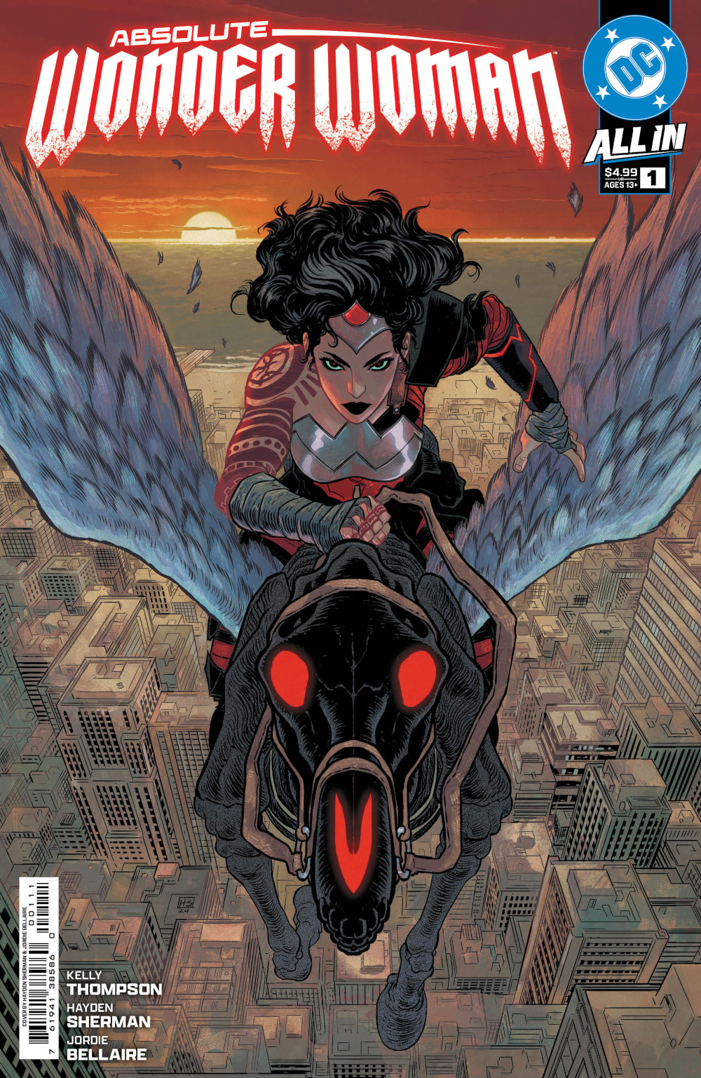
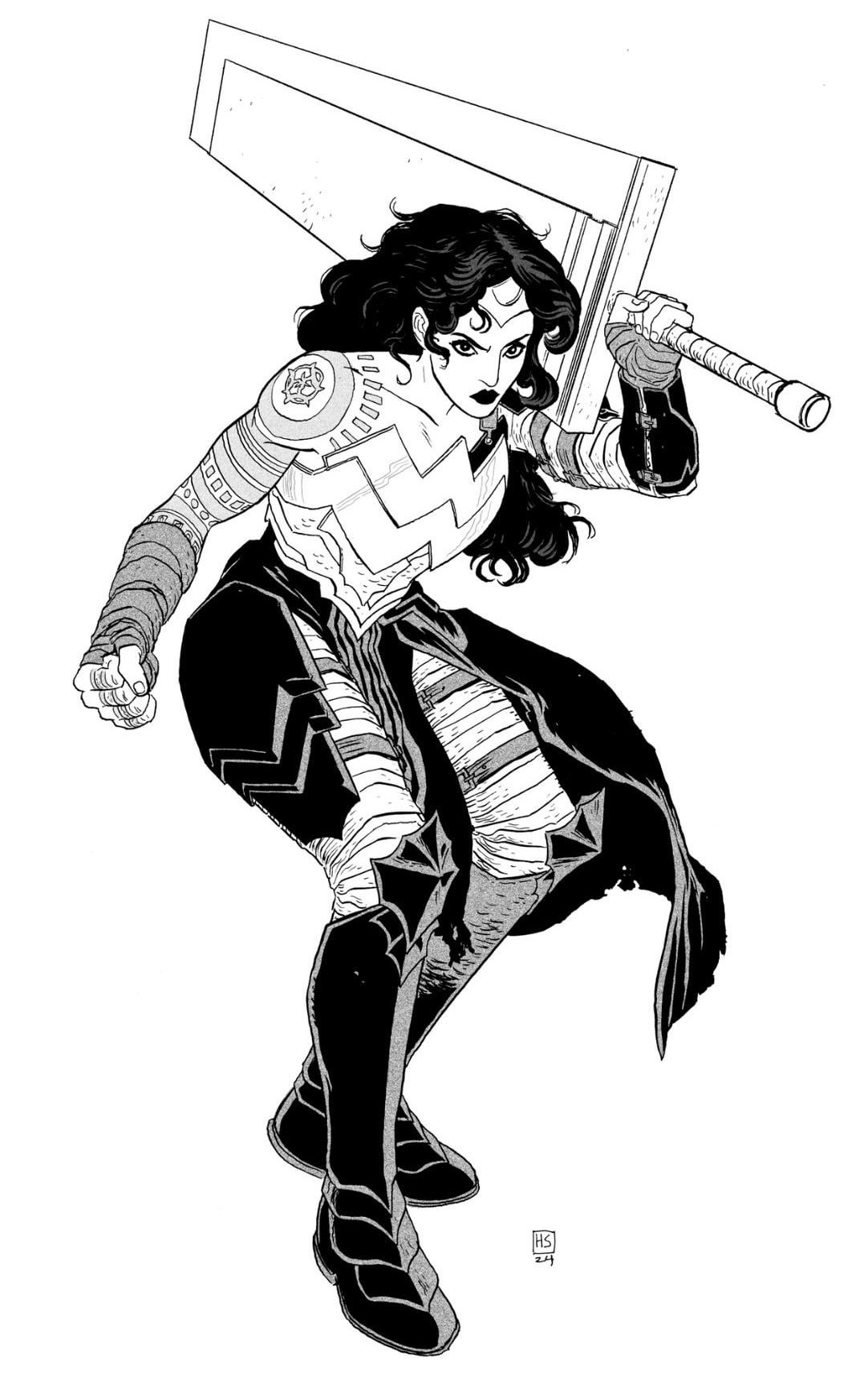
That said, there were two elements that carried through from the artist’s initial vision. One was a desire “to push this Wonder Woman away from a swimsuit model/bathing suit aesthetic.” It just wouldn’t work for this witch warrior version of Diana that was raised in Hell rather than Themyscira. That’s why Sherman aimed for a look that was “more suited up for what the job entails.”
The other was ensuring that the character trademark “W” was “a prominent element of the design.” The reason for that connected to the previous goal, to some degree. But it was also an effort to put Wonder Woman on equal visual footing with the other two parts of DC’s Trinity.
“Batman’s bat symbol always stands out, Superman’s logo stands out, and the Wonder Woman logo can be consumed by the part of the anatomy that it’s on,” Sherman said. “I wanted this to feel like a chest piece that is steady and reliable, and from any angle, you’re going to be able to see it. It’s protective, first and foremost, as opposed to being distinctly and solely revealing.”
All that said, while the artist had their goals, the process was very collaborative. Sherman said, “there was a lot of back and forth, especially at the beginning, when it came to fleshing out the design for Diana.” Thompson’s bible helped. It included character breakdowns and “broad strokes of Diana’s origins” for Sherman to build from. More than that, the team’s conversations helped the artist realize just how many of their objectives overlapped with Thompson’s.
“One of the things we ran into was wanting to bring back the silver emblem so we could create more distance from the classic Diana,” Sherman said. “And knowing the Hell origin and talking with Kelly about what that all means, we wanted to make things a little more asymmetrical and a little bit more full-bodied in terms of armor.”
Sherman described the latter as being particularly important to them. The goal was for the design to “feel practical,” and to have a look that was “well-worn,” as if it was built from elements that could be “replaced if things got messed up.”
Amusingly enough, though, the team behind Absolute Wonder Woman shared one design goal with the creative team of Absolute Batman: They both wanted their version of their character to be big.
“She’s an Amazon. She should be tall,” Sherman said. “As we’re getting further into drawing more of the series and seeing her around different characters, we’re really establishing that she’s the tallest person in the room when she walks in — because she’s Amazonian.”
While there were concrete and shared goals amongst the creative team and DC editorial going in, Sherman admitted there were self-doubts throughout the process. One thing you need to remember is that this is an artist who is comparatively newer to the field, as well as someone who has primarily worked in creator-owned comics. It’s a lot easier to do whatever you want when you’re dealing with your own characters rather than one of the most famous fictional characters in the world. So, questions were present in their head as they navigated this path, if only because, as Sherman said, “I wasn’t quite sure what the boundaries were on this.”
“How far can we push it? What is intrinsically Wonder Woman and what isn’t? And what parts do you take away and then she stops being who she is? What parts do you add on and she stops being who she is? And what are the lines there?” Sherman emphasized. “It really helped to have editorial there to set those boundaries.”
It also aided Sherman’s process that they’re an idea machine. Instead of just delivering one design and hoping it fit the bill, Sherman took a “shotgun blast” approach. The initial design document “had a single image with maybe eight or ten different directions” in it. The goal was to see what worked and what didn’t, at which point they refined it down until it was finalized. In the end, they landed on something that’s a blend of a whole lot of ideas and styles.
“The design skirts the line between fantastical, medieval, and then Greek,” Sherman said. 1
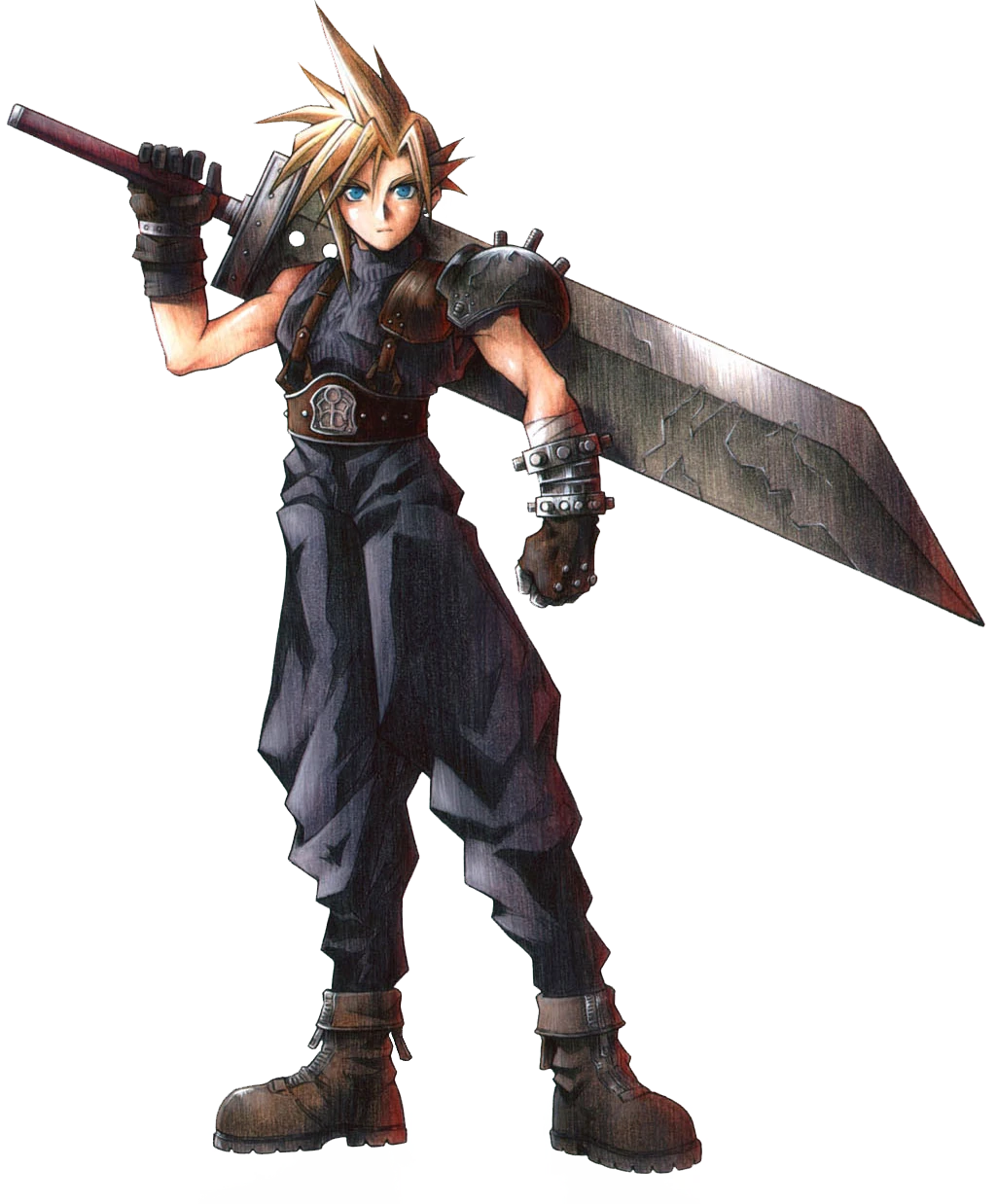
Let’s talk about some of the specific and standout elements of the design, though. And if there’s one thing people point to immediately, it’s Wonder Woman’s massive sword. Sherman’s enjoyed seeing people “bringing their reference points” to the table for that. Fans have quickly noted its similarity to Cloud’s Buster Sword from Final Fantasy VII and Guts’ sword from Berserk. And part of the reason they’ve enjoyed it so much is “because that’s all part of it for me.”
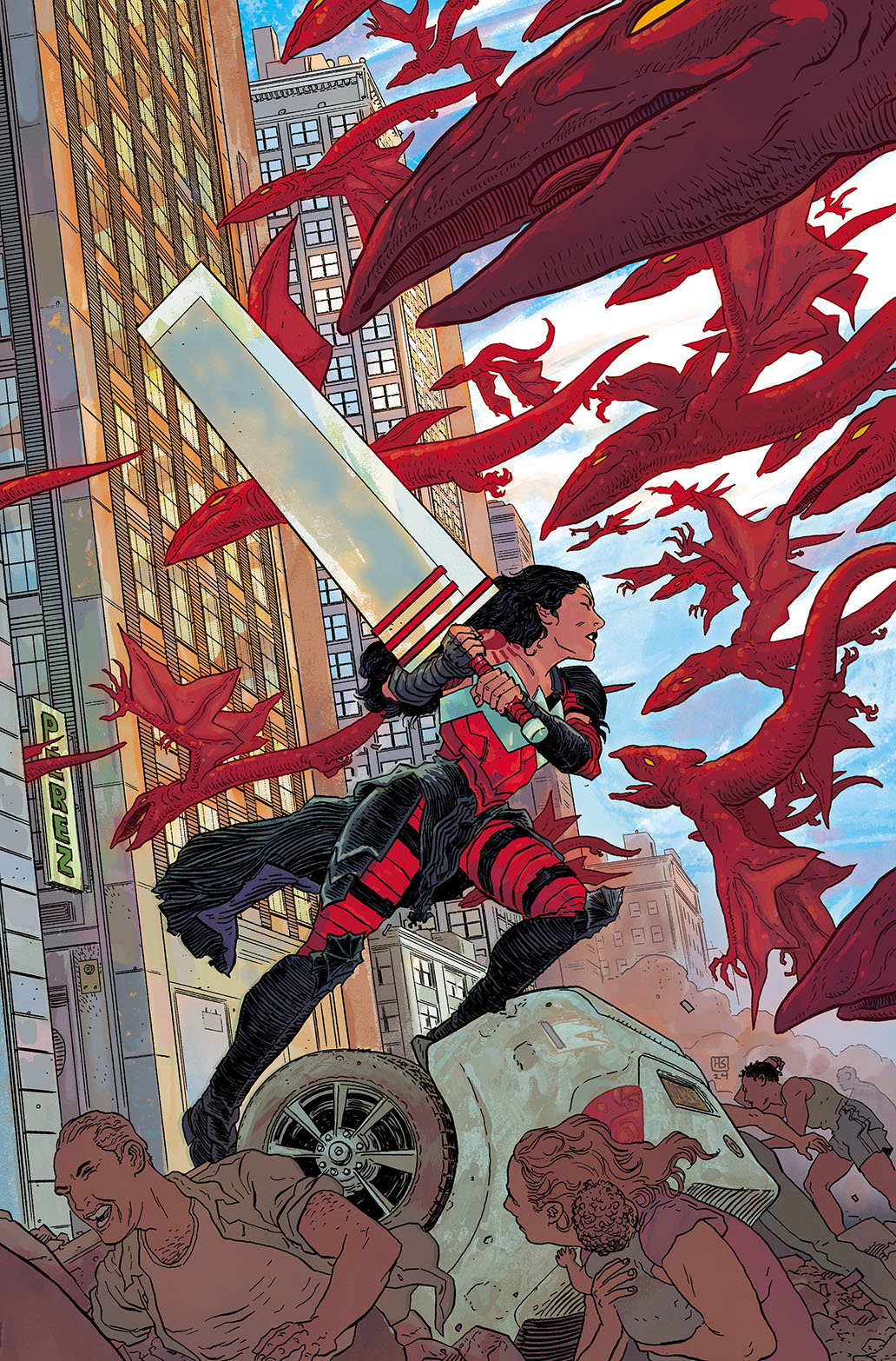
“When we knew we wanted Diana to have a big sword, I wanted to look at, ‘Well, what are the big swords that I love that resonated with people?’ and then try and find a version where we strip it down,” Sherman said. “Ours is just a giant rectangle, like a clean shape. I just kept it simple.” 2
Sherman had several influences in their brain as they designed the sword and different aspects of the character. Final Fantasy, Berserk, and Dark Souls 3 were mental fuel, as were really “any form of fantasy where characters with larger weapons fight large entities.”
“We want Wonder Woman to feel somewhat part of that genre here while still being herself,” Sherman said.
One other aspect that has come up a lot in discussions about Sherman’s design was Wonder Woman’s arm tattoo. There’s a story behind that. It’s just not something that can be discussed quite yet, even if the artist emphasized that “it’s very cool.” But others were a bit easier to talk about and equally as impressive, despite not having been debated as vigorously. One is the aforementioned asymmetricality to the character’s design. That was something Sherman wanted to ensure was present throughout, and for good reason.
“When we see symmetricality, it feels very planned and a little closer to a sense of godliness or perfection,” Sherman said. “And what I love about the fact that Absolute Wonder Woman is coming out alongside main universe Wonder Woman is we get to see these in contrast and in conversation with each other, at least on a visual level.
“Our Wonder Woman doesn’t come from that same amount of means, and by giving her an asymmetrical design, it visualizes that difference in upbringing,” they added. “She isn’t putting forward an aesthetic value in what she’s wearing. She is emphasizing the utilitarian, and that’s going to have different results.”
That’s the space Sherman operates in. Design is storytelling, and the character’s background was essential to the look they came up with. Sherman wanted the armor to feel DIY, offering readers a “sense that it was built over time.” That’s something they suggest we’ll see in the book, as the armor is “an accumulated thing,” something “repurposed and taken from things.” In fact, that connects to one other design influence for Sherman: the Orc armor from Lord of the Rings, and more specifically, the “battered and assembled quality to it.”
There are complements to that overall armor as well. One is a helmet that’s been shown occasionally, something the artist said will emphasize Wonder Woman “means business on an extra level” when it’s deployed. Sherman wanted “some level of that ancient Greek armor feeling” to its look, but with a different spin on it thanks to how it covers her eyes. The reason they didn’t want readers to see her eyes was two-fold. One was it makes her even more fearsome when she’s wearing it. The other is it then offers “that moment of unmasking,” something that Sherman believes humanizes the character. That divide between the scary and human sides of the character brings depth to the story and character, in the artist’s mind.
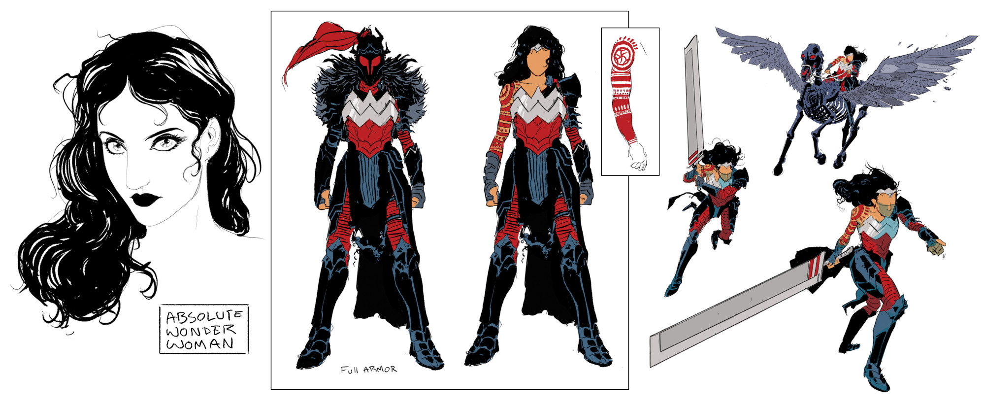
There’s the fur that shows up as well. The biggest reason for its inclusion is simple: it looks good. Sherman believes it “rounds everything out,” making the character a bit more “top heavy” while offering a “sense of regality” because she elects to clothe herself in such a way. Even more practical, though, was “the long piece of cloth that wraps around her waist.” While there will be a story-based reason for why it’s there, it exists at least in part because of how it will emphasize the character’s movement in the comic itself.
“One tool that Batman and Superman both are long capes, which is such a beautiful visual tool for motion in comics,” Sherman said. “Giving her some sort of trail allows us to really see her movement through space, and that’s a dynamic element that helps a lot in a static visual medium that’s supposed to be powerful and movement based.”
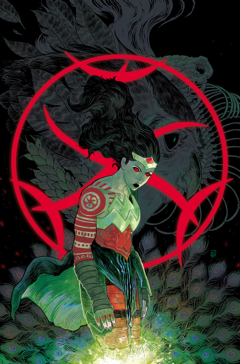
All of that combines to create a more compelling, unique look for Wonder Woman, one that offers contrast to how the character typically is depicted. But her Hell-based roots were essential to one final aspect of the design. That’s its color scheme. Knowing this character is from Hell, the artist focused on red and black as the primary colors. But in typical Sherman fashion, it wasn’t just because these are standard colors for Hell or anything like that. It was about evoking the right feel when you see her.
“I wanted the red to feel like it’s kind of running underneath the layers of black that she has on top of her,” Sherman said. “It’s like cooled molten rock on top of a bed of lava or something. She feels warm and heated.”
While this isn’t part of the character’s look, one important complement to this version of Wonder Woman is she has a terrifying, metallic look flying horse as a mount. That’s pretty unique! And it was all Thompson, the artist said.
“That is thanks to Kelly being like, ‘She rides a black skeletal Pegasus with glowing eyes,’” Sherman said. 4
While the initial sketch Sherman did was received well, there were several different roads taken for Diana’s ride from there. Horns were modeled. Different tails were tried. More monstrous looks were sampled. Nothing seemed to connect in the way everyone wanted. So, instead of going bigger, they dialed things back, something that pleased Sherman.
“I’m so glad we pushed away from that and kept it simple,” the artist said. “There’s something about just a black skeletal horse with glowing eyes and wings that just works.”
Beyond her mount, though, the character’s aesthetic has limited carryover to the rest of the world she resides in. That’s a huge divergence from how Dragotta is approaching Absolute Batman, and it’s for story and character-based reasons.
“She is the last Amazon at this point, so there isn’t a lot that would share her visual language so far for where we’re at in the story. That’s something that I want to keep,” Sherman said. “I want her to feel like a fish out of water, visually.”
That will help the character stand out even more. To be honest, though, there’s hardly a need for it. There isn’t really a version of this world that Sherman’s design for Absolute Wonder Woman wouldn’t pop. That’s been proven by the reaction it, as artists have quickly been moved to draw the design simply because they’re moved by it, something Sherman calls “deeply flattering.” As someone who loves design and to design characters, that has been the highlight of the Absolute Wonder Woman experience for the artist — at least so far.
“It was cool to be asked to do this at all, and I hope people enjoy the issues when they start releasing next month,” Sherman said. “But just seeing artists pick (the design) up and wanting to see it in motion and just doing it themselves…that’s the way I am when I see a design. I want to draw it and figure it out.
“So, if I’ve made anything that makes people want to pick it up and toy with it themselves, then I’m very grateful for that.”
The artist has their own headcanon about how this look came together within the narrative, saying, “I have this thing in my head (where) if (Wonder Woman is) in Hell, maybe she’s encountered versions of other era’s armor before and is incorporating that. This is just my internal justification.”↩
Sherman did say that their biggest reference point was the Buster Sword, and that they wanted it to be even simpler than the PS1’s polygonal look. That’s part of the reason the rectangle is so clean.↩
The famously difficult FromSoftware video game.↩
Sherman recalled their response as, “Great. Yes. Amazing.” Sold!↩