The SKTCHIES: Favorite Creators of 2015 (Part One)
Welcome back to The SKTCHIES, SKTCHD.com’s first annual year-end awards. With The SKTCHIES, it’s less about defining the best in comics. Instead, it’s more about sharing our favorites, and the ones that helped make this year a great one for the medium. And today, our gaze shifts towards the creators whose work stood out the most this year.
Typically, I’d break these lists down to just a split between writers and pencillers, but it takes a lot more than just writers and pencillers to make great comics these days. Over the next few days, we’ll be highlighting the colorists, designers, letterers and even the occasional cartoonist who we loved this year, and talking about what made their work stand out even amongst their peers. This isn’t meant to be an exhaustive list – overall, thirty creators are talked about – but it is meant to be a look at the people whose work we’ll remember first when we think back to 2015.
Also, the list is in alphabetical order by first name. We’ll be back on Thursday with part two – tomorrow’s a skip day, as it’s a podcast day – with the creator centric portion of this wrapping on Friday.
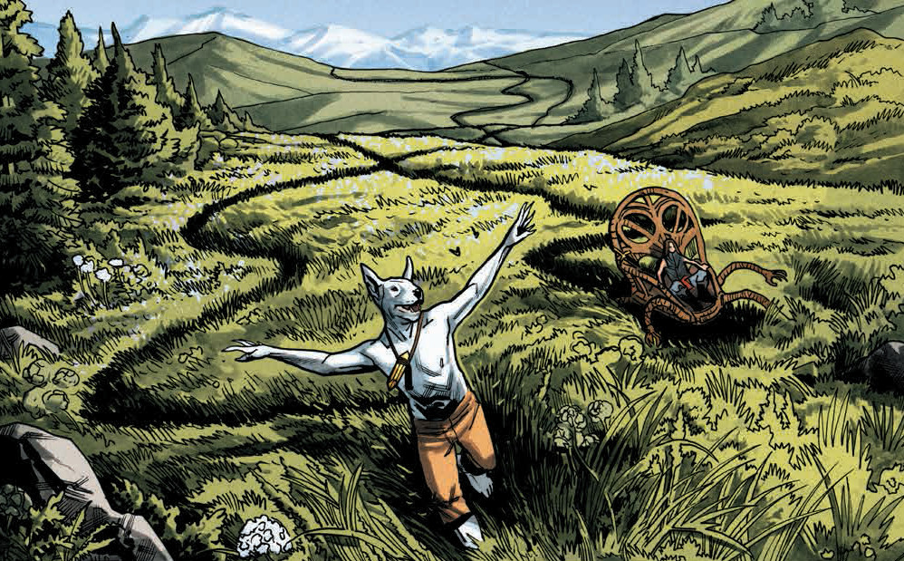
The Animals are People Too Award: Benjamin Dewey (The Autumnlands)
Dewey’s a guy I’ve been fond of for a bit, ever since I first came across his tragically comic webcomic, Tragedy Series. It’s clear from that work that he’s an artist with a surplus of talent, and while it was shown in a big way in the Eisner-nominated graphic novel, I Was the Cat, we had never seen his work in sequentials in a regular fashion. Well, until The Autumnlands, that is.
The Image Comics series that he works on with fellow luminaries like Kurt Busiek, Jordie Bellaire and John Roshell has been a high quality book from the start, but for me, the thing that sets it apart from the rest in the greatest sense is Dewey’s work. For most comic fans, this was his true coming out party, but for me, it was just the realization of his enormous potential in a big way.
It’s a gorgeous book, and one that has a careful, painterly quality that few books can match. It’s clear that there’s a whole lot of Dewey in the book, as the book is lavishly detailed and painstakingly realized. What results is a feast for the eyes, but that’s not the thing that impressed me the most. The cast that is filled with anthropomorphic creatures like Dusty, the dog boy who leads the book, are delivered in a way that isn’t just good character acting; Dewey even gives each character their own species specific tics and tendencies that make each such a unique creation. Reading the book, it’s hard not to think of the level of thought he had to put into putting the cast together, and the effort it takes to keep it consistent. It’s truly impressive, and something that sets his work apart in an era filled with exceptional artists.
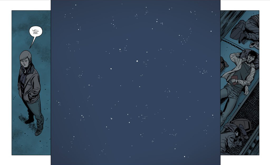
The Hey BKV Award: Brian K. Vaughan (Saga, Paper Girls, The Private Eye, Barrier, We Stand Our Ground)
I could have went bold and left BKV off the list, but what’s the point? It wouldn’t be truly representative of what I enjoy in comics, because Vaughan has and likely will continue to be for a long time my favorite writer. His consistency is second-to-none, his character work is wondrous and engaging, and it’s not a coincidence that his return to comics led into a leap of popularity and attention for the medium. The dude’s arguably the biggest individual in comics, and it’s not undeserved.
Cheers to him for never giving himself an easy route, though. He could spend all of his time plotting out how to generate more income off the Saga train, but instead, he continues to push out quality work that comes from unexpected places. Stories of endangered paper girls, bilingual character pieces with a surprising twist, and theoretical future wars were new on his docket this year, and all added interesting and exciting reads to my pile whenever they came out. Good for him for continuing to push his own work, even though he’s a pretty big deal. He’s the rare creator who has been given the ability to do whatever he wants, and he takes that for all its worth. We’re all the better for it.
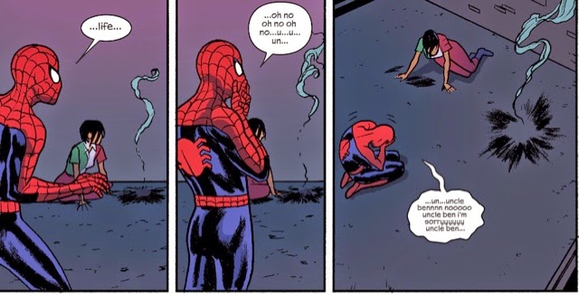
The Special Award for Humor Award: Chip Zdarsky (Howard the Duck, Kaptara, Jughead, Sex Criminals)
Chip Zdarsky’s a funny guy. There’s no doubt of that, and while he doesn’t possess a Harvey Award to prove it, he does marvelous things in the funny books both with his writing and his art.
But I want to highlight maybe his most remarkable achievement of the year, even beyond the laughs he’s delivered throughout. Chip Zdarsky – with his collaborators on the book, of course – made me care about Howard the Duck. That’s no small task. Howard the Duck went from being a joke foisted upon my world to a character that I took great joy in reading. Even beyond that, Zdarsky made me feel…emotions about his story and what happened to him. Sure, he made me laugh, but making me feel? That’s something unexpected.
So sure, he’s a funny guy, and he continues to prove that in all of his work. But his ability to help give us the feels when we’re reading the stories of Jon & Suzie or Howard or Jughead or even the dimbulb that is Dartor (okay, maybe not Dartor) is an underrated aspect of his repertoire. While you could hardly mistake him for the great clown Pagliacci, the hilarity Zdarsky brings to the table should never overwhelm our recognition of how great he is at bringing fantastic characters to life.
Also, massive bonus points to Zdarsky for being part of the squad responsible for the modernization of the Archieverse. There was a part of me that always felt all Jughead needed to be relatable to modern readers like me was time travel, and by golly, he sure proved it in the second issue of that series. Plus, burgers.
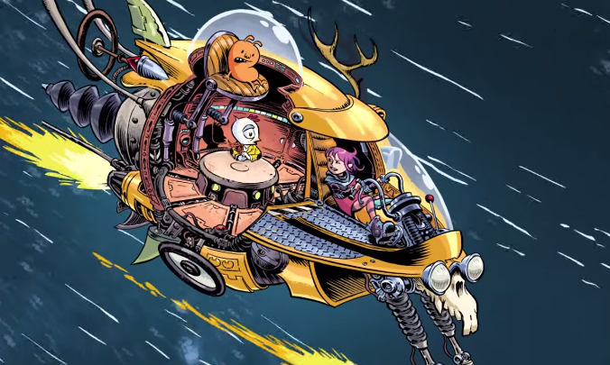
The Reversing the Field Award: Craig Thompson (Space Dumplins)
After winning Eisners, selling tons of copies, and earning the adoration of many with his graphic novels Blankets and Habibi (to name two), Craig Thompson decided to mix things up a little bit this year: he had a little fun.
Not only that, but fun for all ages!
Thompson’s work has always been thoughtful and beautiful, but it’s often steeped heavily in sadness. Unlike the serious, self-explorative stories he told in his other work, Space Dumplins is a fun space adventure that showcases the raw creativity and incredible cartooning we’ve known Thompson for already, but in a whole different light. Sure, there’s still a message in there, but it’s still fun and imaginative in all the best ways.
Space Dumplins gives him the chance to embrace that, and his cartooning is enlivened by the opportunity. Every page is a bonanza of imagination, with Thompson envisioning different ideas and creatures and characters in boisterous, joyous ways. Even the ostensible villains of the story get happy endings, and they’re done so with smiles on their faces. It’s a different, more hopeful side of Thompson we’ve never seen before, really, and it brings the best out of him in a way I don’t think another project more akin to his ones in the past would have. It was a boon for Thompson and for readers that he went this direction, and it has me even more excited to see what direction Thompson could take his work in the future.
The Evocateur Award: Declan Shalvey (Injection, tons of covers)
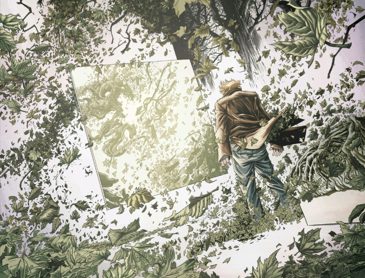
Declan Shalvey’s had a big 2015. Launching a creator-owned series is always a banner achievement in my book, but to reunite with his Moon Knight compadres Warren Ellis and Jordie Bellaire for a new sci-fi series at Image is a pretty big deal. Injection, the series I’m talking about, is a good one, and it is in particular because of the art team working on it. While I may talk about some of the others who work on it later, Shalvey’s impressed me with his ability to bring out the haunting nature of the book with ink washes and phenomenal black and white work. There’s a part of me that wonders what the book would be like if it was published as a black and white book entirely, especially when looking at the originals on his Cadence Comic Art page. But then I remember Bellaire colors the book and I tell that part of me to shut up.
Still, Shalvey has a rare ability at evoking mood and attitude in a story with very little dialogue mixed in. It’s why he’s a perfect fit for this era of Ellis, as the legendary writer seems more interested in ever in letting the art of the comics dictate the story. The whole book is built art out, and it’s been a joy to see how well the art sells the script and vice versa. Shalvey’s more than capable of making that work, and it has helped Injection become one of the strongest books in Image’s exceptional line.
Shalvey also gets bonus points for his prodigious nature as an artist, as he still manages to churn out exceptional covers for other books on the regular, despite drawing two covers himself for each issue of Injection and drawing that book on a Saga-like schedule. He’s one of my favorite cover artists around, and it’s a good thing for fans of great cover art that he has the time and willpower to make that happen despite what is assuredly a busy dance card.
The Character First Award: Ed Brubaker (The Fade Out, Velvet)
Every writer has their strength in comics. Brian K. Vaughan’s one of the finest writers of dialogue around. Robert Kirkman does gut-wrenching twists. Jonathan Hickman makes labyrinthine plots that pay off gloriously in a near tantric sort of way. For Ed Brubaker? He might be the best character writer in the business.
Now, every writer obviously handles characters in some way shape or form. Brubaker, however, has a rare ability to make characters feel less like they are written as much as they are revealed to us. Like we’re getting an unexpected, authentic view into a world that we’ve never seen before. And it’s not just in leads like Velvet Templeton and Charlie Parish, but throughout the cast. Brubaker imbues each person with an identity that feels organic and authentic in an unparalleled way.
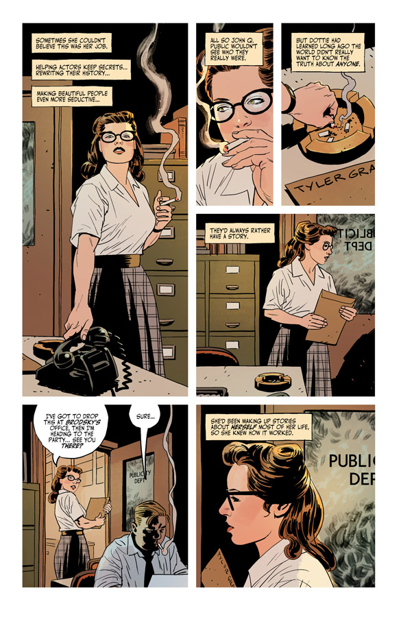
A perfect example is The Fade Out’s Dotty Quinn. The book’s through eleven issues now and Quinn isn’t a lead or co-lead or anything of that sort. She’s the PR girl for the studio Parish is writing for, and she’s ostensibly a girl Friday type but feels like a whole lot more than that. She’s a willful, capable person who doesn’t put up with nonsense and gets things done. She’s also hard to read, but not in a malformed sort of way. In the way any person can be hard to read, as we’re complicated creatures filled with unknown motivation and hard to predict desires. In a way, the way Brubaker writes her – and Phillips’ draws her – makes you wonder why Parish doesn’t say goodbye and try to run away with Quinn (or maybe that’s what I’d do), as she’s hard not to love often.
And Quinn’s a secondary character, really. Despite that, she makes you as a reader go through all kinds of lines of thought, curious as to who she really is and what she’s really all about. That’s because Brubaker’s so good with characters, you just can’t get enough of them. That’s the real reason he’s so able at shifting between wildly different subjects in his comics; each is built on characters who are unforgettable and irresistible, regardless of subject. It’s what makes him one of the greats.
The Superduperstar Award: Fiona Staples (Saga, Archie)
Like with BKV, it can feel like there is little else to say about Fiona Staples sometimes. She wins Eisner and Harvey Awards like it’s her job, and she doesn’t just win them, it’s hard to argue she doesn’t deserve them. She’s a great artist with a unique style that tells stories brilliantly in the most beloved comic of this time. That’s a pretty big deal, and it’s enough of an argument for her to make this list alone.
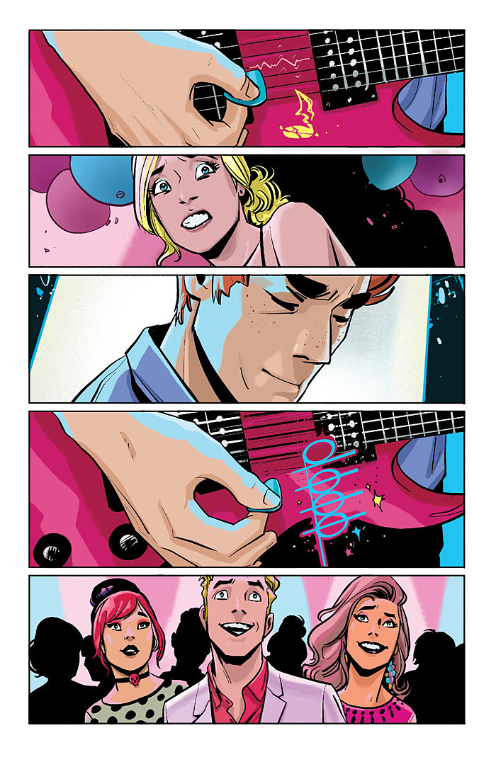
However, she also helped do something I never expected to happen: she made me care about Archie. Alongside Mark Waid, Staples delivered a new Archie for a new generation, and did it with the same brilliance she tells every story with. Her gifts as a character actor were on display throughout the first issue and beyond, and the little tics she’d give everyone would make me laugh and feel in subtle ways that few artists can accomplish. It was a virtuoso mini-run, and for those Archie first timers like myself, they were met with greatness as per usual. Even with her gone, I’m still picking it up, but her name convinced me to get it and her work made me love it. That’s a hell of an accomplishment, especially considering how important Archie is to the comic industry and how irrelevant it had become in recent years.
But that’s what Staples does: superduperstar things, and ones that make the books she works on better and more interesting for readers of all types.
The More than a Letterer Award: Fonografiks (Trees, Saga, Injection, They’re Not Like Us)
Letterer’s don’t get a lot of love. It’s at least in part due to the nature of their role. As one of their very best once told me, “it’s generally the letterer’s aim to go unnoticed,” and that makes sense. Most of the time a letterer is noticed, it’s because they screwed up or made a choice that took the reader out of the story.
The letterer who told me that was one Steven Finch, aka Fonografiks, a guy who isn’t just the letterer on some of Image’s greatest titles, but a designer responsible for some of the production values that make those books so dang beautiful. Take Trees, for example. While that is no doubt Warren Ellis and Jason Howard’s baby, Fonografiks positively impacts that book in very positive and subtle ways. The transitions at the open of each story in that book are the best in the business, as he and Howard pair to give the book a look and feel all its own.
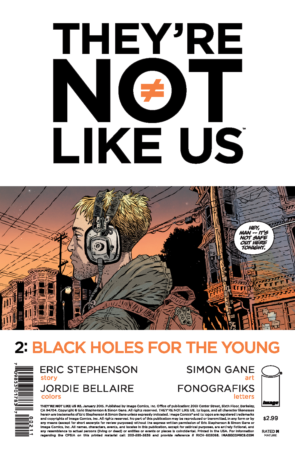
The story’s the same on They’re Not Like Us, in which the cover doubles as the home of the first panel, with this first bit of story being surrounded by the titling and credits in a way I’ve never seen before. It’s a bold move, and something that fits the book like a glove.
While I imagine he’d be nonplussed to find himself on any sort of list of this sort (if only because of that earlier quote), Fonografiks deserves recognition for the work he does. He enhances every book he works on in quiet ways that make a whole heck of a difference for readers, even if they don’t realize it. He makes every comic he touches better, and there are very few creators I can say that with 100% certainty on.
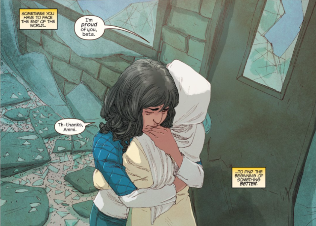
The Person Behind the Icon Award: G. Willow Wilson (Ms. Marvel)
In a weird way, the creative team behind Ms. Marvel has always been quietly secondary in the public’s eye when it comes to the success of its titular star. I don’t mean that in a diminishing way, it’s just Ms. Marvel has been such a sensation that she’s still character first in a way that very few are in this more creator-centric era.
That’s to no fault of G. Willow Wilson, the series writer, who has been instrumental in making Kamala Khan not just an icon, but someone worth rooting for. Wilson’s done a wondrous job of building Kamala up first, helping people care about the girl under the mask before she even started doing all that embiggening and avenging. Like Brubaker, Wilson’s exceptional at crafting characters who feel incredibly authentic, and that more than anything is why Ms. Marvel really feels like a Spider-Man for a new generation. She’s both believable and aspirational, in all the best ways.
For me, the greatest showcase of Wilson’s abilities as a writer this year was, bar none, Ms. Marvel #19. When it comes to single issue comics, that may have been my absolute favorite, and the crazy thing is it was an event comic tie-in that was really just about friends and family more than any pending apocalypse. It was about people, and it was beautiful, heartfelt and unbelievably relatable story. It’s a perfect encapsulation of what makes the character feel not just like another superhero, but a true marvel, and Wilson handles it perfectly. So, sure, Kamala may be a superstar, and that’s a good thing. But Wilson’s the gifted, thoughtful writer behind the burgeoning icon, and I hope the pair never separates. They bring out the best in each other.
The Hyphenate Award: INJ Culbard (Wild’s End)
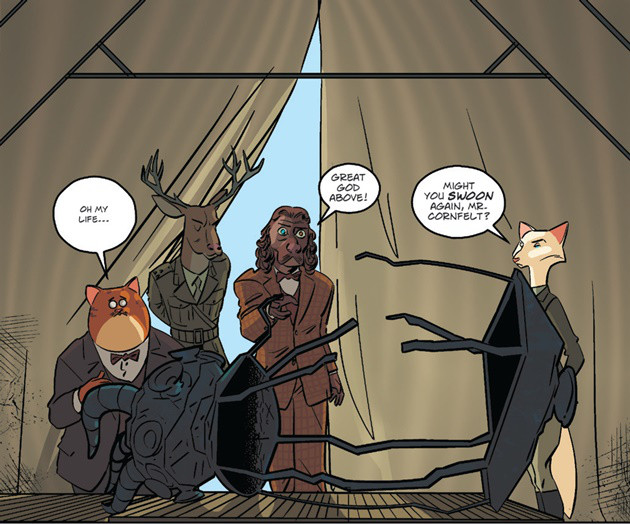
INJ Culbard’s doing a hell of a job on Wild’s End and not nearly enough people are paying attention to it. It’s not just the quality of his work really, but how much of it he’s doing. I mean, he’d deserve a spot on this list if you just told me he did the linework on Wild’s End and that was that, as he’s an incredible storyteller and one with a unique and lovely view on the world. But that’s just part of the story.
Culbard’s real role on the book is artist-colorist-letterer, as he’s handling all of those tasks himself. Basically, anything besides writing – which Dan Abnett does a wonderful job on – Culbard’s doing himself, and every aspect he’s exceedingly gifted at. It’s a lovely looking book, with Culbard’s colors give the book a wonderful feel that feel very much a staple of his work. His lettering is also first rate, and helps give the book a style and panache that isn’t just all its own, but completely unified.
But that’s one of the benefits of being one of the great hyphenates in comics. It allows him to have the control needed to make everything feel cohesive in a way the traditional assembly line team struggles to accomplish. Wild’s End is one of the best comics around, and its greatest weapon is its artist with many hats, even if many miss how many roles he really has.
Look for part two on Thursday, as we take a quick break for a podcast to drop on Wednesday.
