“Everyone Feels Free to Create”: Ivan Reis on the Art and Freedom of Hyde Street and Ghost Machine
What’s waiting for an iconic, era-defining creator when they move on from what they’re most well known for?
That’s a question Ivan Reis is finding an answer to right now, as the artist of superhero comics like Green Lantern, Blackest Night, Infinite Crisis, Brightest Day, Aquaman, Justice League, and more has moved on from the capes beat. He’s taken his talents to the Ghost Machine imprint at Image Comics as one of its owner/creators. That cooperative features names like Brad Meltzer, Gary Frank, Francis Manapul, Peter Tomasi, Bryan Hitch, and more, so it’s easy to understand why it would appeal.
But perhaps most importantly for Reis, Ghost Machine also stars his oft-collaborator in writer Geoff Johns. And they aren’t just hanging at the same imprint without doing anything together, either. They’re teaming up for the new horror series Hyde Street, and doing so alongside inker Danny Miki, colorist Brad Anderson, and letterer Rob Leigh. It’s a murderer’s row of talent, all working together to build something new and different, both for themselves and readers.
Hyde Street is about a mysterious, monstrous, and eerie street that exists in every city and town in the world, and the varying denizens of that land and the things they do to the people who end up there. It’s a character-driven horror story, one that brings a taste of Twilight Zone, Black Mirror, and Universal Monsters all together — amongst other things. It is undeniably a huge change of pace for Johns and Reis, but they’re both bringing all their signature strengths to the series, just in a new genre. And they’re clearly having a great time doing it as well.
I’ve already talked with Johns a bit about the series on Off Panel, but I recently had the chance to do the same with Reis. It’s an art feature interview, one where I talk with the artist about his comics background, his journey in comics, working with Johns, the appeal of Hyde Street and Ghost Machine, and more, before we discuss several pages of his work from the second issue of the series — which arrives in comic shops today — and the decisions he makes on each of them. It’s a great conversation with a heck of a talent that’s trying something new on for size, and you can read it in full below.
For you as an artist and as a person, what was and is the appeal of comics? Is there something about the way the visuals work that speaks to you as a storyteller?
Ivan Reis: That’s a tough question! Honestly, I’ve always loved comics; they’ve been a big part of my life growing up. Comics have helped spark my creativity more than any other art form. Being able to connect with the art not only gives me pure joy while I check out all the details in lines and colors of a story but also inspires me to create whole worlds and sequences in my mind just by giving me bits of art and storytelling that aid my creative flow is one of the biggest draws of this medium.
You come from Brazil, a country with a lot of gifted comic artists and cartoonists. What (or who) were your biggest guides as you figured out your artistic voice over the years?
Reis: In my childhood and teenage years, horror and kids’ comics were super common, made by Brazilian artists. Mozart Couto was one of my favorites. I started my career young (14 years old) and many artists from the children’s comics studio (MSP Studio) I worked at really helped me grow professionally with tons of tips and advice. But throughout my journey as an artist since I started reading comics, I found my biggest inspirations in John Buscema, Tony d’Zuniga, Alfredo Alcala, Rudy Nebres, George Pérez, and John Byrne.
From what I understand, your first project in the American direct market of comics was Ghost at Dark Horse Comics. What was your breaking in story? How did that project come together?
Reis: Ghost was my first book in the American market. It was in issue 17. Before that, I did some pin-ups for various publishers. I spent about a year trying to develop my drawing into a more realistic style. At that time, I had been working in children’s comics for about three years, and I had lost a bit of my anatomy drawing skills. But in the end, I got picked for the magazine because I had a style that was less ‘IMAGE’ at the time. It was when Jim Lee, Todd McFarlane, and Marc Silvestri were the biggest influences in the industry. Dark Horse was looking for a less superhero-centric language for the magazine. I was coming from the influences of those artists I mentioned earlier and started to draw inspiration from new ones like Serpieri and Adam Hughes. That was one of the things that helped me land the book. I still had a pretty uncertain style and average quality, but it was enough.
You’ve worked with Geoff Johns a lot in your career. And I mean a lot, and on projects both big and small. What is it about that partnership that just works for you?
Reis: Yep! We teamed up on a ton of titles, from Avengers to Justice League. We spent many years building worlds and mythology together. Most of my important work has been in partnership with Geoff: The Vision, Sinestro Corps War, Blackest Night, Aquaman, and so on. We always worked with this fan energy. We really created comics for fans, by fans. We had a blast, like kids, when we came up with the stories and their visuals. It was more than just simple professional projects; these were projects where we genuinely enjoyed the process. And we still have fun!
Taking on a project like Hyde Street isn’t the only change of pace for you. Moving to Ghost Machine itself is a massive difference. What was it about what they’re building there that made you want to join up as a co-owner and creator?
Reis: Before I was invited to Ghost Machine, I had already decided to create something with Geoff once my contract with DC was up. In fact, we’d been chatting about that possibility for a couple of years before. That was my goal. Then, this opportunity came up, and I got invited to be part of this project alongside big names in the industry who, on top of everything, are a huge inspiration to me. I saw it as a moment for personal and professional growth because not only would I be exploring different artistic paths with new challenges and inspirations, but I’d also be involved in the development process of the company. I’d get to understand better how the industry works from the other side of the process.
Hyde Street is a considerably different kind of project for you with its Twilight Zone horror like vibes. What made that the right fit for you? Was it just because it was you and Geoff teaming up and the subject almost didn’t matter, or does this kind of story and its atmosphere appeal to you as a storyteller?
Reis: Definitely, I love horror stories. My first professional project at 14 was in horror. Ghost was a horror/detective story, Lady Death was horror/fantasy, and Marvel’s Supernatural revisited horror characters from their lineup. If you look at my journey with Geoff, there’s always been a touch of horror in our stories. The Vision had a supernatural and eerie vibe, Blackest Night was horror with superheroes, and Aquaman also had its scary element with the Trenches. Plus, a big part of my artistic influence came from black-and-white stories that were often used in horror/fantasy, like in Conan or Crypt. Hyde Street feels like the culmination of years of my learning as an artist, and it’s such a gift to revisit my old references and influences. Hyde Street was a natural and spot-on decision.

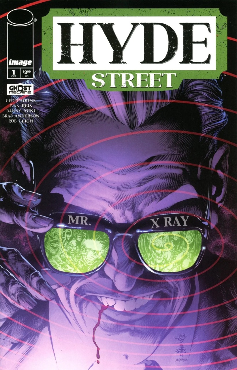
Everyone has a slightly different take on what makes a great comic book cover, but for you, what’s the key? In your mind, what makes a good cover?
Reis: I’m not just a cover illustrator; I’m a storyteller. So whenever I think about a cover, I try to bring the story element into the illustration. I want the cover to tell a story as well, sparking the reader’s imagination about what will happen next.
You’ve done hundreds of comic covers of the years, most of which were at DC Comics. Obviously horror comics and superhero comics are slightly different beasts. Is your approach for a cover like this any different than what you’d bring to a superhero project? Or is it much the same?
Reis: In general, the concept is the same: creating a one-page story with an illustration. What changes is how you handle the different artistic languages. Superheroes allow for more visual elements and big moments, while Hyde Street is more intimate and silent. Hyde Street isn’t about a grand image; it’s about creating a certain discomfort while also sparking curiosity about the story.
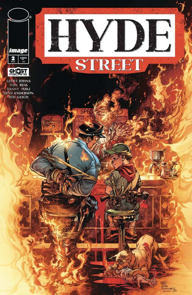
What were your goals for this cover in specific? Was it really about finding a good showcase for Pranky and his nature as a character?
Reis: This cover really connects with the story in different ways. It’s not random. The way the image was created serves not only as a tribute but also shows just how creepy Pranky can be.

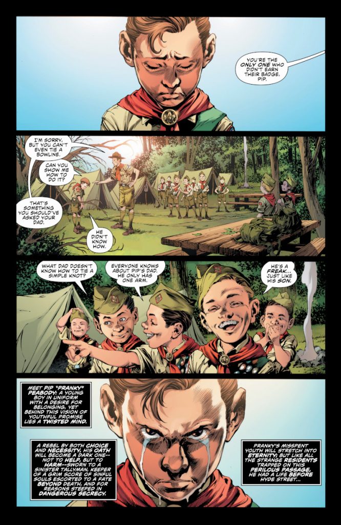
This page, particularly the first and fourth panels, do a great job of showcasing your gifts with character acting, as we see Pranky’s sadness and determined revenge brought to life. What’s your approach to character acting like this?
Reis: I always strive for a more theatrical tone. I try to elevate the moment or emotion just a bit above the normal, almost to the point of exaggeration. The challenge is finding the balance between emotion and overkill. I don’t want the reader to lose the feeling that the story is trying to convey.
At least in the open of this issue, there are a lot of wide, purely horizontal panels streaming down the page, save for the big splash that follows this. When you and Geoff teamed up for Hyde Street, did the two of you talk about goals you might have for the visuals?
Reis: We always talk whenever we can about all the possibilities. I always try to create unique things and exclusive elements for each comic I work on. Sometimes I blend everything together, other times I focus on one element, but I’m constantly searching for the best way to tell the story in a way that flows. I’m not worried about which panel is more important or which scene needs more emphasis or space. Instead, I focus on how the panels work to maintain a readable rhythm. Whenever a sequence calls for identical panels of the same size, I try to push the elements within those panels if it’s important to preserve the emotion and how the reader will perceive that sequence. I adjust them when a sequence ends and another begins. If there’s a scene in between that needs a larger panel and that would disrupt the flow, I incorporate it into the sequence with the others. No panel is more important than the other. Sometimes the tiniest panel is just what I need to give a scene the emphasis it deserves.
You get a script from Geoff for Hyde Street, like this very issue. What’s your process from there? Is it pretty similar to the one you use on other titles, or are you trying new things for this new project at all?
Reis: I maintain the same process. I read the script a few times to get a sense of the whole, and then I work on each page in order without planning the others in advance. I try to feel the rhythm of the story and develop the pages sequentially. That’s why I avoid viewing a page as having a key panel or a highlight. I need to perceive that happening as I absorb the story and use impactful moments only when I feel they’re warranted. If I have that perception, I believe the reader will too. Geoff is really great at guiding us through the story and making that possible. We truly immerse ourselves in his narrative.
subscribers only.
Learn more about what you get with a subscription

