
“I’ve Never Had More Fun on a Project”: Kyle Strahm on the Art and Adventure of Twig
I haven’t gotten to the point where I’ve started to consider my favorite comics of 2022 yet, if only because it’s August, and there are a heck of a lot more comics still to come. Even without that, though, you sort of just know ones that stand out. One of those is Twig, the Image Comics series from writer Skottie Young, artist Kyle Strahm, colorist Jean-Francois Beaulieu, and letterer Nate Piekos, a classic, throwback adventure story in the vein of Jeff Smith’s Bone that finds its titular hero and his pal Splat trying to save the world by finishing a quest together.
It’s an absolute delight for many reasons, but if I was forced to pick one, it’d be the art of the series. Strahm and Beaulieu are as perfect a partnership as you can find right now in comics, with the colorist amplifying the artist’s qualities to the absolute max. I’ve been meaning to explore the art side of this book for a while, and with the mini-series nearing its finale in just a few short weeks, it was time.
Today, I talk with Strahm about his art, how it developed, the origins of Twig, and more, before we dive deep into his processes and decision-making both on the page and the title’s covers, as we use several pages from the first issue as a jump off to that chat. We discuss the keys to covers, character design and acting, Beaulieu’s colors, the title’s brilliant travel pages, collaborating with Young, and a whole lot more in a lengthy discussion about his work on the series. All the pages discussed contain no spoilers, so if you haven’t read Twig yet, you’re safe! But if you haven’t read it yet, let this be a reminder to you: read Twig!
This interview is open to non-subscribers. If you enjoy our conversation, consider subscribing to SKTCHD for access to features like this and more.
Let’s start at the beginning for you. What came first, art or comics, and what led to you wanting to pair the two into your career?
Kyle Strahm: They were both always around when I was little. My grandpa had an old tin trashcan stuffed full of MAD Magazines and before I could read, I would go through those, just looking at the pictures. I liked Spy vs Spy, the strips by Sergio Aragones, and the MAD fold-in. Anything that didn’t have words. And if the strips did have words, I would fill in the blanks on my own. I think a lot kids draw and I wasn’t any different. I just kept with it. I remember drawing scenes from Ghostbusters and later, a Batman ’89 story, but not in a comic book format yet.
In the 90s, all my grade school friends and I were into comics. It was a great time for kids my age. Image Comics was just starting. Spawn and The Maxx were my jam. We all wanted to make comics and that’s when I started. In 4th grade, I wrote and drew my first full comic, Ninja Killer Blind Alien.
After some lazy days in high school and going down some roads in college I didn’t end up liking, I dove back into making comics and never really stopped. I started getting paid, though not a lot, around 2005. Around the same time I write and drew a 50-page web comic called Clockwork Creature.
You teach illustration yourself, but how did you develop your own art? Did you go to art school or were you all self-taught? And, regardless of your origins, what (or who) best helped you refine your approach and voice as an artist?
KS: I had an interest in art for my entire education, but not always focused on comics. I bounced around to several different colleges. I went to the Kansas City Art Institute for a year and did okay. After that, I leveled up by taking 4 semesters of figure drawing from a professor at UMKC named Steve Gosnell. He was an important teacher for me. Any artist I’ve seen improve quickly at drawing, it’s because they spent a lot of time figure drawing and life drawing.
Learning to make comics is a challenge because most newcomers who want to do it have a story in their head, but there are many invisible skill sets they need to learn to translate that story to a comic format. The best advice I can give is just to get started.
How I learned and refined those skills was to make a comic and take it to conventions. There are pros tabling at nearly every convention. A lot of them work in isolation and are happy to share the knowledge they’ve spent years, and sometimes decades, accumulating. I showed my comic to creators and asked for feedback. But this is the important part: I applied the feedback to my next comic, then I took that around and showed the pros at cons. I repeated this over and over, unaware I was building a reputation as a kid who always has new work. Eventually, the pros I’d been visiting started asking me to do pinups and to collaborate.
If anyone is interested in how to start making comics when you’ve never done it or if you’re well on your way, I write about the subject on my blog and newsletter at my website.
There are so many comic book creators and editors who have helped me out along the way. Every job I’ve ever had, if I trace it back far enough, came from going to comic conventions.
Twig is your current Image Comics series, and it’s an absolute delight. I love it. How did you and Skottie first pair up for this project, and how did it first develop from an idea into what you and the rest of the team are bringing to life in the series?
KS: Skottie and I have known each other for years and decided we wanted to do something together. I’d mostly done horror comics up to that point, but showed him sketches and designs of the sort of stuff I wanted to be drawing. It was mostly weird creatures and things like that. We both grew up liking the same media that was made for kids but had a bizarre dark underbelly. The films of Don Bluth, non-Muppet Jim Henson, and gloomy fantasy films of the ’80s.
We landed on some touchstones and I went away and did some designs. That started a back-and-forth with the two of us fleshing out the story and the world together. Skottie is great to collaborate with because I can have a notion of a story idea or a design I love that doesn’t have a place and he’ll flesh it out in the perfect way. And in a way I never would have come up with.
Both Nate Piekos and Jean-Francois Beaulieu frequently collaborate with Skottie so I was very happy when we brought them onboard. Nate is a master of his craft and nails the design and lettering every time. When we were figuring out the color, we gave Jean a few pages and asked him to try whatever he wanted. He blew the doors off. Nate and Jean are the real deal.
I know you for Spread primarily, and I think the first thing I think of when I think of that comic is blood, mostly because the covers, which typically had a lot of blood on them! In my mind, it was about as far from Twig as one could ask for. So that leads to the why behind this. What made this all-ages adventure story something that appealed to you as a storyteller?
KS: Even when I was working on Spread, I thought of it more like Evil Dead 2 than like Saw or something. My favorite scary stuff is Large Marge and Gremlins 2. Which, to adults, isn’t really that scary at all. For me, it was a very easy jump. I’m interested in schlock horror, but while working on Twig, I learned all I have to do is pivot over to this other stuff I’m also interested in. Until now, I had just never made comics focused on that part of my interests.
There’s an underlying throughline between Spread and Twig. In the story, the spread is a wild environment and isn’t that different from one Twig might travel through. It’s way more wet, of course. And some of the monsters in Spread resemble creatures that might appear in Twig. They would just need to be toned down a little.

Let’s start with the cover to #1. I love this piece, and it has a lot of Drew Struzan by way of 80s family, fantasy adventure movie energy to it. What were you going for with this piece? Was it all about establishing the cast and just how weird this world might be able to get?
KS: Skottie and I had a lot of conversations about the tone of Twig. The goal with this cover was to make that feeling come across immediately. An issue one cover is seen more than any other image from the book. We really wanted to nail it. Twig himself is cute critter and we wanted to showcase some of the more bizarre characters from his world. We didn’t want people to write Twig off as something that’s only for kids.
Struzan was definitely an inspiration. Nostalgia is a powerful tool. I collected a lot of poster images from the old 80s fantasy films Skottie and I loved growing up. And I looked at a lot of pieces by Struzan. It’s harder than it seems to try to emulate what he does! The man makes it look easy.
At first I thought it was about cramming characters into the composition, but I learned it’s more about leaving large areas of negative space. In the end, I put more drafts and sketches into this cover than any other cover for Twig.
And of course, Jean-Francois Beaulieu’s beautiful color brings the piece to life. And the logo by Nate Peikos is the chef’s kiss.
When it comes to covers in general, what’s your approach, and what do you think the keys to an effective cover are?
KS: What makes a cover work is relative to the needs of the issue or collection. A first issue cover will need to check different boxes than the final cover in a mini-series.
And, of course, different strategies work for different artists. A good cover needs to stand out across the room. It should give hints about the story, but doesn’t need to be literal. The sad truth is that because of the way comic book publishing works, over time, all the covers except for #1 are destined to be back matter in a collected edition. Most people who see these covers will see them in the back of the collection.
I don’t think that lessens the importance of cover art, but once I made that realization, it made me less precious about my covers. That allowed me to relax a bit and, ironically, made my covers better…and on time.
For me, in general, I like a cover with a narrative. It can be complex or loose, but should make the viewer ask “What just happened here?” Or “What is about to happen?” That’s something I learned from looking at Frank Frazetta’s work and have noticed a lot since then all over the place. I ignored that rule on the cover above.

I wanted to talk about the two leads of the series, Twig and Splat. They’re gems, both. I love Twig’s hat in particular. The beauty of this story is literally anything is possible. It’s your own world with Skottie and the rest of the team. Twig could have been 47 feet tall and covered in spikes. Splat could have been some sort of turtle creature. Whatever you wanted, that would have been the answer. But this was the answer. What was the process for developing the looks of these characters, and what made this the right look?
KS: Twig was originally a bald, blue cave dweller and more ugly than cute. Skottie suggested we give him fur. I drew more sketches of Twig than anything else in the book and after a lot of iterations, we landed on one we liked. We put that drawing on the cover of the Twig Preview. From there, he evolved even further because that initial design had wild eyes and wasn’t really able to emote much. Twig’s leaf hat came from early concept art. I had designed a society of fuzzy creatures. The warriors had bird talons on their hats and the most celebrated scientists had elaborate branches covered in leaves. Twig, who assisted one of those scientists, had one little leaf.
I drew some little slug things on some of the concept designs and we decided to put one with Twig. The slug was originally going to be silent, but Skottie suggested it would be better if Twig had someone to converse with instead of traveling in silence.
Twig has a backpack and pouches as a placeling, and unusually for a character with a pack or pouches in a comic, we actually see him use them. There are also little moments throughout the mini, like when you all have Twig cook at a fire, slicing up food for dinner, that often aren’t shown in comics or even these types of stories. Why do you value these little moments as a storyteller? Is that part of the joy of an adventure story, getting to see those details of the experience?
KS: Twig originally had some items on his belt, but Skottie learned from drawing hundreds (thousands?) of pages of Oz that it’s better to have a pouch because then anything can be inside. Throughout the book, I thought a lot about what Twig brought with him and where he kept it. It caused me some distress later when Twig loses his backpack. Luckily no one but me knew the rules I’d created.
Yes, I love the cooking scenes. Wanting to be a chef while being forced down another path is central to Twig’s character. It was important to show him doing what he loves. He’s not great at the job he’s been tasked with, but he’s a fantastic cook.
I love panel four, as Twig and Splat go through the door to places unknown. Skimming through issue #1, I realized there are several shots of Twig from behind. Is something like that you allowing the readers to place themselves in his shoes, a point-of-view shot for all of us? Or is it just a striking image?
KS: I didn’t intend that, but I think it’s accurate. Showing Twig from the front makes the panel about Twig. Showing him from behind says “this is where we’re headed.” I love a small figure with its back to us, standing in front of something massive. It’s part of the language of fantasy storytelling. The turtle in The NeverEnding Story is where that comes from for me.

This mountain is how Twig and Splat get where they need to go, as they walk on his tongue into the mountain itself. It’s super weird and funny and grounded feeling in its own way, just like everything in the book, basically. What was your process with Skottie in coming up with elements like this? Is a lot of it conversations and sketching and brainstorming, is some of it just Skottie unleashing you, or does much of it come from the script?
KS: In this case specifically I had drawn a council of trees at one point. One of the trees was giant and had this face. We didn’t end up going down that route, but we liked the face and wanted to use it for something. Elsewhere, I had drawn concept art of living hills and mountains. This actually is a great example of how we work together. Skottie had all that concept art in front of him when he wrote the script, and he came up with the tongue and going inside.
Like in comics, Skottie is a great storyteller face-to-face. We usually go over stuff like this before I read it in the final script. I’m rarely caught off guard. He also doesn’t mind if I riff and add elements that aren’t in the script. The further along we went, the less detailed the scripts became. By then we were in step and had talked about everything so much.
There are a lot of great designs throughout the series. Was there one that stood out as particularly fun or challenging for you?
KS: In issue #2 the design for the Nektarmancer was great fun, but it’s very time consuming to draw. I joke with Skottie that I don’t want to draw that character anymore. I did it to myself!
The most challenging character to design shows up in Twig’s dream in issue 4 and then later. I can’t say much here now, but when I finally found the solution I was very happy.
My favorite might be the Boxed Loxs in issue #4.
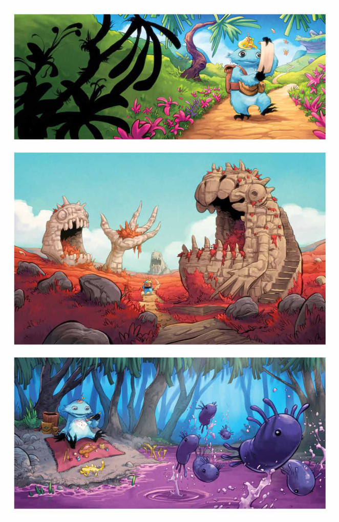
I’m not going to say with 100% certainty that these are my favorite pages from the series, but I love these little travel montages in each issue, showing the process of Twig’s journey. Each place he visits feels like it could be a story on its own, a whole new world that we’ve never seen. Is that world-building part of the appeal to the project for you? And do you find that aspect, the extreme world-building and environmental needs, to be particularly challenging, or is that a joy for you?
KS: I think it’s my favorite part. I can just draw whatever I want!
I learned that the best travel panels are those where Twig and Splat are doing something besides only walking. Either taking a lunch break, sleeping, or if they’re walking there’s some sort of little narrative. In one, he’s made an umbrella from a flower. In one, they’re looking over the edge of an abyss.
I’ve never had more fun on a project than Twig, and the constantly changing environments is a big part of that.
I have to ask about Jean-Francois Beaulieu. Every once in a while, you’ll come across an artist and a colorist who just naturally sync with one another. You two do. There’s something about his colors that just feel perfect on your art. In your mind, why is that? What makes Jean-Francois such a perfect fit for you art and this story?
KS: Jean is one of the best colorists in comics. Once I saw what he was doing on issue 1, it opened up a lot of storytelling possibilities for me. I’ll now design scenes with his amazing colors in mind and the sorts of lighting effects and mood I know he’s capable of. It’s made me a better storyteller because I’m not limited by what I can draw in black and white. I try to create situations for him to stretch his wings. He also understands storytelling and nails everything with minimal direction.

I wanted to close with this page, because it made me realize something. Every page in Twig #1 is very clean and clear from a layout standpoint. A lot of wide panels and massive gutters. Was that a decision oriented around the all-ages nature of this comic, or was it just what this story needed?
KS: I like wide panels because I want everything to feel cinematic. It’s funny about the borders though. When I draw Twig, I do it with panel borders, just like I have on all my other comics. We decided to go borderless, though, so Jean deletes them when he’s coloring. The result is bigger gutters! I think we lucked out that it helped define the visual feeling of the book.
I like my panels on a grid because it removes a lot of problem solving puzzles. We decided against panel borders because we wanted this book to feel like it wasn’t a regular comic, but a big, open world.
Lastly, I wanted to talk about character acting. One of the leads, Twig, has gigantic eyes and a fairly human-ish body in the sense that he has a head, two arms, and two legs. The other is a faceless, seemingly endlessly malleable creature that’s like a snail that is also a Pokemon. And yet, they’re both incredibly, exquisitely expressive. It’s great work. In your mind, what’s the key to bringing a character to life, and in particular, these two? Was Splat a challenge at all, or did his amorphous nature make it easier to a degree?
KS: Twig’s eyes, hands, mouth, and body language are the key to his expression. He’s harder precisely because he’s fairly human-ish. There’s a “right answer” to the way he emotes and sometimes it takes me some time to find it. I wish I were the kind of artist who could immediately access the correct expression for Twig and put it down in one try. But, especially in very emotive scenes, I’ll try a few different expressions in the sketch phase, moving things around until I feel like the expression is coming across the way I want it to.
As for Splat, he started off with a pretty consistent form, but there was a panel in issue 2 that unlocked his malleability for me. When the machine in that issue is going haywire, Splat is all stretched out and holding on while Twig runs away, gripping him. At first it felt weird stretching him out like that, but after that moment, I always explored his abilities while drawing him. It takes far less time to draw Splat than Twig.
The two characters have a chemistry that folks have really responded to and I’m grateful to the readers for continuing to support the book!
Thanks for reading this interview with Kyle Strahm. If you enjoyed our conversation, consider subscribing to SKTCHD for more features that dig deep into the world of comics