
Superhero Chic: Talking Fashion and Illustration with Kevin Wada
The frequent Marvel cover artist and illustrator talks his work
A lot of the art features here on SKTCHD are focused on interior art from comics. That makes sense, of course. That’s the vast majority of comic art, and where a lot of the juicier, storytelling related questions lie. But the world of comics has grown immensely, and quite often, you can find exemplary comic (or comic inspired) art anywhere these days.
Illustrator Kevin Wada’s story is a great example of that. He’d been mixing prominent comic characters – most notably the women of the X-Men – with high fashion for a while online, appearing on sites like Project Rooftop and developing his own fanbase thanks to the power of social media. It brought him to the attention of the powers that be at Marvel, which led to him becoming one of today’s best character designers and cover artists in the medium. It’s not just business savvy and a unique angle that drove his rise in comics, though. He’s a brilliant illustrator, and one that clearly has deep love and passion for the characters and art form. But his specific take has earned him a lot of fans because it is so exquisite and fresh for medium.
Today, you can read a recent interview I put together with Wada about his art, background, how fashion came into the mix, his character design and cover work, his approach on commissions, and much more. Give it a read below, and if you’d like to see more of his work, check out his website or follow him on Twitter, Tumblr or Instagram.
You studied traditional illustration in college, but art has always been a lifelong passion for you. Do you ever find that there’s a real push/pull between the more formal training you received and the more raw, instinctual side of your art? Or is that something you’re not really actively cognizant of as you work these days?
KW: I think I always knew art was going to be what I pursued as an adult. Even as a child, I had parents who fostered my skills and really embraced it. I’m very lucky in that regard, as my identity was always supported and reinforced, and when it came time to seek formal training, I had a solid foundation. These days, I think all of my formal training has become quite subconscious. I don’t even really think about it – in a way it has become the instinctual side of me. After I graduated, I really threw myself into creating work I wanted to create (3 years of drawing what someone else wants you to draw will do that to you). And as such, the raw side of my personality really came to the forefront of my artwork. These days, the formal and the raw are very much intwined and I think I implement both when I’m tackling a piece.
You’re well known for your character redesigns and for the way you don’t just follow typical costuming practices on characters, instead integrating thoughtful choices to character fashion. When it comes to fashion, where did that interest first come from? And as a person interested in fashion, comics and art, was creating your own redesigns and, eventually, ones for Marvel just the natural extension of your own interests? Or was it more of a deliberate choice?
KW: Fashion has always been this sort of background player in my choices for my work. I didn’t study fashion, and I’m certainly not a slave to it in my life. It was sort of a natural extension of my desire to create aesthetically pleasing characters/figures. Once I started fully accepting what I wanted to draw after graduating, fashion slowly started to become this conscious element to my work. I started doing more research, studying designers, educating myself on some of the history. When it came to superheroes, I saw implementing fashion as a fun way to cultivate a perspective that was fresh and exciting.
Not that it’s rags to riches by any means, but I think it’s exciting and says a lot about the value of getting out there and creating art you’re passionate about that you went from creating your own fashion art of the X-Men to creating covers and new designs for Marvel in a pretty short span. I’m sure you’ve told this story a million times at this point, but how did you first connect with Marvel? And beyond that, how important do you think online and social media has been to you getting your work discovered?
KW: Well, first off, I think utilizing social media to get your work out there is hugely important, as that is the way I got on Marvel’s radar. I’ve never confirmed that this is the right story, but Brian Wood bought a print from my store, and I assume passed my name along to an editor at Marvel. The editor, Jeanine Schaefer, contacted me shortly thereafter and my first cover gig ended up snowballing into the ongoing She-Hulk covers. My success is largely luck, and also making sure I had an extensive online presence. Having a few pieces really take off and go viral is a great way to spread your work like crazy.
You’ve been working in comics for a little while now, but your most extensive work so far has been on covers for Charles Soule and Javier Pulido’s She Hulk. I was a huge fan of that book, and your covers were a perfect fit for them. For you, what’s your approach to cover work, and beyond that, what do you think the key is to a great comic cover?
KW: I approached every cover utilizing all of my background training in editorial illustration. It really isn’t different. You’re there to tell a narrative, however simple, in one image. You can go complex and conceptual, or you can be straightforward and simple. I think my favorite comic covers are the ones that keep to simple, iconic, clear, and striking designs. If you’re trying to stand out amongst a sea of comics on a shelf (or in a sea of thumbnails on a website) often times the less noise your image makes, the more it will stand out. Now often, that’s just not what the concept of a piece calls for. And that’s ok too. But for me, lots of flats and graphic shapes really grab my attention.
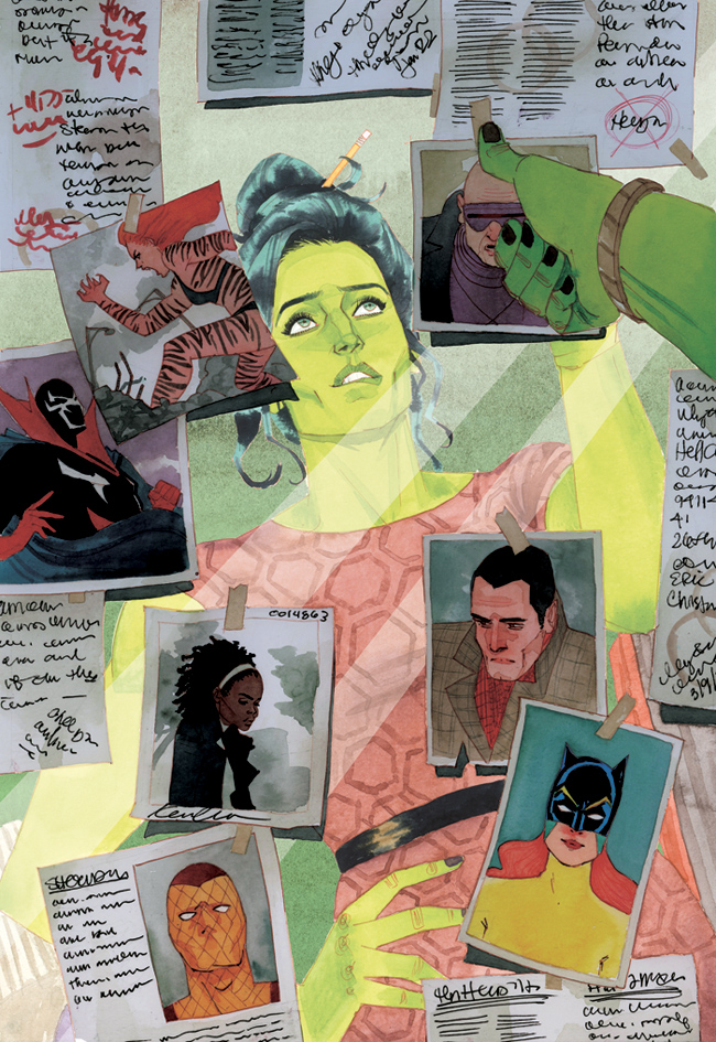
As I said before, I was a big fan of your She Hulk covers and this one for #5 is one I enjoyed in particular. There’s a number of reasons why – it definitely stands out amongst other covers, it tells a story well, and it’s just a unique perspective – but the one above all is the thoughtful look you deliver on Jen’s face. Her biting her lip as she’s deep in thought. When it comes to character acting elements like that, it seems like there’s a fine line between overly gestural and just right. You nail it. When you’re thinking an aspect like that, is it as simple as you just thinking, “what face do I make when I’m thinking hard?” Or do you go deeper into those types of things?
KW: I think in regards to this piece, specifically, there was a quick back and forth with the editor on what her facial expression should be. Is she confident? Is she troubled? Is she focused? I actually took reference for this image, which is something I rarely do. Partly, because I’m a lazy man, and partly because there isn’t enough time to do it (or I haven’t budgeted enough time :P). Getting to actually act out the pose was incredibly helpful in the complex angle, and the feeling of the moment. A lip bite isn’t a terribly complex gesture, but in the same way animators keep a mirror by the desk, acting something out definitely helps you dive deeper into a character’s condition.
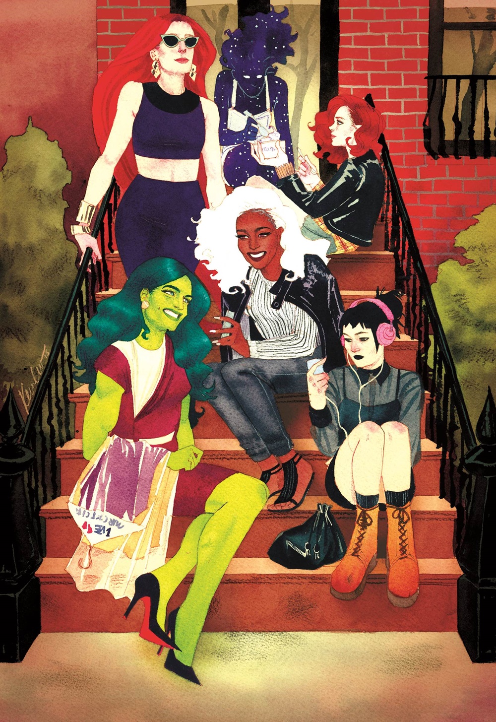
This variant cover you did for A-Force #3 is wonderful, both in the character work (Nico reminds me so much of a friend of mine there) and in how well you convey each of the character’s identities in what they’re wearing and how they’re positioned. When it comes to figuring out the looks of people we’re used to seeing in superhero outfits, what’s your process? Do you find that a bigger part of your work comes in the concepting phase than when you’re actually drawing?
KW: Very often, figuring out what a character would be wearing when in civilian garb comes down to “how would I make their superhero uniform into an everyday outfit?” I choose colors and shapes and patterns based off of an iconic costume and go to town. I try to keep in mind age, civilian occupation if they have one, and personality and bearing. She-Hulk is obviously just off work, fresh from the dry cleaners and still in her sensible workplace sheath dress. Nico is much younger, much fresher, and has established a very clear and unique style for herself. These days, I think most of a piece is created in the concept. There used to be a bit of “winging it” that happened before, but now I’m finding I’m much happier with a piece when I’ve worked out a lot of it in the design phase. Composition, color, value, idea – all developed more concretely at the start so that there’s less chance to mess up in the execution.
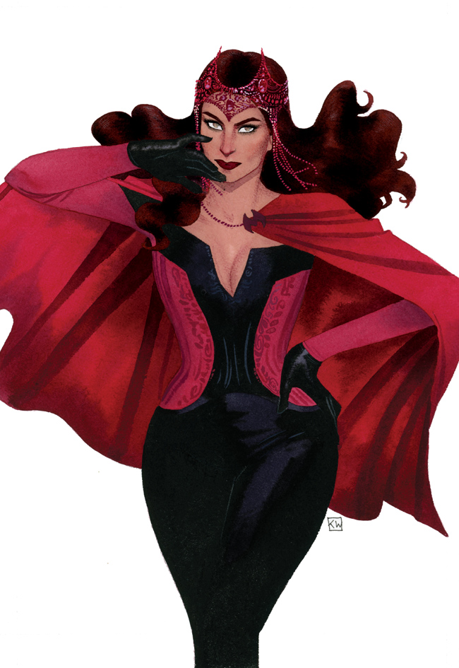
You’ve already talked a lot about your new design for Scarlet Witch quite a bit, but I just wanted to note how perfect the new headdress is, which is significant considering how well known her iconic but frankly kind of weird original one was. The thing I like the most about the headdress though is it reminds me of gypsy like headdresses, so it feels more reflective of her Romani origins. Was paying homage to her personal story a consideration as you designed? Or were you more looking to find something that looked good and fit her overall aesthetic?
KW: The prompt was to make her darkly romantic. Goth high fashion. And so I think there was a marriage of ideas at play. How do we make her contemporary but also referential. I definitely wanted to stay away from anything stereotypically incorrect with her Romani roots. Subconsciously, I was thinking about her origins and story, but superficially I was trying to convey the keywords above: witchy, dark, romantic, etc. I originally envisioned the headdress to be much different than where we ended up, and to be honest, I’m not 100% happy with my design of it. I’ve seen some artists do their renditions that really make it sing and come alive – looking at you, Adam Hughes – but I wish we could have refined it a bit more.
You recently had an experience that I’ve always thought would be so cool: one of your favorite artists – Adam Hughes – did a cover with your Scarlet Witch design. Is there a part of you that just loses it at the idea that some of your art heroes (including Adam, but even beyond) could and likely will be working off your design for the foreseeable future?
KW: It boggles the mind. Even though I’m not the most well versed comic contributor, I’ve been a fan of Adam’s for years and years. To have someone I’ve admired for so long do their take on one of my designs just feels like a weird dream. A great dream, but totally unreal. So many amazing comic artists have done artwork for the new SW title and to see them do their own takes on her new look is just amazing. I feel so grateful to have left a little mark on the character, officially. And honestly, the way everyone else draws the design is way better than I do so there’s that too.
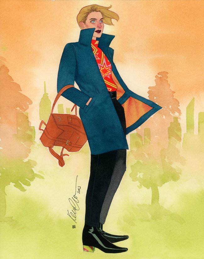
I had to bring up your commissions, as every time I see one posted I always run through a range of emotions, starting with, “WOW!” then moving on to “why isn’t that mine?” then I wonder if I could buy it from the person who got it, before I finally wonder, “how did he do that?” This Carol Danvers piece from NYCC 2015 is fantastic, but I just have to ask: even compared to some of your peers, commissions are something you clearly go all out on. Why is that? Do you find that coming into comics as you did gives you a greater appreciation for the value of a commission like this one?
KW: Very much so, yes. When I was doing editorial illustration, it was a much more lonely endeavor. You turn in your work, it gets printed to very little fanfare or attention, and you move on to the next assignment. When I entered the comic book scene, it hit me very quickly that this was a community that appreciated art and artists, and that energy and enthusiasm makes me want to put in 100% on these commissions. The idea that I would have people wanting to shell out their hard earned money to get a piece of my work is so amazing and humbling and I just want to do my very best and create personal pieces that requesters will prize and feel was worth the price tag.
I wanted to ask about mediums you’re working with as well. You use a lot of watercolor on pieces like this, and you use it to both build the world behind Carol and give her look some texture beyond the color. When you’re working on commissions, what tools do you typically use? And do you use a thicker stock of paper typically because of the watercolor?
KW: The paper is Arches Aquarelle cold pressed in 140lb. Other than watercolor there is pen and color pencil, and sometimes some gouache and ink. Those are the main tools I use. I’ve been itching to explore more opaque mediums so hopefully I’ll get around to feeling more comfortable with those.