
“Work Smart, Not Hard”: Nic Klein on the Art of Thor
I’m a rather big fan of Nic Klein’s art, and I have been for some time, given that one of the first art feature interviews on this very site was with the artist about his work on Drifter, his Image series with writer Ivan Brandon. That adoration hasn’t relented since that series concluded, nor did it after he colored Esad Ribic on VS. at Image or when he worked on Deadpool with Skottie Young. But my love for his art has seen a little bit of a bump upwards recently, and that’s because of a match made in heaven project for the artist: Thor, with writer Donny Cates and colorist Matt Wilson.
That writer and that colorist with this artist on that title was just perfection, a beautiful mix of casting inspiration and opportunity. So far, Klein has not disappointed one bit, as the artist has delivered both the epic scope and scale we’d hope for in The Devourer King arc (which finds the God of Thunder imbued with the Power Cosmic as one of Galactus’ heralds) as well as the typically pitch perfect storytelling he brings to each project.
Naturally, I wanted to chat with Klein about what he’s been up to and his work on Thor, so chat we did. We jumped on the phone recently for a solid hour long conversation about his art, working for Marvel, working with a colorist, and more, before we dove into a discussion about some specific pages from the first arc of the book. 1
It’s a fantastic chat, and because of its rather significant nature, I’m leaving it open to non-subscribers. If you enjoy it, though, maybe consider subscribing to the site to read content like this and more!
Also, this conversation was edited for clarity, with one small tweak made after publishing.
You’ve been working on Marvel books mostly, or maybe exclusively, since VS. ended. Why was that the move? Was it a matter of opportunity or interest or like a bit of both?
Nic Klein: A bit of both. Weirdly I often get asked by writers if I want to work with them. For large Projects in the past it’s been the writers that mention me to the editors or ask for me. I guess it’s nice to know that writers appreciate my work or appreciate what I make out of the script. So after Drifter, I colored VS. and then I was talking to Skottie Young and he was like, “Oh, cool. I got a secret.” Me: “Cool.” “I’m taking over Deadpool.” I was like, “Awesome.” And we’re just shooting the shit about Deadpool being cool and whatever. How we both love Lobo, and Deadpool’s basically Marvel’s version of Lobo.
And then the next day he’s like, “Hey man, do you want to draw it?” And I was like, “Yes! Let’s do it.” Because we’ve been wanting to work together for a long time. So that kind of set Deadpool in motion, and then after Skottie had to leave because of schedule problems, then Donny/Marvel asked me to do Thor with him. And lightning cracked in the sky.
So it does seem like … The opportunity was definitely through the roof. It’s funny because I think a lot of times, particularly with like Marvel or DC books, I think from the outside people think these are like arranged marriages. Like Marvel’s just like, “Ah, take this guy, take this guy,” and you know, they’re the book. But I’m actually a little surprised to hear that in both cases it was the writers advocating you in specific. But I did want to ask specifically-
NK: You’re not wrong though. I think in a lot of times, especially if it’s newer people, newer creative teams, it does tend to go that way, that it boils down to arranged marriages. Also, every editor has its own way of working, but I think for like bigger projects and I think maybe even with bigger names, obviously the bigger writers or artists, the more they get to be picky and choosy.
So I think it boils down to that as well, if somebody who has a certain ranking or a certain standing in the company or in the industry and he says, “I want to work with that person,” they’re probably not going to say, “We don’t see that happening.”
They don’t normally tell Skottie Young that, you know, “You can’t work with who you want.” My next question was about fit but, you know, specifically with Deadpool, I don’t know why, but I wouldn’t have pegged you as a Deadpool guy before that. It sounds like there was an affinity for that idea beforehand, sounded like you enjoyed the character, but did you feel like going in, that that was a fit for you? Especially working with Skottie?
NK: Oh, I had no doubt that working with Skottie was a good fit. Him being an artist as well, and us being friends and seeing eye to eye on so many things that are storytelling/art. The character, I’m not really a huge fan of any character to be honest. I usually follow the creative teams on books, but Skottie and me love Lobo and Trencher and all that kind of over-the-top ’90s kind of thing. I haven’t done a lot of humor, but I love humorous comics. So when Skottie’s like, “Yeah, this is what I want to do with the book,” I was like, “Fuck yeah. I’m there.”
And especially that he wanted to do small episodes, like the first story was three issues but after that we did like a whole bunch of single issue stories, which nobody does anymore. But it was an awesome opportunity to just kind of like flex your muscles a little bit in different directions.
It’s funny, because initially in my head, I think Thor is a better fit. Because I think of your art and I think of some really like just incredible visuals. Like big visuals and stuff like that. But then also I remember our art feature last time with Drifter, and I was kind of obsessed with some little character details you did. And I guess that’s really where the humor comes from a lot of times in comics, being able to use panels for comedic timing and for those little details in character work. So I guess it’s a way better fit than I would’ve initially thought of.
NK: Yeah. I think a huge part of humor in comics is timing and panel juxtapositions and that kind of stuff. And of course, yeah, small moments. Like humor and beat doesn’t really go together but it’s more like a series of small things that makes things funny.
But did you feel like … I mean, even if you weren’t a fan of Thor…
NK: I am a fan of Thor, actually.
Oh, okay. Well…perfect. I mean, does it feel like that? Reading your current Thor run with Donny and Matt it feels like hand in glove. It feels like a great fit. Did it feel like that when you started jumping into the book? Like this is something that just really jives well with what you like to do with your art?
NK: Oddly enough, it totally was that way, but I was of course very intimidated, because first of all I am actually a Thor fan. I have a lot of Thor stuff here.
I have like all the Jason Aaron stuff and stuff before that, like Walt Simonson, because Thor always of course had great artists onboard, so that kind of was an instant sell for me. But the stories were cool too. But to make a long story long, yeah, when Skottie told me, he was like, “Listen Nic, you might get a call from Marvel tomorrow asking you to do a book with Donny.” I was like, “Are you fucking serious?” And he’s like, “Yeah, but if it doesn’t happen, don’t be sad.” I was like, “What the hell? You can’t say something like that to me,” but then thank God they did. They did call. And I was like, “Donny Cates and Thor, fuck yeah!” I was like, “You don’t even have to tell me what it’s about,” but then I had a long phone call with Donny and he basically told me his ideas for the first 50 issues.
Wow.
NK: Yeah. That phone call was just like a rollercoaster ride. The only thing I was saying was like, “Holy shit!” It was like, “Are you serious? Holy fuck!” Because this was like just one thing after another and I was like, “Yeah, I’m so onboard for this.” It was like, “I just hope I can do it justice.” After the phone call I was like, “Holy cow, I have to draw all this stuff. Oh my God.”
That’s incredible. Well before we get into the pages, I did want to ask about one different thing. When we previously talked for Drifter, you were coloring yourself. I mean, like that was a huge part of your process. You aren’t here, and Marvel books, you just don’t. But Matt Wilson is. How does that-
NK: Well I did on Deadpool.
Oh you did, didn’t you?
NK: Yeah. This is the second book that I did not color myself. And the first book was Captain America, that was Dean White and that was mainly because I kind of said, “I want to color myself.” And they were like, “Well Dean’s been on the book for a really long time.”
Don’t want to break up that run.
NK: Yeah. “Maybe you can see it working … If you’re super unhappy with it, we can talk about it, but let’s try first.” But I was only staying on for six issues anyway, so I was like, “Well screw it, let’s try.” But on this, it was a scheduling problem. First and foremost. I was like, “I can’t do this and color myself.” As much as I would like to. And then there was really only like two colorists that I could see working with, and the first one on that list was Matt. And I was like, “Can we get Matt?” And they were like, “Well, we can ask him.” And then Matt said, “Hells yeah.”
So how does that change your process though? Is it as simple as stopping yourself when you get to colors or does it change more than that?
NK: Oh no, I totally changed. I totally change everything. Like on Deadpool even, I did most of the stuff on Deadpool digitally. Drifter was completely digital, 100%, and on Deadpool, I did a lot of stuff digitally. I did this one issue completely on paper and once in a while, I’d do like a nice two page start or something on paper and I did a bunch of painted covers. But most of it was still digital, pencils and inks and colors. And for Thor, I figured if I’m going to get somebody else to color it, I need to give them more information of what I want. Because a lot of shading stuff I would do and I would render in color if I do it myself. And if someone else colors it, it could go either way. If I keep it open like that, it could either backfire on me or it could be awesome, but you never know.
And I want to do something that’s a little bit more visceral, so I opted for doing inks on paper and doing like an ink wash on top. Which just adds one more layer of shading, one more layer of information that Matt doesn’t have to worry about. And then, yeah, we just ran from there. We talked a little bit about how I would color ink wash, when I do it myself, if I color it myself, because I’ve done it before. And he kind of took that and made his own thing out of it.
So he was kind of like fusing what you would’ve done yourself with what he would do typically.
NK: Well I just told him how I would approach it and he took some things and ran with it, and he went in his own directions on other stuff, and it’s learning by doing too.
Yeah.
NK: Because coloring ink wash stuff on paper and not digitally, where you have the grey tones on separate layers, the gray scale can be a real pain in the ass. So I apologize for that already Matt, but yeah. You kind of have to experiment a lot before you get to a point where you get results that, you know, looks like what you’re going for. You know what I mean? Sometimes he’s like, “Man, this issue I kind of had to rethink everything again.” But you know, that’s part of the process I think. The work has been amazing though, and it’s great to see someone go in a direction that I wouldn’t have thought of.
I talked to Esad Ribic when he was doing Thor: God of Thunder. He’s used to painting himself in the very similar way that you are, and it’s such a huge part of the process for you guys that like removing it is … Like, in our heads we’re just like, “Oh, he just doesn’t add color,” but it’s a lot more complicated than that and I think that’s really interesting.
NK: Yeah, I mean I colored Esad on VS. and I can see how … I try to do something a little bit similar to what he does, but he does it a lot more. Which is where the painter comes through. His line art is very loose, he doesn’t do a lot of shading with his line art, but he does like a lot of digital gray scale stuff. And basically what he does is he directs the eye with is tonal work, which is more or less what a painter does, like when you take away the color. Like the tonal work has to be the most important … Well, not the most, but one the most important things in painting is the tonal work. If your tones don’t work and if you switch your painting to gray scale, in Photoshop, for example, and the focal points are gone, then I would say have of your work has failed because the tones have to also draw the eye and work as part of the composition, basically.
So he does a lot of that stuff and I try to do that too. It’s a little bit difficult, more difficult if you do it on like actual paper instead of digitally. But yeah. That’s kind of the way that I approached it. I try to block in shapes and draw the eye to parts of the panel or whatever are on the page with the gray scale stuff as well.
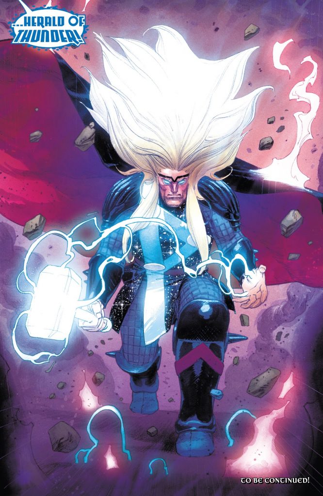
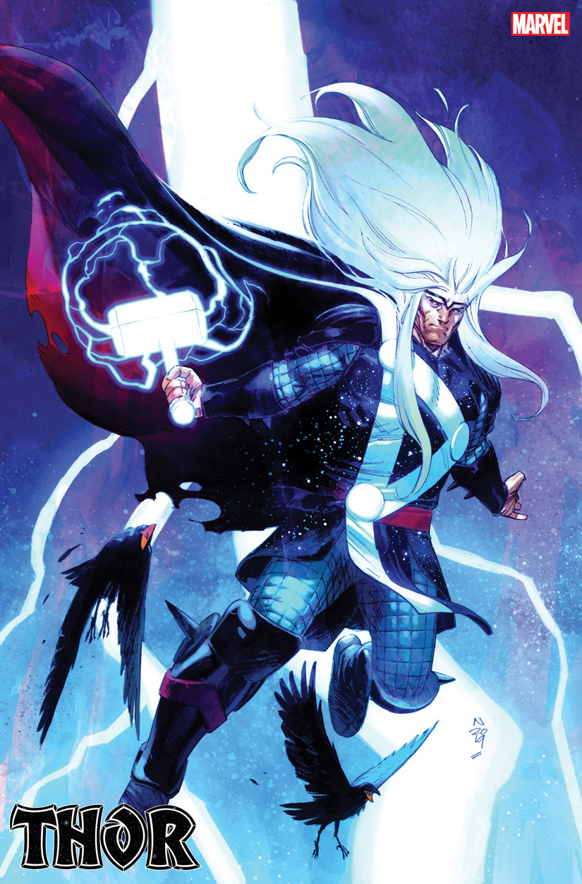
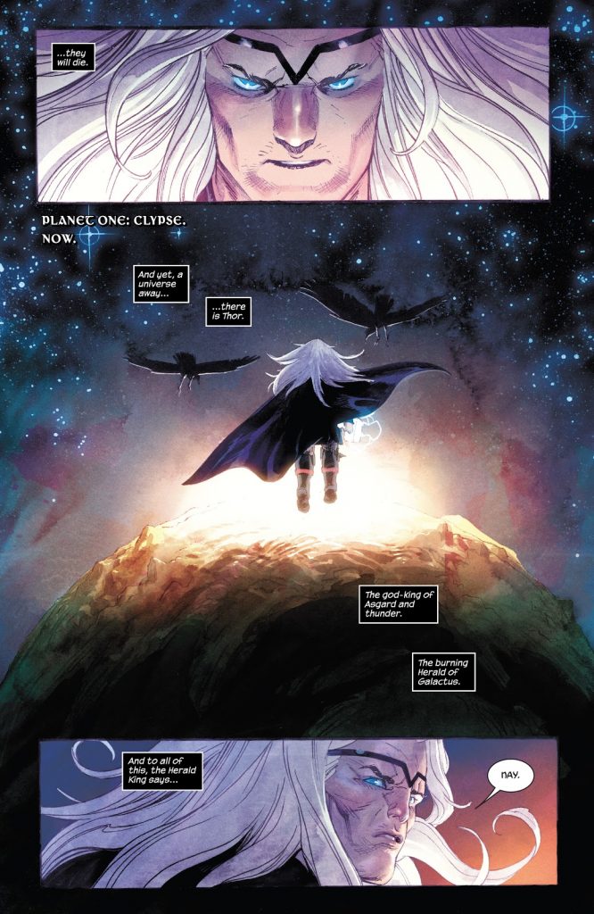
Let’s jump into the first page. It’s the one from Thor #1. At least in the first arc of the series, Thor has a new costume as Galactus’ Herald of Thunder. You designed it. It’s interesting because it’s always presented as this huge deal. Whenever a character gets a new costume, it’s this massive thing in comics. But for you, what goes into the process of redesigning such a major character’s costume? Was there a lot of direction or input into it, or was it mostly you just riffing and getting a thumbs up or thumbs down as you went along?
NK: Kind of, yeah. I mean Donny wrote a pretty specific thing that he kind of wanted. He was like, “I want that long, nice ‘90s Thor hair that I love so much.” I was like, “All right, that sounds cool.” Then it’s like, “Well I want the Thor rune 2 worked into the costume.” That was like almost the hardest part of…trying to figure out how to put that…
Trying to incorporate it.
NK: Yeah, because I wanted it to be reminiscent of the previous Thor looks. So having those big metal buttons, actually on the … later on the regular costume, the rune is still there but on the galactic thing, those circles that he has, which are connected by the lines. Those are kind of, you know, a callback to the original Kirby Thor. Pretty much every Thor had those, either out of metal or out of whatever. It was just basically kind of mixing an old costume with new elements and trying not to make it look too crazy but have it look new but have it also be reminiscent of past costumes, which is very important I think.
I mean, you have like the mail elements into the arms and legs and everything like that. So there’s like enough visual consistency that it doesn’t feel totally off. I will say, I do love the huge hair. It’s incredible.
NK: Thank you.
Based on this, is it just like an electricity-based look, or is it something else?
NK: Yeah.
It’s just him popping with static electricity.
NK: Yeah, and this one is just like electricity. In later issues, you’ll see it’s more like flowy. But we kind of wanted to go like … So this is the first time we saw him kind of be like over-the-top a little bit.
I love it.
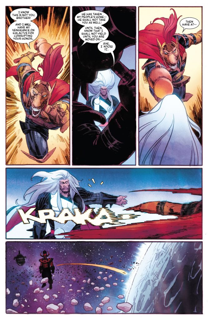
Okay, so the next page. I love sound effects. I think I talked to you about sound effects with Drifter. I love the “KRAKA” you deliver with Thor’s backhand, especially because of how it goes from like various solid to completely distorted at the end. As if Thor actually backhanded the sound effect itself.
NK: Yeah.
When it comes to those sound effects, what are you going for? Is it more of like an energy thing or is it largely dependent on like the sound effect itself?
NK: It’s funny because Donny writes sound effects and usually I don’t argue with him. The favorite sound effects that he always uses which are: “kraka-doom,” “krakoom,” or it’s “boom” or “doom.” So there is not really like a lot of variation in that, but I usually just treat them like a character in itself.
Yeah.
NK: What I like especially is putting them into the picture, like have foreground elements being in front of them sometimes, so it adds depth in the panel if you have sound. Like, I don’t know, like the one you sent me, (the Galactus page), it has Thor in the foreground, and it has the “krakoom” in the middle and it has Galactus in the background. And that kind of stuff I like because it adds depth and it also shows where the sound is coming from and where it kind of permeates.
And sometimes it’s great for adding direction. I mean for that “kraka” here, I could’ve done speed lines-
Right.
NK: But why do the speed lines? They were unnecessary. I could just do it with a sound effect. That just seemed logical for me. I don’t know. I don’t put like huge amount of thought into it though. A lot of this stuff is kind of just like intuitive.
Yeah. Well that’s one of the things I was curious about because it’s just like, for me, it’s one of those things when I don’t know if everyone looks at that “kraka” is like, “Holy shit.” But I got to that “kraka” and there’s just something about it that … I even wrote about it for this weekly column I have, because I just think it was such a great usage of sound effects and how they’re incorporated into the environment. And I really love how you always find a way to make it not just like a sound effect, but part of the actual experience. It’s like, you know, it moves in that motion or the “krakoom” that you have on that other page, it’s like you said, it’s in between them, so it’s indicating where it’s taking place but it’s also, you know, interacting with the environment.
So when you say you’re instinctual, are you figuring that out as you’re laying it out or is it when you’re figuring out like the final actual pages?
NK: Oh no, this stuff happens in layout phase. If you want, I can probably find the layouts for this and send them to you.
Oh yeah, that’d be awesome.
NK: I usually letter the layouts as well. I letter them and I do the sound effects and stuff in the layouts.
Oh wow. Wait, so you letter the actual balloons too?
NK: Yeah.
Oh wow.
NK: I just basically copy-paste out of the script and just place the balloons in my layouts. I don’t like do a super-fine version of … You’ll see when I send this to you.
You just want to know where it fits.
NK: I know. Exactly. Some artists, I see them do balloon placement in their layouts and they number them. And I was like, “That’s cool, but why …” I mean if I do them digitally, which I am, just out of editing reasons alone, why not put in the actual dialogue?
Right.
NK: And Donny is like, “Awesome, you could read this whole thing!” Because I put it in an Image Map, like the whole thing, I make an image map out of the whole issue and I lay it out with facing pages. So you can basically read the whole issue once I’ve laid it out. I think I stole this modus operandi from Jason Latour while working with him, at least the image map thing with facing pages. And then I just basically draw it, but it’s a readable issue.
Which is super helpful. Also, when you have the dialogue on the layout, especially when it’s like the talk-heavy scene, you know what they’re talking about which is also reflecting in their facial expressions and gestures, so it’s easier to have the actual dialogue on that page.
Yeah, you know, going back to the instinctual thing. One thing I’m interested in is figuring things out like this is instinctual…is that because that’s just the way that you work? Or is part of it … You know, comic deadlines are insane. Trying to turn stuff around really fast and trying to maintain as a schedule is like a very arduous process for artists. Has it been generated by circumstance or is it mostly that’s just how you work?
NK: That’s a good question. It’s probably born out of necessity. Even though I don’t really stick to it a lot, I like the saying, “Work smart, not hard.” So like doing layouts digitally, I’ve seen people who do layouts do it differently on paper, and then do the art digitally. I was like, “Why would you do it that way? That doesn’t make any sense for me.” The process that takes most editing or where you should have the most options, like going back and forth and figuring stuff out. Why would you not do that digitally? But anyway, yeah, most of the stuff is born out of necessity. And just out of workflow, like if you’re working in a team and I’m sending layouts through to the whole team, and if I have the option, why not incorporate the dialogue so you can actually read the whole thing already? And then it’s easier to find mistakes or find things that don’t work if you have the dialogue in there.
Because it’s all about story flow, right?
NK: Exactly. Yeah. For me, it’s like I always try to find the best way to communicate something. Even if it may be not the most dynamic way. Like a lot of times if you try to do something more dynamic than it should be, you’re kind of ruining the storytelling. I find especially in superhero comics, if you overcomplicate stuff by trying to make it dynamic or whatever, it can get to a point where it’s very hard to read. For me, the first and foremost thing, this is visual communication. It should be easy to read, the storytelling should be concise.
Yeah. So I’ve made this comparison way too many times, but are you familiar with J.H. Williams III’s work?
NK: Yes.
Yeah. So when he was doing Detective Comics and Batwoman, he was incredible at incorporating the bat symbol into layouts and making it work. He was doing some really unique stuff with that. But after that, I swear to God, there was a lot of people who were just trying to incorporate similar ideas into layouts because they’d seen it work elsewhere and it just didn’t work for the story. And I think some … this isn’t me slandering artists, but sometimes I think people can get lost in the cool rather than the effective, if that makes sense?
NK: Sure, totally, yeah. I mean I can do that too.
Sure.
NK: That’s easy. And sometimes that’s a valid thing to do. Like especially in superhero comics because if you’re…
You want people to say, “Wow.”
NK: Yeah, of course you want people to say, “Wow,” and you want it to be larger than life. And also, like reading an issue of comics takes like five minutes. How long does it take to read a comic book? So if you want to slow that process down and you obviously can work against that by throwing a lot of detail in it and that will slow down the pacing in the story. Which is valid, but if that’s all you’re doing, then maybe it’s time to reevaluate what you’re doing. But that’s all personal taste as well, so I don’t want to diss anybody.
From Thor #2, art by Nic Klein and Matt Wilson 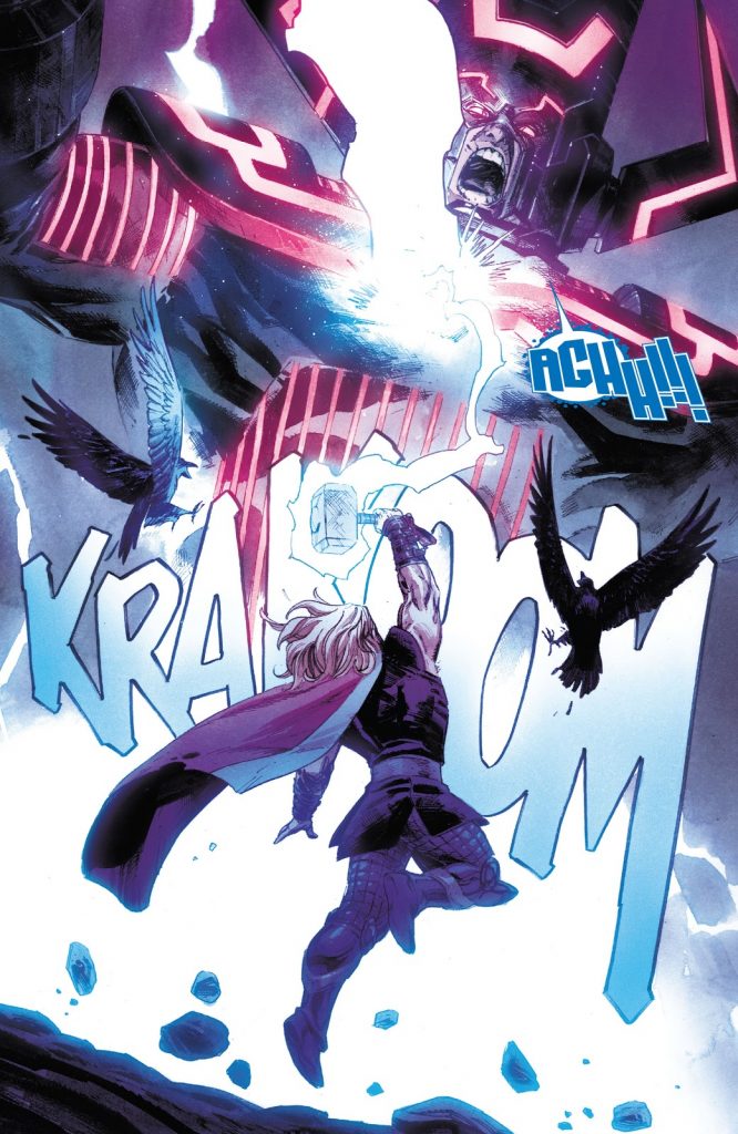
From Thor #4, art by Nic Klein and Matt Wilson
No, no. I mean it totally makes sense. I mean a lot of it depends on the type of art you’re trying to deliver, but you know, I wasn’t actually planning … I was going to skip these two pages, but with the scale page from Thor #2 and Thor #4 colors, those pages. I did want to ask, are those types of pages the types you’re talking about where you can have this big … like the page from Thor #2 has a lot more dialogue to it, actually.
With both of those, it really changes like how the story paces. Like especially with the Thor #2 page. I look at that and I’m looking at all the details and I’m looking at like Thor observing this world from above and everything like that, and I naturally slow. Is that the point of these types of pages, where you’re trying to change the pacing and also, you know, bring a little bit of that “wow” while you’re at it?
NK: Right. Yeah, exactly. I mean, it’s hard. The easiest way I’ve heard this explained is if you want action to be read as fast on a page, just strip it down of all details. Like the easier it is to read it, if you take away all the crosshatching, everything out, the easier it is to read. The less detail, the less clutter, the faster the eye will be finished with it and move on to the next panel and the faster they will be able to read it. So the faster you want action to be, make it from left to right and take all the details out. As soon as you start adding stuff to it, then the eye will take more time looking at something and then will slow down the pacing.
And it’s obviously hard to do because that’s a very avant-garde kind of way of looking at stuff. Like if I did like all action stuff in a superhero comic without details, that would be a very stripped-down comic book, but in a sense that’s kind of … If I think about this stuff, that’s kind of like the premise behind … You know, that page from Thor #2 is, you could argue, is the opposite of that – super un-dynamic. It’s just him kind of standing in space and … But it’s still a cool image to look at I think, at least I hope it is.
It works for me. Well, I do think too. You know, that’s one of the interesting things about … I mean, really any art honestly, at this point. I was going to say it’s a unique to comics thing but a lot of times when a lot of people are watching movies these days, they’re also on their phone. So it’s like there’s only so much you can control. But I think with comics, the interesting thing is so much of how people engage with comics, the experience is dependent on who’s reading it.
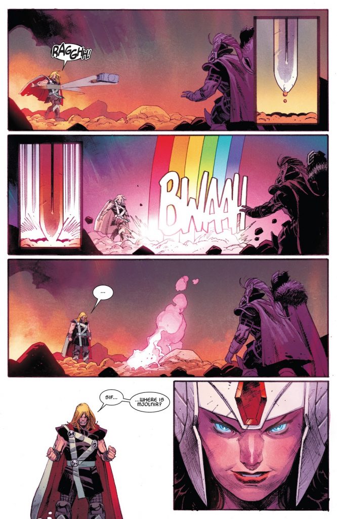
So let’s move on to the page from Thor #4. Like I look at this page, and I love what you did with Sif’s sword. Just having those two inset panels in there and like having the rainbow bridge come out right on the fourth panel is really nice. That’s one of those things that makes me wonder how you and Donny work. Is Donny pretty loose on the scripts and like letting you figure out how to lay this type of stuff out? Or was something like this scripted into it? How do you guys figure out that dynamic?
NK: Let me see what he wrote. He will tell me how many panels he thinks it should be in, but I can obviously change that if I feel necessary. But the way I arrange it, usually the work step I dislike the most, but it’s also the most rewarding, is layouts, because that’s where you actually have to do all the thinking. Basically layouts, all it is is just problem solving.
Some artists I talk to love layouts. They think it’s the best. Very few think penciling is the best. A lot love inking, inking is typically the favorite. And I just think it’s interesting … I mean, obviously every person is different but I do think it’s interesting how some just love the problem solving. They love getting in there and figuring out the other stuff. But I think it was maybe Michael Lark or…somebody told me that inking is their favorite and it’s just very zen. It’s just like they get locked in and they just kind of get lost in it. And I just think that’s interesting, how different it is from person to person. Every person has a different favorite phase, everyone has the part that they take the most out of. And some people just love problem solving because they love challenges.
NK: I mean, I guess I don’t like layouts because it is problem solving. It is the most rewarding, if you do something really cool and if you figure something out, but at the same time I hate concentrating on stuff. I can have a very short attention span, and I kind of get sidetracked really easily if I have to do layouts because my brain doesn’t work that way. I can’t sit and ponder something for too long, I have to get up and do something. So it usually takes me a lot of time, usually more than it should and that is kind of the part that bothers me the most about it because I’m on a deadline.
Oh yeah, totally.
NK: It’s like I get frustrated. Okay, so before this, “Panel one, Thor throws his hammer at her, long shot if you like,” he writes. Then, “Panel two, on Sif raising her sword a few inches above the ground. Panel three, and now slamming it down again, like a judge hitting a gavel. On panel four, that same long shot of Thor throwing the hammer, where the hammer is flying, a bolt of rainbow … Bifrost energy smashes down from the heavens and takes it. And panel five is the bridge energy is gone, Thor standing there with his arm held out, confused.” So he wrote … I mean he did write all of those things but I didn’t … Like for those inlay panels, I didn’t even bother showing Sif, I just did the sword.
And just went from there. I guess the three horizontal layouts with those inlays. And just for readability, it didn’t make any sense to show her in there. We all know it’s her sword and she’s kind of showing that mechanism of lifting it up and clanking it down and the rainbow bridge coming.
Yeah. Well and I really like too how, you know, you’re reading left to right already, and so it’s like operating those timing elements. I think that’s one thing people forget about with comics, when you’re reading a comic, it’s not like you’re thinking about how this is the passage of time, but the inlay panels as you’re saying, like when those happen it’s indicating order of operations, how it’s all happening. And I just really like how you did that.
NK: Thank you. Also, it is a bit of a humorous scene as well, because panel five where Thor’s kind of like “what the hell?” with those three dots. That’s what I meant earlier about humor in comics, juxtaposing those three panels which are the same shot and just showing the difference in the characters which is…if you really want to show a difference in something, you just do similar panels, and just change little stuff in it. Because it’s very apparent what changes, like if you did a different camera angle, it wouldn’t be so apparent. So that’s a great tool in humor in comics as well.
I love that. There’s this one moment in Invincible, like the Kirkman or Ryan Ottley and Cory Walker comic. And If I remember correctly, it was like specifically referencing the fact that sometimes artists just don’t change things. And like there was only one of something like eight panels that changed at all. And because it calls that out, it’s so much funnier because of it. And you know, I remember seeing it brought up one time by somebody who’s like, “Look at this, they’re barely even trying on this.” But that’s a deliberate choice that is being made for humor purposes. And I think it’s interesting how like wide to interpretation these things can be.
NK: Oh I’m sure there’s … Like if a writer writes, “Same panel,” like as previous, the easiest thing to do, especially if you’re working digital, just copy-paste that. So I don’t doubt that there’s a lot of opportunity to cut corners, which any working professional will cut a corner if you give them an opportunity to just because deadline. But it can be a cool element or a cool tool to work with as well, just outside of saving time.
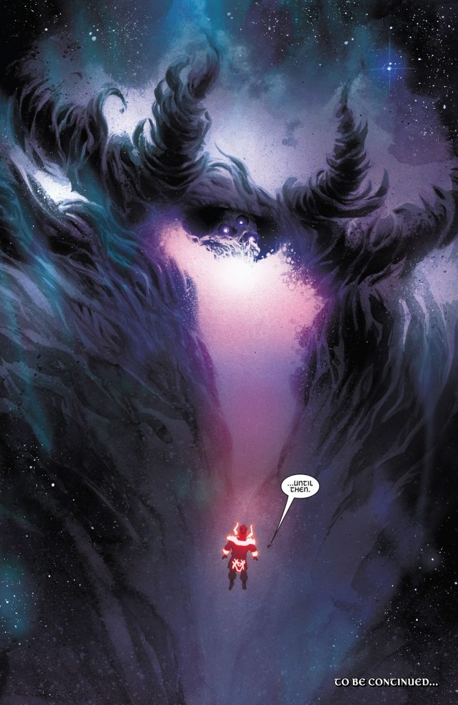
Okay, last page, the black-something, because I couldn’t remember if it was Black Winter. Thor 4, Black-something. So this page reveals our first look at the big bad of the story, the Black Winter. It was a previously undefined idea, I believe. For something that’s … You know, you obviously are going to put a bunch of time into making sure that this new Thor redesign is going to work out, but something as significant as this beat, this new big bad for the first arc of the story, was that something that you worked out in the development of the book or is this something you figure out as you’re kind of putting the issue together? How does that work?
NK: We figured this out while we were putting the issue together. And basically, Donny did a description, but then we just kind of chatted a little bit, and then I drew a version of this and I was like, “Holy shit, this is badass.” And I sent it through to Marvel too and then they were like, “Wow, this is crazy.” And Donny was like, “Yeah, this is crazy but that’s not really what I kind of envisioned.” And I was like, “Fuck. Back to the drawing board.” So this is the second version, I actually drew this page twice. Like the original version of this is the second version, and I guess the only thing that was wrong, “wrong” in quotation marks, for the first version is it was too … What’s the word I’m looking for? It had too much body. Like there was too much mass.
Oh sure.
NK: There’s more of a, I don’t know a nebula, energy kind of thing.
I mean, it’s interesting because I get where Donny is coming from in that regard because it almost … Like looking at this page, the thing that freaks me out about it is two things. One, the fact that it’s this big black mass of just horror. And then second, the fact that it seems to me like the most important element is the fact that it makes Galactus look small as hell.
NK: Right. That was a thing that Donny was like, “I want this thing to be so big, I want Galactus to be the same size as a human is to Galactus.”
Wow. Yeah. That’s something that I think you’re really good at is using scale to make moments really pop. And this beat is no different. But I feel like if you overuse scale as a tool, if like the next page was like another thing that makes the Black Winter as small as Galactus does now, it would diminish the value of its use. To you, how can artists best use scale to really bring significance out in a moment like you did here?
NK: Yeah, that’s a good question. I mean, use it sparingly, probably. But the thing is you will use it sparingly anyway because it’s a huge pain in the ass to have to fit a lot of characters with different sizes into a panel.
I don’t know. I mean scale is where you can work a lot with perspective, which you will have to do if you work with them, with scale. But at one point or another, you’re going to have to do like a page like this where you can see the scale comparison. This is like an establishing shot kind of, almost, because you … this kind of sets the tone for like … Later, they’re … Spoiler, in later issues, we will not see them in this arrangement again, but because you know what size everybody has, it’s impossible to even… even putting Thor and Galactus in the same panel in all those issues, one to four, is a bit of a nightmare.
Yeah. Because he’s the size of, like, his nose.
NK: Exactly. So the easiest way is having him in the foreground and Galactus in the background and stuff like that to do perspective tricks. But it’s a lot harder than having two characters who’re the same size.
Yeah. I do like how you guys do things to really level the playing field in a way. Because I liked how when Thor was basically trying to establish that they were peers rather than his minion, he sends Mjolnir through Galactus’ knee.
NK: Right.
But the interesting thing is like you don’t contextualize it with all of Galactus, you just contextualize it with his knee and Mjolnir going through it. Because if you had the whole thing and he was just like, “Ugh!” And like you saw the hammer going through his knee, it wouldn’t have the same impact. Having that close-up really changes it.
Nic’s layout to the previous page in Thor #3 
Nic’s finals to the previous page in Thor #3
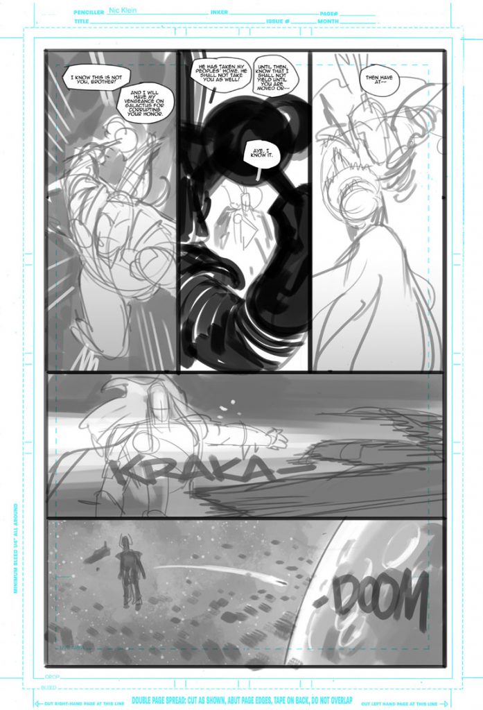
So I want to go back to one thing. I think the layout for the original “kraka” page is interesting. You talked about how Donny has his regular sound effects he uses. You took “doom” out after the layout stage.
NK: Right. I took “doom” out and put it on the next page when he actually lands on the planet.
Because you wanted to have cause and then effect?
NK: Exactly, yeah. And it made more sense for me that way … I think Donny wrote it on that page, and I was like, “but if I split it up and move it”, I basically took the “doom” and made that the impact sound effect when he hits the planet. So it’s kind of like when the hyphen is there. It’s like “kraka,” hyphen, and then there comes the “doom.”
Yeah, I mean it wouldn’t make very much sense if he was just like flying and then all of a sudden the “doom” comes. Unless you just want “doom” to happen, in which case, cool.
NK: Right. I’m looking at the layout of that page, I don’t have the “doom” on that page where he hits the planet. It must have been actually … That was probably an afterthought. So yeah.
Interesting. Well, you know, I can’t really show the original version of the Black Winter and everything, but looking at this, you digitally lay everything out and then you do this traditionally?
NK: Yeah. I do digital pencils, and then I print them out in like a light blue and then I go and ink on them and do the ink wash.
So you totally had to redo this page.
NK: Right, yeah.
Damn. Yeah. You did not take that easy on yourself. There’s a lot to it.
NK: No. Right. And that was kind of… I wasn’t annoyed, but actually you know what’s funny? Me, five years ago, I would’ve been cranky at that, at me having to redo this page I was in love with. Where I probably would’ve tried to have a conversation about it. Like, I’ve come to the realization that the people I work with, they’re not going to … I know that they think enough of me that they’re not going to critique me or have notes unless they really think that it’s a valid thing to do.
I don’t think there’d be anything that I would probably get in an argument about, because usually I think they’re probably right. I’m going to trust them the way they trust me on everything else, because I don’t get that many notes. So when I do get a note and it’s like, “Well, you know, that probably is a valid thing to do.” And if Donny says he’s not happy with it, that’s not the way he envisioned it, it’s like, “screw it, we’ll see how I can get closer to what you had in mind.”
Even though I think that original is still badass, but in hindsight it doesn’t fit what we were going for, so it was the right call to make.
I think at the end of the day you have to try to objectively ask yourself: “is this the best image/page/panel for the story you’re trying to tell?” And if the answer is “no,” then change it. It may be a good drawing, but this isn’t the place for it.
Yeah. It’s funny. It’s all things at the same time. It is extremely awesome, but also I could see why it wouldn’t fit. It’s like almost in some ways…I think sometimes the visuals, it’s like the unknown can be scarier than the known.
NK: Exactly. Yeah.
I do have to ask, you said that previously that might’ve been something you would’ve made a bigger deal with. I know that I take things personally. I used to take things a lot more personally than I do now. For you, when somebody sends something back to you and says, “Oh, this isn’t how I wanted it,” was that something that you just kind of got over with time or is that something that you kind of deliberately were like, “I need to work on this. I need to make sure I get over this type of stuff because it’s not really about what I’m doing, it’s about the work.”
NK: Both. I’m a very high strung person anyway, so I kind of … You can ask Ivan Brandon about this because we’ve gotten into a few fights over projects. So it doesn’t take a lot for me to like go off, but for work I think I realized that putting my ego with stuff like this on the back burner just makes sense because nobody’s trying to do any harm.
You know, we’re in this together and if I get notes, it’s to make the story that we’re telling better or in the direction that we want it to be. Nobody’s trying to annoy me or nobody’s trying to make me look bad or anything, it’s just … The only thing that would cause trouble is my ego, because I think it’s an awesome drawing that I fell in love with or whatever, but does it actually serve the story? Probably not. So why bother getting upset about it? But it took a lot of time for me to get to that realization.
I wonder if it helps … And maybe it doesn’t because you said you used to get into it with Ivan, but you know, if … let’s say you got thrown into another project with a completely different writer you knew nothing about and they didn’t even know you. And they were just giving you notes, and you didn’t know any better. Like with Skottie, you knew Skottie. You got roped in because of Skottie. With Donny, you were picked. You were the chosen one for this. And I wonder if it makes a certain amount of difference when there’s almost maybe more inherent trust when there’s more of a selection process rather than that arranged marriage we talked about earlier.
NK: Right. Could be. Yeah, I mean, I’ve had the luck to work with … Like pretty much all the writers I work with are people that I know personally, and then whose work I respect and admire. So coming from that standpoint, it makes it really hard to kind of like get upset when they tell you something because you know they’re competent professionals, as well, and competent storytellers. I don’t know. That’s a tough question to answer. Probably it could be situations where I still would say, “I disagree with that,” or whatever. Whether it’s worth like getting into a huge drama fight over it is another question.
Yeah. It totally makes sense. Especially given the fact that it’s like a hypothetical you haven’t had to actually deal with.
NK: Well you don’t want to have that reputation that you’re difficult to work with either. That’s another thing. Especially over stuff that shouldn’t be a problem to … You know what I mean? Having to redo the page because it works better is not something that should cause, you know, any kind of destruction in the team, I think.
And I think it would be one thing too if you were getting lots and lots of notes. It sounds like you’re really kind of given space and just finding solutions and like just in this one case it just didn’t work out.
NK: Yeah, and not to pat myself on my own shoulder, but I don’t get a lot of notes in general. Like over the years. Maybe because I do try to actually do good storytelling or whatever. But when I do get notes and when I usually think, “Yeah, that’s a good note,” I’m not going to argue with it because that’s the editor’s job. If an editor thinks something doesn’t work, then usually it doesn’t work because that’s why he’s mentioning it to me.
That’s one of the good things of doing layouts the way I do them, is you can actually read it and if something really does not read very well, then you can tell me in the layout stage already. Having to redo a page is very, very rare. And also I usually have it happen when I jump the gun and I kind of want to make this page awesome and show it to everybody when it’s done, and then they’re like, “Eh, it’s awesome but it’s not what I wanted.” So if I would’ve shown Donny the layouts for this, he probably would’ve called me out on it earlier, but I decided to just finish it. So that was my bad.
I hope you enjoyed this conversation with artist Nic Klein. If you did, maybe consider subscribing for more content like this each week on SKTCHD!