Rethinking the Medium: The Stela Team on Creator-Owned Comics, Mobile First
In today’s world, an incredible amount of what we do is mobile. Whether you’re talking about getting news updates, listening to music, or reading your favorite site about comics (almost half of SKTCHD’s readers over the past month were on a mobile device), we’re thinking mobile first at an increasing rate. Even reading comics has become a mobile heavy experience for many, as apps like comiXology and Marvel Unlimited are fantastic for tablets and smart phones. But, for the most part, very few comics themselves have been designed for that environment. In fact, the only one I can think of right off hand is David Gallaher and Steve Ellis’ Box 13, a comic designed specifically for the iPhone reading experience.
Until Stela, that is.
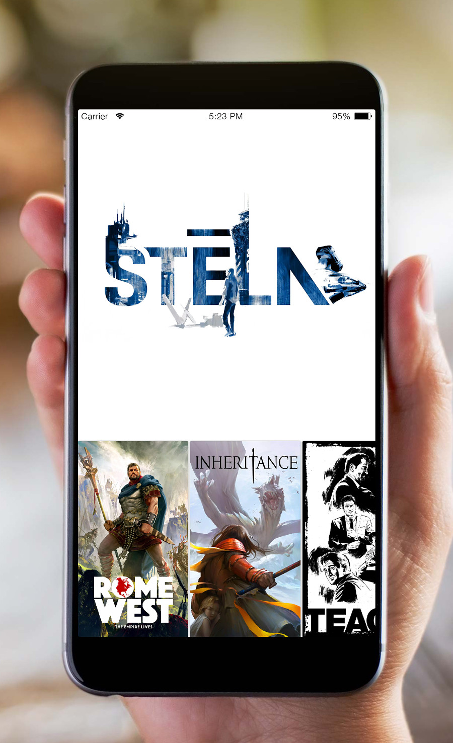
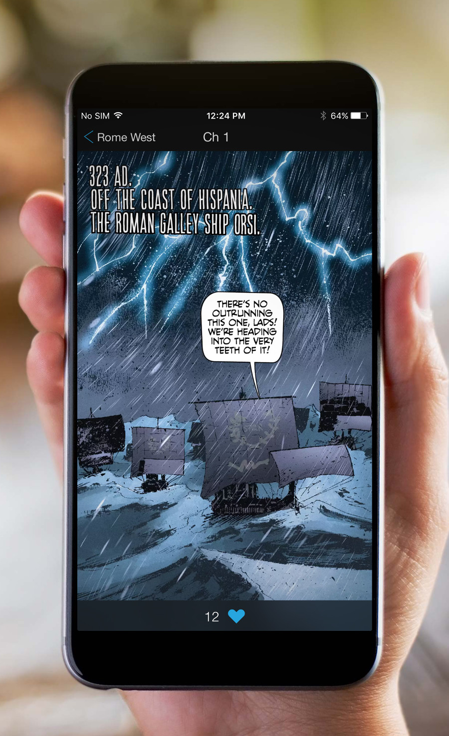
Stela’s a new all-in-one creator-owned comic publisher and app that is designed mobile first. Not only that, but it has its own unique angle: its comics are all told vertically, rather than both vertically and horizontally. To read one of their comics in-app, you just have to use a familiar motion – the swiping of your thumb up the screen as you read each passing panel. It’s a Stela specific angle, and it’s a smart one as it plays off our natural tendencies as mobile users. But Stela’s not just a one trick pony. The publisher features a bevy of talented creators, including Brian Wood, Andrea Mutti, Caleb Goellner and more, as well as an editorial team of seasoned veterans in comics like Editor-in-Chief Ryan Yount and Senior Editor Jim Gibbons. It’s a really exciting combination of strong talent and a smart and original spin on the medium we love. So naturally, I wanted to talk with the team about it.
So today, you can read my conversation with Yount and Gibbons as they talk how the project came together, why Android isn’t part of their launch, why vertical scrolling is what they went with, their creator-owned model, creators adjusting creating comics specifically for mobile, and more. It’s a good conversation, but one quick note about the app. I’ve seen an early build of it, and it’s a beauty. They’ve put together something special here, and even early on, you can see how great this really could be.
If you’re interested in checking Stela out upon its launch, sign up to get updates from their site. It’s set to drop sometime early this year.

Obviously mobile is the direction the way the world is going, and that’s the case in pretty much anything you can think of. We’re more mobile obsessed these days than mobile enabled these days. It’s exciting to see a comic publisher put such a singular focus in this direction. That said, it’s a bold, potentially risky move. What made this a risk worth taking for Team Stela?
RY: For us, the risk is worth taking because that’s where the opportunity is. If we want to grow comics readership, we have to do it on a platform that can reach a massive amount of people. And that’s mobile.
JG: Exactly! We’re seeing signs that comic sales and the comics audience is growing and a lot of that seems to be due to more inclusive and—for folks not engrained in the Big Two since their teenage years—more accessible comics. We’re aiming to take that accessibility and that ease of entry to the next level by beaming an impressive roster of curated creator owned comics straight to peoples’ pockets. Hot, fresh comics delivered daily. It doesn’t get any easier than that. And the hope is that the content is so compelling that current comic fans feel the need to read it as well as acting as a gateway into comics for folks who maybe love watching The Flash but aren’t sure where to start when it comes to comic reading.
Between the app itself and putting together the comics and creative teams, I have to imagine this wasn’t something that just spontaneously came together late last year. How long has it been in the works?
RY: We’ve been working on this for a full year now. I came onboard last January and started signing up creators and projects. We’ve been cranking away at full steam for the entire year, building the app and getting all the projects into gear.
JG: And we just recently crossed the 40 projects milestone. That’ll be 40 brand spankin’ new creative visions available for your entertainment in 2016!

I have to ask…as an Android user, the first thing that stood out to me – past the coolness – was the lack of Android initially. Why launch without it, and how far out is that on your roadmap?
RY: We’ve got a lot of Android users that will be eagerly awaiting our Android release. I won’t get too specific about our tech roadmap, but Android is very, very high on the list. As for why we’re launching with iOS rather than with both – honestly, it’s just one of those things inherent to tech and mobile development. You want to launch with as many features and platforms supported, but you’ve also got to focus. Once we’re satisfied that we’ve nailed iOS, we’ll be tackling Android.
While there are other comic reading apps on mobile, this is the first one where the comics are read vertically. Why vertical? Was it more of a differentiator for you vs. something like comiXology’s Guided View, or is it leaning into the way we already are using mobile devices?
RY: It really starts with mobile itself. That’s the design process; looking at the phone and figuring out what will work best. And when we looked around the digital comics space, we saw a lot of folks that were adding things (sound effects, minor animation) that we felt were not only unnecessary, but, frankly, often interfered with the experience of reading comics.
Our goal was for the tech to disappear – we don’t want to pull people out of that wonderful zone of bliss that comes when you’re fully absorbed in a good comic story. So it was important that the navigation, the way the user uses the app, be as instinctive as possible. And on mobile phones, scrolling through vertical feeds (whether that’s Facebook, Instagram, Twitter, Tumblr, etc.) is a nearly automatic action we all do for hours everyday. We knew that the vertical scrolling would form the core of the product very early on – both for the app itself, and for the comics.

JG: It really goes back to that accessibility we talked about earlier. The goal isn’t to just make comics for the current comics market but to make comics for a whole new audience, as well. Reading order in comics is second nature to those of us who’ve been lifelong readers, but it can be a stumbling block for new readers. Telling comic stories panel after panel, stacked so that reading order is very clear, has seen a ton of growth of readership in webcomics and on platforms like tumblr That scroll is becoming the way more and more people consume media. And that makes jumping into vertical comics a simpler proposition for new readers!
Having played with an early build, I have to say: I love the app. It’s easy to use, quite pretty and very informational. I only saw it on an iPad, but I imagine it looks even slicker on a smart phone. When you were designing it, what were the key things your team wanted out of it?
RY: The team wanted to create the best-looking, easiest-to-use comic app possible. We’ve been getting great feedback from our tests, which is validating. The core functionality is simple – get in, get to the comics, and read! And on the visual front, we needed a clean design that would showcase the greatest art assets we have – the comics themselves.
JG: One of the really exhilarating things creatively that we’ve seen is how creators are playing around with that vertical format, which we think makes the slick look of the app even more engaging. And each creator that tries something new inspires another creator to play around with the format even more. It’s leading to some really intriguing additions to the sequential storytelling lexicon! Giving creators a new challenge and seeing comics, in a way, evolve has been a nice side benefit of the app.
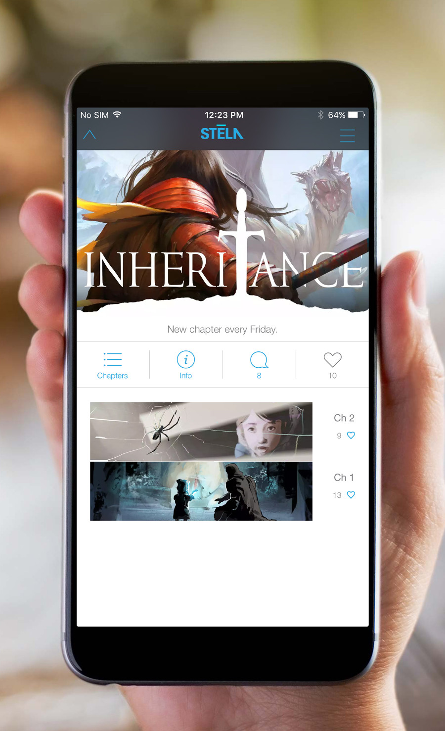
One thing I thought that was interesting was how different each of the titles read on the app. One stood out above all of them: Inheritance. The reason is it feels like the only title I’ve read that feels specifically designed to be read vertically, versus a normal comic adapted to vertical. Was that the case? Have you found some creators have taken to thinking about the Stela reading experience in their comics quicker than others?
RY: Ah, yes! The Inheritance was a lot of fun to create. I worked with Kinman Chan, one of our early visual designers. He’s an incredibly talented artist with great storytelling chops, so he and I got to spend a lot of time talking about the story’s visual design. And Kinman was one of the first to experiment with the vertical space for us, trying out different techniques to see what would work. That process and experience led directly into us doing the first few episodes of The Inheritance, so it was super useful.
As for our other creators, it’s been quicker for some to adapt to the vertical flow than others. It’s not an easy translation to go from years of experience dealing with the printed page as a unit of storytelling, to us talking about ‘screens’ and saying “there is no more page.” But through the process we’ve garnered a whole new lexicon and ways to explain how to think about the vertical scroll for storytelling.
And some artists have taken to the format from the jump – if you’re a young artist who’s spent a significant amount of time on Tumblr… well, the vertical aspects of what we’re doing are easier to make sense of. Really, having creators be able to see the app in action, play with it, that’s where it clicks right away for everyone.
JG: And, as the saying goes, you ain’t seen nothing yet! Ha!

Do you think there could be a slight learning curve for creators when it comes to crafting comics that utilize the app’s full capabilities?
RY: There is definitely a learning curve. Some stuff that we’ve taken for granted in printed comics have to be thrown away right off the bat (the page transition when you turn a page, for example… or the fact that ‘widescreen’ panels just don’t work in our format). But the vertical format isn’t complex, it’s just different. In fact, it’s pretty simple in a lot of key ways. One example I like to give is that in the vertical format, it’s really impossible to ‘lose’ a reader with unclear panel layouts – you’ll never have the moment of deciding “So, am I supposed to read this panel next, or follow this panel?”
JG: I keep referring to it as pure sequential storytelling. It’s panel after panel with no skipping ahead by letting your peripheral vision show you that final panel across the spread. Page turn reveals are certainly out, but in this format, each panel is a potential reveal. I think some folks have almost had a hard time grasping that potential because, in ways, it’s almost a bit too good to be true. Pacing is totally in your control, not something that an open spread can negatively affect.
One of the most interesting things to me is that it’s both a subscription service and creator-owned. It’s an interesting setup. Obviously you can’t get too deep into this, but how does that work financially exactly? Would the amount of chapters released or the total reads for each comic impact the percentage a creator would receive?

RY: You’re right – we can’t get too deep into this, but for all of our creator-owned series, those teams are eligible for profit-sharing when their series is actively running. We are ignoring total reads for the time being, although we’ll be tracking all of that info. As you know, a ‘read’ is a tough thing even to define (technically, that is, in terms of how you measure it), and since we are a subscription service, our hunch is that people will be trying out all the other comics running concurrently. If subscribers are reading everything we release (which is actually possible since we’re not overwhelming folks with 10,000 choices), it’s more difficult to define popularity just based on ‘reads’.
Because of the same things I was just mentioning, do you foresee Stela having a cap as to how many titles are publishing at any given moment?
RY: Yes, there is a cap, for sure. But we’ve got some room to expand the number of concurrent titles we’re running before we hit that cap.
It’s not a perfect fit, but to me, this feels like a mobile, independent version of Zuda Comics. It could be a really exciting opportunity for newer creators. I know there are a fair amount of name creators at the start, but is Stela looking to embrace new and diverse voices as you move along?
RY: A hearty, resounding YES – in fact, we’ve already got a lot of exciting projects in the works with exciting, younger talent. One of our editorial principles is for a portion of our lineup to always be made up of newer diverse voices. You won’t have to wait for us to start that initiative, we’ve been working on it for a while now, and you’ll be seeing some of the fruits of that effort early on in our launch.
