The SKTCHD AWRDS: The Comics of 2020
There were a lot of bad things in the world and in comics itself in 2020, but one important consideration for everyone, at least in my mind, is it wasn’t a bad year for the art form itself. Quite the opposite, in fact. I’d argue that 2020 – purely from a qualitative standpoint – was pound-for-pound one of the best years in comics of my lifetime, with a deep bench of high quality works and high highs everywhere you look. It puts us all in the “making lists about comics” world into a position where it’s damn near impossible to consider everything, so no list is comprehensive in a way the medium deserves.
Alas.
Despite that, despite knowing that there’s no way I could read enough to truly do the medium justice, I decided to highlight my favorites anyways. I did that over the past week here on SKTCHD, touting 25 specific titles from the year that stood out the most to me. Those are now all highlighted in one master post, with each standout earning a totally real, absolutely not made up award for their individual greatness.
These awards are deliberately selected for each title and are reflective of what I want to say about each of them. They’re meant to emphasize that this isn’t a “Best Comics of 2020” thing, but a showcase of the releases that made this the year what it was for me. And this isn’t meant to be any one type of comic. It’s meant to be reflective of all types. That’s why within this week you’ll find regular single issue comics, graphic novels, manga, webcomics, and beyond celebrated. The only real rule here was that they had to be released in some capacity in 2020.
That’s enough for preamble! Give my awards a read below, and hey, if you dig what I had to say about each of them, consider, you know, reading these titles! They’re great! This feature is now open to non-subscribers, so if you really enjoy what I have to say, consider subscribing to SKTCHD to support independent comics journalism.
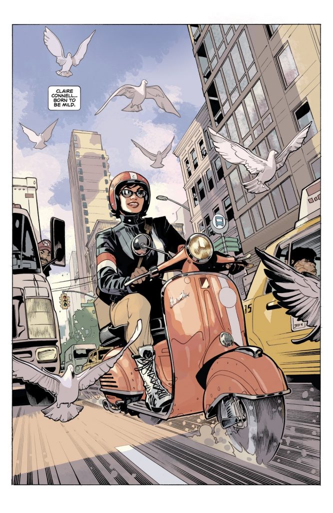
The Modern Classic Award: Adventureman
Written by Matt Fraction
Art by Terry Dodson and Rachel Dodson
Letters by Clayton Cowles
You might take the title of this award as extreme praise, and it is. Adventureman is a great comic. But I don’t mean “modern classic” in the traditional sense of the phrase. What I mean is Adventureman is a title that thrives both as a comic that’s very much of 2020 – from the diverse cast to its storytelling sensibilities – and as a throwback to yesteryear, as this Image Comics series has a vibe that reminds you of pulp stories from the past without ever feeling dated. Instead, both halves of the whole feel invigorated by the era mash-up, resulting in a comic that’s fun as heck and smart as hell.
If you know a little about Adventureman, you know it’s been long in the works. Long, long in the works, with Matt Fraction and Terry Dodson planning on collaborating again for forever and a day after previous partnerships. The wait was worth it, because it feels like a labor of love in a way many creator-owned titles can’t match, with energy and heart pouring out of every idea and line and concept within the book.
Everyone involved is being the very best version of themselves because of it, with Fraction clearly having a blast, The Dodson’s residing within the Venn diagram of all their interests seemingly, and Cowles facing a difficult challenge but excelling because of it. That energy translates to us, the reader, as it’s a fizzy blast each issue.
It’s a unique book. Not only does it feel like the comic equivalent of the Adventureman book series lead Claire and her son Tommy discover, a relic from the past realized today, but it’s also like a European book built for the American market. There’s a fusion here that makes the title stand on its own. That means Adventureman isn’t just a great comic; it’s one without comparison, truly.
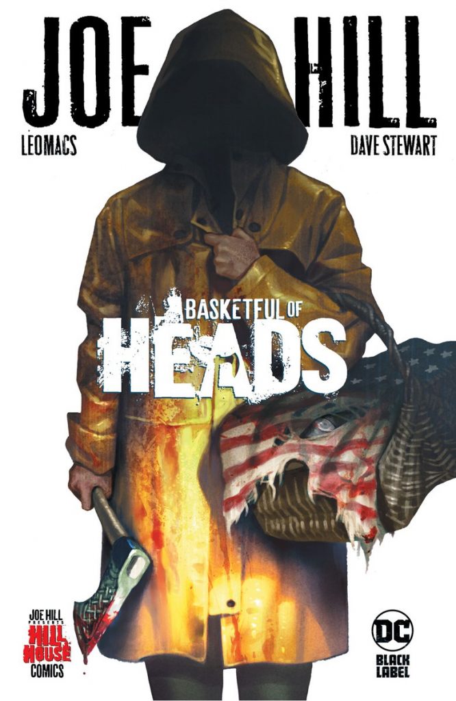
The Proof of Concept Award: Basketful of Heads
Written by Joe Hill
Art by Leomacs
Colored by Dave Stewart
Letters by Deron Bennett
I didn’t know what to expect from Hill House, Joe Hill’s pop up imprint at DC Black Label. I knew it was going to be horror focused and that it had a lot of great creators working on it. But there was a part of me that just resisted the attraction to the idea. I’m not even sure why. But with a couple key comics laying the tracks for me getting onboard, I ended up trying everything from the line. While I wouldn’t say this with 100% certainty – because I enjoyed almost everything it offered – its launch title of Joe Hill and Leomacs’ Basketful of Heads may have been my favorite from the lot.
And it’s because of how perfectly it wore its influences while combining them into a beautiful pot of malevolent glory. This story felt like an 80s slasher flick married with modern sensibilities and a little Norse myth worked in. All of that together could easily have been a mess. The path to disaster is a short one there. Instead, it felt like it maximized each influence, resulting in a revenge story with an A+ lead, a healthy amount of edge, and immersive rhythms, all of which added up to a whole lot of fun.
In that regard, I suppose it’s not even necessarily that Basketful of Heads was the best title in the line as much as it was the proof of concept to it, the one that showed what Hill was going for with this broader imprint, selling everyone with its highly entertaining ways. It, through its propulsive, compelling story, told us that this whole line was worth keeping an eye out for. I’d call that a job well done.
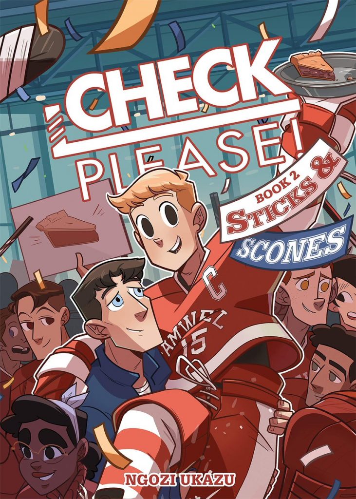
The Flow Award: Check, Please!
Everything by Ngozi Ukazu
The first thing that comes to mind when Check, Please!, Ngozi Ukazu’s excellent and now complete webcomic-turned-First Second graphic novel series, comes up is flow. What’s flow? Well, Ukazu has an excellent comic explaining it – short answer, it’s the long locks many hockey players have that disgust and attract women simultaneously – but more than that, it represents Ukazu’s perspective as a storyteller. They say the devil is in the details, but for Ukazu, it’s the magic that lies there instead.
And Check, Please! is a comic that’s all about the details, whether it’s recipes and vlogging antics or hockey minutiae and character habits. Ukazu created a world within this series – which is about Eric “Bitty” Bittle, a college hockey player who goes from a mostly closeted freshman who vlogs about baking to a graduating champion who meets the man of his dreams and, well, keeps vlogging about baking – that feels completely real in every way it can, being both hilarious and utterly charming because of it.
And that happens because Ukazu values beats like “flow.” Maybe that wouldn’t make the cut for some, but for Check, Please!, it’s elements like flow that make it all special and magical and wonderful and hilarious. You can’t feel lived in without attention to the details, and few comics feel more lived in than Ukazu’s beloved work.
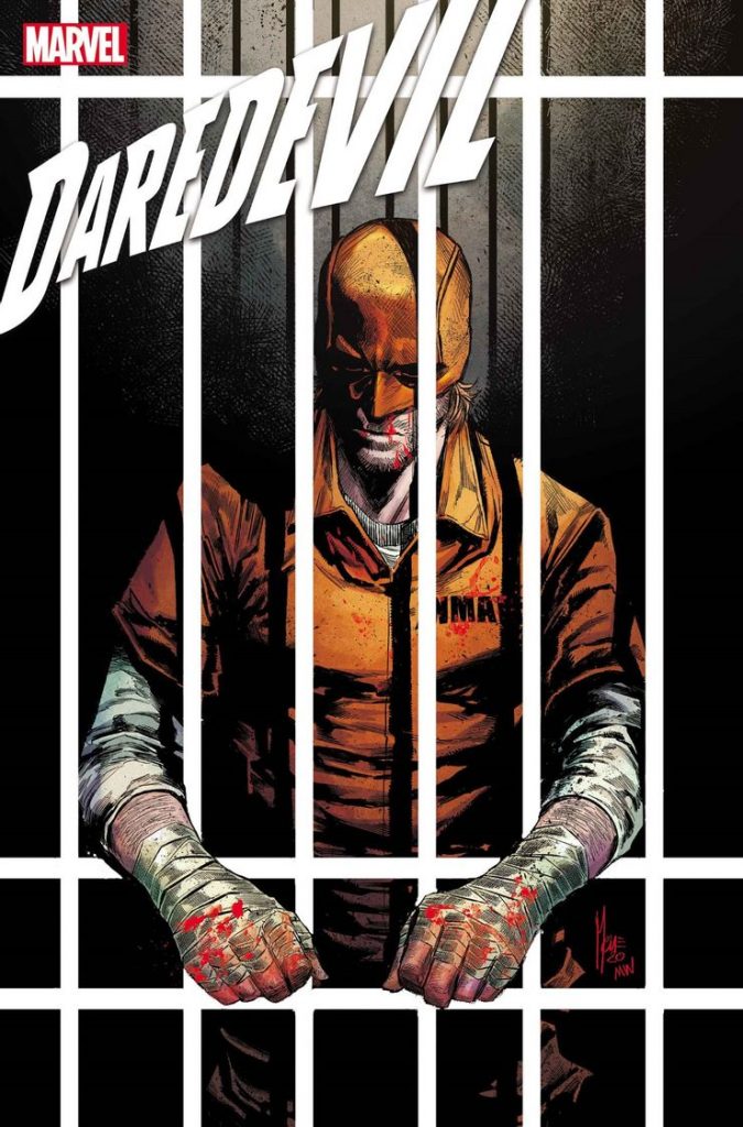
The Measuring Stick Award: Daredevil
Written by Chip Zdarsky
Art by Marco Checchetto, Jorge Fornes, Mike Hawthorne, etc.
Colors by Sunny Gho, Mattia Iacono, etc.
Letters by Clayton Cowles
Working on Daredevil has to be an absolute pain.
Don’t get me wrong, it would be an amazing opportunity, as it’s a series that’s steeped in history. But that history is where the pain comes from. You’re always competing with teams like Miller and Janson (or Mazzucchelli), Nocenti and JRJR, Bendis and Mack, Brubaker and Lark, Waid and Samnee, and an array of others in reader’s memories. So you have to somehow live up to the spirit of those stories while finding new ground to tread on.
That’s why this volume from Chip Zdarsky and Marco Checchetto (as the primary line artist if not the only one) has been so impressive. It’s resided in that middle space, that needle Daredevil teams have to thread, throughout its run. It’s touched on story beats we’ve seen before in a way – Daredevil struggling with his identity, someone new in the identity, questions of faith, Stilt-Man being a boss – but somehow always found new angles on them.
That’s tough to do! And yet, everything has felt fresh but connected, new but familiar, in all the best ways. Pair that with remarkable art – Marco Checchetto really has astonishing throughout, and he somehow keeps getting better – and you all of a sudden have a run that isn’t just living up to what came before it, but becoming a bar from which you measure future runs. That’s all you can ask for when it comes to, in my opinion, the most consistently great Marvel title in its history.
The Empire Award: DCeased
Written by Tom Taylor
Art by Trevor Hairsine, Karl Mostert, Carmine di Giandomenico, etc.
Colors by Rain Beredo
Letters by Saida Temofonte
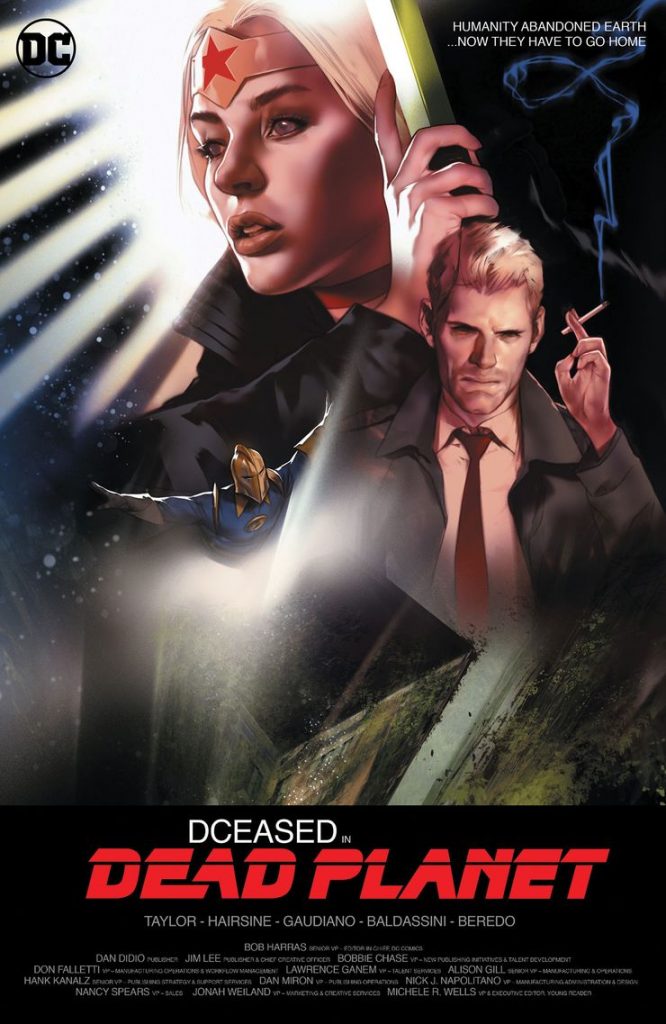
This shouldn’t be a surprise if you’ve been reading SKTCHD for a bit, but I am a rather big fan of DCeased. A big part of that is qualitative, as Tom Taylor is certainly maximizing the ceiling of an idea I once jokingly called DC’s Marvel Zombies, Trevor Hairsine and others like Karl Mostert and Carmine di Giandomenico have provided highly effectively art, and the whole production is solid top to bottom. But one thing I truly admire it for how it’s flexed into a much bigger thing and not lessened in quality, going from a potential short-run Elseworlds-style story to an empire in its own right.
I wrote about this idea at length in a previous feature, but it’s been wild to see DCeased and it expanding into the ancillary mini-series DCeased: Unkillables and its digital twin in DCeased: Hope at World’s End before launching into an outright sequel in DCeased: Dead Planet without skipping a beat. That’s very difficult to do, especially if it wasn’t designed as a larger thing to begin with (I have no clue if that’s the case, to be honest). If that is what happened, that means Taylor was positioned to follow up on a success and has only improved the formula ever since, a staggeringly difficult thing to do.
In a weird way, the success DCeased has had mirrors a TV show that’s near and dear to my heart in Ted Lasso. That may strike you as an odd comparison, no doubt, but hear me out. Both are stories that are unexpected sources of hope and goodness, and both are entertainment you often hear people rhetorically ask out loud, “HOW IS THIS SO GOOD?” about the totality of their being. How is DCeased so good? That’s a fair question. The short answer is Tom Taylor. The longer answer is it respects the characters of the DC universe and the craft of stories in the way few do these days, while doing something different and unexpected. That’s a tough line to walk, but one DCeased does so well, and in a sprawling way.
If 2019 was about DCeased‘s rise, 2020 was its solidification into an empire of its own, a line within the DC line that better represents what at least this reader wants out of stories featuring these characters. 2021 might be the end of it – I’ve seen little indication that Dead Planet will have a follow up – but I’m here for whatever the year brings, whether it’s the end or to be continued. I’m happy for what it became, even if much of it is a whole lot of it is rather intense ultimately. Intense, but with a heart of gold. That’s a sweet spot for it to own, I say.
The “Okay Mike, We Get It” Award: Decorum
Written by Jonathan Hickman
Art by Mike Huddleston
Letters by Rus Wooton
Designed by Sasha E. Head
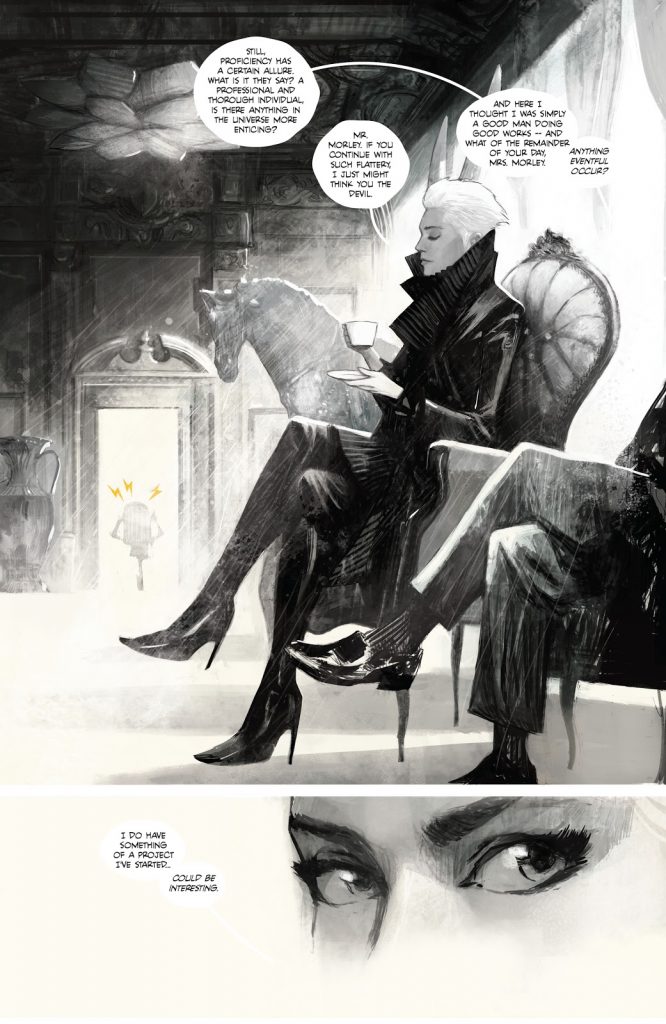
Last week, Mike Huddleston was named my Comic Artist of the Year, so this selection might have almost felt predestined. It’s hard for me to find a comic that has my favorite art of any given year and for it to not make my favorite comics of the year list. So the simplest reason Decorum makes my list is Mike Huddleston, plain and simple.
That said, to act as if that’s the only reason is diminishing to the rest of the team, each of whom has stamped their own mark on the greatness of this comic. Take Jonathan Hickman, who seemingly considered the work he was doing on the X-Men line and was like, “I need to take my creator-owned work to the next level” and delivered his most electric fusion of design pages and traditional comic story yet. Or Sasha E. Head, who nearly made my Creators of 2020 list for her design work on the title, helping bridge Hickman’s vision with Huddleston’s in the most gorgeous, immersive way possible. Or Rus Wooton’s pitch perfect lettering choices no matter what part of the story is taking place, matching Huddleston’s artistic choices and amplifying them all the way.
Let’s be clear: Decorum is at times a batshit crazy comic that easily could have not worked. But because it’s Huddleston and because it’s Hickman and because it’s Head and because it’s Wooton, 1 it doesn’t just work, it soars. Decorum is a comic unlike anything else out there, as well as the best looking comic on the stands. A lot of that is Mike Huddleston. But it takes a team to make it work as it does. And they’re all killers, even if they might not all be as well-mannered as the ones from the story itself.
The My Guys Award: The Dollhouse Family
Written by Mike Carey
Art by Peter Gross and Vince Locke
Colored by Cris Peter
Letters by Todd Klein
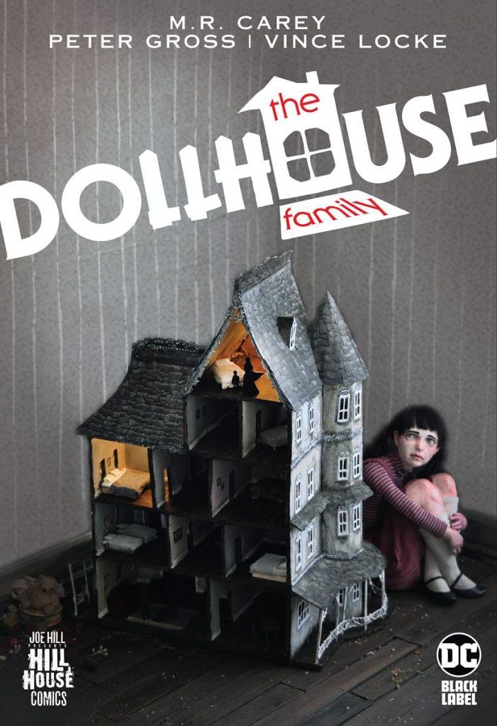
I wrote about this series at length earlier this year so I don’t want to reiterate too much about it, but The Dollhouse Family is one of my Comics of 2020 primarily because the duo at its head: Mike Carey and Peter Gross. Those two are my guys, a writer and an artist whose work strengthens the other and becomes one of the finest examples of the faux cartoonist concept in the process.
And The Dollhouse Family stands up well against their finest works together, as it captures the menace of The Highest House and the wonder of The Unwritten while still building everything off rich characters we easily invest ourselves in. It’s the most directly “horror” title I’ve read of theirs – yes, I have not read their Lucifer run because I am the world’s greatest monster – but it never loses the hallmarks we know them for, as the pair ably retrofits their style onto a haunting story about the curses families can carry with them at times, albeit in a much more specific way within this story.
This was the one Hill House title I knew I was going to be all about, as Carey and Gross always get a tryout from me at the very least. I’ve yet to be disappointed, and The Dollhouse Family certainly did not, especially with Vince Locke on finishes, Cris Peter on colors, and the immortal Todd Klein on letters, a murderer’s row of talents to work with the prodigious pair at the top. If you slept on this book and enjoy horror stories, I couldn’t recommend it more.
The Virtuoso Award: Don’t Go Without Me
Everything by Rosemary Valero-O’Connell
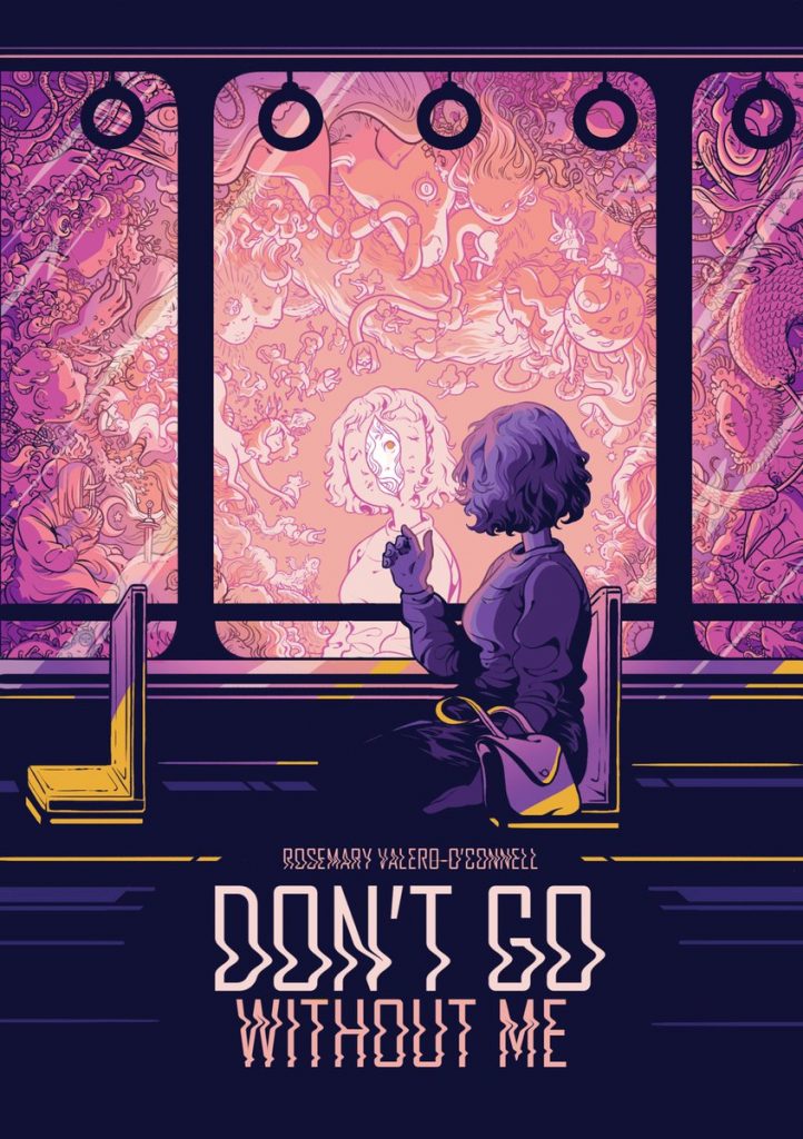
There are few greater talents in comics than Rosemary Valero-O’Connell. I know that’s hardly a radical take when it comes to someone who won an Eisner Award this year, but that’s an important starting point when we’re talking about a virtuoso. Most cartoonists tend to have some level of lean in where their talents lie, whether it’s character work or storytelling, idea generation or execution, or even just writing versus art. Valero-O’Connell is one of the rare examples of someone who excels at all facets of the craft, the cartoonist equivalent of a character who would have earned all sevens on the Marvel Universe trading card power ratings.
Those gifts are on display throughout Don’t Go Without Me, the cartoonist’s ShortBox graphic novel that collects a trio of stories – the titular tale, the rereleased “What Is left,” and the dreamy “Con Temor, Con Ternura” – into one gorgeous production. While this trio is remarkably different in subject matter and even execution, the throughline between each of them is Valero-O’Connell’s stunning art, thoughtful scripting, and, maybe more importantly than anything else, her insightful, wondrous perspective within these stories and themes.
There’s a lot in here about memory, and in a year where we’re all indoors, considering our lives and how we’ve gotten where we are, it all hits a little harder. But even without that, these potent odes pop in a way that makes each stand out. That’s because of Valero-O’Connell’s astonishing gifts as a cartoonist. Some sequences are genuinely breathtaking, alternatively in their visual beauty and emotional clarity (the close of the first story in particular is a perfect example of this), and the ceiling of this effort’s quality is about as high as anything else you could find in 2020.
I’d say Valero-O’Connell is one to watch, but we’re past that point already. She’s amongst the very best in the business, and Don’t Go Without Me is a perfect example of how it doesn’t matter what type of story she tackles, it’s going to be one that can’t be missed.
Bonus points go to the book’s production value, which includes gold foil on the cover. Yes, please. That doesn’t define the book, but it gives it a, let’s say…5% bump. I dig it.
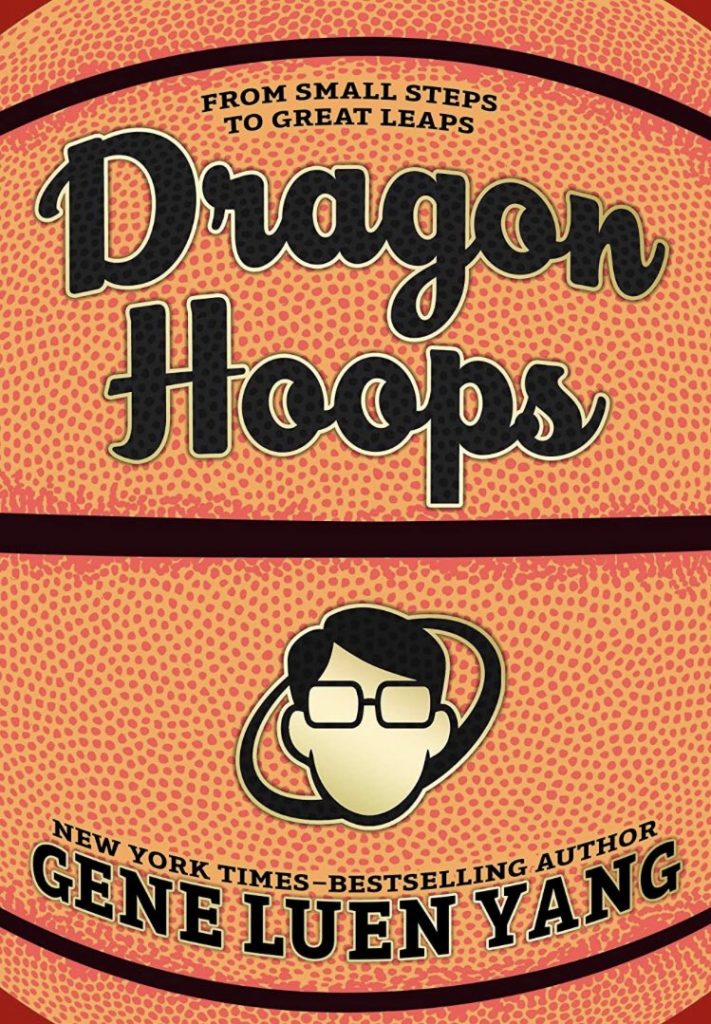
The “David” Comic of the Year Award: Dragon Hoops
Everything (besides coloring) by Gene Luen Yang
Colors by Lark Pien
While Dragon Hoops is not my outright Comic of the Year winner – it was close, though! – it does earn a special commendation for being the comic that most specifically feels like it was made for me. You see, there are two things I love about as much as anything from an entertainment standpoint. First, you have basketball, my favorite sport by a healthy margin. Second, you have the stories behind things, whether you’re talking about the history of basketball, why cartoonist Gene Luen Yang decided to focus on comics, or how a high school team made its way to its state championship.
Dragon Hoops somehow marries all of those things into one massive tome of glory, meaning it’s about as far up my alley as you can ask for out of a comic. That said, if it didn’t work, it wouldn’t make the cut. Seemingly fitting my style isn’t enough to earn a spot here. That it was also an impeccably crafted, remarkably charming, endlessly insightful, and highly entertaining read is what does that, as Yang spent years making this project what it is. That thought and care shows on each and every page, as Dragon Hoops is the finest work of the cartoonist’s career in my opinion, which is saying something because American Born Chinese and Boxers & Saints are about as good as you can ask for.
One other thing that makes it a top notch David book? Its production value. With a cover that looks and feels like a basketball as well as A+ paper quality, First Second went above and beyond in making sure this book looks and feels as good as it reads. It does that and then some. This is one of the finest comics of the year, regardless of its fit to my personal interests.
But that doesn’t hurt its case either!
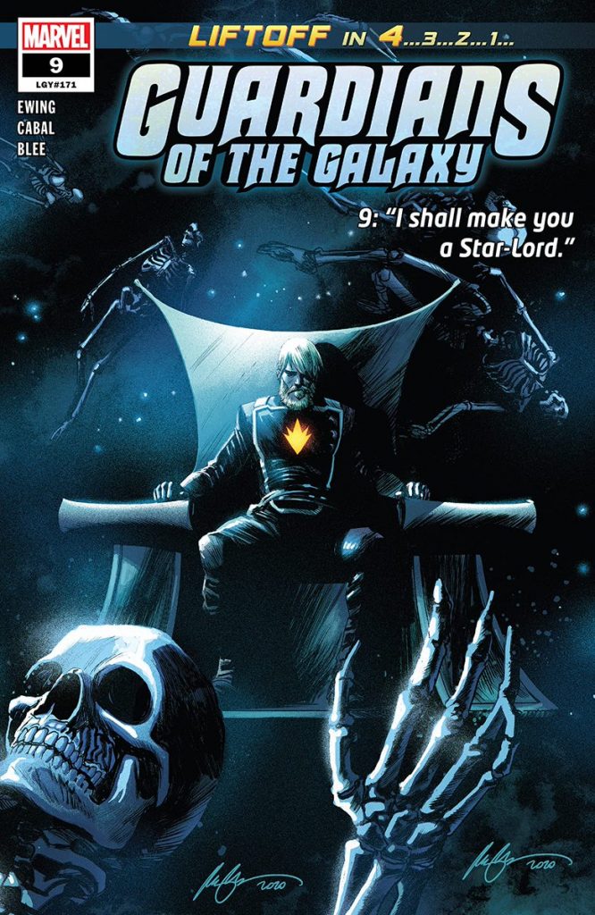
The DnA Award: Guardians of the Galaxy
Written by Al Ewing
Art by Juann Cabal, Marcio Takara, etc.
Colors by Federico Blee
Letters by Cory Petit
A huge part of this book’s success is Juann Cabal making the leap from “underrated Marvel artist” to “maybe one of Marvel’s two or three best artists.” Having that kind of talent on art makes a considerable difference, as it ensures that the story is competently told while still having enough juice to pop visually. There are sequences that Cabal draws – particularly in the second arc of the series when Noh-Varr is off on his own mission-within-the-mission – that are jaw-dropping both both their composition and execution. The man is a fierce talent, and one of the best superhero artists going today.
That said, the DnA that earn this title its award isn’t like the building blocks of life but Dan Abnett (D) and (n) Andy Lanning (A), aka the fathers of the modern Guardians of the Galaxy (this makes Keith Giffen their grandfather, by the way). They are the measuring stick upon which every Guardians run is compared to, and since their departure, we’ve largely seen the Guardians movie as the title’s guiding light rather than DnA, which has been a shame. The Guardians of the Galaxy succeeding as comic characters because of the verve and vision of the creative team that reinvigorated them before giving way to an imitation of the movie that closely followed DnA’s influence is a real bummer.
That inspiration returns here, though, as Al Ewing and Cabal have managed to recapture the spirit of DnA’s run while building on it. Ewing’s a master of using continuity as the, well, DNA from which everything builds from, and within this series he’s deftly used everything from Annihilation and Abnett/Lanning’s run with the Guardians to Star-Lord’s original iteration from before he was technically even in the Marvel universe. But it hasn’t been to impersonate anything. Instead, it has been purely to find new angles to their story, with it all culminating in the astonishing ninth issue of the series, which found Cabal and Ewing reattaching Star-Lord’s connection with the Master of the Sun, changing what we know about the character and his gifts in one fell swoop.
If anything defined DnA’s original run, it was their ability to recognize what worked about Marvel cosmic and to use that to find a new tomorrow. Everyone involved with this current Guardians run has taken that same idea on as a challenge and passed that test with flying colors. It’s brilliant, and one of Marvel’s very best titles.
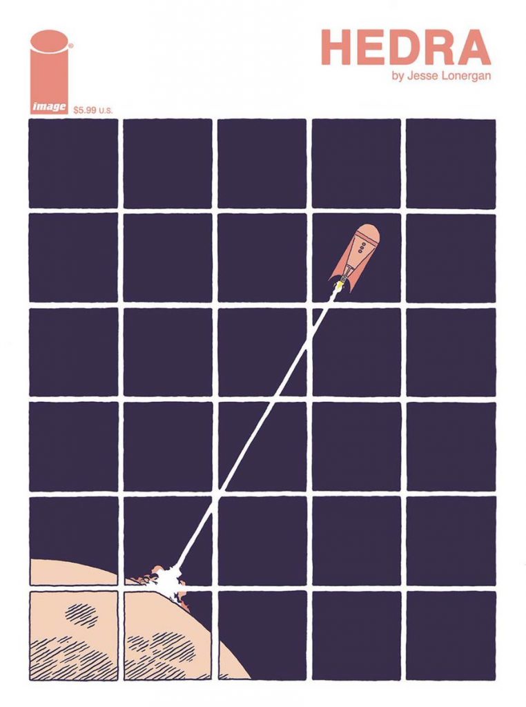
The “Do Your Own Thing” Award: Hedra
Everything by Jesse Lonergan
I like coming across a comic that feels new. Maybe it isn’t new, maybe it is, but if it at least feels that way, that’s a huge win in my book. And few comics felt newer to me than Jesse Lonergan’s Hedra, an Image Comics one-shot that, ironically, was kind of, sort of a reprint!
What felt new about Hedra was mostly a combination of things. The way Lonergan used a grid to do all kinds of things, some of which involved the passage of time but other times was utilized to play with space. How the comic was silent, but also not totally, with the language of comics being the one he spoke. Even the format, which was more like a magazine than a comic, but in a way the comic luxuriated in, using the space to better deploy the elements we’ve already spoke to. All of this together felt fresh, vital and exciting in a way comics often aren’t. It was like the difference between listening to a cover band and then hearing Girl Talk’s “Night Ripper” for the first time, turning something old into something new and thrilling instead of playing back the hits.
What it resulted in was an immersive, thoughtful, entertaining, and exemplary read, and one that helped make Lonergan one of my big standouts for the year (especially when paired with his other book this year in Planet Paradise, a near cut form this list). Hedra‘s a remarkable effort, and one that, I hope, garners the cartoonist a much more visible future going forward.
Here’s one bit about the book I wanted to note that I rarely see come up: it’s actually funny! Lonergan’s humor is subtle, but there’s madcap energy here, and the same elements I noted above elevate the comedy. I really dig that part of it, and it helps round out the whole affair.
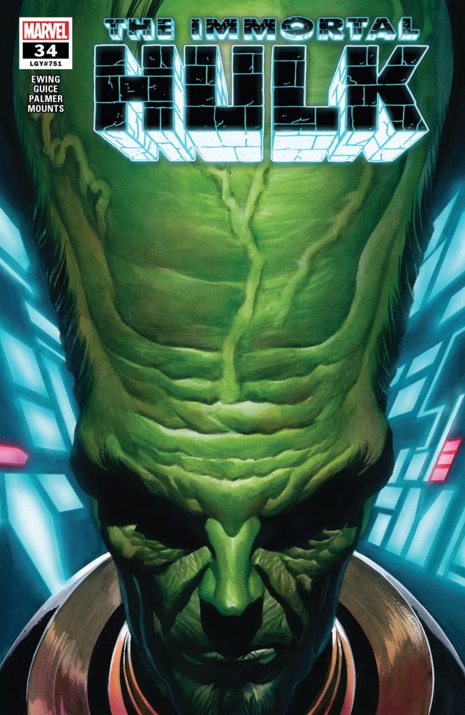
The Leader Award: Immortal Hulk
Written by Al Ewing
Art by Joe Bennett and Ruy Jose
Colored by Paul Mounts
Letters by Cory Petit
I would say that, if you polled the broader world of comic critics, the most well-liked ongoing series would be Immortal Hulk, and I don’t imagine it would be particularly close. It’s been going for just over two years now – which we honestly don’t talk about enough, as that means we’ve gotten 41 issues (as well as several one-shots tying in to some degree) – and almost since it debuted I’d say it was Marvel’s most beloved book. For good reason: it’s absolutely incredible, with Al Ewing and Joe Bennett turning a solid start into a modern classic. That’s why it’s the leader here, because that’s what it is for Marvel’s line.
But also, if anything defined 2020 for the series it was the ascent of The Leader as the man behind the curtain, the one who was pulling Banner’s strings and making things bad for him. The pinnacle of the book for me this year – because I’m a mad man, as I’ve largely been the only one I’ve seen tout this issue as much – was #34, which laid out The Leader’s life and how he got from where he started to where he is now, running the Hulk’s life and dominating the world of gamma in the way few have. That’s been a fascinating wrinkle to add to the mix, because it’s given us a third act turn that, in some ways, set the tone for the totality of the run.
Because my awards know no bounds, just like The Leader in Banner’s head, I do want to tout one other leader-related angle: the fact that Immortal Hulk has become a brand unto itself. The concept works across creative teams – Jeff Lemire and Mike Del Mundo did work in Immortal Hulk: The Threshing Place and Declan Shalvey’s going to blow people away with Immortal Hulk: Flatline – and connected titles, whether you’re talking Immortal She-Hulk or King in Black: Immortal Hulk. It’s a transmutable idea, one that can be applied elsewhere with little magic rubbing off, at all. It’s a heck of a thing, but representative of how the idea behind Immortal Hulk is so solid at the core it translates no matter where you put it.
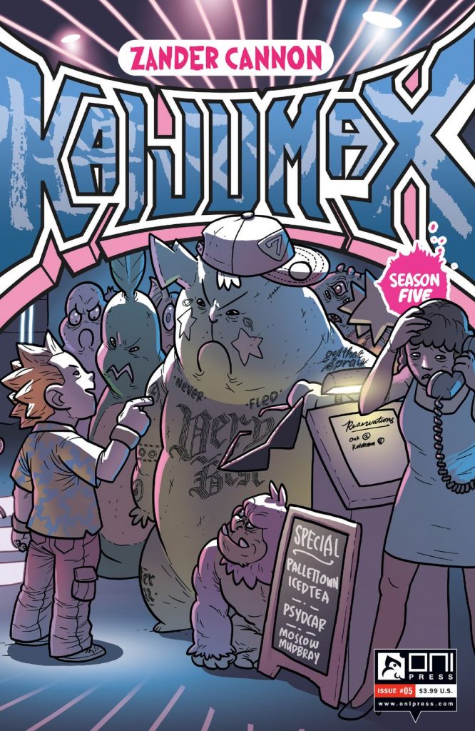
The Apex Mountain Award: Kaijumax
Everything by Zander Cannon
Color Assists by Jason Fischer
Apex Mountain is an idea introduced by The Ringer’s Rewatchables podcast, and it’s an award they give out that’s simultaneously obvious in its distinction and completely undefined. The gist of it, though, is it’s identifying the individual within a specific movie that reached their own peak within the film they’re talking about, although the definition is often subjective and even arbitrary to outsiders.
We’re going to be rolling with all definitions of that phrase here, because I believe Kaijumax, Zander Cannon’s remarkable Oni Press series, qualifies for at least two different definitions of the phrase this year.
First, it’s Apex Mountain because it’s my opinion that the series continues to hold its place as the best ongoing series in comics, albeit in a relatively quiet year for the series with just five issues over its calendar year. While many ongoings produce more, Kaijumax has the rare distinction of being the one continuing series that is undeniably all killer and no filler since day one. I’d take quality over quantity any day of the week, and Kaijumax is all about that.
Second, it’s Apex Mountain because I could make a very strong argument that the most recent issue, the fifth entry in its current fifth season, was Kaijumax‘s finest yet. That is a high, high standard to live up to, but the fact that Cannon turned a character that otherwise could have been a joke – Pikadon, a mafia boss that, for all intents and purposes, is a gigantic green Pikachu – into a single character representation of the complexity and tragedy of the prison-industrial complex and the lives of criminals themselves…well, that’s astonishing.
There’s a lot more to that series and that issue than just what I’ve written, but the thing that amazes me about Kaijumax each year is how it never ceases to find ways to surprise me, finding higher heights in places I couldn’t have imagined otherwise. Its Apex Mountain, in that regard, is whatever comes next. That’s what Zander Cannon has been giving us for years now, and I’ve come to expect that out of him. I’m sure 2021 will be the same, even if I have no idea where we’re headed in the future.
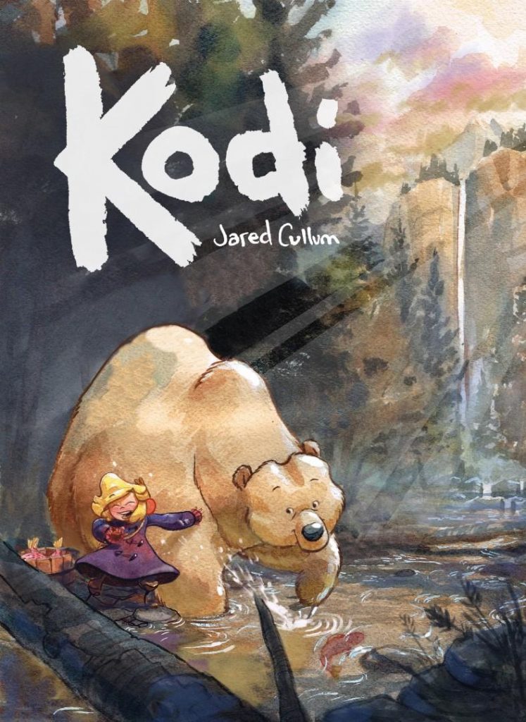
The Heartwarmer Award: Kodi
Everything by Jared Cullum
Let’s start with the obvious: I am an absolute sucker for watercolors. You have watercolor art, you’re winning a whole lot of the battle already because I just adore watercolors if used properly. And my word, can Jared Cullum use watercolors. The cartoonist is a remarkable artist, giving each character such life and vitality from the jump – I mean just look at that cover – while realizing it in such an idyllic fashion thanks to his deft hand at watercolors.
But that’s not the reason Kodi made the list. This Top Shelf graphic novel tells the story of a young girl, Katya, and an injured bear, Kodi, she discovers near her home in Alaska (!!). When she aids the animal, it leads to a rare friendship for Katya, something that was all too rare for her in her youth. But when she and her Meema quickly have to move, she has to say goodbye to Kodi, which isn’t good enough for the bear, who follows her down to Seattle in a quest to rejoin his best friend. This is an all-ages story, and one that features a silent co-lead. That could be a tough sell to some. But let me say this: Kodi is the perfect balm to the 2020 of it all, as its story of friendship across great distances would melt the iciest of hearts.
A lot of that comes from Cullum’s aforementioned gifts. He’s a smart storyteller, someone who feels as if his sensibilities are rooted in names that bridged the gap between comics and animation like Hayao Miyazaki. But this is pure comics here, as Cullum delivers a story that thrives in the medium and wears its heart on its sleeve throughout. If you’re looking for a comic that will bring a smile to your face and maybe a small (happy!) tear to your eye, Kodi is where it’s at. It’s an absolute delight of a graphic novel.
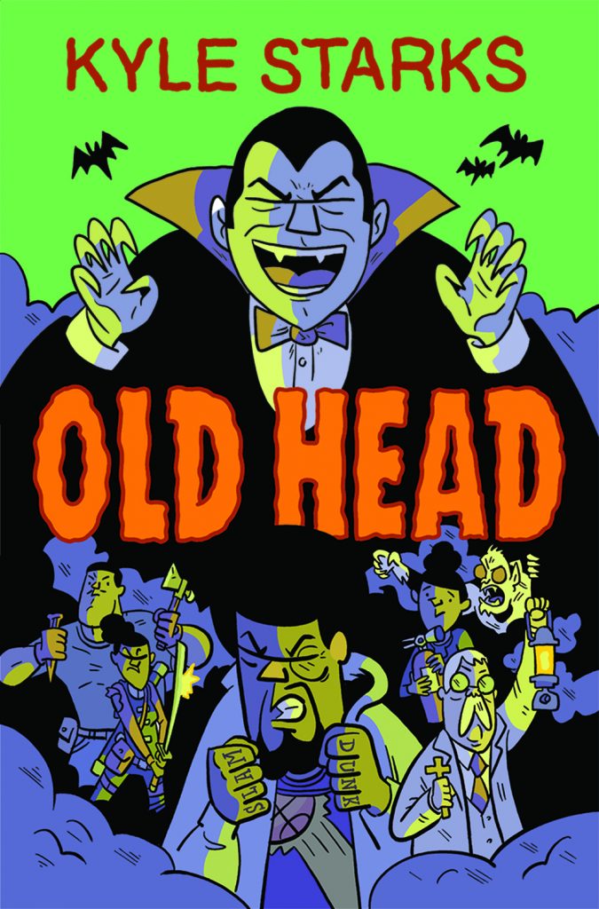
The Funny Book Award: Karate Prom/Old Head
Everything by Kyle Starks
Comics are often called “funny books,” but you know what? They’re often not very funny! In fact, they’re often dreadfully serious at times! Now, while I enjoy my fair share of dreadfully serious things, sometimes I’m just looking for a good laugh and a rollicking good time. And few are better at that than cartoonist Kyle Starks, whose Kickstarter-fueled hoops-and-vampires graphic novel Old Head and Free Comic Book Day prompt comic Karate Prom (which…is exactly what it sounds like) are arguably the two funniest comics of the year.
Now, part of that is driven by how my own loves overlap a lot with Starks’ interests. A beat like lead Nash Gliven Jr. crossing up a monster – while dribbling Dracula’s head, of all things – and breaking said monster’s ankle in the process is the kind of joke that speaks very, very specifically to me. But Starks always thrives on leveraging his interests in universal ways to bring entertainment and joy to readers, whether it’s his love of 80s action comedies or hoops.
And these are two of his very finest works, even if one was a release he made with the turbo button firmly pressed down. I think that’s part of the charm of Starks’ work. He’s a tremendous storyteller, with the cartoonist innately understanding how to make each beat work, but there’s a spontaneity and devil may care attitude about all of it that just pops. His work almost feels improvisational at times, and like the best improv comics, Starks hits more than he doesn’t. That happened twice this year with Old Head and Karate Prom, as both truly are funny books.
By the way, Karate Prom is pay-what-you-want on Gumroad. There’s really no reason you shouldn’t get on that, although come on, throw the guy a few bucks. He’s a killer and deserves your support.
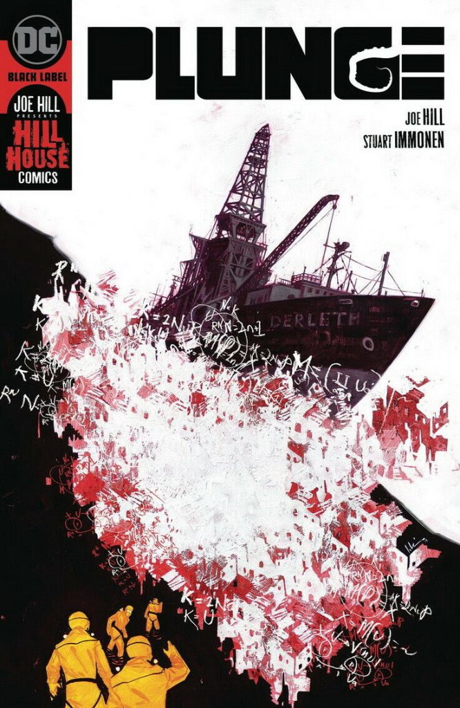
The IMMMMMONNENNNNNNNNNNN Award: Plunge
Written by Joe Hill
Art by Stuart Immonen
Colored by Dave Stewart
Letters by Deron Bennett
Plunge is a lot of things.
It’s a great comic! Throughout, the craft and competency on it is tremendous, resulting in a scary, thoughtful read with an easy-to-connect-to cast and top notch villains.
It’s a unique comic! It has a lot of hallmarks of other kinds of stories, but this feels more similar to a tale like The Thing or the good Alien movies than any of its peers. Pair that with its finite nature, and you have a tight title that stands on its own.
It’s a rare comic set in Anchorage, Alaska, at least for a time! I’d say that this didn’t count in my book as a plus, but I’d be lying. Any time Alaska shows up, I immediately turn into Leo pointing in Once Upon a Time in…Hollywood.
But more than that, as you might have guessed based off the award I gave it, it’s a Stuart Immonen comic. Immonen is my favorite comic artist, probably ever, and him doing this book was the biggest draw. He did not disappoint, as his art was gorgeous throughout, ably capturing the interpersonal moments and staggeringly large ones with equal skill. There are some moments that are so massive, and others that are so intimate – I particularly enjoy the scene around the fire in the opening issue – and somehow Immonen is equally gifted at delivering both.
I don’t even know how to describe his style within this series, as it is sort of like his Marvel look fused with his Rockwellian vibes from Superman: Secret Identity, but, you know, with Dave Stewart coloring him. So it’s beautiful throughout. OH. And it’s Stuart inking himself, a rare treat, given that Wade von Grawbadger had inked him on basically everything since…maybe Secret Identity? I’m definitely forgetting something.
But yeah, Plunge is a great comic, but maybe more importantly to yours truly, it’s a Stuart Immonen comic. That makes a substantial difference to me.
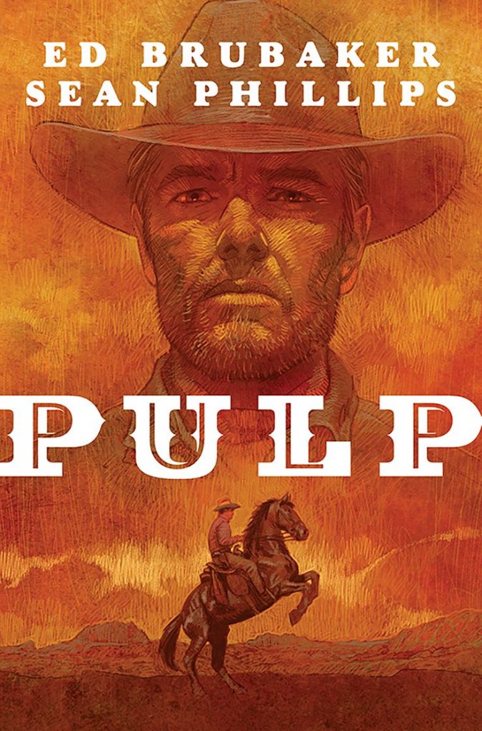
The Brubaker and Phillips Honorary Award: Pulp
Written by Ed Brubaker
Art and lettering by Sean Phillips
Colored by Jacob Phillips
I remember once facetiously suggesting that the Eisner Awards should rename the Best Colorist award after Dave Stewart and then omit him from future consideration. It wasn’t because Stewart is bad at what he does. Quite the contrary, in fact. It’s because he’s so good you could just write him in every year, like he was Tom Hanks in the mid 1990s for the Oscars. That’s basically the case for Ed Brubaker and Sean Phillips as well, except it’s for The SKTCHD AWRDS and how they will always have at least one book in my comics of the year.
That, again, is the case, as Pulp made the cut for its exemplary version of the Ed and Sean Comics form. The graphic novella format agrees with them nicely, and this tight, taut story really popped in a way that’s even above average for them. The fact it all felt rather timely – who expected Nazis would be back in the news…ever? – added even more to its impact, as it made the whole book feel all the more urgent and prescient.
But I don’t need to tell you all of this. You know Brubaker and Phillips are going to be elite, because that’s what they do. So instead of writing more about Pulp, I just wanted to say this: this very well may have been the best year the pair has had! They produced a ton of comics – the first volume of Reckless as well as an array of Criminal related releases and even work on the most recent Martini Edition of Darwyn Cooke’s Parker series – all of which seemed to hit and hit hard with readers. That they went renegade, changing formats and reinventing the way they do things, in the process makes it all the more impressive. Heck of a year for Brubaker and Phillips.
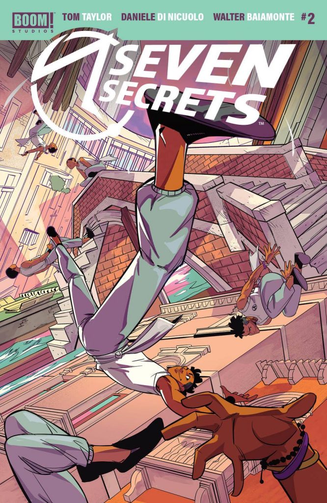
The Shonen Jump Off Award: Seven Secrets
Written by Tom Taylor
Art by Daniele Di Nicuolo
Colored by Walter Baiamonte
Letters by Ed Dukeshire
Shonen Jump, as you may or may not, know is a weekly manga anthology that collects serialized comic stories aimed at young men that are part action and part comedy. It’s a whole vibe, that shonen world, and one that’s kind of sort of underrepresented in the Western comics market, save for translations of shonen manga themselves.
Maybe that’s why Seven Secrets, Tom Taylor and Daniele Di Nicuolo’s fizzy blast of a series, feels so refreshing. It’s nothing new for the broader idea of comics – although its story is a delight of untread territory – but its energy and vibe are atypical for the western comics market. It follows a young man named Caspar as he follows in his parents’ footsteps as part of a secret organization who prevent the end of the world by protecting its seven secrets – just as a rival organization comes for the secrets – having been raised by the organization itself because his parents were rule breakers in having him. The story itself is fun, as it introduces us to all kinds of interesting characters, but it’s really all about the energy, as it has a Lupin III (particularly The Castle of Cagliostro) like sense of perpetual motion to it.
Taylor is obviously a boss, but a whole lot of that comes from Di Nicuolo, one of the true revelations of the year. When paired with colorist Walter Baiamonte on colors, it’s staggering to see the joy and life that comes onto the page. There’s something about that combination that amplifies one another in only the best ways, creating an idealized version of the story. Every once in a while there’s a creative team that just feels like they were meant to work together, and this squad is one of those. It’s great to see, and surprisingly common from BOOM!’s editorial team, who always seems to matchmake with the best of them.
Back to the point, though: if you’re looking for a fun, action-packed story with memorable characters, Seven Secrets has it going on. This is your shonen jump off, if you will, and a great place to start in that world if you’ve never dug in, even if it’s a western comics version of the idea.
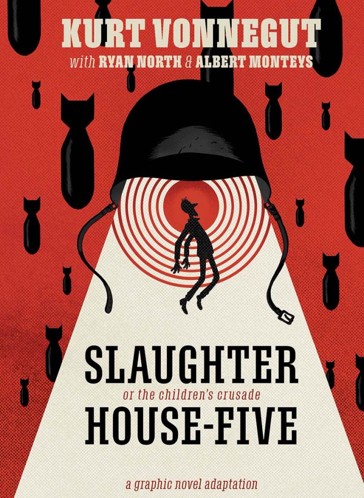
The Comic of the Year Award: Slaughterhouse-Five
Written by Ryan North
Everything else by Albert Monteys
As soon as I finished Ryan North and Albert Monteys’ adaptation of Kurt Vonnegut’s Slaughterhouse-Five, I knew it was my comic of the year. Now, there was always the possibility that something else could sneak in there, stealing the spot unexpectedly. But I loved this book so much it seemed preposterously unlikely.
Sure enough, I was right!
So why is it my comic of the year? Well, there are a lot of reasons. First off, it’s hard to go wrong with the base. If Slaughterhouse-Five is your starting point, you have a sizable head start. But one thing that really struck me as I read it – and I know this is borderline blasphemy – was that this story felt like it was perfectly made for the comic book format. It’s all about playing with time and space, as lead Billy Pilgrim becomes unstuck in time, and there are few formats that are more agile at dealing with those two variables than comics. And my god, North and Monteys slay at working with those concepts, using layouts, colors, and when to let the art talk instead of words to make beats hit harder.
It’s honestly a staggering achievement, a true wonder of comics experience, seeing how they deftly tell this story. I recently recorded a podcast with North about the book for Off Panel – coming soon! – and throughout, it was basically me repeatedly complimenting something he did or Albert did and Ryan being like, “I know, right?!” That was one of the fascinating revelations of that chat, as North suggested it was the first work of his career he could almost appreciate as an outsider, as his focus was all about on doing Vonnegut right as a longtime fan of his work.
The pair definitely did that here, as they managed to pair to turn this well-crafted, beautiful tome about loss and pain and cost and life and all kinds of other things into something truly wonderful and unexpected: the finest version of one of the most beloved novels of all-time. It’s a hell of a thing.
Also, in case I didn’t convey this last week, Monteys was on one here. The cartoonist was a beloved talent already, but his work – the art, colors and lettering – is one of the finest artistic performances in recent memory. I don’t say that lightly, but it’s well deserved acclaim if you ask me.
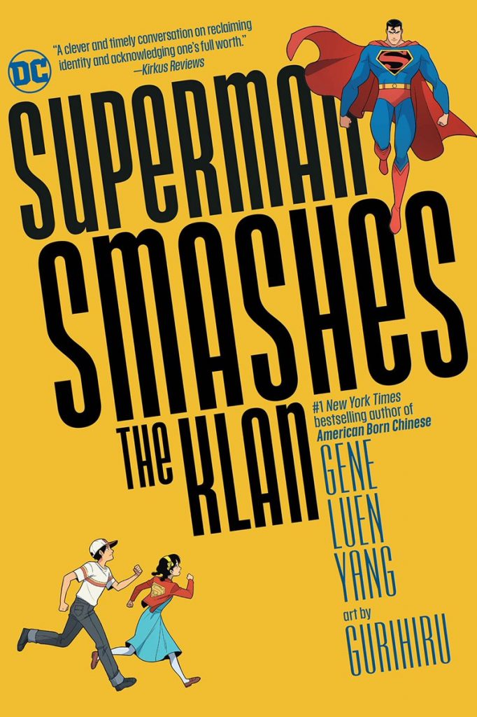
The Sense of Wonder Award: Superman Smashes the Klan
Written by Gene Luen Yang
Art and colors by Gurihiru
Letters by Janice Chiang
There are a whole lot of delightful things about Superman Smashes the Klan, Gene Luen Yang and Gurihiru’s adaptation of the 1940s radio serial with the same name. Yang’s wondrous characterization. Gurihiru’s endlessly delightful art. Chiang’s pitch perfect colors. This comic is so enjoyable and immersive that very little doesn’t strike the right chord here.
But the thing I love about it is how it simultaneously maximizes the sense of wonder of superhero stories and grounds them in the lives of everyday people. The biggest thrill throughout is seeing how heroism can truly come from anyone, whether it’s lead Lan-Shin “Roberta” Lee and Jimmy Olsen trying to save the day or collaborating with Superman and Lois Lane to get the job done. There’s an innate goodness at the heart of Superman Smashes the Klan, underlining how no matter where you come from or who you are, humanity comes from your actions as much as your place of origin.
Like with Pulp before, you would hope this was the kind of thing we had long ago figured out – Nazis are bad and hating people for where they’re from is too – but we clearly have not. And reading a story like this, especially with a paragon like Superman grappling with his own place of origin within, leads to something that hits harder even as our hearts soar because of the delivery. I loved this book – honestly, I want Yang and Gurihiru to work together forever – and it was, without a doubt, my superhero comic of the year. I wish more were like it, to be honest!
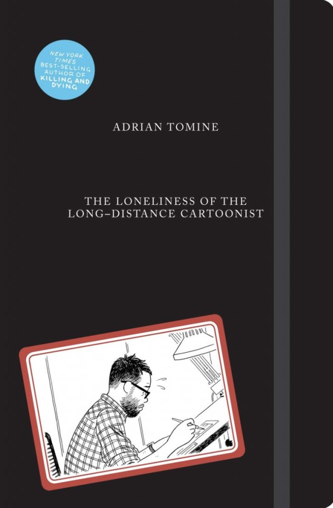
The Pagliacci Award: The Loneliness of the Long-Distance Cartoonist
Everything by Adrian Tomine
You might be familiar with the story of great clown Pagliacci’s visit to the doctor. It’s sort of a famous moment in comic book history, as Rorschach from Alan Moore and Dave Gibbons’ Watchmen does his weird thing and delivered an iconic beat in the history of fiction. I love the duality of that moment, and how great humor can come out of those who also can contain great sadness.
Now, I’m not saying Adrian Tomine is a super bummed out guy, but in The Loneliness of the Long-Distance Cartoonist, the beloved cartoonist himself is our very own comic book Pagliacci, telling self-deprecating tale after self-deprecating tale from his own life about the blurred line between hilarity and sadness. It’s an autobiographical graphic novel from Tomine’s life and career, and throughout its totality, it contains a litany of laugh out loud moments built into the tales of torment of a comic book creator.
Each chapter of the book is a different moment from the cartoonist’s life, as he shares beats from his childhood all the way to the fear of health problems hitting him after he became a father. And while it’s simultaneously deeply funny and insightful into the pain that comes with making comics for a living, the thing I appreciated the most about the book is its ending. I don’t want to spoil it, but the way Tomine concludes the story threads the needle and reminds each reader why someone creative keeps pushing through the challenges that present themselves, no matter the hardship that comes with.
Tomine has always been a fascinating storyteller for his rare ability to layer so much into a single story, and perhaps unexpectedly, he found his greatest muse yet in himself, even if, like Pagliacci, he can’t share in the joy.
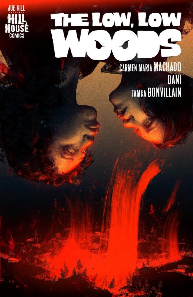
The Paper Girls Award: The Low, Low Woods
Written by Carmen Maria Machado
Art by Dani
Colors by Tamra Bonvillain
The first thing I thought of when I started to read The Low, Low Woods, the final – I swear! – Hill House release on this list, was Brian K. Vaughan and Cliff Chiang’s Paper Girls. The comparison is obvious. Early on in the book, it’s a pair of young women who seem mature beyond their age traveling by bicycle. It’s not exactly a stretch to make that comparison.
Beyond that element and those girls finding themselves in an extraordinary situation, though, the comparison isn’t the best. They’re very different stories. But the thing that does overlap between the two books is a) their uniform quality, as both comics are tremendous, fantastical tales about young women being put in positions few their age should have to deal with and b) the fact that, relative to their peers, they might have been slept on (in Paper Girls‘ case, that means compared to Saga, and for The Low, Low Woods, I mean the rest of the Hill House line).
That’s definitely the case for The Low, Low Woods. As I was diligently reading comics to get my final list together, it took a tweet from Black Label editor Chris Conroy – who said he adored this book – for me to make sure to take time to check it out before I made any final judgment calls. I’m glad I did. It ended up being a heartening gut punch of a read, with leads El and Octavia being thoughtful, impulsive, and endearing guides to it.
Carmen Maria Machado, who I don’t believe had written a comic before, took the medium quite adeptly, crafting winning leads and an engaging story out of a small, rural Pennsylvania town. It helped that she had able partners in Dani and one of my Creators of 2020 as the colorist in Tamra Bonvillain, ensuring that the story is executed in the best possible way visually. It’s a comic that is more than the sum of its parts, even if its parts are very good to begin with, and one that proved to be every bit as good as the others in the Hill House line. Given the competition, that’s really saying something.
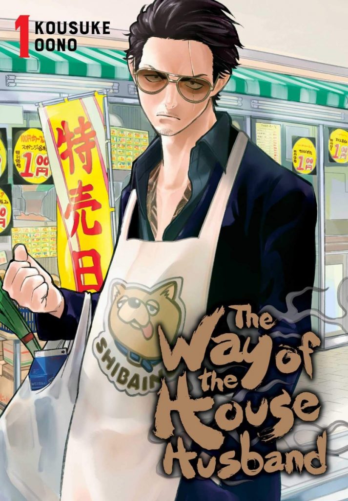
The Mileage Award: The Way of the Househusband
Everything by Kousuke Oono
Kousuke Oono’s The Way of the Househusband really shouldn’t work as well as it does. It has a marvelous concept – what if a Yakuza boss became a househusband and lived his domestic life with the same intensity and skill? – and the highly episodic structure of anthology manga fits it beautifully. But at a certain point, a comedy book designed around flavor should tire, no matter what the flavor is.
And yet, it does.
That’s why this comic gets The Mileage Award. Oono’s ability to both conceptualize and then execute new iterations of this idea entry after entry is genuinely astonishing. Whether it’s via his writing or his visual manifestation of those ideas and moments, Oono routinely takes a great idea and elevates it, chapter after chapter, book after book. Saying this about the 2020 winner of the Eisner for Best Humor Publication means I’m not exactly taking a bold stance here. But, hey, what can I say? The Eisners have great taste sometimes!
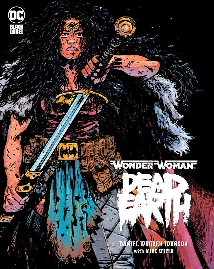
The Big Badaboom Award: Wonder Woman: Dead Earth
Writing and art by Daniel Warren Johnson
Colors by Mike Spicer
Letters by Rus Wooton
Let’s get this out of the way: Daniel Warren Johnson is good at everything. He’s a remarkably gifted comic book storyteller, and that manifests itself in every way it could. But if I’m being honest – if we’re being honest, he says to the world – DWJ is the beast that he is because of the big badaboom he brings to the table. What’s the big badaboom? It’s every moment where Johnson delivers a moment that leaves you thinking, “holy shit.”
Diana versus Superman? That’s a big badaboom. Cheetah showing up on Pegasus to save the day? That’s a big badaboom. The Batcave reveal? Big. Bada. Boom. No one does the big badaboom like DWJ does, and throughout Wonder Woman: Dead Earth – a heck of a comic that shows the super and humanity of Wonder Woman with equal adeptness – we’re given a sea of opportunities to drink those moments in. That it’s all told on oversized, glorious paper stock makes it all the better.
Wonder Woman: Dead Earth is a great comic, but more than that, it’s a big one. That’s what makes it such a stand out this year, and unlike anything else in its vein.
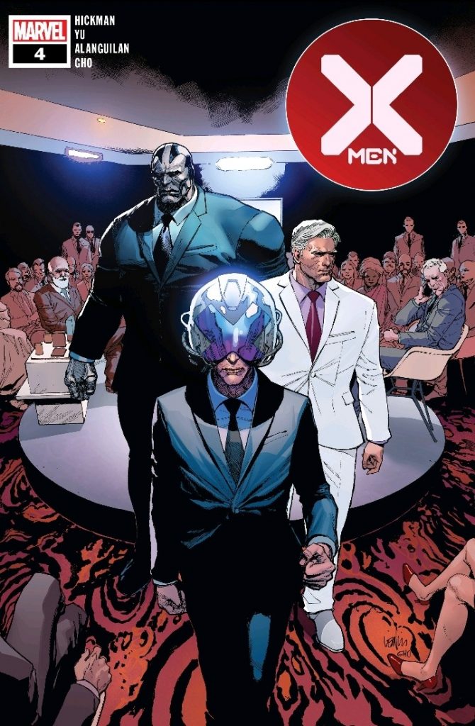
The Tourist Award: X-Men
Written by Jonathan Hickman
Art by Leinil Yu, Mahmud Asrar, and friends
Colored by Sunny Gho
Letters by Clayton Cowles
There’s a whole lot to love about the flagship X-Men book. I’ve talked a lot in the past about how much I enjoy its perpetual one-shot nature, as it drops in on specific stories and gives us a snapshot of a certain side of the world from Jonathan Hickman and, typically, Cyclops’ point-of-view. That allows us a window into this world, whether it’s how humans have reacted to the Krakoa of it all, Mystique’s continuing rage, The Crucible, intergalactic fun, or anything else. It’s the flagship book, but it doesn’t behave like one, as it’s like the NFL RedZone of X-Men comics: only delivering bangers instead of the full story.
That’s why it gets The Tourist Award. I appreciate how this title is used to range from place to place, character to character, idea to idea, all to better show what’s going on in the bigger picture even if we don’t get all of the details. It’s a fascinating way to use a book like this, but I dig it. It gives everything else a spine to bump up against, story points from which others can jump off to and build on. That’s a very cool way to build a book, and it has resulted in a unique and exciting read.
Plus: great art throughout! While Leinil Yu’s time on the title has run its course, Mahmud Asrar has proven himself as an equally adept regular artist, and it seems as if that will be the case going forward. Yes, Brett Booth will be stepping in for an issue – I’d wager that’s for a much more story-driven reason than we might imagine, though – but I’d wager we see a lot more of Asrar and other, similar artists than we do of him on the main book in the future.
This is a great book. It’s a unique book. And I’m guessing it will continue to be a good looking one as well. That suggests that 2021 will be every bit as good and as impactful as 2020 was for X-Men, which means it might find itself here once again next year.
Really messing up that H theme, Rus!↩
