
The Art of Photo Reference: Phillip Sevy Takes Us Behind the Scenes of the Making of Triage
This week’s feature is a guest piece from artist Phillip Sevy, whose new Dark Horse series Triage debuts tomorrow, Wednesday, September 4th, as Sevy takes us deep into how he as an artist uses photo reference to improve his artwork. It’s a fascinating – and amusing! – look into the world of artists, and how photo reference can be used to aid artists without losing any of its organic feel. So without further ado, take it away, Phil!
After some great discussion on Twitter and elsewhere, we thought it would be fun to take a peek behind the curtain of comic art as it relates to photo reference. It’s a misconception that using photo reference is “cheating” or “lazy” or “bad” – an idea that often plagues art school students and artists early in their careers. For those of us in the trenches – and having been there for a while – we know how helpful/lifesaving/timesaving reference can be. I’ve taught comic art to students for quite a few years now and I always tell them “Your brain is not designed to be able to remember how to draw every little thing you’ve ever seen – USE REFERENCE.”
Now, that can mean a lot of different things – photos, 3D models, toys, statues, friends and family – but let me show you how I’ve been using reference as I’ve been drawing my new Dark Horse book Triage.
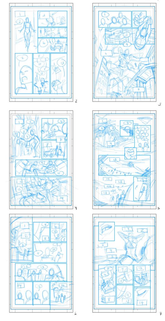
Step 1: Layouts
My mantra for reference is “Use the tools, don’t let them use you.” For me, the most important element of that is found in my layouts. They’re not as tight or detailed as many (I’m looking at you, Marc Laming – you could literally just publish your layouts), but they have all the essential elements figured out – panel arrangement, figure placement, balloon placement, perspective, shot choices, and minor character acting. I’m getting everything down on paper that I need to in order to draw the pages. To me, this is where a comic is created. Pencils, inks, colors are just window dressing I do over my layouts. These are the guides that I use to find my reference instead of finding great reference first and trying to retrofit it into my pages.
Step 2: The Reference
For Triage, I have three main reference steps on my pages. I’ll talk mostly about the first two here, but show you what step three is towards the end.
3D reference: If I’m going to be drawing an environment for more than a page or so, I’ll often create it in 3D (a combination of building it new, using an existing model, or kitbashing some together). Usually SketchUp, but I’ve been using Blender more and more for this book. Once I have my environment built, I match the camera and lens focal length to match my layouts. I export the line art of the model and drop it into my page.
Photo Reference: here’s where things get silly, but super valuable. I’ll grab my iPhone (usually) and a Gorilla Pod bendable tripod and set up my camera to match the angle/shot of the panel I want. Setting the camera to time mode, I’ll run in front of it and act out each character. Before I hit the button, I try and get the line/emotion into my head as much as I can, so I can act it out as best as I can. I use my photos as not only body language reference, but also (and especially) for facial expressions. I’ll act out each character in the scene, snapping a shot for each one.
From there, I’ll use my Messenger app to drop the photos from my phone to my computer (and this has only ONCE resulted in my dropping lots of stupid shirtless reference photos to a nice neighbor lady instead of to MY account). I download them and then throw them into Clip Studio Paint (the program where I do all my pencils).
Average human bodies do not have the same proportions as comic book bodies (See Andrew Loomis’ “Figure Drawing for All Its Worth” for more information on idealized proportions), so I usually make some adjustments to the photos before dropping them into the page. I’ll always shrink down heads. I’ll have to adjust the foreshortening of objects closer to the camera usually as well. iPhones have a set focal length on their lenses that can cause distortion for objects up close.
There are times where I need/want a specific reference that I can’t provide, so I’ll do some internet searching. Google Images, Deviant Art, and Pinterest are my go to’s.
After adjustments, I’ll copy, paste, and arrange the photos into my digital page. Once I have all my reference, I’ll knock the opacity way down and use them as a “Roughs” layer – a place to start my pencils with.
As I’ve shared images of my reference layers and process, I’ve had a few other artists say that it’s way too time consuming, but, in truth, I can do all of this in an hour or less (3D models and photos). Once you do it a few times, it gets really fast.
Now, reference isn’t required and I don’t look down on people who don’t use it. The more abstracted and cartoony your style, the less need you have for it. The closer to realism you tend, it’s going to help you get the natural subtleties that are hard to nail from your imagination.
I also tend to eschew reference to more dynamic/action packed images. It’s hard to get a picture of yourself flying, kicking, or jumping. If you’re holding still – pretending – the image is going to look stiff and dead. If you’re in motion, good luck getting that captured at the right moment or in focus.
subscribers only.
Learn more about what you get with a subscription