The SKTCHD AWRDS: The Creators of 2019
After five straight days of creator-centric awards, I wanted to wrap everything up and collect it all in one massive article. The SKTCHD AWRDS highlighting the creators of 2019 in my eyes can be found all in one place below, with a tour through my favorite writers, artists, cartoonists, colorists, letterer and even one editor that snuck in there out of nowhere. It’s a deep dive into the people whose work moved me the most this year, even if it’s nowhere near to all-encompassing.
I’ll be back next week with my comics of the year, before the year closes out with the decade list to end all decade lists. There’s a whole lot more coming, folks, and that’s saying something.
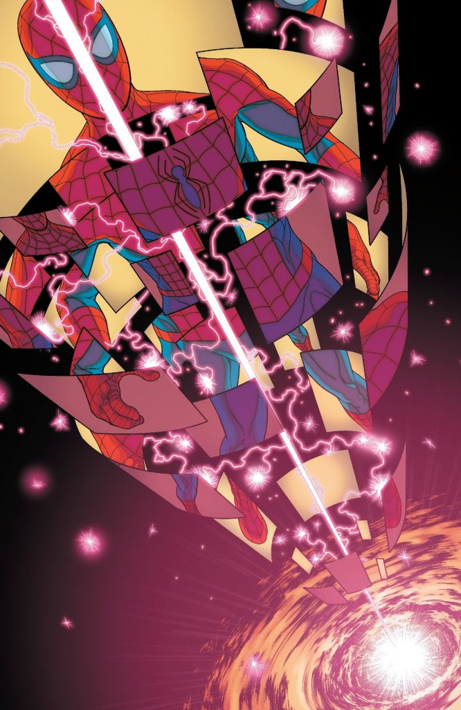
The Young-ish Gun-ish Award: Juann Cabal (Friendly Neighborhood Spider-Man)
Marvel loves its “Young Guns,” or the artists that are seemingly relatively newer that are doing exciting work, which allows the publisher to tout these exciting talents as just that: young guns. Whether or not they’re young is uncertain, or at least not clarified. 1 Perhaps the most exciting “newer” artistic voice at Marvel right now, though, is Juann Cabal, someone who earned himself a whole lot of fans with All-New Wolverine and then continued to kill it when he collaborated with writer Tom Taylor on a bigger book in the new Friendly Neighborhood Spider-Man series.
Cabal’s art is everything you want from a superhero artist. Is he a good storyteller? One of the absolute best, with page layouts is both simple yet wondrously clever. Does he bring good energy to the page? His art buzzes and bustles like few do, all without feeling unnecessarily lively. Is he good at bringing characters to life? You better believe it, and it works whether it’s Spider-Man, Spider-Bite or even unaffiliated, unrelated non-Spider characters.
The guy is a heck of a talent, and someone whose inventiveness allowed Taylor to bring whole new locales to life in that book in believable, exciting ways. Next year looks even more promising, as Cabal and writer Al Ewing are teaming up for a new Guardians of the Galaxy book. Cabal’s star will continue to rise, and while I’m unsure of his age or whether or not he is in fact a firearm, he’s a young-ish gun-ish to me, and one of the absolute best at the House of Ideas today.

The Next Big Thing Award: Jamal Campbell (Naomi, Far Sector)
Campbell is an artist who is so good right from my first experience with him that I was certain I had to have missed a whole lot of his work. But when browsing through his ComicBookDB page, I found a career that was largely focused on covers of titles I wasn’t reading or one-off interiors here or there that came and went. Seemingly, his longest run on interiors before this year was on a Prowler series at Marvel from 2016 in which he was the artist of all six issues. He was an artist who was waiting for the right book, and he sure got it this year. Twice!
Campbell first did interiors for all six issues of Wonder Comics’ largest hit, Naomi, and then launched Far Sector at Young Animal with author N.K. Jemisin. No matter the project, Campbell’s art was astonishing in every way it could be, with his linework, colors, layouts and everything being world-class despite the seemingly limited reps he had before then. While Naomi was a standout book, Far Sector saw the artist’s work maximized, with Jemisin’s script and concept seemingly giving him the greatest opportunity to do the most with his work. It was genuinely incredible to drink in these pages and layouts and style he was bringing to each and every page. There’s a swagger to his work that few can top, an attitude that radiates off the page as you read it.
Campbell has the intangibles it takes to be a true great, the je ne sais quoi of a world-beater whose work demands to be bought, read, consumed and touted endlessly. This feels like the beginning for him. It’s only going to get better for here. I can hardly imagine that, but it’s true.

The Level Up Award: Marco Checchetto (Daredevil)
Speaking of Young Guns, Marco Checchetto! Current Marvel Young Gun! But if he was a young gun before, my guy Marco has leveled up this year, as his work on Daredevil with Chip Zdarsky has seen the guy take two leaps in one year. First was the first arc of the series, as Checchetto’s work felt more confident, considered, and well-crafted, with an attitude and energy that made it feel like he was owning the book in ways he hadn’t previously. That was a big leap.
But then he returned with the third arc, and issue #11 saw something a little different enter the picture. There was a little peak of his powers Joe Quesada to him, but very much of his own flavor, delivering something just a smidge different but more assured and livelier than even five issues previous. I was in the midst of emailing with Checchetto for an interview when that issue came out, so when I saw it, I knew a switch was flipped. Whether it’s something Checchetto is aware of or it’s something I’m fictionalizing is uncertain, but either way, this guy has had a big year, and one that has helped make this Daredevil run stand out even amidst the deluge of legendary runs that title has had. That’s a heck of a thing.
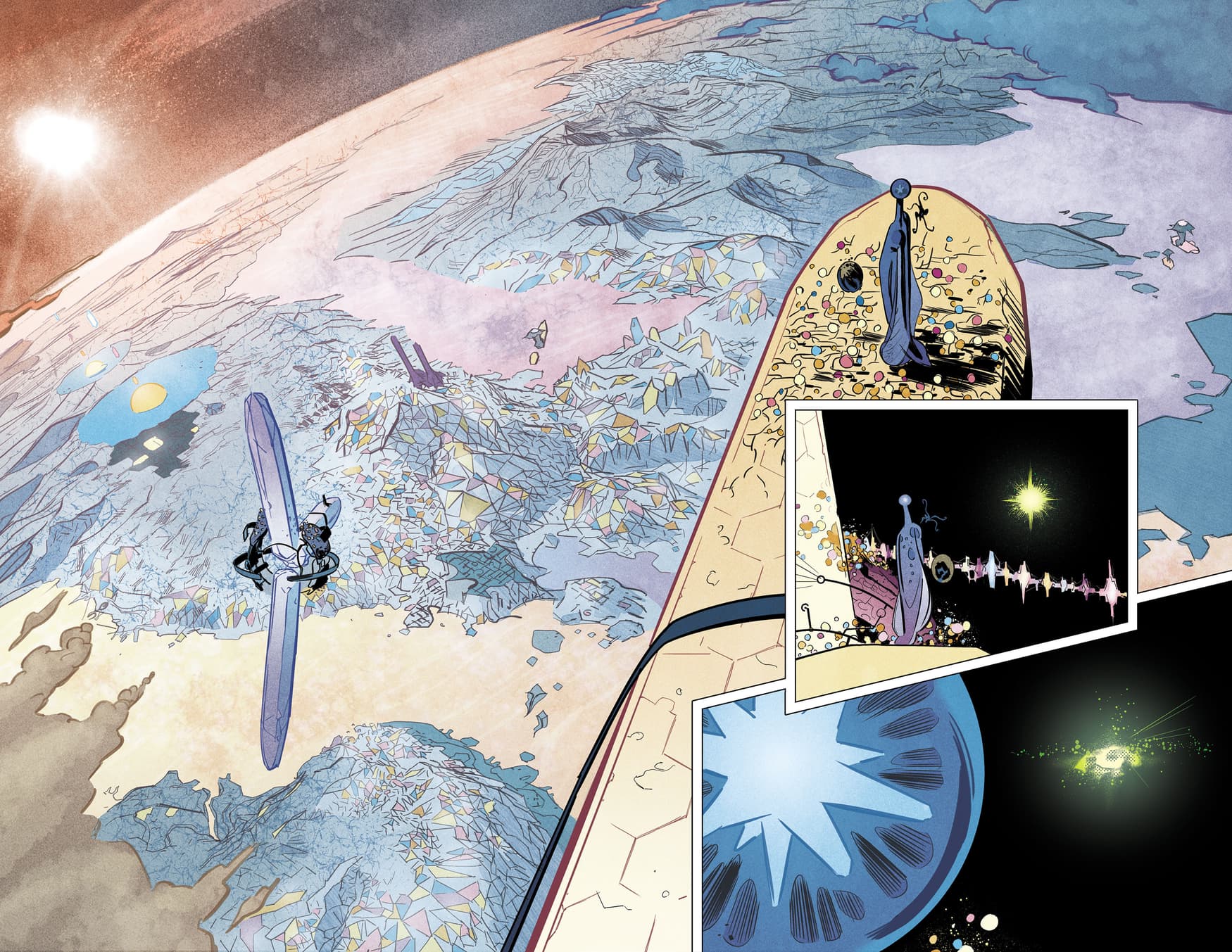
The Architect Award: Al Ewing (Immortal Hulk, Spider-Man: Full Circle, Marvel Comics #1000)
Writing about Ewing feels vaguely unnecessary with a big feature about the writer going up just two weeks ago on this very site. There was a whole lot said that pretty much covers everything I could or should say about his greatness.
But I’m going to say something anyways.
After Brian Michael Bendis left Marvel, I was curious who would become the architect of the line, as that’s a skillset not everyone has. At the time, it felt more like Marvel’s editorial team would drive it for the most part, at least until a writer presented themselves as a better alternative. That happened, as Ewing has proven himself as a writer with a mind like few others, someone who can fit pieces and parts from one side of the world to another in a way few can. You read something like Spider-Man: Full Circle’s backmatter – which shows email correspondence between the writers who worked on that title – and you see even amidst the other greats, the one who solves the structural problem of that one-shot is Ewing.
Even in the New Hickman World Order, Ewing is hero that Marvel needs, the one that can connect disparate sections of the world unlike anyone else there. Marvel’s line has struggled with finding unity at times, but with his work in Immortal Hulk and beyond and the work yet to come next year, Ewing has established himself as The Guy. I hope Marvel recognizes it, and I hope we gets the chance to become the one driving that ship in a way few writers ever get to do.
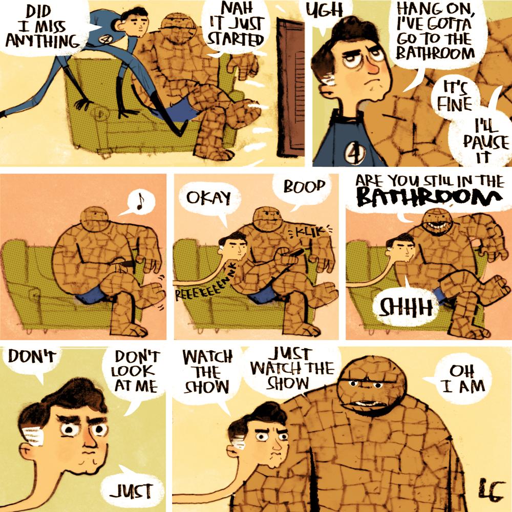
Twitter’s Best Follow Award: Lee Gatlin (comics on Twitter?)
I have a theme sketchbook I get artists to draw commissions in at cons. The theme is “superheroes doing ordinary things,” or, these spectacular, superpowered beings eating hot dogs or shopping for melons and other things of that sort. It’s very much up my alley, which makes sense: it was my idea!
That’s an important intro because Lee Gatlin, a cartoonist who illustrated the poetry-driven picture book Monster School (with writer Kate Coombs), is the best in the biz at superheroes doing ordinary things. His comics on Twitter intermittently go viral to the max, and for deserved reasons: they are absolutely hilarious and spot on. Gatlin clearly has a lot of love for these characters, and he takes the freedom that comes with making Twitter-centric comics featuring them to tap into important subjects like Jim Gordon’s gym routine, Batman’s toilet struggles, or how Reed Richards can’t miss a second of a TV show he and the thing are watching and how he finds a loophole to watching while needing to use the restroom. Those sound funny. They are much funnier than the concepts, most notably the latter (which you can see above).
Gatlin’s a prodigious talent, and someone who can find hilarious depths in simple ideas like superheroes or famous monsters like vampires or werewolves. His cartooning has a jaggedness to it that makes it feel rawer yet charming at the same time, and a gift for character acting and lettering choices that feel like he’s already at Kate Beaton-levels of delivering humorous beats. He’s an idea guy, but his execution doesn’t lag behind. It makes him one of the absolute best Twitter follows in comics, as every time one of his comics drop, it’s an event unto itself.
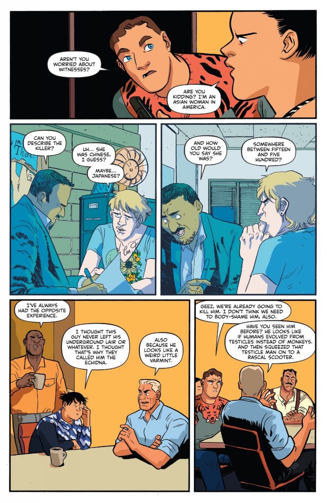
The Best Actor Award: Erica Henderson (Assassin Nation, The Unbeatable Squirrel Girl)
I’m obsessed with character acting in comic art. It’s genuinely one of my very favorite things in comics, and the difference between someone who does it well versus someone who doesn’t can make or break a comic for me.
And for me, there’s no better character actor in comics than Erica Henderson. Whether she’s drawing a room full of assassins discussing plans to kill a varmint-looking crime boss or a montage of Squirrel Girl set to her theme song, Henderson’s gifts as a visual storyteller are beyond compare right now when it comes to bringing a title’s cast to life.
That manifests itself in a number of ways. There’s the big, obvious stuff, like in panel #3 above where the man who is genuinely awful at determining the age or ethnicity of someone is putting in some thought. That’s a layup for Henderson, which is why she was such a great fit for Assassin Nation. You need someone who can sell big humor when it’s a title written by Kyle Starks. But the juice really comes in beats like panel #1, when Henderson is depicting the overly eager Dave’s curiosity about Smoke’s “go up and blast ’em” strategy with their target. There’s nothing showy about that, but that simple face, that turn of head, that amazing shirt…it speaks volumes about Dave when you look at it.
Assassin Nation was a big, nuts action book that was only five issues, and to get through the plot and the explosions and the gunfire and all of that, you had to kind of get through a lot pretty quickly. There’s not always a ton of room to dig into character. The good news is Henderson is so good at saying a lot about a character with one image here or another one there that you feel like you know these characters based off posture, delivery, gestures, and all of that jazz. Henderson is of course good at more than just character acting – she’s one of my favorite artists, period – but in this specific attribute, she maxes out her power set. It’s always a joy to read a story drawn by Henderson, and a huge part of that is how she can make you feel you know the cast with her art. It’s a true gift, and a rare one at the levels she’s at.
Speaking of all of that, I talked with Henderson about all of this for an art feature about Assassin Nation this year. If you’re a fan, consider reading that!

The Visionary Award: Jonathan Hickman (I don’t know some X-Men comic or something, East of West)
To relaunch the X-Men to the levels they needed to be at, you needed a few key things.
First, you needed someone who knew and genuinely loved the X-Men.
Second, you needed someone who recognized their strengths, but also their weaknesses.
Third, you needed someone who wouldn’t care if people got mad at them, because frankly, it was going to happen whatever they did.
Fourth, you needed someone who just didn’t care about anything that came before him. I don’t mean that in a nihilist sort of way. I just mean they couldn’t be someone who was going to play back the hits. They had to do their own thing, even as they worked off of what came before.
Finally, you needed someone with real vision. After all, the X-Men have had plenty of good stories over the past decade, but what they lacked was someone who could deliver real cohesion to the line and a direction that spoke to who and what the X-Men were and should be.
The list of creators who fit that bill are…well, I don’t know how big it is. But to my knowledge, there’s only person who checked all of those boxes, and that’s Jonathan Hickman. There are plenty of writers who could write a good X-Men comic. That is assured. But I’m unsure if there is anyone in comics who could have delivered the vision he brought to the book while distancing himself as much as he did from the criticisms that were sure to come his way while deploying said vision. He’s the hero we needed, even if we may not have deserved him.
I’d say more, but my god, I’ve said a whole lot about all of this already. If you haven’t listened already, maybe consider listening to my podcast with Hickman about all this. It’s a good one.
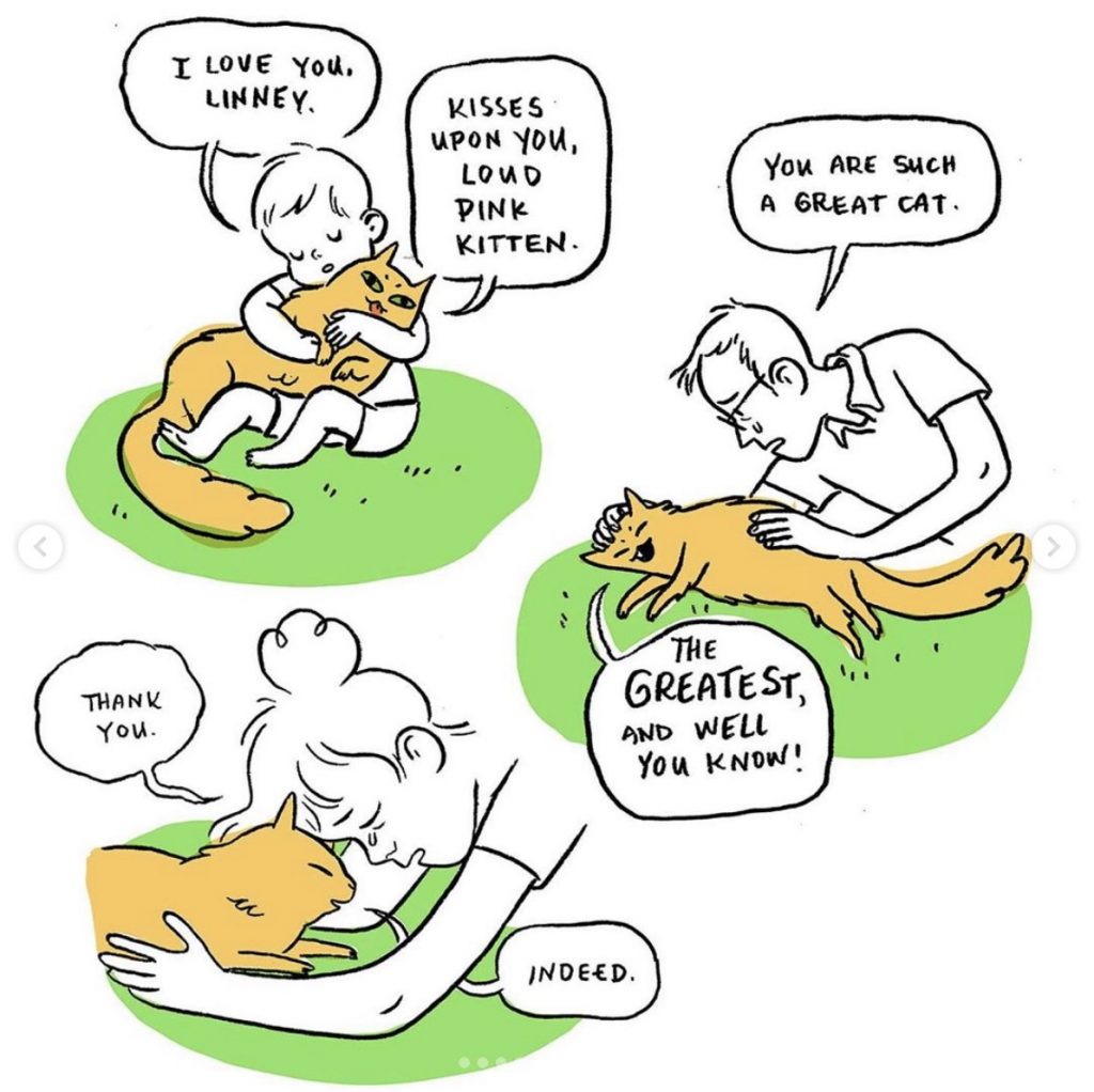
The More Splendid Than Ever Award: Lucy Knisley (Kid Gloves, Linney comics on Instagram/Twitter)
Short note about Knisley’s work: if she’s published something new in a year, there’s a pretty good chance I’ll tout her. That’s because Lucy Knisley is as sure of a shot as you can ask for in comics, as she is always delivering treasures in comic form whether it’s a graphic novel about the experience of having a child or a short comic about her wondrous cat Linney passing on.
Knisley’s brain is a wonder, as her abilities at writing, drawing, structuring stories and a million other things somehow perfectly match and complement each other, ensuring that her works are always engrossing and memorable. Beyond that, she has a true gift at realizing perspectives outside of her own, as even an effort like Kid Gloves takes time to represent that perfectly reasonable decision for a couple to not have children. That’s a small thing to some, but for others, it speaks to the care and consideration she puts into her work. As a reader, I cannot help but love and respect that, as it’s a balance that makes her work feel inclusive regardless of subject.
This cartoonist been a highlight reel since she got started, but 2019 has been her strongest year yet. It’s been so exciting to see how she uses not just traditional forms like graphic novels but Instagram to generate a following and, more importantly, tell endlessly engaging stories. This isn’t new for her, but Knisley’s one of the best at it, and it’s always irresistible when one of her new comics pops up on whatever social channel I’m visiting at the time. To steal a line from one of her comics, Knisley and her work are truly more splendid than ever, and with a deluge of exciting releases coming our way in the future, I can’t imagine this train is stopping any time soon. We’re all luckier for it.
Knisley visited Off Panel this year to talk about Linney comics and Kid Gloves and everything else. Maybe consider listening if you missed that one, as Knisley is always a gem.
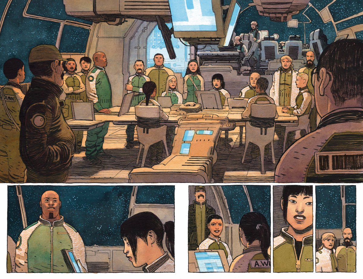
The Terminator Award: Jeff Lemire (all of the comics)
Stop me if you’ve heard this one before, but Jeff Lemire is a pretty busy guy. I kid when I say he worked on “all of the comics” as his credit for this year, but it sometimes seems like it, doesn’t it? This year, Lemire’s works included:
- Sentient with Gabriel Hernandez Walta
- Varying Black Hammer titles with varying creative teams
- Ascender with Dustin Nguyen
- Gideon Falls with Andrea Sorrentino
- Joker: Killer Smile with Andrea Sorrentino 2
- The Question: The Deaths of Vic Sage with Bill Sienkiewicz and Denys Cowan
- Family Tree with Phil Hester
- Berserker Unbound with Mike Deodato, Jr.
- Inferior Five with Keith Giffen
- Frogcatchers, a graphic novel which he did everything for
- He also apparently wrote some of The Terrifics this year?
That’s 11 credits, all of which were multiple issue runs, besides Frogcatchers, and that’s because it was a dang graphic novel that he wrote and drew and I think hand lettered? His workload isn’t a lot by comics standards; it’s an entire pull list unto itself.
Now, if he just worked on a lot of comics, that’d be impressive but whatever. But his comics are also extremely good! I considered four of his titles for my comic-centric awards, and while not all of them made it, that’s a heck of a hit ratio. Even beyond that, that’s not even saying any of the others are bad in any way. They’re just less incredible for Lemire, which is still very good.
Lemire is clearly a Terminator, sent from the future to maybe save John Connor but, if I’m being honest, mostly to make comics. As long as he keeps making as good of ones as what he’s putting together on the regular, then I’m cool with said terminating, presuming it doesn’t also eventually lead to Skynet. Precluding that scenario, I am very pro-Lemire.
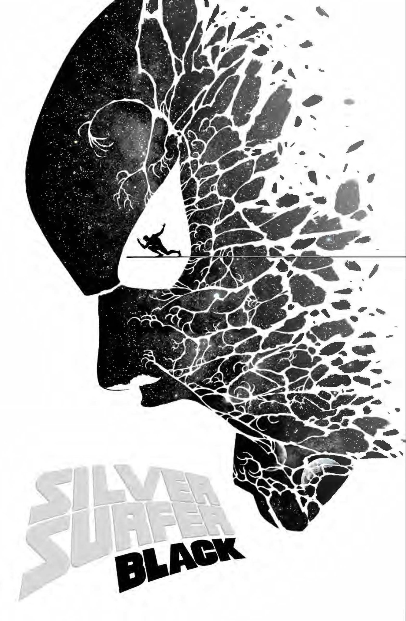
The “We’re Not Worthy” Award: Marcos Martin (covers for a variety of Marvel comics)
Marcos Martin has a rare gift.
There’s something he has in his brain that allows him to find the exact right solution for each and every cover he does, whether it’s something very character based like on Meet the Skrulls or something a bit more abstract like on the above Silver Surfer: Black #2 variant, while executing it perfectly as well. That may not seem that unique, but it is when you consider his covers as a whole, as Martin ranges from Rockwellian looks at the life of a young man in the 1960s on Spider-Man: Life Story #1, a quintessential snapshot of what makes Squirrel Girl who she is on The Unbeatable Squirrel Girl #42, or a visually arresting, dynamic bit of figurework and design on Absolute Carnage #2, you realize that he delivers covers with zero uniformity from a style or look standpoint.
The only thing you can guarantee is that it will be the best possible version of that cover. Martin is a brilliant cover artist – although I’d argue he’s even better on interiors – and this was one of his finest years yet, with his mix of Marvel work showcasing an artist at the peak of his powers and with a mind to match. Clever, unforgettable stuff from my guy, Marcos, and covers that make even I – a general resister of variants – stand up and pay attention.
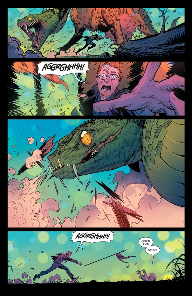
The Art Team of the Year Award: Dan Mora + Tamra Bonvillain (Once & Future)
It was a fierce competition for the Art Team of the Year award. For this category, I wanted to find the artist and colorist I felt elevated each other’s work the most. It was the only one that I had listed before I had the creators in mind. I wanted to focus this one on the collective rather than the individual, and so it made sense to reverse engineer the result.
But as I started digging into it, it became pretty obvious to me: it had to be Dan Mora and Tamra Bonvillain for Once & Future. I already touted the pair in my art feature interview with Mora, but they deserve far more acclaim as a partnership than I gave them even there. Few artist and colorist collaborations result in the highs that this one does, as each issue of Once & Future is a tour de force that sees this pair augment each other’s work in astonishing ways.
Mora’s line art has never popped like this, as Bonvillain knows just how to bring the figures and world to life in a way that accentuates his efforts. And while Bonvillain has other, notable partnerships – I’m particularly fond of her work with Ramon Villalobos – there’s something about this story and Mora’s line art that just makes her colors sizzle. When I first saw preview pages for this series, I knew I had to read it just because of how these two artists made each other’s work sing. The appeal leapt off the page, slapping me in the face and telling me, “You have to read this book.” And it was worth it, if only for the art. 3
And the wild thing is, to my knowledge, this is the first time the pair has worked together. Amongst the other competitors for this category, that’s truly rare. I had considered names like Jamie McKelvie and Matt Wilson, Cliff Chiang and Matt Wilson, or Russell Dauterman and…Matt Wilson, 4 all of which are long-time partnerships. But Mora and Bonvillain are seemingly first time teammates, which makes it this effort all the more amazing. I hope they keep working together for a long time, because there’s just something about this pair. It’s scary to think of how much better they could get together with more projects under their belts.
The “Take That for Data” Award: Tom Muller (the X-Men relaunch)
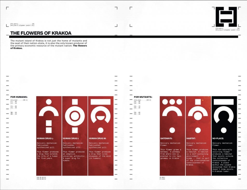
Long ago, Jonathan Hickman told me in a feature about design in comics, “Want someone to pick up your book? Want some good advice on creating a visual identity? Hire Tom (Muller). Then go to bed.” It’s something I’ve remembered fondly ever since, if only because that’s pretty much how I looked at it. While there are many talented folks designing comics today, there’s just something about Tom Muller and what he brings to a book. Every title he works on is just that much better because of how he thinks about design integrated into story and overall visuals. He makes the whole thing look incredible, but more than that, there’s a cohesiveness to what he delivers. That’s important.
So when Hickman hired Muller to work on the X-Men relaunch, I knew immediately that this was destiny. The pair had to work together at some point, and this being the project for them to do it on was exactly the one it needed to be. Given how much Hickman was going for it on these titles, he needed someone who spoke his language, and what Muller did throughout House of X and Powers of X – and in design for the Dawn of X titles, of course – was astonishing. From a sheer “what’s different?” standpoint, the biggest delta between HOXPOX and the X-Men’s other comics throughout history were those data pages. Muller – in collaboration with Hickman – ensured that they weren’t just data dumps, they were resplendent yet clean, stunning yet highly effective at delivering information.
They were truly perfect.
Everything Muller touches, though, is that much better for his efforts. He’s one of the only creators I know that only adds to projects and never takes away relative to others. He’s the top of his class, and someone I hope publishers are studying and learning from 5 as he delivers world-class design to a medium that often treats design as an element that’s secondary at best or forgotten at worst. Comics are better for his work, and someone that represents a better looking and better designed future for the medium. Plus, what an X! Good job by you, Tom! You did it! You completely nailed that X!
I talked to Muller a whole lot about the whole X-Men relaunch and his design work on a podcast earlier this year. It’s a good one. I highly recommend it.

The Brand Loyal Award: Wil Moss (Immortal Hulk, The Unbeatable Squirrel Girl, Thor, Black Panther)
One might see Moss’ name here and immediately scoff. “He’s not a creator!” you may be thinking about this notable Marvel editor. And sure, he isn’t in typical comic terms. But when it comes to story impact, editors have a whole lot more than most comic fans realize. They help drive the line and find the right directions to take titles under their purview, which may not lead to them creating, but it does lead to them helping titles reach the heights they might not get to otherwise.
And Moss is the editor of a slew of titles that are amongst Marvel’s very best, making him a slam dunk choice here. I mean, just look at those titles next to his name above. Immortal Hulk, the comic I’d say is widely considered to be Marvel’s best. The Unbeatable Squirrel Girl, my personal favorite Marvel title. Thor and its assorted, associated works, like War of the Realms, King Thor and beyond. Black Panther, or, as I call it, SPACE PANTHER! These are great, unique titles, and Moss has the highest rate of any editor in comics – besides MAYBE Calista Brill – of hits to comics. 6 That’s important.
Moss is like a brand that you just implicitly trust by seeing its name. Some people buy every Apple product they can get their hands on. Me? I see Wil Moss in the credits, and I go straight Matthew McConaughey in Dazed and Confused immediately: alright, alright, alright. And its not as if he’s as uniform as other beloved brands, where you know you’re going to get certain things with it each time. Moss is remarkable about helping each title become what it needs to be, but never trying to push it into a specific directions related to himself. You don’t get a Moss flavor with each bite. You just get the best version of each comic he edits, with the flavors of the creative teams amplified instead of mixed with what he’s bringing. That’s refreshing, delightful and remarkably impactful.

The Lifegiver Award: Rosemary Valero O’Connell (Laura Dean Keeps Breaking Up With Me)
At New York Comic Con this year, I had the opportunity to record a podcast with Rosemary Valero O’Connell, the incredible artist of the graphic novel Laura Dean Keeps Breaking Up With Me. Normally, I try to be a professional, respectable human being. It’s a thing I aim for. A bare minimum, if you will.
I failed miserably with O’Connell, as my interview with her was basically full out Chris Farley Show, with me taking the book and pointing at pages while saying things like, “This was awesome. How did you do this?” O’Connell, being a true professional, rolled with my fanboy questions, answering each answer with intelligence and insight. But that’s not a surprise, as O’Connell is one of the most impressive new voices in recent years, with Laura Dean being a highlight reel of everything that makes her one of the best artists in comics.
My favorite part about her art, though, is how she gives every page and panel and setting and character as much life as humanly possible. You look at Freddy’s room throughout the book, and you learn so much about the character. You look at how O’Connell stages a shot of Freddy and Doodle at a restaurant, and it feels so much more fully realized while also conveying emotion by the distance between us and the pair. Everything she delivers on the page, from clothing and posture to camera angles and environment, gives us key information while doing exactly what a page needs to connect us with these characters and this situation.
O’Connell’s a remarkable talent, and someone who is quite young and maybe even barely scratching the surface of what she’s capable of. I cannot even imagine what kind of virtuoso work she’ll be bringing our way next, but I can tell you what: I’ll be reading it, no matter what.

The “STOP IT!” Award: Hassan Otsmane-Elhaou (PanelxPanel, Strip Panel Naked, Peter Cannon: Thunderbolt)
I’ve joked before that my primary goal in writing and podcasting about comics is to actually destroy all other comic sites and podcasts. It’s spite that drives this engine, and I must destroy. Now, that isn’t true. But Hassan Otsmane-Elhaou is so good at what he does it’s at least somewhat true.
That’s why he gets my “STOP IT!” award for the year. Every time he releases a new issue of PanelxPanel, a new Strip Panel Naked video, a random tweet thread where he expresses why he loves a comic (while underlining, frustratingly, how good he is at understanding them), or announces a new project like the upcoming PanelxPanel pocket books, that’s my response: STOP IT!
It’s like the old Chris Kattan-as-Antonio Banderas, “How Do You Say? Ah Yes, Show” skit SNL would do, except instead of me randomly saying, “TOO SEXY! TOO SEXY!” in the background, it’s me saying, “TOO GOOD! TOO GOOD!” as I gesture wildly at everything Hass does. 7 Otsmane-Elhaou’s mind for comics is outrageously, remarkably effective at seeing what few others do, while finding a way to realize it that’s both visually appealing and easy to take in.
He delivers that in his lettering work as well, with this year’s Peter Cannon: Thunderbolt series he did with Kieron Gillen and Caspar Wijngaard being the perfect example. That was the ideal marriage of project and letterer, as Gillen pushed the formal boundaries of the comic medium as much as one really can, and Otsmane-Elhaou rose to the challenge in incredible ways. It was a remarkable effort, and a great example of how lettering can elevate a work.
I respect the hell out of Otsmane-Elhaou. The guy is one of the best in the business, regardless of what hat he’s wearing at the time. But I must begrudgingly request that he “STOP IT!” all the same, because you know what? He’s making us all look bad. Think of your peers, Hass! We try so hard and we still can’t compete!
I talked to Hass about his destructive goodness on Off Panel. If you’re interested in his work, it’s a great episode to listen to.

The Hell of a Thing Award: Steve Pugh (Harley Quinn: Breaking Glass)
Sometimes when you’re talking about comic art, it’s all about the subtleties of the work. “Did you notice how the art guided your eye down the page?” you might ask yourself, or maybe, “Did you notice how the artist reflected an earlier beat there?” Things like that. These are the kinds of things one might miss when reading a comic simply because you’re engrossed in the story. It happens, and it’s part of the reason it can be hard to talk about comic art. Much of the impact comes from the nuance. It’s wondrous.
Sometimes, though, there’s efforts like what Steve Pugh put in on Harley Quinn: Breaking Glass where you look at a page and are like “holy crap what am I looking at this is amazing.” Art that immediately turns you into that weird Persian Cat meme, gesturing generally in the direction of the pages of this graphic novel because it’s all so incredible.
There are two elements that stand out the most amongst what Pugh brings to the page. First is his character work, which is astonishing in how it enlivens the cast without feeling too lifelike. There’s a verisimilitude to his delivery of the cast, but his art never feels beholden or enslaved to reality in a way that takes away from the energy on the page. These characters feel alive, but they still feel like comics, which is a subtle difference that’s important to the reading experience. It feels real, but comic book real and at the absolute apex of that admittedly amorphous concept.
The other is color. Pugh uses color brilliantly throughout, as the bulk of the book is blue-ish, gray-ish tones mixed with white to establish a base layer, but when he escapes from that foundation, it’s for maximum impact. The amazing thing that happens when a significant portion of your comic features a limited palette is whenever you choose to leave your home row, everything pops like it wouldn’t otherwise. The reds of Harley Quinn’s outfits, the flames of the explosion shown above, the purple of The Joker’s suit…it’s easy to know the importance of these elements because the colors are telling us oh so vividly. It’s a fascinating mix of restraint and showiness, and something that works very well.
Harley Quinn: Breaking Glass is the best Harley Quinn comic I’ve ever read. Pugh’s art is a massive part of that, as it truly is a hell of a thing.
The Chameleon Award: Joe Quinones (Dial H for Hero)
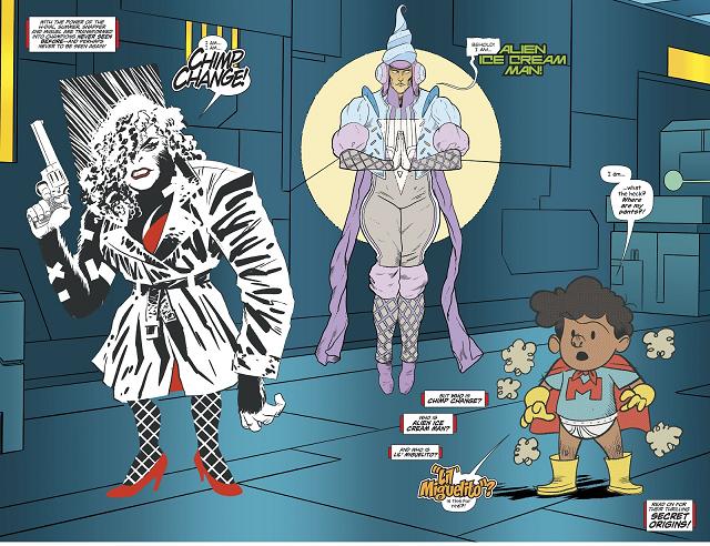
Joe Quinones has always been an artist who is adept at switching styles if the story requires it. It’s a strength of his, and something that is fun to see when it happens because it’s such a unique skillset. We don’t get to see it very often, but when we do, it stands out because few can do it better.
That’s what makes Dial H for Hero such a fitting project for him: the H Dial that turns people into different heroes is all setup for him switching styles to match the figures they become. Take the above image, in which all four elements – the Frank Miller-esque Chimp Change, the Moebius-fueled Alien Ice Cream Man, the Captain Underpants-like Lil Miguelito, and the base style background of Quinones – require different visual takes on one page. All four he nails, and that’s barely scratching the surface of the what he delivers as he bobs and weaves out of 90s action styles or a Matt Groening-like animated feel. It’s unbelievable.
Despite rotating through all of these styles, Quinones never takes a play off when it comes to the storytelling chops we know him for. Whether he’s channeling Jamie Hewlett or Mike Allred, everything is absolutely pristine and easy to understand. That’s because Quinones is a chameleon, someone who can match whatever is asked of him without losing who he is at the root of his art brain. No matter whose style he’s channeling, the gifts we know Quinones are still there. That’s a rare thing, and one of the reasons Quinones is genuinely one of the best artists in the business.
The Storyteller Award: Javier Rodriguez (The History of the Marvel Universe)
Being a comic artist is an incredibly difficult job. I wanted to start there, because I had to acknowledge the totality of comic artists before saying what I’m going to say.
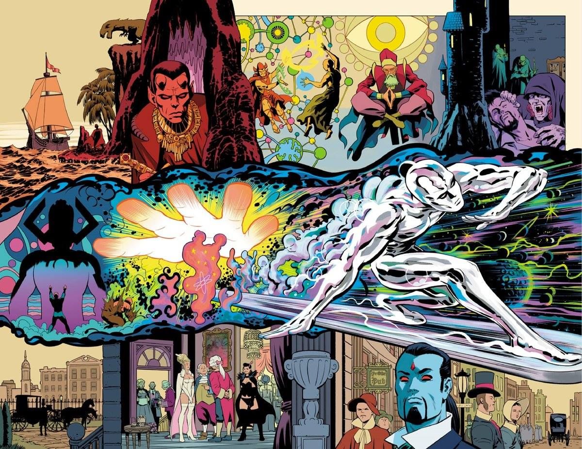
I think Javier Rodriguez had the toughest task of any comic artist this year. His main project this year has been The History of the Marvel Universe, a series he has taken on with writer Mark Waid, his pal and inker Alvaro Lopez, and letterer Joe Caramagna, and to say it’s not like a typical comic is perhaps an understatement. It’s retelling the totality of Marvel history in six issues, and because of that, it has a rather atypical structure. In fact, it’s almost absent of real structure, instead being delivered as a constant flow touring the biggest stories and events from the House of Ideas. Waid does a heck of a job to give the whole thing as much shape as he can, but the nature of it puts an inordinate amount of weight on Rodriguez.
And he completely kills it on every page and every issue.
Rodriguez is able to turn each individual page into a story unto itself, with panels floating and rearranging to fit whatever narrative there is and deliver what the artist needs. Standard layouts don’t play here, as Rodriguez has to solve wildly different problems scene by scene, issue by issue. While he excels at everything, it underlines why Rodriguez is one of the finest visual storytellers going today. His ability to flow stories – no matter what they call for – is nearly unparalleled, to the point that when I suggested to Waid on his recent podcast appearance that I didn’t think anyone else could have drawn the book, the legendary writer agreed. It’s a tall task, but one the artist doesn’t just deliver on, but thrives at.
Every project Rodriguez works on is maximized by his presence. But this is the first one I’ve read from him where he was irreplaceable, with his storytelling efforts not just being impressive but absolutely essential.
The Natural Award: Rainbow Rowell (Runaways, Pumpkinheads)
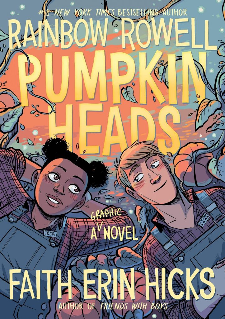
When Rainbow Rowell came on Off Panel, I of course asked her about her preternatural gifts as a writer of comics, something I know she is asked about a whole lot…yet I asked anyways. It had to be asked. Rowell is already one of the better comic writers out there, and it feels like she’s been doing this for five minutes.
That’s why she’s earning The Natural Award from me, as Rowell showcases a rare, natural gift at writing comics that not any writer from outside comics – or even writer inside comics – often shows. Whether it’s in her graphic novel Pumpkinheads with Faith Erin Hicks or Runaways with Andres Genolet and Kris Anka, Rowell showcases a confidence and competence at the art form that betrays her relatively neophyte nature.
That’s particularly well delivered in Pumpkinheads, a story that’s so fully realized and so wonderfully inviting at least in part because of how Rowell doesn’t look at any detail as too trivial or any nuance as not worth exploring. Granted, it helps a whole lot that Hicks was her collaborator on that book, as they really are a perfectly matched duo, with strengths matching strengths completely. But Rowell’s brain doesn’t allow for unfulfilled ideas or undercooked elements. Because of that, relationships feel lived in. Worlds feel like they were always there. Desserts feel real. 8
That makes each of her works all the better for it, and it’s something she figured out basically day one of making comics. Rowell is a natural at writing comics, and someone that’s equally adept at graphic novels and monthly titles. Both of those are rare attributes, while also being things that make her a must buy creator for me going forward.
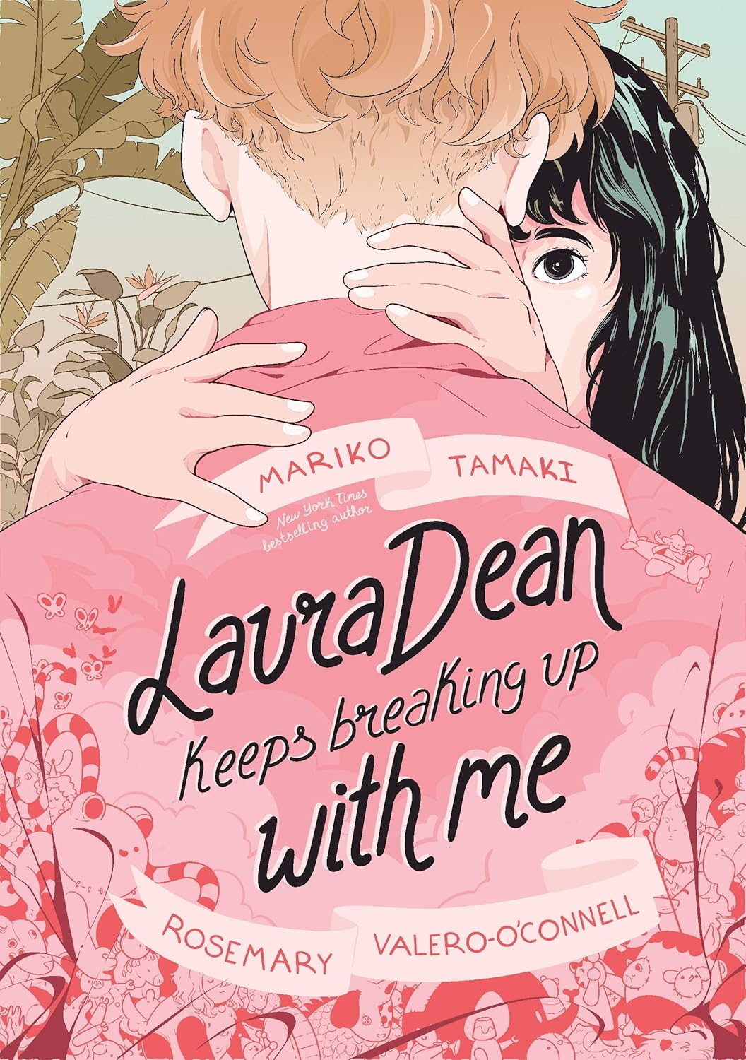
The Empathy Award: Mariko Tamaki (Laura Dean Keeps Breaking Up With Me, Harley Quinn: Breaking Glass)
I already described Harley Quinn: Breaking Glass as my favorite Harley Quinn story ever. Regardless of your stance on Harley Quinn, a comic being your favorite of any character is a heck of a thing. So when I say that I liked Laura Dean Keeps Breaking Up With Me considerably more than I did Breaking Glass – again, a great comic – that is saying something.
And the commonality the two have is the woman who wrote them: Mariko Tamaki, a writer who had a heck of a year.
Tamaki’s one of the best in the business, and this was arguably her finest year yet – although I suppose that depends on where you rate This One Summer – with two primo graphic novel releases. While Tamaki had exemplary art partners on each, both of whom have earned awards in this endeavor as well, the thing that really makes Tamaki’s work stand out is how much emotion she can get readers to feel for the cast in such a rapid fashion.
That’s showcased particularly well with the characters of Mama in Breaking Glass – a character who we grow to care about quickly because the heart and emotion they wear on their sleeves – and Doodle in Laura Dean, a character I feel immensely protective of. Neither of those characters are leads, but Tamaki is such an empathetic writer we can’t help but feel for them and their plights and relationships and everything they are going through. I empathized more with Doodle than I did any other character in comics this year, and it was thanks to the richness of character Tamaki brings to not just the leads, but each cast member of her books. That she can do that with two such wildly different books and such a vastly different set of characters is all the more impressive.
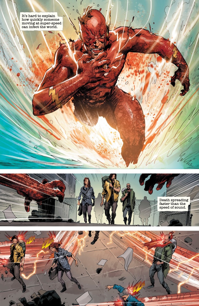
The Shoot Your Shot Award: Tom Taylor (DCeased, Friendly Neighborhood Spider-Man)
Writer Shea Serrano is a huge proponent of the idea of “shooting your shot,” or, effectively, going for it even if you have no idea if it’s going to work for you. It’s basically a mantra of his “FOH Army,” a brigade of Twitter users who use those powers to…relentlessly do good things for people? It’s a fascinating thing, and an idea I love to see executed by storytellers. Who wants to read a story where someone doesn’t shoot their shot? It’s far more entertaining to engage with something where you’re like, “I can’t believe they’re trying this.”
The comic god of shooting your shot is writer Tom Taylor, a writer whose credits for 2019 included a comic I lovingly called “DC’s Marvel Zombies” and a Spider-Man story in which the wall-crawler adventures through a previously unknown secret city under New York literally called “Under York” with a geriatric superhero. In the wrong hands, those are deeply stupid ideas that fans either mock or rage about. Instead, Taylor turned them into absolute delights – or, whatever the equivalent of delight is for stories in which an entire world dies – that constantly surprise and entertain, finding a way to not just come up with brilliant ideas but deliver on them at the same time.
The premise of fan fiction about superheroes is a funny one to me, as in many ways, what are superhero comics but paid fan fiction that last forever? I don’t mean that as a way to degrade superhero comics, as I love them. But that’s what they are. Sometimes, because of the nature of IP management or perhaps the slightly less willful nature of other creators, that can lead to toothless works. But Taylor’s the king of that idea, delivering A+ fan fiction where you’re constantly astonished by what he’s doing. A zombified version of The Flash is transmitting an Anti-Life Equation at super speed?! Superman decides to fly through him and is infected by a finger that jammed through his skin?! Superman decides to kill the sun to more efficiently kill the Earth? GUY GARDNER SAVES EVERYONE?!
Taylor’s stories are constantly delivering beats with question marks attached to them, but crucially, there are also exclamation points there. That’s what you get when you’re the comic book master of shooting your shot, always going deeply outside the box but nailing it when you do. It’s why Taylor is one of my favorite writers of 2019.

The Artist of the Year Award: Julian Totino Tedesco (Daredevil covers)
If I had to pick one person as my creator of the year and Jonathan Hickman was for some reason exempt from the awards, Julian Totino Tedesco would be my pick. JTT – that’s what I call Tedesco, as I’m inexplicably trying to steal Jonathan Taylor Thomas’ identity – is the best cover artist in comics, full stop. I’ve been arguing it for years, but 2019 ended that fight. If you don’t believe that, you’re just being obstinate, because his run on Daredevil is an instant classic of unforgettable work.
I mean, look at that cover above from Daredevil #14. They say a picture is worth a thousand words, but for my guy JTT, it’s at least double that. That’s a story in one image. It says so much about the situation, the characters, the relationship, where everything is…you name it. Tedesco can deliver more story in a single image than many artists can in an entire issue, and I don’t mean that as a diminishing statement to other artists. He’s just that good.
Does it help that this cover showcases people enjoying coffee in a diner? Yes. If I’m anything, it’s someone who is quite weak to the allure of superheroes doing ordinary things, or more particularly, superheroes drinking coffee in diners. But it’s far more than that. Tedesco’s someone who delivers on all of my key components to a good comic cover – does it reflect the story within? is it a standout piece of art? would it draw your eye as you walk the stands in a comic shop? – each and every time he brings a cover to life. Even more importantly, he feels like an essential part to the mix to what has been a very good run on Daredevil this year, as his covers are cornerstones to the overall appeal of the book.
From the jump, there was no doubt in my mind what Julian Totino Tedesco would be getting in these awards. Fictional awards are necessary sometimes, but I had to call Tedesco what he was to me: the artist of the year, plain and simple.

The Virtuoso Award: Jen Wang (Stargazing)
While there are arguably “better” cartoonists out there in the world, I’m not sure if there’s anyone I prefer over Jen Wang. There’s just something about her work that completely jives with my sensibilities as a reader, with lively characters, impeccable storytelling and a musical energy to everything that happens on the page. Her stories have heart, but they also have reality. They have weight, but they also have hope. They’re inviting, yet real. Wang’s gift is one of balance, as she somehow brings just what every page and story needs to be maximized.
She’s a true virtuoso, someone whose first work – the graphic novel Koko Be Good, a personal favorite of mine – was already gloriously fully realized. But what happens when a virtuoso keeps learning, keeps working, keeps growing? Something like Stargazing comes our way, a middle-grade graphic novel that underlines Wang’s potential as the next Raina without diminishing her artistic bonafides.
This is a personal story for Wang – the back of the book reveals how much of the story of this title’s leads, Moon and Christine, comes from her own life and experiences – and one that’s told with honesty and beauty. Like with Raina’s work, on the surface it seems to have a narrow perspective, but there’s a universality to this story. Who hasn’t wanted to fit in a little better, to be a little cooler, to be a little more natural in your own skin? Or what it’s like to just be a little different, in a way that even you can’t explain? It’s a story of self-discovery through friendship, and it’s a beautifully crafted and gorgeous graphic novel, even if it’s perhaps a bit smaller by nature than what we’ve seen from Wang before. That’s not even a bad thing, as it allows her to keep the whole thing a little more grounded.
Wang continues to prove herself as a cartoonist that’s on par with the best working in comics, and each graphic novel is a gift. 2019 gave us that once again with Stargazing, and I can’t wait to read whatever next comes from her.
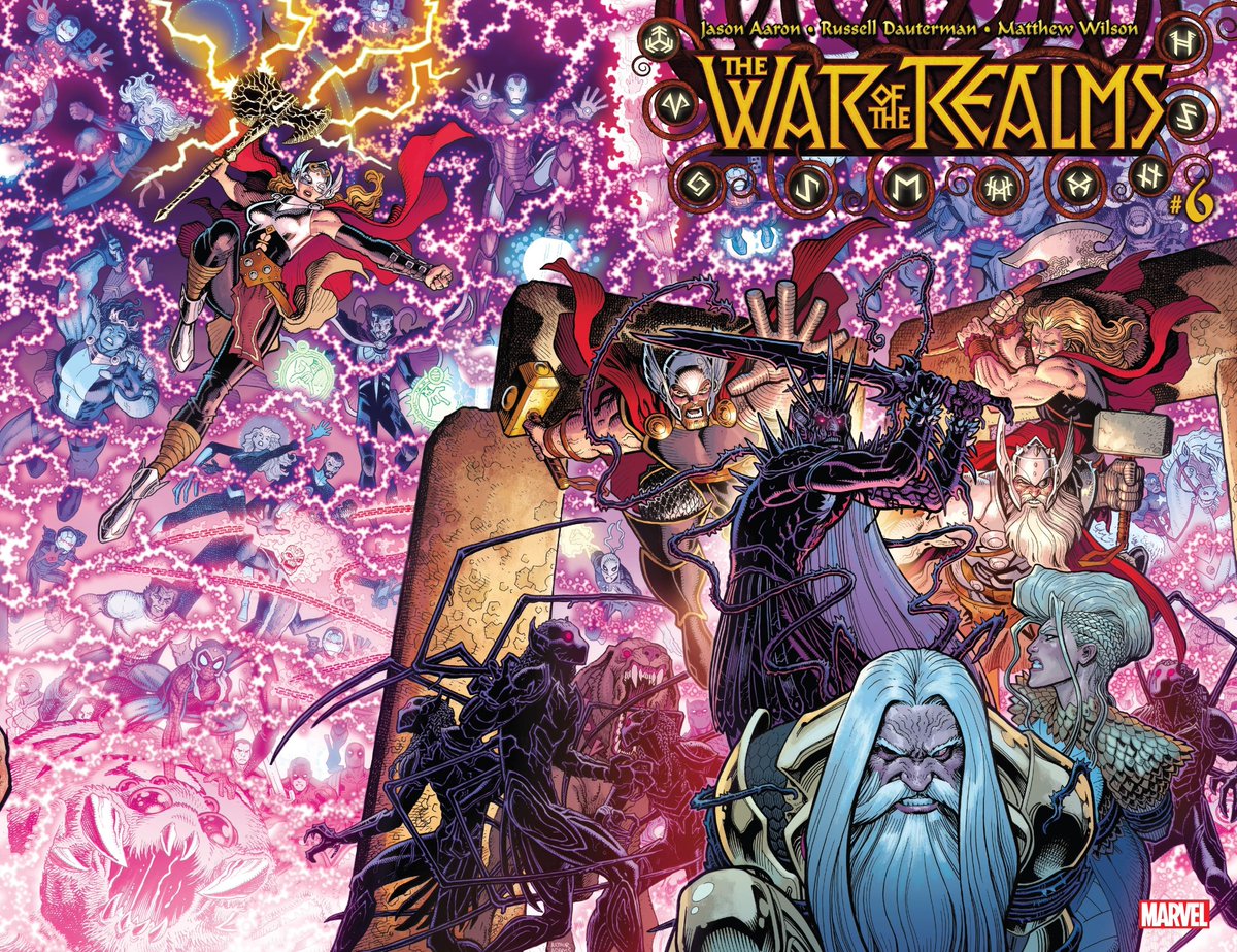
The Barometer Award: Matt Wilson (War of the Realms, The Wicked + The Divine, Paper Girls, The White Trees, etc.)
Anyone who had to color the above cover deserves some sort of award. The levels of intricacy to an Arthur Adams cover is enough to break your average colorist, as it’s an absolutely exhausting amount of detail. But for Wilson, it was just another day in the office, as the guy is both unbelievably reliable and remarkably talented. He just gets it done, and to the absolute max.
While my guy Matty Eis – Wilson won another Eisner for Best Coloring this year – deserves this spot for a whole lot of reasons, I wanted to shout out a specific thing I’ve touted him for before. No creator is a better barometer for a great book for me, as Wilson is only capable of taking on so many books – six seems like his max for the most part – so he has to be choosey about what he takes on. This year, his list of titles included the Marvel event War of the Realms, the conclusions of both The Wicked + The Divine and Paper Girls, The White Trees with Chip Zdarsky and Kris Anka, as well as assorted others. And you know what? Every single one of them was a title I deeply enjoyed, outside of the end of the year release that was Undiscovered Country. And that wasn’t Wilson’s fault.
If Wilson is on a title, I know I’m going to pick it up because it’s almost a certainty I will like the book a whole lot. Part of that is the collaborators he works with. Part of that is his selective nature. But you know what? One part I always forget to note is, oh yeah, Wilson is an incredible colorist! He’s a storyteller, and someone who finds the right answer for every project he takes on. Whether that’s the sensational neons and crackling energy of what he did in WicDiv or the flatter, 80s influenced palette of Paper Girls, Wilson never delivers a Wilson brand of colors. He brings exactly what the title needs. That makes him a far more interesting colorist, and the best in the business in my book.

The “Okay, Chip” Award: Chip Zdarsky (Spider-Man: Life Story (writing and covers), Daredevil, The White Trees, his newsletter, etc.)
I regret to inform you that Chip Zdarsky is apparently good at everything.
Writing comics. Drawing comics. Drawing covers. Tweeting. Making newsletters. Wearing fashionable clothing. Filming Coca Cola commercials while suffering from the plague. He’s a true hyphenate, someone whose skill set is robust and varied in often surprising ways.
2019 was a perfect year to showcase that, as he had a variety of projects that emphasized all of his talents in unique ways. Take Spider-Man: Life Story, for example. This six issue mini-series that told Peter Parker’s actual life story if he was able to age like a normal person was a remarkable, emotional read, and one that featured both Zdarsky writing and providing instantly iconic, wondrously simple covers. Sure sure, Mark Bagley and others made it what it was as well, but Zdarsky’s double duty made it more appealing from the outside and the inside.
And in Daredevil, the writer side of Chip’s brain continues to prove itself as quite the big deal itself. Tackling Daredevil is a challenge because you’re always racing giants in doing so, as it’s easy to say things like, “that was pretty good but it was no Miller/Bendis/Nocenti/Brubaker/Waid/whomever.” Chip was smart enough to know that was coming and do something fiercely his own while still being very much a Daredevil story. Sure, there are roots in those other great runs, but I’ve loved to see the unique angles he’s taken in separating himself from the pack in a very Chip way.
Meanwhile, on a wildly different front, his newsletter and hijinks with assorted creator-based podcasts have become must enjoy meta insanity that only further endears us to The World of Zdarsky and reinforcing his particular brand of entertainment. Is it a comic? No. But it reemphasizes what it is we love about the whole Chip experience.
That’s why he gets the “Okay, Chip” Award, the most fictional of my fictional awards. It’s like, “Okay, Chip, we get it. You’re really good at this stuff. You’re like Wolverine, you’re the best there is at what you do, and what you do is very nice and strangely arousing and I need to stop typing.” Zdarsky’s rise from the clown prince of comics to still maybe that but also someone who is impressively capable at delivering multi-faceted stories that we connect with on all levels has been a sight to behold. Comics are better for having Zdarsky doing what he does, and I hope for a long future of big, weird and often shockingly emotional stories from my guy Chip.
Come back next week for another round of awards, as we’re jumping into the comics themselves from the year that was. And if you enjoyed this content, consider subscribing for all this and more.
They are also definitely not guns…or least I don’t think they are.↩
Speaking of busy guys!↩
I’m enjoying the rest of it as well, as Kieron Gillen is writing an engrossing, entertaining blockbuster of a story.↩
This might not be the last time Wilson will appear in these awards.↩
I know I am, as when my wife asking what I’d like the headers for these features to look like, I basically said, “GIVE ME THE MULLER!”↩
And I mean that qualitatively, not from a sales standpoint.↩
This reference might be too old for the average person here, but I’m going with it all the same.↩
For real, pumpkin bombs seem out of control yet irresistible.↩
